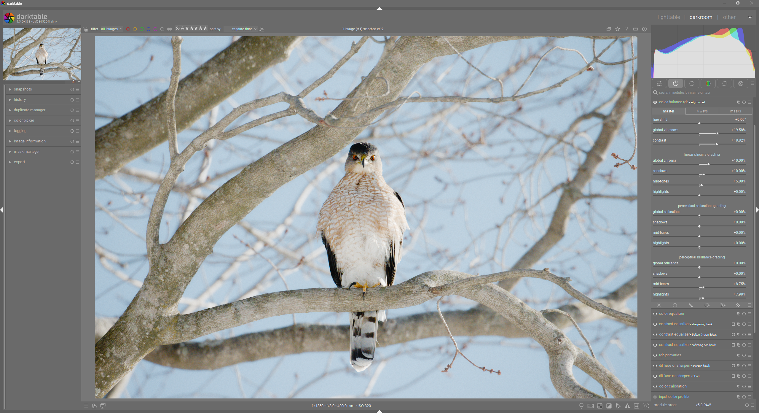
I wanted to see what people think of some UI work that I have been playing with. Below is the elegant grey theme with my changes. You will see the biggest differences in the module group buttons, module search bar, tabs within modules, and the formatting on control sections.
5 Likes
I like your idea for displaying the tabs better, and I also think the more compact slides are great.
I would like to reiterate my suggestion as an idea here.
My main concern is to achieve a better visual separation between the modules, hence the slightly rounded corners and 4px spacing.
In smaller font:
I’m a little uncertain what problem these proposals are supposed to solve.
Dt’s UI in itself has hardly appeared as a problem to me - neither as a beginner in identifying what parts and functions there are, nor in performing editing work.
(The only thing I may find as a problem is to discern a module’s activation status from the appearance of the activation icon - it’s a tad too small / little contrasty.)
So, to me it seems like a good idea to first try to agree on what we want to obtain, before I’m ready to respond on some graphical details.
1 Like
To keep it brief, take a look at the top post, where I briefly explain my idea/goals.
I like where you are going with this.
I love the sliders and the overall look.
I am not a big fan of the borders of tabs and button (e.g. the module selectors). I have not found the proper word to describe it… but it makes them kind of ‘floating’ which I don’t like
1 Like
There is a PR currently in work, [RFC] - UI: rework sliders. by TurboGit · Pull Request #20388 · darktable-org/darktable · GitHub
1 Like
While i don’t see it as necessary I do like the way tabs are displayed here. For me the big issue was identifying modules were switched on. I previously installed a theme that had green for activated modules and that meets my needs very well.
4 Likes
I wouldn’t say there is a “problem”, more like a goal of consistent optimization and improvement.
By the way, the work I am doing is not endorsed or affiliated with anyone else here. @Qor does great work, but our efforts are not interchangeable or meant to be unified (though they are probably complementary).
My Goals
- Find ways to contribute to darktable, whether that be providing inspiration or stepping stones for others to utilize and build off of, or by making the contribution myself via coding.
- Provide input as someone who has developed complex UIs as a part of my work, so that perhaps darktable can benefit (if possible). I’m not an expert, but I do really enjoy it and don’t mind spending time on these sorts of things.
My Theory
I think that darktable is incredibly powerful, but I think something about the UI makes people feel like it is too complicated or dated or just not as nice looking as other software. It is sort of an intangible thing, but I have some ideas: insufficient whitespace, unclear UI presentations, and an inclination towards distinction rather than simplification. These are very difficult things to accomplish, which is why paid-softwares typically have “nicer” UIs. They have whole teams of UI/UX people working on this.
The Inspiration for this Work
My original post was inspired by someone who noticed that the behavior of the Module Group buttons was confusing for beginners in their photo editing workshop. I also have found the behavior slightly odd for some reason, and then realized that it is because the presentation doesn’t match the behavior. The module group buttons are essentially filter toggles (generally called “filter chips” from what I can tell). They are not tabs, but the UI makes them look like tabs. So basically, this started out as a proof of concept to make them look more like “filter chips”, instead of tabs.
What I changed
I made the module filter toggles look more like module filter toggles.
Then I realized that the module header might be improved with some additional interior “padding” around the content of the headers. I also make the borders around module headers darker, which creates visual separation without adding visual noise (I have never been a fan of the brighter underline beneath headers).
Then I worked on updating the tabs inside the modules like color balance RGB and others. I modified their styling to make it incredibly obvious that they are in fact tabs.
I then changed the control sections by removing the horizontal bar beneath the section labels and adding whitespace above the section labels (accomplishing distinctive sections while reducing visual elements).
There are also some tweaks to slider color and general padding to improve readability and increase the usable space within a module ui.
It is ok if no one’s likes it or thinks it is necessary. I enjoyed working on it. Maybe their are some good ideas in their, or maybe I’ll hate it all in the morning  .
.
5 Likes
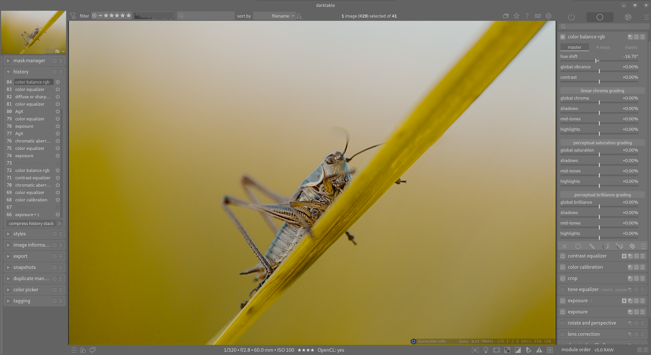
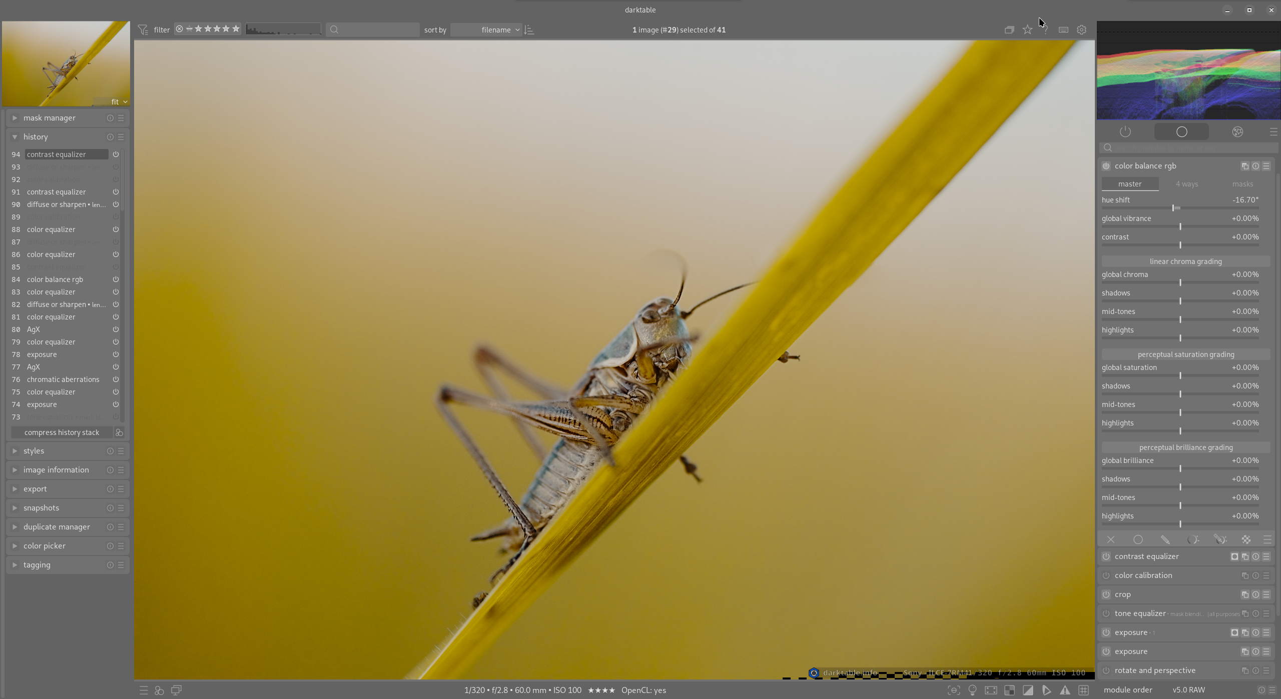
I tried doing a similar thing, and I just didn’t like it as much as I thought I would. When multiple modules are collapsed beside each other, I think it looks messy with all of the borders and troughs between them.
Something I am really trying to push towards is more simplicity, almost to the extreme (my current styling is still far too complex for my liking).
I’m not saying you are wrong, just that I am trying something different.
1 Like
I concede that when I refer to them when teaching DT I call them tabs. I don’t see it as a big issue what you are proposing. I am all for optional themes in DT as long as they don’t put any burden on the maintainers. I know there will be resistance to change because there is not really a problem being fixed by your tweaks. It is just cosmetic. I hope people will be respectful to your effort here.
I agree with your assessment partially. I need to continue working on the module group toggles in order to get them to look cleaner and more solid.
For the tabs, I have ideas to maybe improve them, but the idea is for them to look like actual physical tabs. So whichever tab is active actually visibly connects to the “page” and the others sit above the page border, just like physical tabs.
Thanks for the tabular praise! I will work on the module activation issue. I know you already have a solution but I want to improve it for myself 
I don’t think the tab can be more prominent than the module header; there is a clear hierarchy:
Group > module header > tab > slider
8 Likes
I agree, upon considering this more specifically, (which using dt has never really made me feel compelled to before), that in a row with other horizontal lines that identifies a slider, like in the 4 ways tab of CB, the lines beneath the section labels act as visual noise in large and would be best to avoid.
Compare this, however, with the master tab where the lines beneath the section labels rather to the contrary does help identify a section and is IMO in no way acting as noise.
There was something about confusion regarding the module header tabs, because a second clicking, that one may not be so conscious about, suddenly fills the tab content with a large number of modules. I agreed that this may be a problem for a beginner who has not yet become aware of this function, (that I incidentally believe is not often used), but I cannot see that the design proposed here takes care of that.
Pascal Obry put forward the idea that said function (listing all modules) could perhaps rather be triggered from its own tab/icon. I think this would be a OK solution. There could also be other good alternatives. For my own part, what I would at least do, is to include information on this in the icons’ hover-over pop-up (-- which I imagine it was some time ago).
Has there been other confusion about the functioning of the module groups header tabs related to their appearance?
There are other aspects of the modules header group that actually has bothered me:
- The QAP and Active Modules each has a function different from the rest of the tabs. Perhaps this should be indicated visually somehow?
- The modules displayed, and their varying division into tabs, under some of the presets.
- The not so obvious link to the auto-apply pixel workflow defaults setting in preferences.
But then we are definitely outside the css domain.
.
I like this option because then all modules could be listed to show the pipeline order, but I personally don’t like the current click means of revealing all modules. However, I can live with it if that is what the developers want to do.
In the spirit of “less is more”, which is not always true but in this case maybe it is, I would argue in favor of removing the module group tabs altogether.
There are only three groups that are really necessary:
- All modules
- All modules in a certain workflow (I use workflow as a synonym from system or user defined group of modules)
- Currently active modules
So, there are just two axes that matter:
- Workflow selection
- All modules in workflow vs. only active modules
My concrete proposal would then be:
-
One combobox to select the workflow (replacing the current tabs)
-
Three tabs:
- “All modules in [currently selected] workflow”
- “All modules”, which would be selected automatically when the search box is focused
- “All active modules”
1 Like
This is something that also really bothers me.
The second thing that completely turns me off Darktable is the inconsistency in using left and right mouse clicks. My god, every time I have to try and figure out if I should click this icon one way or the other. Plus all those different keyboard modifiers for mouse clicks.
The third thing is the lack of a dropdown top menu. How many things would it make easier and improve feature discoverability in the program if it had a proper menu. I’ve been ready to start a discussion about this a few times and try to fix something myself, but every time I realize I’d probably mess things up more than fix them 
I appreciate it 
I definitely am not trying to put more work on the maintainers for DT. This is why I didn’t even share my css yet: inspiration/feedback is good, but I am not wanting to put something half-formed.
This is a great point. I’ll think about that.
You then seem to look away from the function of the current system that gives new users a certain level of crude guidance in what function a module has / which modules are relevant to major groups of task. The categorization in this way is IMO a useful feature when starting to get an overview over dt.
I therefore do not think it is wise to take that away, unless this simultaneously is cared for in another manner.