The point of the 18% is that you don’t need a perfectly calibrated screen or environment because with the reference white point, and mid grey, you have what you need to adjust exposure and tone mapping.
It wouldn’t be a bad idea to go check out the ISO spec Aurelien used for the color assessment mode and see what it says, or not, about a black point anchor. Maybe there is good info there.
–
It seems like overall people(not you bastibe) are mostly speaking and basing their ideas on vibes and not research like it used to be done just a few years ago.
3 Likes
I think that the “color science” and artistic dimensions can be decoupled. Sometimes I would like to have a black reference, even though that may not be the “technically right” thing to do.
2 Likes
Yes, I am not against a black point reference at all  Especially if someone edits on OLED or in an environment that lends itself to really good black levels, it’s sometimes hard to get things correctly without it
1 Like
Well, I’ve had a look. The referenced ISO 12646 does not seem to specify a viewing setup, but is all about the display hardware instead. However, it references ISO 14861, which describes a soft proofing system:
Section 4.3.2 states that
“the display frame, the surrounds of the display, desks, walls, and everything in the field of view should be near neutral to ensure that no saturated chromatic elements affect the chromatic adaptation of the observer. For the display frame, grey would be the best color, but black and white can also be used […]. For walls and desks, a neutral grey would also be best, but white can also be used”.
Furthermore, it refers to ISO 3664 for a specification of the viewing booth:
In section 4.5.5, it states
"The area immediately surrounding the displayed image and its border shall be neutral, preferably dark grey or black, and of approximately the same chromaticity as the white point of the monitor. The luminance of the border should be ≤ 20 % of the white point luminance, and preferably ≤ 3 % of the white point luminance.
When the monitor is being used to visualize images which will be reproduced as hardcopy, the recommended lightness of any border displayed around the image will depend upon the comparison. In general, for comparison to prints, which may well be reproduced with a white border consisting of unprinted substrate, the border of the image should simulate the colour of the substrate; for comparison to transparencies, it should be dark. However, it is generally preferable that any such border be no more than 1 cm to 2 cm wide, even if it would normally be wider on the hardcopy reproduction."
That said, I can say from personal experience that a bright border serves me well as a white reference. Without it, I tend to choose a white point below pure white, which looks odd when printed, or when compared to other photos (although it looks fine on its own). Similarly, I need a black reference to ensure an appropriate black point.
I can of course use the histogram instead to ensure my black and white point, but a visual reference is easier to me.
With regards to colored accents in the UI, I have not observed any ill effect of e.g. the orange accents in Capture One, or the blue accents in DxO Photo Lab. But surrounds illumination and color temperature certainly does influence my color perception.
3 Likes
Perhaps a black-and-white border would actually be good. But I would have to experiment with it, it might look distracting. For now, a white border, a grey background, and a near-black UI seem to work well for me.
1 Like
The modules that are in each tab are in pixelpipe order in relation to each other in the tab.
1 Like
Yes, I understand it. But the stateful tab paradigm is confusing if you are not used to it, as in the list of active modules suddenly there are some modules that where not there.
Active modules and groups of modules are different concepts and mixing them is confusing.
As I said before, I understand how it works and it does not bother me, but this does not mean that it’s good UX.
2 Likes
The “solution” would be to have the pixelpipe order in the “powered on” tab (or in some completely new location) and then be able to arbitrarily order the modules in other tabs.
I don’t know that this is great either, people will wonder why its different in yet another place. People are already confused by the history stack and the module order in the other tabs and why the pixelpipe order is not the same as the history order.
1 Like
One possible solution would be something I mentioned elsewhere in this thread. Have the only pixel pie visible be the “active modules” panel, and then have a separate panel somewhere (below it or… I don’t know) that is the “module library”. The module library could be organized into categories, have a search bar and be sorted alphabetically within each category. On each module item in the library, there would be a “add to pixel pipe” button that would add it to the active modules panel, enable it, and expand it for editing.
I’m just theory crafting right now. But I think this set up would solve way more issues than it would create and users could still use all their custom module groups for organizing modules in the module library. It would actually not remove any current features, but move them around a bit.
Actually it would remove one feature: modifying modules from a panel other than the active modules panel.
2 Likes
but crippling the software so that it can fit in the one size fits all UI/UX box isn’t good either.
Commercial software is written around the UI/UX. We create a widget and then we add code to run the widget. Any feature that doesn’t “fit” that paradigm is left out. In the end we have mediocre software wrapped in a “nice” interface that fits in the “look and feel” box that mainstream users are comfortable with.
FOSS on the other hand writes software designed to accomplish a task, then wraps the software in a UI that lets the user access ALL the power of the software. No needed feature is left out.
My first UI was an ASR 33 Teletype (eletro-mechanical) and a line printer. 10+ years after I started with computers I ran Windows 1.0. I’ve seen all kinds of interfaces and never have I said “that’s a great interface”. My definition of a good interface is that I can use the program and get it to do what I want when I want. I also understand that in order to use any program I have to learn the interface, and not just the dumbed down section that’s most convenient.
I understand that most users have grown up using a GUI and Windows, and thus have a narrow view of what an interface can be. Just because an interface doesn’t fit into the one size fits all UI/UX box doesn’t mean it’s bad, it just means it’s different (and sometimes better).
As far as darktable UI/UX changes I think most everyone will be receptive to CSS styling changes, including adding code to make more elements accessible to styling. We can always add more styles.
What I believe will meet with resistance is functional changes for UI/UX reasons.
2 Likes
If I am not mistaken we are discussing ways of providing the same functionality with a more principled UI.
There are principles which are associated with good UX design. This is not a matter of taste, there is a ton of research on this stuff. One simple rule is that if something in confusing, probably it is not well designed. In this thread there are many long time users - not total beginners - who are saying that they had not understood how a certain widget works. To me, this is a very hard to confute indication that something can (and maybe should) be improved.
As I said above, I understand that there other priorities, so these things are disnissed as less relevant. Fair enough, but this does not make the problem go away.
2 Likes
Over the last few days, I’ve been looking at the user interfaces of Lightroom CC, Capture One and Luminar Neo.
In many areas, DT is significantly better in terms of UI, especially with/despite the high number of modules.
If we take out the issue of module order, there are only a few points that “separate” DT from a very good UI.
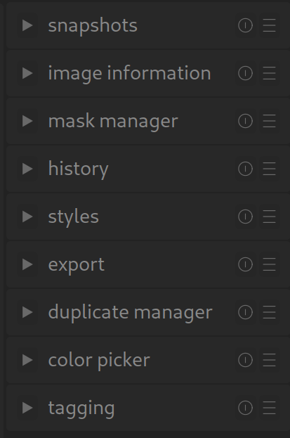
Here’s an example: On the right-hand side, there are two columns with icons. “Reset” (which is not recognisable from the icon alone – but that’s another topic) and the hamburger icons. Visually, it is not apparent that seven modules have a reset option and that the hamburger icon also has a function in three of them.
Even though we often only receive criticism or suggestions for improvement, the vast majority of people are extremely satisfied with DT and wholeheartedly support the software, even if this is not always apparent.
2 Likes
This is like saying that everyone could use a different alphabet when they write a book in English, or a random word order, and that it’s up to the reader to figure it out if they want to understand.
Makes not this does sense of lot a.
UX design is a language. Like all languages, it has rules and limitations. It is perfectly okay to break out of the protocol when it is necessary, like in a language when new words or expressions are coined, or when cases are dropped or vowels shift. It is not okay to ignore it and expect that users learn everything from scratch because of an arbitrary preference, if the software is meant for the general public and not just for private use.
Note that I am not saying that this is what darktable does, but is seems to be what you are entailing.
If we didn’t like darktable we would probably have better things to do than embark in these discussions
And just to be clear, for me darktable is the best raw editor, bar none, which does not mean that it can’t be improved.
4 Likes
I really like darktable. I believe it can absolutely compete with commercial software, and I am excited to tell people about it. This is exactly why I want to do a everything I can to improve it.
1 Like
Nobody wants to cripple the software.
Nobody is saying we should remove features.
Streamlining things and improving the UI means how do we correctly deliver all of the awesome features darktable has.
1 Like
The beauty of it is, we don’t have to compete. There is no market for us.
I think the friction we are encountering is that the UI/UX of darktable has historically served those who are using darktable and those who have the skill to implement change in the code base.
3 Likes
FYI, my understanding is that Affinity Photo uses a bottom-up process flow. See e.g. :
Eric Lenz: Order of Operations
Relevant section starts at 4:00.
The pixelpipe is one of the best features of darktable. Presenting module order bottom-up or top-down is just a choice, and for dt a choice was made years ago. I would not suggest changing it.
2 Likes
The problem with darktable UI is not usability. If you know what it can do and how to do it, then it’s not hard to use.
The problem is discoverability. The interface does not help you understand and discover what the software can do or how to do it, and one of the reasons is that darktable decided to reinvent a large part of the UX vocabulary. As a result, users who try to use established ways to learn how to navigate the interface find themselves at a loss.
As I said in many other posts, if you have to explain in the manual how to use the interface, then the interface has a discoverability problem.
6 Likes
I’m not saying compete in a monetary/market sense, I mean in a feature sense.
I think the only place where darktable “lacks” is in UI/UX.
It would be awesome if our UI/UX could also be super awesome, just like the other features. That is my passion right now. The UI is already good… But I will continue doing what I can to make it better. I’m not asking anyone else to work on this. I don’t want to distract other contributors from what they are passionate about.
3 Likes