I am struggling to understand the difference between some related controls present both in AgX and Color Balance RGB:
AgX’s “saturation” (in the “look” controls) vs Color Balance RGB’s “global saturation”
AgX’s “contrast” vs Color Balance RGB’s “contrast”
I can see that they’re doing subtlety different things, but I am failing to understand what that difference is, so I am never quite sure which one to reach for. In practice, I’ve largely stopped using Color Balance RGB’s “contrast” in favor of AgX’s, and to the contrary, I don’t use AgX’s saturation, and do that in Color Balance RGB. But that’s largely driven by the fact that for each of these control, this is where there are more related controls (shoulder/toe power and friends in AgX, shadow/mid-tone/highlight saturation in Color Balance RGB), so it’s easier to tweak further when needed.
But maybe there are contexts where the alternative tool would bring something useful to the table.
So, I’d appreciate if someone could explain the difference, both in theory, and in terms of how one might want to take advantage of that difference in various situations.
The saturation in AgX is a plain and simple RGB saturation control (multiply the the difference between the pixel’s luminance and each RGB channel by the given number). color balance rgb uses a much more sophisticated algorithm. I recommend you use that.
The contrast in AgX drive the the slope at the pivot (or of the linear section, if shoulder start and/or toe start are not 0, so a linear section exists). However, the curve takes log-encoded input and produces gamma-encoded output, so this is not constant contrast for the ‘linear section’ in scene-referred linear terms. The white and black points remain anchored where they are. Since AgX uses a per-channel curve, contrast effects saturation.
The color balance rgb contrast is a power function on the Y (luminance) channel only:
The d->contrast value is 1 + contrast on UI. The fulcrum is the contrast gray fulcrum in the masks tab. It shifts the white point! E.g. if the white point is 4 EV above mid-grey (16 times the value), and contrast on the UI is 20%:
effective contrast = 1.2
white point after contrast: mid-grey * ((2^4)^1.2) ~= mid-grey * 27.9, 4*1.2 = 4.8 EV above mid-grey.
I feel these questions are very relevant to a new user of AgX such as myself. Thank you @kofa for answering the question and explaining the difference. I tend to do similar to @frivoal and do saturation corrections in color balance rgb as well as color zones and color equalizer. But contrast I tend to do in AgX and the local contrast module.
The saturation in AgX is a plain and simple RGB saturation control (multiply the the difference between the pixel’s luminance and each RGB channel by the given number). color balance rgb uses a much more sophisticated algorithm. I recommend you use that.
Thanks. I now understand why their difference in theory, and when it comes to usage, that matches what I do, so that’s easy. At the same time, especially given that the answer is coming from you @kofa, is there any context/situation where using AgX’s saturation would be desirable? Even if that’s not the common case, I imagine that there’s some reason why you chose to add this control in the first place.
As for contrast, I’m seeing two key takeaways in your explanation:
AgX’s contrast affects saturation, Color Balance RGB’s doesn’t.
The white and black points remain anchored where they are in AgX, but not in Color Balance RGB. (That also seems to be the key difference between AgX’s Brightness and Color Balance RGB’s Brilliance)
I also understand that AgX’s contrast is not linear in the scene-referred linear terms, but I have a much harder time visualizing why I’d want it one way or the other.
Now, all I’d need is a nice video by @s7habo showing how to use these differences creatively
Ermmm… in the beginning, I had not much idea what I was doing. The code example I started with, had this control, so I added it. Just like the initial ‘offet’, which was later replaced with ‘lift’ (it tries to leave highlights alone now), or how the initial ‘power’ got replaced with ‘brightness’.
In fact, now ‘target black’ is probably safer to use than ‘lift’ (it does not move mid-tones, its effect is automatically confined to the region below the pivot). However, initially, the curve was fixed (no tuneable params).
‘brightness’ is a similar story: in the curve was fixed, and you could change the tone mapping result in the look. Now you can change the curve.
If you are almost done in your processing, but then realise you need a bit less/more contrast, changing the contrast in AgX is easier, you won’t have to re-adjust the white relative exposure (but you’ll affect saturation, so…).
I think the look controls are useful for that small little tweak of color, contrast, or a small brightness adjustment. That’s how I use them.
Often you have your edit essentially complete and just want to see about a little bump or reduction here or there…to me it seems natural to do it here as changing some thing earlier might pass along or shift things in other modules of the edit…
It’s like exposure edits. Some people will use two instances…one initially to set middle gray and then do the edit and then one strategically placed when the goal is to lift the whole edit from a certain point of development.
Others may use tone eq or RGB CB instances in a similar way…
It’s often just a workflow preference that evolves based on results and experience.
I think way back actually AP suggested people not use the contrast slider in RGB CB as it would quickly drive the highlights too hard Many people use it and never set the fulcrum which to me would be a key thing to do every time in a scene referred edit so it can be good to know any usage caveats for a module or control. In the end many people bend the tools in various ways using DT that are perhaps not the “suggested” way to do things and yet the results are very nice and not impaired by their chosen workflow.
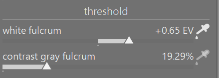
I am guilty as charged. I notice that in color balance rgb the threshold adjustments for the fulcrum have pickers. Should I use these every time I use the module?
Not really guilty but basically you can set the pivot tone in your image for the contrast where things will get lighter or darker around that point so it can help and you can use it to darken or brighten more of the image depending on where you place it so…it’s worth experimenting with at the very least…
White level is essential to the proper functioning of the module (docs update, based on Aurélien’s comments, were merged yesterday). Contrast fulcrum is more of an artistic choice, like moving the pivot in AgX.
that’s exactly how I use it. If I’m blazing through a ton of edits, I might use it to avoid a trip to Color balance rgb. The slope/lift/brightness are very familiar to me from my Resolve video colour grading. Again, they are a handy way of ‘seasoning’ the final image.
I usually stick to: Exposure >> Col Calibration >> AGX – pivot relative exposure picker to target my subject (sometimes) – adjust shoulder/toe >> Tone Equaliser to bring down/up anything >> Colour Balance RBG for saturation and color casts/looks/split toning>> Exposure for vignetting and local contrast nonsense.
I find that on my mouse with the indexed scroll wheel sometimes as little as one or two increments or maybe a bit more for slope can often as you say really bring a bit of life into the edit and the lift can really do a nice job on the black level to just add or remove a little…same to a degree with the other two… I find those sliders very useful for "seasoning " the meal…
I could revist that. I tend not to change the target values…Often when I did, it gave a bit of washed out blacks…I know in many cases then I can tweak the power and or toe start and come to a conclusion I suspect but its just a sort of comfort workflow to do a little dabble with the look sliders.
Actually, I mostly use slope/lift to increase contrast. I just like the way they do it. So I am usually moving lift to less. But with both, I’m using small-number decimal-point changes.
I move the black point in Sigmoid, sometimes, to recover detail in black hair. I’m in India, all my subjects, unless elderly, have it! Sometimes in AgX. One has to be careful with it, not to wash out the blacks.
(Actually, I’m not that often looking for detail in shadows otherwise. Unless its hair or a face that was generally badly lit. Then I’ll be using Tone Equaliser and/or Colour Balance RGB. That’s my subject matter and personal style, which absolutely might not apply to other styles/subjects)
This is why I say that I might well be doing it “wrong.” You must be setting up your brightness and contrast entirely to your satisfaction in AgX, and/or in other modules, before/without the “Look” sliders.
Plainly, what works, works, hence the quotes around “wrong.” On the other hand wrong may work, but there may be better/quicker ways.
I’m currently using Sigmoid again, as I need the quickest, easiest way to get through a big backlog. I’ll revisit these matters in AgX when I have more time to spend on editing.