Hi everyone,
Since a while I’m doing my migration to do raw photo edition with Dark Table (DT) . A few days ago, I was comparing the output between DT and Light Room (LR) because I was comparing the skin tones results from DT, which I prefer over LR. Nevertheless, I realize that the output JPG have more details (more sharpness) in the one produce by Light Room (LR*), I tested on a more suitable photo (with more fine details). I tried all the demosaic methods, local contrast, sharpen, diffuse or sharpen, among other methods, but no results. Also, observed the same on every photo that I was editing, so there is no an isolate issue.
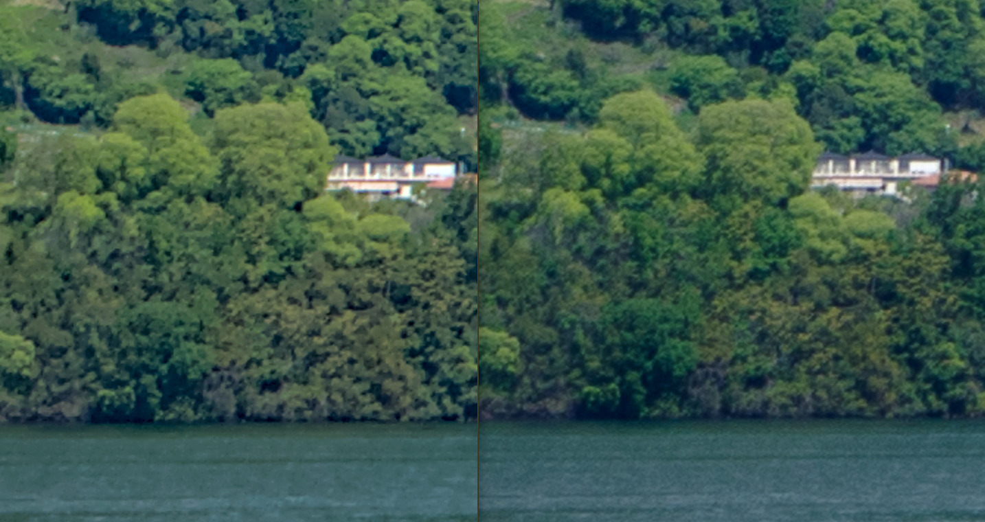
I don’t know if I’m missing something quite basic or it’s a very know issue that I wasn’t aware. Due to that I’ll leave some crop to 100%, 200%, and a link for the full size images.
I look for an answer on several places without result. If the topic arouses interest I can upload the RAW for further studies.
Note 1: both images are processed in both software, but the adjustment that I did do not affect the issue described, I just did a basic adjusment to have pretty photo.
Export settings??? Are you also comparing at 100% after exporting or from screenshots There can be nuances to the display preview between programs when viewed in the zoomed out preview…
EDIT
After checking out your link it seems you are… Many of the trees in the DT edit seem to be blobs of pixels so I would be curious to see your settings for sharpening…
There are a couple topics in this forum discussing subpar sharpening in DT compared to ART/RT. To my eyes Capture Sharpening is always better than D&S.
I think one issue with DT is most people throw on profiled denoise and don’t adjust it… Its pretty strong on the luminance correction and can blur things early in the pipeline. I also have a few presets that I stumbled on in DorS and I have to dial them way back as they would make “crispy” an understatement… and finally depending on viewing zoom and the settings the DT preview can be misleading so its definitely best to compare exported files in the same viewer rather than side by side screen shots of previews within the software…
Thanks to all for the feedback! Just some thing to clarify:
The crop images were cut from the JPG obtained from each respective software. I’m not comparing the preview.
I tried in the past with disabling “profiled denoise” but it didn’t make a difference.
Also tried doing edition with a *.PEF (Pentax) and with *.DNG but arose the same issue.
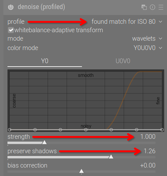
In DT I activated the following modules:
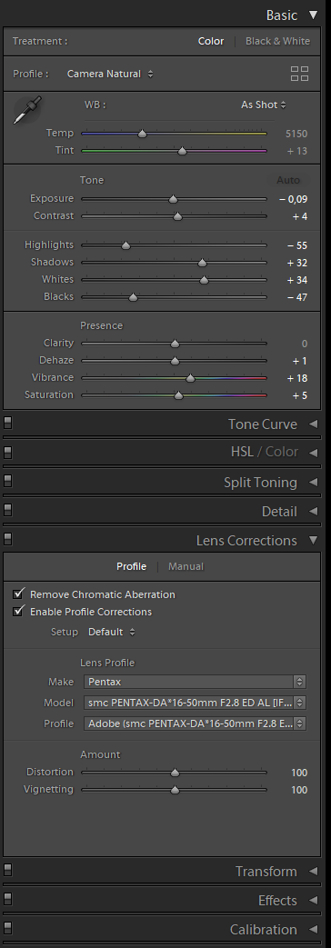
In the case of LR I just modified the modules displayed in the next image. I didn’t touch the “detail” module that contains the sharpening and noise reduction:
I’m going to take a look just for kicks… I wonder if there are sort of two questions in play one being the sharpening and one being the overall edit/rendering… I have seen these sorts of questions and comparison’s… As many people don’t have LR I wonder if the best way to assess the two for the possibility to sharpen would be to edit the image as you like in LR and then save a tiff and then try in both programs to sharpen the tiff file… Just a thought
This is one quick proposed edit… your provided sidecar is shown here as a snapshot on the left… of course the color and contrast could be tweaked to your liking…
It’s because you haven’t dealt with chromatic aberrations. If you uncheck Remove Chromatic Aberration in LR, I suspect the results will be fairly close.
It’s very obvious if you look at the church tower. Notice the thick glowing blue line going down the right side. And left-side lines are very reddish:
It’s also easy to see here:
There are three modules for this, which I would try in the following order: Lens correction, chromatic aberrations and raw chromatic aberrations. Make sure you read the manual for the last two, as they can easily cause color issues, if you’re not careful. In this case, lens correction doesn’t support TCA for the lens, so you will have to use one of the other two.
I tried Chromatic Aberrations (CA) using first the lens correction module but the results were kind of a mixed bag because it fixes it in some areas and makes it worse in others, then I tried the other two modules(chromatic aberrations and raw chromatic aberrations) but results in loss of reddish color in part of the photo. Nonetheless, I must say that your edition looks much better than mine.
Comparing again the output between LR and DT based on your sidecar it still look to me that LR did a better job handling the sharpness of the photo, the trees look more defined and not washed out, the same for the houses. I don’t know, maybe I’m been too picky with the results.
I’m thinking that maybe is something related to the algorithm (demosaic), but I’m not sure about this. As I said reviewing other photos I’m still finding the same sharpness issue. And as I said in the OP there wasn’t improvemente changing the demosaic approach of DT.
I think both of these are way softer than what I offered in my post above and in fact I am sure I have overdone it to emphasize how far you could take it… What I do find and its hard to explain is that I find that on some images ART and RT can manage to improve the sharpness without much of a contrast change whereas in DT you often can get what looks like more like a strong micro contrast bump rather than just the sharpening with too much highlight/shadow boost in the micro details… you can address that a couple of ways if needed in DT to get the best of both… but many times the RT result is certainly better at least strait away because of this…
Hi Todd. Can you provide more advice about how to adjust the profiled denoise. I use it all the time and generally I am very happy with it. You explained previously how to use the preserve shadows slider and shadows bias slider which have both been very helpful. I am unsure how to tone the luminance correct if I have allowed the module to pick a profile.
You can try this one – it’s a very gentle, chroma-only preset, trying to keep as much detail as possible. I don’t like chroma noise, but don’t worry much about luma. denoiseprofile_wavelet chroma 3.dtpreset (1.1 KB)
I then sometimes add a 2nd, default instance, and use details threshold to smooth skies, and leave details alone.
CA correction is always a matter of trade-offs, which is why it’s important to read the manual for those modules. This video is also recommended:
For better corrections in the lens correction module, you should consider contributing the missing TCA support to Lensfun. You can see how to do that here:
I only applied basic capture sharpening (Diffuse or Sharpen sharpen demosaicing AA filter preset), so that’s not a surprise. By default LR adds way more sharpening than that. It was just a quick edit to give you an idea - if it was a picture I cared about, I would have spent more time getting it right.
You are pixel-peeping at 200%. It can be useful when learning and such, but no one is ever going to look at it blown up like that. Try resizing down to 1080 pixels wide (Instagram size) and look at it on your phone.
Possible, but unlikely. RCD is already one of the best general-purpose algorithms. And in this case it’s very clearly mainly due to CA, so no point in exploring other avenues until you have that fully under control.
Thanks for sharing this, but is it able to detect the change of ISO used. I often bracket and have ISO switch between exposures. I have tended to be happy with the performance of the denoised profile module, but am willing to learn how to use it even better.
I have just got home from travelling and have looked at this image on my large screen at home rather than my laptop screen when travelling.
I didn’t feel that the denoise (profiled) module was causing any issue. So I left that alone.
I usually apply the sharpen demosaicing: AA filter preset in the diffuse or sharpen module to images for initial sharpening. This has the radius span set to 8 px by default, however changing this to a radius span of 4 px and increasing the iterations to 2 seemed to give a sharper look to the image without detriment. I have saved this as a preset for further testing on other images.
Much to my surprise I felt I preferred what I could do with the original sharpen module rather than the DorS module. I set the amount to 200% and experimented with the radius slider and settled on about 1.5 for the radius.
I then applied raw chromatic aberrations module. This may have reduced the red saturation levels a little in the image, but the color zones module could easily be used to restore these if desired.
I felt the local contrast module, even just at default settings helped lift this image a little with improved clarity and contrast boost.
I was reasonably happy with the results I obtained. Without doing a direct comparison to LR I was satisfied with the level of detail and sharpness I obtained.
This exercise has forced me to reconsider how I use the DorS modules presets for sharpening and also how I may wrongly have totally dismissed the usefulness of the sharpen module.
I hope through all the answers here you have found the information that you were seeking.
I think CA correction is too aggressive, it desaturates not only the edges. If you pixel-peep, you’ll see the roof has lost the red tinge, even though it was probably not CA: