Diffuse or Sharpen | UI Enhancements PR (PR CLOSED)

I have put in the following PR to enhance the UI for the diffuse or sharpen module:

I wrote quite a long description, so please check it out and let me know what you think.

@Pascal_Obry I started a new topic to keep things organized, and because this is now a discussion about an actual PR, instead of some random experimentation.

I am not saying that all my ideas are set in stone. Instead, I feel like the discussion around the particulars started to fizzle out, and so I think we might be at a point where we can take the next step and put code in the hands of the maintainers.

8 Likes

I have read your pull request. Your changes make it for me much easier to predict which slider will do what. Nice work!

I have three remarks:

  1. The only label I find a bit confusing is ‘fine tuning’. I kind of like the term ‘edge management’. I personally find that more descriptive.

  2. It is a bit inconsistent that the top of ui the coarse / fine are in separate groups. While in the auxiliary sharpen / diffuse they are not separate but do have coarse / fine in the label.

  3. For me it would make sense to swap the ‘fine tuning’ and the ’ auxiliary sharpen / diffuse’ section.

I also have one question. Although I use darktable in English, I also care about the translation. Have you consulted with the translators of this works?

First, thank you for a feedback. I really appreciate it.

The issue is that the “edge management” section includes the sharpening control, which doesn’t really fit with the idea of edge management. Also the “edge threshold” control, which I have renamed to “surface protection”, has the effect of modifying how much the diffusion/sharpening affects flat surfaces, so it doesn’t really make sense for it to have “edge” in the name either.

So in the end the “edge management” section would have the following controls: sharpness, edge protection, and surface protection. These are all controls meant for fine-tuning the module’s output, and they don’t all directly affect or manage “edges” so I chose “fine-tuning” to help convey the purpose of the control section

Yes, I wanted to make the layout the exact same in the auxiliary sharpen/diffuse panel as in the regular control area, but at this time, I don’t think it is possible to have sub sections inside a collapsible section. So I went with the next best option in my mind. There might be another solution though.

I understand that thought, but it is important to remember that, in general, the auxiliary sharpen/diffuse controls accomplish the same effect as the regular sharpen/diffuse controls, and are not generally required. In fact, in the manual, it says not to increase the overall sharpness/diffusion by more than 100% (each coarse/fine slider goes to 100%), unless you want to introduce glitch effects. So you are apparently not supposed to increase the primary coarse slider to ±100% and then add more with the auxiliary. But since a 50%-50% split also seems to be identical to just using one slider at 100%, there are really very few reasons to use the auxiliary sharpen/diffuse sliders. I kept them because:

  1. I don’t want to remove any controls
  2. I don’t want to break any presets
  3. In some cases, you can use them along with varying edge avoidance settings to target different areas of the image to accomplish very complex effects. This is a situation in which they are then distinct from the primary sharpen/diffuse controls.

On the other hand, the fine-tuning controls are incredibly useful in most situations, and so I placed them higher in the visual hierarchy to reflect their utility.

I have not worked with any translators, but I have an opinion on this :slight_smile:
The current control names mean next to nothing to me, and they are in English. They might as well be in French. I think no matter what, the new control names will be more understandable and easier to translate. But we definitely will need to see if there are any translation issues that arise.

Okay got you.

For me that is absolute the case. My comment was if you have spoken with translators to see of these new - imho much improved labels - also will trickle down to other languages.

1 Like

I haven’t yet. I need to figure out who I should talk to about that.

The sharpness in that section is different to that of the “diffuse or sharpness” controls - it acts more like an unsharp mask, which works not by reducing blur but by increasing contrast around the edges (which is typical for a lot of other “sharpness” algorithms). Therefore, one can see why AP put it in the “edge management” section. It could be called “edge contrast”, though “sharpness” is standard for that kind of thing.

From the manual:

Apply a gain on wavelet details, regardless of properties set above. Zero does nothing, positive values sharpen, negative values blur. This is mostly useful as an adjustment variable when blooming or blurring, to retain some sharpness while adding a glow around edges. You are not advised to use this for sharpening alone, since there is nothing to prevent halos or fringes with this setting.

So you could also call it “gain”, but I think that gets a bit too obscure.

Perhaps “spacial management” would be better than “edge management”? “Fine Tuning” feels a bit vague to me also. Every control could be called “fine tuning.”

Sorry, yes, sharpening generally works on the idea of “edges” since an edge is an area of contrast, but generally, I don’t know that regular photographers would think of edges when they think of sharpening. And since the sharpness control is meant as a fine-tuning control (or at least that is what the tooltip mentions), I figured it would be important to try and convey to users that it wasn’t meant as a quick fix, general-purpose sharpening tool.

I think “spacial” departs heavily from terminology that photographers are used to. Fine-tuning is meant to convey that the main controls are where you should perform most of the heavy lifting to achieve the effect, and then open up fine-tuning to find tools to help correct, improve, etc. the main effect.

UX is hard :laughing:

I wonder, if this will conflict with the module “contrast & texture” under development by @Christian-B . Can someone illustrate the fundamental differences. My take is all modules, in a sense, should be unique with minimal overlap with another. Then only DT will be enriched. @Pascal_Obry , can you throw some light in here?

Looking at the code, it is applied to the HF component of the decomposed wavelet scales. It will be strongest near the central radius and taper following the “Gaussian gate” created by the radius and span.

So it seems the tool tip is a little more accuate in what it does


No, why do you think so? Here we are only talking about renaming UI items.

2 Likes

Diffuse or Sharpen is a well-established module that already exists in darktable. It works on two fundamental areas: low-frequency wavelet layers and high-frequency wavelet layers. It can perform positive(blurring) and negative (sharpening) diffusion. Because it works on a very fundamental level, with little to no layers of abstraction, it can accomplish a WIDE range of effects: local contrast, sharpening, bloom, lens deblur, denoising, etc.

My UI rework is primarily focused on providing more helpful control names and better organization so that it is easier to use.

The module from @Christian-B is focused on contrast effects and is purpose-built to accomplish those well.

While there could be some effect overlap, it is like the overlap between a kitchen knife and a Swiss Army knife. Both are the right tools for certain tasks. Functional overlap doesn’t necessarily equal use case overlap.

2 Likes

The current names of controls are using terminology describing diffusion as a physical process - not photographic terminology (I recommend reading and understanding darktable user manual - diffuse or sharpen before relabeling something)
It’s a tool designed from an expert for other experts - most users are recommended to use presets as a starting point for learning.

When renamed, you completely lose that background and it seems, that it does similar things as other modules. But even if you name a cat a dog it doesn’t change it’s behaviour.

I‘m not convinced, that it’s a good idea to replace precise terms in a quite technically demanding module with feeling based terms, since the terminology guides expectations. It’s quite easy to shoot yourselves into the foot if you don’t understand, how a module is working.

6 Likes

@MStraeten I have a bunch of comments on your posts. My intention is to understand you better, and why you are advocating strongly for keeping the names as they are. No criticism.

But an expert in what? Mathematics? Isn’t darktable ’ for photographers, by photographers .’

I understand that. But, the target audience photographers are likely to be more known with the photographic terminology, or are they?

The particle simulation algorithm is a rather generic, abstract mathematical algorithm. Darktable takes that algorithm into the domain of photography / raw development.

That comes with an application step. In this case for diffuse / sharpen / local contrast. So in my mind it makes sense that we also make a ‘mapping’ from the mathematical terms to photographic terminology.


I recall from years working on software in the domain of water management / flooding prediction that sometimes the same type of algorithm was used. If I recall correctly, what we call ‘speed’ in darktable, was called ‘flow rate’ (basically the speed with which water is flowing in a river’).

With that relabelling / mapping even the most ‘mathematical’ experts where happy because it described the effect of the algorithm and referred to what was actually a very know established term within that domain.

Fun fact: using the word ‘speed’ on the sliders would have been very confusing in that domain. One of the factors determining the ‘flow rate’ is ‘wind speed’
 You can see how quickly it will become confusing.

Wind speed is not the only factor that determines the flow rate, general water mass, width of the river, the inclination of river bed, and here you have orders in the algorithm


What I do want to say with this is, isn’t it very valid to think about how we also map the terminology to our photographic domain? It is a bit harder because in our application it is not such a clear physical proces as with my example above, but I think it is very much an effort

That is absolute true. But given that same reasoning, maybe the module should not be name ‘Diffuse or Sharpen’, but ‘particle simulation’. So the name of the module describes the effect you want to reach with in.

Is it a problem if we lose that background? And why would it a problem? Because in how my photo’s in the end look, the effect is more or less the same.

If the suggestion was to simplify the module, I would be against that. I love the control. But, regarding the background, would it not be sufficient if it is mentioned and explain in the manual?

Can you explain this? What do you mean by ‘shoot yourself into the foot’?

Compared with other raw editors, darktable is not holding your hand and not guarding for stupid things. But in the end - at least for me - if I see strange effects in my photo (like in the beginning I had often with tone equaliser) I reset the module and start over again.


Open question / suggestion

There is a lot of discussion on which terms to use on which labels in various modules. And I more or less see two camps:

  1. let’s keep the labels as technical / mathematical correct as possible
  2. let’s map the labels to photographic terminology. (maybe a bit based on feeling)

But can’t we have both? That in the settings you have a toggle for 'use layman’s terminology` and for modules like this we have 2 sets of labels?

This is of course not a perfect solution. Because it introduces documentation overhead. But this may help to get people with less grasp of a module such as DorS to get better understanding.

just one simple question: is the suggested terminology precise regarding the expectation that can be derived from the term in any constellation of the 8 transmission related sliders?

If yes, the go for it 


If it’s too hard to understand, then in my opinion it’s not the proper tool for an average user (thats really ok, i also don’t use SAP to track my personal finance). Then better give him appopriate tools (like the 3 propositions to handle contrast) where the math better aligns to the implemented GUI.

A similar case can already be seen with rgb primaries. thats noting you can’t also do with the channelmixer in color calibration. If you are comfortable with a channel mixer, you don’t need such tool. But if you don’t need the whole complexity of a channelmixer, it’s more comfortable to use the primaries module


I have been sitting on this for some time.

First all kudo’s to those participating and to @thumper for taking this on.

I looked at the current proposal and for me there is just something a little out of step with what happens to the controls.

For some reason I could see a benefit from renaming, in particular the anisotropy term and perhaps extend that to some other controls


I think my main issue is that the controls are designed to be used together so separating out a pair of them into auxillary which for some reason also is a term that just doesn’t ring in my ear out of the gate is an issue. It may present some visual UI efficiency but the sliders do different things.

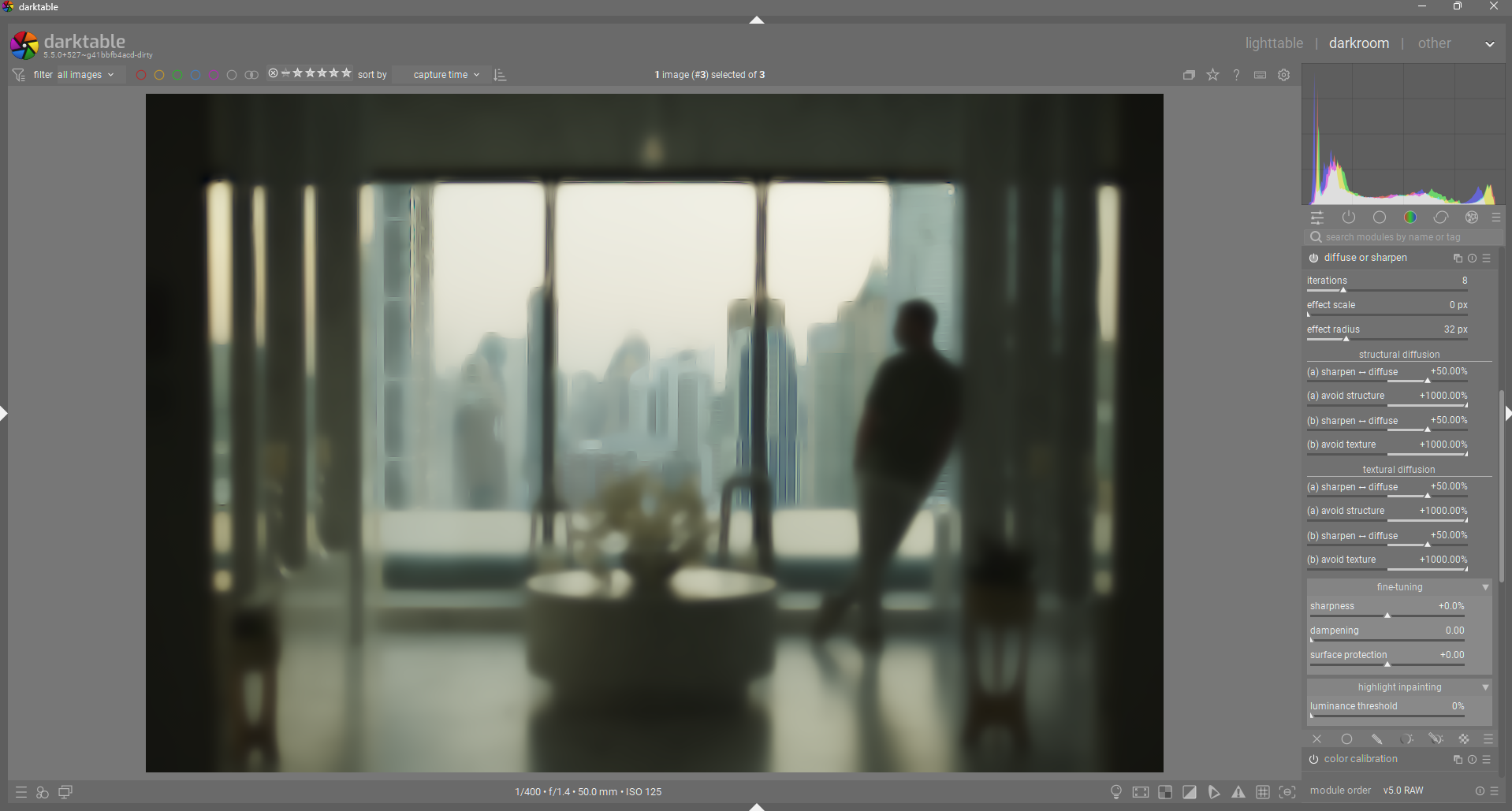
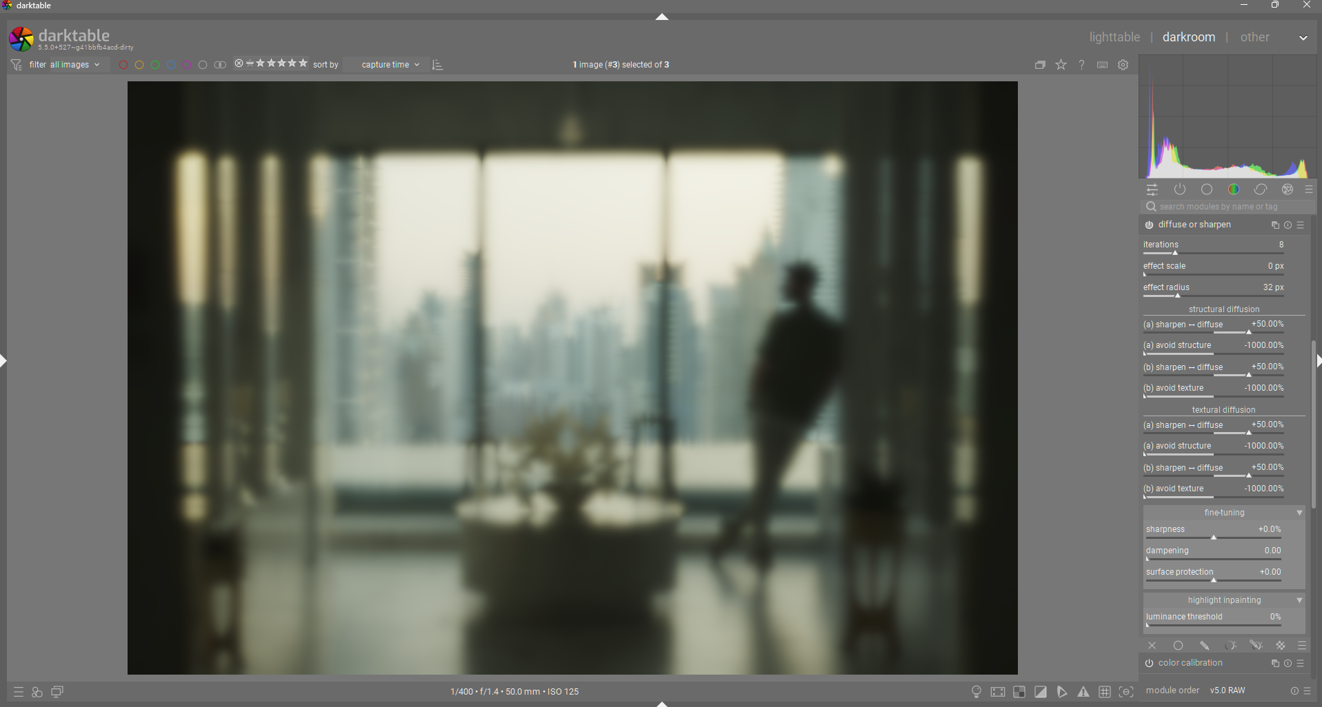
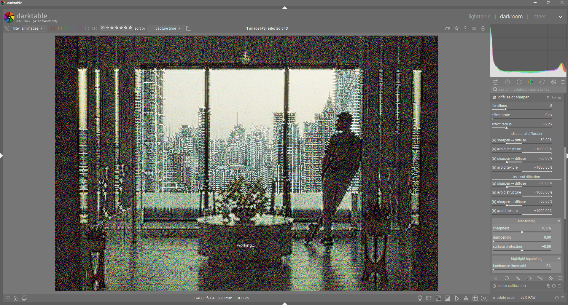
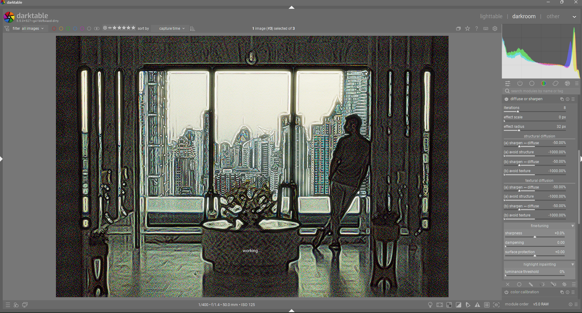
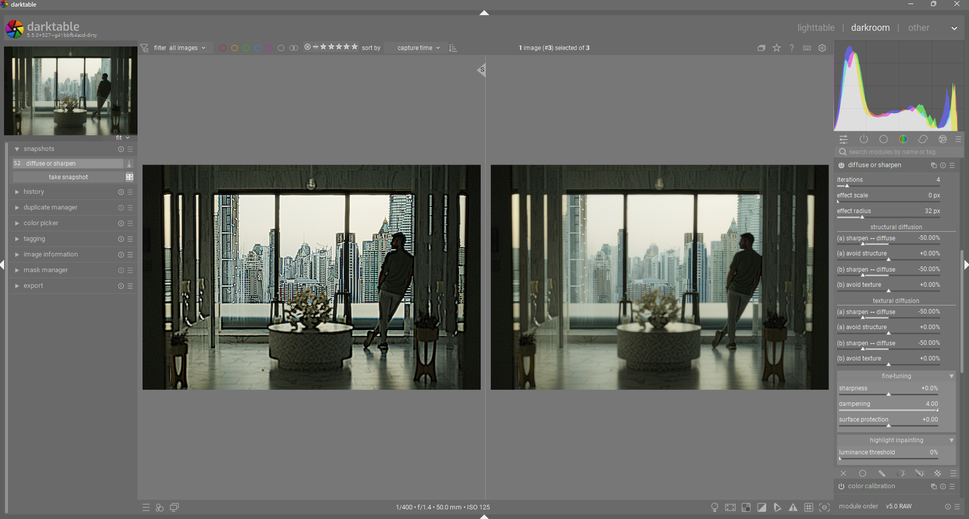
For sure if you keep the direction at 0 and allow diffusion in all directions then you will not see a difference but if you change the direction in either direction there are clear differences in what is targeted. If you take the first order and set a speed and direction and take a snapshot and then reset it and do it for the second order you can see these differences when you set the blend mode to difference and compare. The 2nd and 4th orders are not a second round but if you like a texture guided correction options for the LF and HF layers respectively.

A good example might be that strong sharpening using the first and third orders might create coarse layer artifacts that can be corrected by the “texture” (HF) guided 2nd order slider using a small positive value.

I realized that I am biased from having used the module since it first appeared and having to fight with it like many others but for me separating the order sliders seems like trying to hide a problem of figuring out what they do
 or maybe not
 I’m just an observation of one here


I might propose that the controls are organized in combined pairs ie speed and direction (x4). There would be a 2x2 layout using coarse and fine as the top level LF and HF equivalents and that maybe a small space could be added between coarse and fine.

I would use the terms

Coarse · Structure - Sharpen /Blur
Shapes broad image structure (local contrast, lens softness) along scene edges.
(Maps to first - LF signal, LF‑gradient orientation.)
Coarse · Texture - Sharpen /Blur
Stabilizes coarse adjustments using micro‑texture cues—keep subtle unless needed.
(Maps to second - LF signal, HF‑gradient orientation.)
Fine · Structure - Sharpen /Blur
The detail workhorse: enhance or smooth fine detail, guided by coarse edges.
(Maps to third - HF signal, LF‑gradient orientation.)
Fine · Texture - Sharpen /Blur
Target pure micro‑texture: grain, pores, fabric weave; also key for inpainting.
(Maps to fourth - HF signal, HF‑gradient orientation.)

Why


Coarse = acts on low‑frequency (LF) wavelet layers;
Fine = acts on high‑frequency (HF) detail layers. In code: first/second act on LF, third/fourth on HF.
Structure = orientation driven by the LF gradient (coarse scene geometry); Texture = orientation driven by the HF gradient (micro‑pattern). In code: first and third use LF‑gradient orientation; second and fourth use HF‑gradient orientation.

This 2×2 (Coarse/Fine × Structure/Texture) directly mirrors how the module builds four rotated kernels and mixes them with the four “speed” sliders.

The anisotropy sliders could potentially be called Edge Alignment, Direction bias, or maybe just as proposed here and there would be one under each of the sections above so you move through coarse to fine texture


Tips might be along the lines of


Sharpen /Blur (any band): “Negative sharpens (reverse diffusion); positive blurs (diffusion).”
Edge alignment (any band): “>0 follow edges (isophotes), <0 cross edges (gradient), 0 no preference; higher magnitude = stronger bias.”

And the four band‑specific hints:

Coarse · Structure: “Broad structure/local contrast guided by coarse edges.”

Coarse · Texture: “Coarse tone shaping informed by micro‑texture.”

Fine · Structure: “Fine details enhanced/smoothed along scene edges (edge‑safe).”

Fine · Texture: “Pure micro‑texture control; also pairs with highlight inpainting.”

To me 
again observation of one


Why this naming could work (and maybe keep experts happy)

It matches the implementation—LF vs HF (“Coarse/Fine”) and the two orientation sources (“Structure/Texture”)—so advanced users can still reason about what happens under the hood.

It pairs each “what to do” control (speed) with a “how to do it” control (alignment) using the same two words, reinforcing that they are a linked pair for each band.

Thats just my 2 cents 


5 Likes

@priort, I really appreciate your honest feedback. I think this is probably a good way to move forward. Hopefully in a few days I will be able to implement this and other suggested improvements to my PR.

3 Likes

Update

Alright, I have been doing a lot of thinking, reading, etc.

AP was kind enough to comment on my PR and share a link to his documentation for the math to DorS, and I went over it quite a bit.

I am attempting to adhere much more closely with his documentation. Here is a screenshot of the current iteration. These terms are much more technically accurate while still trying to convey their meaning in “laymen” terms.

The new terms for the speed and direction controls are derived directly from AP’s documentation on those controls: Ansel | The mathematics of diffuse or sharpen

The meaning of all that can be translated in layman’s term like so :

  1. we diffuse structure in the direction of structure (, first order),
  2. we diffuse structure in the direction of texture (, second order),
  3. we diffuse texture in the direction of structure (, third order),
  4. we diffuse texture in the direction of texture (, fourth order).

Based on the above descriptions. I have split the speed/direction controls into two sections, structural and textural diffusion. The structure section is where low-frequency sharpening/diffusion is done. The texture section is where high-frequency sharpening/diffusion is done. In each section, there are two pairs of speed & direction sliders (‘a’ and ‘b’). “a” diffusion uses structure as it’s guide (only visible with non-zero anisotropy). ‘b’ diffusion uses texture as it’s guide (again, only visible with non-zero anisotropy).
Here is what the module now looks like:


And here it is collapsed:

How did I decide the names for the direction sliders?
AP says that the direction parameters control how the diffusion aligns with the structure/texture of the image, which effectively means that positive anisotropy values leads to diffusion that flows perpendicular to the gradient, therefore not affecting edges (structure/texture). This has lead me to adopt the term “avoid structure/texture” for anisotropy controls, since positive values avoid affecting edges, and negative values focus/target edges. For example:

  • diffusion + positive anisotropy = diffusion that avoids disturbing structure/texture. “avoid structure/texture” properly indicates that diffusion will avoid these features.

  • diffusion + negative anisotropy = diffusion that primarily moves across edges, leading to messy/diffuse edges. A negative “avoid structure/texture” value makes it clear that the diffusion is now focusing on structure/texture, instead of avoiding it.

  • sharpening + positive anisotropy = sharpening that avoid sharpening the well defined structure/texture, leading to a relative loss in large detail. “avoid structure/texture” is less intuitive here, but once you understand that the selected effect is avoiding structure/texture, it then makes sense that edges of structure/texture is no longer really visible, since it is not being sharpened along with everything else.

  • sharpening + negative anisotropy = sharpening that focuses more on sharpening structure/texture, preserving those primary shape/detail shapes. Negative “avoid structure/texture” is easy to understand here, since it can be interpreted as “target structure/texture”.

So I have chosen “avoid structure/texture” as a way to accurately describe the function and effect in as many cases as possible.

I have also renamed the edge protection control to “dampening”, since I think it more accurately describes what it does. It is the regularization/variance threshold internally. My understanding is that this control effectively dampens the variance of the input data to the diffusion process, effectively reducing the overall diffusion/sharpening in a pleasing way. This can be used to reduce halos or to pull back diffusion to preserve some edges in a very smooth way.
Here is an example of zero dampening vs max dampening used with sharpening:

7 Likes

“in the direction of structure”
“in the direction of texture”

I feel we are just swapping obscure concepts for different flavours of obscure concepts.

Will most users know the difference between texture and structure in terms of a 2D photo?

5 Likes

This is from AP’s documentation. I use a variety of the same terminology but with more clarity IMO:
“avoid structure”, “avoid texture”


Actually, I think this is describing “anisotropy” instead of swapping it for a different abstraction altogether.

At the very least, it is easier to grasp the idea of structure = larger details and texture = smaller details. We must remember what we are comparing to (i.e. the current “anisotropy” and “speed”)

1 Like

Well that could be true but the module uses frequency separation and terms structure and texture are often used in that portrait retouching process for the coarse details and the fine “texture” on surfaces
hairs pores etc.

So maybe the issue is that these terms or similar weren’t used from the start


1 Like