Did anyone actually make complaints about the old recent collections module?
A single way should be enforced if it is oft used by many users and superior to the alternate way. The alternate way for recent collections has been to collapse it into history button and have the option for uncollapsed state in a menu that is not likely to be found - this is certainly regression for those who use it. So the question is, did many use it? If not, then this solution is understandable. If so, then we should revert to the old way.
Based on discussions in this thread it seems to me many used it, but maybe steps were taken to determine how heavily it was used before implementing changes, and it was found actually not many used it? If changes were made without determining this then its a good time to reconsider, now Alic is asking for feedback.
The only way to gauge that sort of thing is comments on the pull request / feature request or issues raised after the fact (or discussions like this one). Any poll would just be a small self-selected sample of users anyway and couldn’t really be representative.
Forum polls/discussions like Alic started here may not represent all users, but does help give a wider perspective. They don’t have to be after the fact if the question is about how useful people find a current feature.
Lets not get side tracked. The requestion for suggestions were made and I feel Soupy’s (Tim) post was made within that spirit. For me the long list of recent collections was difficult to navigate and took up lots of real estate (but that was just my experience). Now we have a history, which I presume does the same function, but I like it and use it a lot. I am just sharing my opinion so that developers can see what people like and don’t like. Then the generous developers can decide what is worth implementing and coding for. Lets not be critical of people sharing their opinions here as that is what the post requested.
Lets all have a good day and keep supplying our constructive suggestions and experiences here. I love this forum for the professional level of respect that people have for each other. Thanks Terry
Remember, I am not the one who intentionally took the discussion down this track. I am simply responding to those who replied or quoted me. And I have only ever done so in a calm, rational, respectful manner. If people think this is a side track, they can simply stop responding to me.
In regards to your use case for the history button - when recent collections is collapsed, it takes up exactly the same amount of room as the current history button - so it shouldn’t effect your screen real estate any differently. (In terms of screen real estate, the only people who benefit from this change are those who also keep collections module collapsed). It will cause one extra click if you constantly collapse and expand it - but anyone doing that would just leave it expanded - which gives one less click. So the way I see it there are three use cases:
Use recent collections often. Keep it expanded always. 1 click to open collection. (Benefit: Fast for regular use).
Use history button. 1 click to open history, 1 click to open collection. (Benefit: Save screen real estate. Only a benefit if you previously left recent collections expanded - but anyone who did that actually used recent collections a lot - so for them it is no benefit, as they value fast regular use over screen real estate. For everyone who just left recent collections collapsed, there is also no benefit).
Use recent collections the same way one would use current history button. 1 click to expand recent collections, 1 click to open collection, 1 click to collapse recent collections.
If your use case is 3, then 2 is a better solution, because it has same real estate for less clicks. If your use case is 1, then 2 is a worse solution, because it has more clicks. But I suspect most people with use case 3 did not use the module very often - therefore the one extra click saved by use case 2 is not really a big deal to them. However the people with use case 1 did use the module very often - so the extra click created by use case 2 is a big deal. So IMO, the current default (history button) is catering to people with only a casual need for it, whereas it should be the opposite (recent collections) - catering to people with a constant need for it. Only people who use recent collections often but are happy to sacrifice fast use for screen real estate would prefer 2 over 1.
Of course we can have whichever we like with the other one being in preferences - but this discussion began because people don’t know its there.
I am 100% on your side. You have done nothing wrong by posting your view. I am only recently started using the history button and for me it works well. Again I am only sharing my experience supporting the history button. DT is loaded with so many features and options and there is often more than one way to achieve the same outcome, so I totally respect your method and viewpoint. My comments were not criticising your viewpoint.
I am actually impressed with how DT’s image management options seem to be improving or maybe I am just taking more time to learn about what was already there.
BTW, I rarely like to see options and modules removed from DT. There may be sometimes when the implementation, coding or maintenance of a module means the developers need to delete the module, but I find the more options the better. As an example defringe module is meant to be deprecated and replaced by ‘better’ modules, yet I can find a few images where defringe works better than the new modules. That being said, the new chromatic aberration modules are a great addition to DT. The good part is that DT developers rarely if ever remove past modules.
have a good day and I look forward to more posts by you and I agree having the recently used collections module would be a nice option to retain for those who want it. I would explore its use again after your constructive suggestions here.
I will stick to the main point.
My typical photos are vacations. And I end up shooting a lot. Last 2 vacations I shot 10k for each so I have to sort 20k of photos.
My 3.8 approach was.
import with RPD to a folder and then from the folder move to DT. For collections I only use folders (and sub folders).
Once imported - I was using star rating - less than, greater than and number of stars with meaning
one star initial setting
two star and up - a keeper.
I was going through the photos on groups - adding stars and processing - so I was constantly switching (with shortcuts) these menus in order to select what I am working on - in terms processing).
Once a set was selected to be processed - I would use color labels - (yellow - must process, red - processed - done, green hdr, panorama)
In 4.0 - I changed my approach.
Still use import from RPD to a folder and then to a permanent folder.
Still use the folder structure to organize my pictures by year / event etc.
Adopted the new filter - color coding the pictures - yellow - must process, red - final, green hdr / panoramic
I should say (on the positive side):
the 4.0 is a considerable improvement for me because I like the ability to fast filter by color.
I like the ability to use logic on the color selection - and / or - like red AND yellow or red OR yellow. The math symbols don’t bother me.
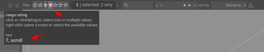
I like the ability to drag between the stars to include subsets like 1-2 stars 4-5 stars etc.
I like the ability to define more complex searches in collection filters. Typically once my presets are done (and I don’t have many) - the collection filters is closed and I only use the hamburger to access the short cuts.
With the first 2 items - (the new stars and the color coding) being used 99% of the time.
Search is also often utilized (and I just realized it can search tags - and I have a few of them and do utilize them.)
My struggles (that is what I had challenge with or can be improved on).
I did not comprehend initially that the new stars and the old stars are independent of one another (separate filters).
I did not perceive correctly how the top bar can be organized (or re organized). This would be the “pining” functionality.
Since I was trying to utilize hot keys (in order to mimic 3.8 behavior - but on the new stars) - I was unable to achieve it (and at the time I did not know that there are 2 completely different filters related to stars).
Since I understood the behavior - I leaned more on the mouse and the color selection and this appears to work well for me.
Final thoughts - I see the new development as a considerable improvement. While I did struggle for few days - at the end I can see a lot of benefits in the new approach.
Once new tools become available - people can change their habits (or workflow in the case).
And a big thank you to the developers! Your work is very much appreciated!
in my opinion it’s worth to differentiate between collections and filters.
1st dimension: collections to group related stuff:
From my point of view collections are a tool to order my image library. Not just as physically done in directory structures, but on demand by date ranges, tags, customers etc.pp. Current implementation gives a lot of freedom to do so. So a collection is just a bunch of image that i want to deal with in a specific context.
2nd dimension: workflow/task oriented filtering
Filtering the stuff within one collection is primarily to achieve a subset of the collection on demand. I don’t want to change the collection just to hide already edited stuff or rejected or even lower rated images. filter can be set, changed or reset on demand.
so of course combining both dimension in one tool can be done, but then we need spend more effort on how a filter pipe can be organized to keep it simple …
I also use the color filter a lot, though technically this was implemented before (and originally separate from) the collection filters module (see here). IMO for the ‘workflow based filtering’ that @MStraeten mentions, that change was a significant improvement and with a nice simple implementation.
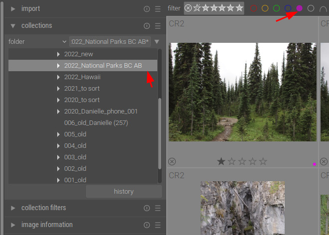
I maybe a bit lost but collections (below)
deals with the physical location
or logical (like this)
I used the same approach to have multiple criteria (and I can see the math symbol “and” is already present here)
But we can use collection filters to filter for the color - in essence - temporary filter (color) on top of the more permanent filter of the collection.
So - in a sense - they are separate because one acts on the “collections” the other acts on “collection filters”
If the collection filters tab is closed - then we have physical on the left and logical on the top. So in essence we do filter logically the “collection” (regardless if it is physical or logical).
One confusion a user can experience would be a more elaborate filtering like this. So there is a double restriction within the collection - both folder and color label - to yellow in the case (and a further restriction on the top to purple in the case).
So - logically it is correct - the filters display exactly what is selected. But the user perception can be affected (the user may not realize what they are asking the filters to do).
I think both collections and collection filters have benefits. But - how can they be simplified to help the user not to get confused?
For now I am using a mixture of both. Collections as a first step and then collection filter constantly changing depending on what I need.
Edit: this isn’t meant to be a complaint fest or overly negative, none of it has been bad enough to make me jump ship. Just some rough edges in my workflow. I do appreciate the work that goes into this program after all!
Workflow:
I have a curated directory structure based on subject eg:
000_Screenshots
000 through 0XX_Application_Name
001_Models
000 through 0XX_Model_Name
* 000 through 0XX_Job_Date
002_Clients
000 through 0XX_Client_Name_Date
* 000 through 0XX_Client_Job_or_Event
003_Personal_by_Year
1999 through 2022
* 01 through 12
* 000 through 0XX_Meaningful_Name_Place_Event_under_the_month_etc
and so on
I don’t bother with RPD or renaming files as my cameras have custom names set, mostly with my initials as that’s a hold over from when I used to second shoot a lot. This application agnostic directory structure is mostly a result of me hopping RAW processors a few times over the years. XMPs are stored in the appropriate sub-directories with their photos.
I use the add to library button after that. I find the new post 3.6 dialog to be a bit frustrating as the tags and meta data are no longer handled in the import dialog but in the side bar so if you’re like me and importing a few different directories at a time you have to remember what you’re doing before you open the dialog and select the directory. Where as before I could go “oh, that’s this thing or job I need x, y and z tags or a, b or c metadata preset.” I drop back out to the application a lot to edit that after opening the import dialog. Where as before I could just edit in the dialog.
I mostly just find the collection filters sidebar module to be redundant ant taking up extra real estate. I’ll use the collections box to narrow down a search (eg, in this directory and has this tag). I mostly use a 0 or 5 star rating system with reject for things I want to throw away. I’m a binary kid of person. The photo is either good and gets to be edited (5 stars) or meh and can be ignored and/or purged later (0 stars). If it’s blurry or of my feet while I’m walking or something it gets rejected out of hand. I don’t really use the color filters, I tried to work with those a few times but just never got them to stick in my work flow. Seems like there could be an easier way to exclude things from the top bar instead of having another module to take up space on the side bar?
My biggest beef with the new top bar is the selection interface is obtuse. It’s not evident you need to click and drag, the old drop down was a bit more clear and straight forward IMO. Maybe I’m an idiot but it took me an embarrassingly long time to figure that out.
Anyway, hope that’s some useful feedback. The UI isn’t the worst ever but there’s a lot of two and three different ways to do the same thing and non-obvious ways of interaction IMO. I really dislike how the import has been handled with how I work but it’s not really world ending either. Would just like an option to have tagging and presets back in the dialog proper.
I considered it like… the collections module filters the images in the database to get, say, a group of images you want to work on together (I use a simple directory structure and work a directory-at-a-time) and the top bar was a temporary filter on the current view (to manage culling/editing workflow within that collection).
I see what you mean… Yes - I use it in such a way too (most of the time). I have maybe one instance when I utilized the “collection filters” for wider range (but it certainly can be done with the “collections”.
I agree with this. When I said it should be one or the other, not both, what I really meant is that they both should not perform the same task - so there is no duplicate of function.
Ie. Ability to filter by rating (or anything else) should either be available in collections, or collection filters, but not both.
Collections is for your subset of images (folder, film roll, etc), filters is for more specific criteria (rating, label,etc) within that collection. There are some things that could be available to both (tag, date), but the main thing, if we have two different modules, is that you can only select one thing in ‘collections’ so all filtering is done ‘collections filters’.
One more thought. On my screen (27", 2k), the filters I use (defaults of rating, label, search, sort) take up only half the top panel, and there is absolutely no need for me to have them also available in the side panel. Others have mentioned a hamburger menu in the top panel, an idea I like. Here’s how I imagine it to work: All possible filters are listed in the hamburger menu. There is also a button beside each listing to duplicate the filter (eg. you would use two instances if you want to search “and” this term, “not” that term). When selected, the filter gets added to the top panel. Selected filters have a dot next to them in the hamburger list. To remove from top panel, simply click on the dot in hamburger menu. This would allow to remove filters from side panel entirely.
I see two possible problems with this:
Not enough screen width in top panel for all desired filters.
Need to display and/or/not logic.
Solutions:
In preferences, user can select whether they want side panel filters, top panel, or both.
include and/or/not logic in top panel.
Here is a dodgy mockup to demonstrate the basic idea:
Today I was playing around with the collections filters and the ability to set ‘new rules’. I like this module and how I can choose to pin to the top bar if I want, but there are some strange choices for new rules while some more obvious ones are missing. I would certainly like to see some more options added here. This is what Lightroom offers (and no I am not asking the developers to simply create a free version of LR). But I have found some of these options useful in the past. I don’t know what is involved in adding more rules to the filters in DT and appreciate the work done so far by the developers.
First, thanks to all posters, for the very interesting idea/comments done so far.
Completely agree. and even more that your following explanation, in a more generic way, this allow to separate the “filtering” in 2 parts, whatever the workflow. This esp. allow user to use the power of the presets and history for the steps independently.
Yes, we know. Removal of the “recent collection” module for NOT a goal at all, but more a consequence of the other changes :
Now that we have 2 modules in the left panel to determine which image will be shown in the lighttable, we have also 2 “history”. Keeping the “recent module” as it was imho very confusing (why the filters doesn’t appears there, etc…) Hence the decision of putting it under a menu with an “history” button in each module.
Then some have raised the issue that this has made more difficult some workflow (1 more click, impossible to work with the collect module collapsed, …).
To mitigate that issue, we have proposed multiple solutions, all rejected… hence the “fallback” to the “half-hidden” option in the menu.
Let’s self-quote the solution that I prefer :
For the hamburger menu in the topbar, I like that idea too. The question is : if we do that, is the lateral filter module still useful ? Compiling the ideas you provide and some of mine :
++ Simplification of the interface
++ allow to put back recent collection without the risk of misunderstanding
– we’ll loose the ability to use “and/or…” or it’ll be very difficult to put them in the GUI
– we’ll loose the ability to quickly disable the filters individually
– use of lot of filters may use too much space, esp. in small screens
– some widgets will certainly disappear, esp. date range ones because they need can’t really be represented in “1 line”.
– we’ll need to find a solution to differentiate some widgets
– advanced use of the topbar (configuration, presets, etc…) will be “half-hidden” under a menu
I think this maybe debatable. On a first look I agree with you. On a second one I can see cases when this is not entirely true.
Supposed one color codes the images with few colors. Then the person decides to work on the “red” images but temporary has to turn on / off “yellow”.
How would you configure that? Would you take away the color coding from “collections” and move it entirely to “collection filters” or the other way around?
IMHO - either way some people would like one of the configuration and the other group would like the other.
So - what would the developers do? Regardless what the choice is there will be a group of people who would like the opposite.
The icon you show in your screenshot is for colorlabels only. What I was speaking of is the operator between filters : the first item in each filter header line in lateral filter module
Yes In the lateral filter module, you can quickly enable/disable filters by clicking on the last icons in each filter header line