I am encountering an issue in Darktable 4.6.0, and 4.6.1 now, where my export does not match the RAW image as I see it in the editor. As shown below, the left image is the RAW image as I have edited it, and the right image is a JPG exported into sRGB colorspace by setting the output color profile to “sRGB” and the export profile and intent to “image settings”. This difference is also apparent when viewing the JPG with IrfanView and Firefox.
I have tried a number of things, including forcing LittleCMS on, trying other file formats, and changing which location (the “output color profile” module, or the export menu) I use to set the colorspace. I get the same exported image that does not match my original image every time. If I change the export colorspace to Adobe RGB, the export image colors change slightly, which is what I think should happen (?).
I did my RAW editing with the “system display profile” setting in the display options in the softproof menu. If I set the display profile to sRGB, it still does not match the exported sRGB image. Interestingly, setting my display profile to Adobe RGB also very slightly does not match the exported file in Adobe RGB. My display has a factory color profile that is installed on my machine so it should be close, but it is not a fancy display, and I have not individually calibrated it.
This may be related, or a whole other issue (or simple user error) but when I set a softproof profile and turn softproofing on, nothing changes at all, no matter what softproof profile I select. However, the gamut checker does reflect changes to the clipping areas with different softproof profiles.
My objective here is just to have consistently exported pictures that look like the edited RAW, I’m not a professional and I’m not seeking color perfection. I likely wouldn’t know color perfection if it came up and introduced itself.
What can I try next to make the export look like the edited RAW?
It is in Irfanview, I’m not sure how to do that in Firefox I guess. But even in Darktable itself the images are visibly different, and I would think they should look the same there for sure.
I suggest moving have moved this to Software → darktable, as it’s not really a ‘processing’ question.
Anyway:
in darktable’s editor preview, the effect of some modules is not reflected properly, unless you zoom to 100%, or you enable the ‘high quality processing’ option, but I think that’s a development feature not present in 4.6.1 (will be available in 4.8):
If enabled, darktable processes the image at full resolution, even if it is to be exported at a lower resolution, and only downscales it at the end of all processing. When the option is disabled, the image is downscaled early, and the downscaled image is processed, resulting in better performance. If the export size is close to the editor preview’s size, disabling the option may easily result in an image closer to what you see in the editor without zooming in. It should not matter if you export at full size (dimensions set to 0); but then you get the difference between the downscaled editor vs the full-size export.
Can you upload a raw and a sidecar (XMP), so we could check?
Don’t try soft proofing for this…it might work for certain profiles for printing but not for colorspace comparisons on previews/exports… you will see the histogram graph change when you turn on soft proofing but the image preview will not change…
As noted by @Kofa… if you are viewing the image full screen or in a zoomed out view then setting HQ reprocessing to no will give you a better match. If you set it to Yes then your image will be a nice match at 100% zoom but could look different zoomed out.
Finally you have to be 100% sure that you have all your color management settings correct and that all the applications you use are set to use them. I personally specify them in the OS and in DT rather than use “system”… For viewing I use XnView and set it to my calibrated ICC file… I do this in Darktable and in WIndows so that all are explicitly set.
Even then an srgb export could be a bit different than what my monitor profile shows but it should be close
if you encounter differences then the best way to get help is providing the raw with xmp and the exported image and the used export settings so someone can try to reproduce it.
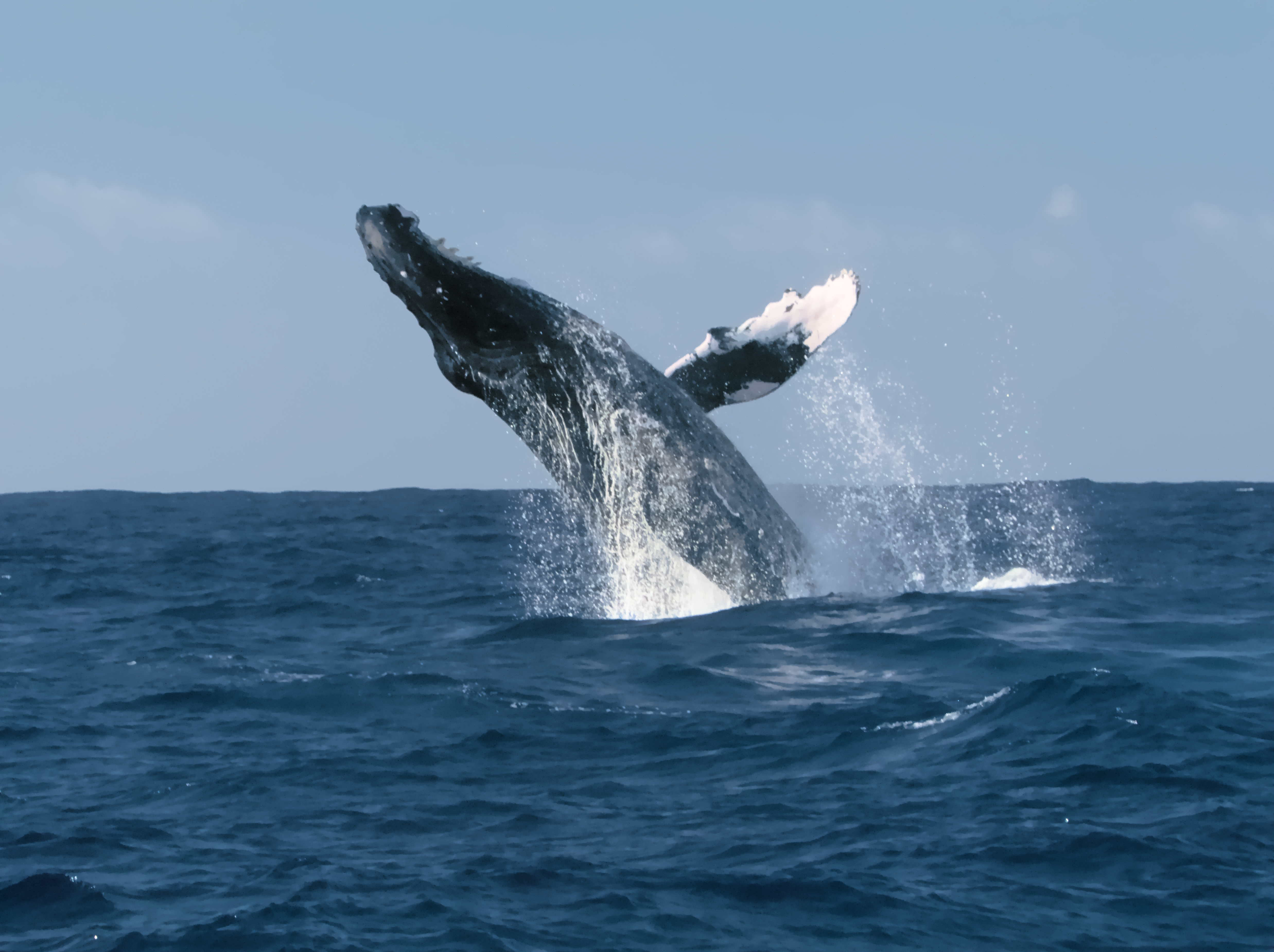
It’s a bit hard to tell from the screenshot as the image is a bit monochromatic but there appears to be more reddish/yellow on the left, sunlit side of the whale (?) in the lefthand image.
Depends on the profile fed as “softproof”. If it’s gamut is not materially different from the display gamut, the differences are probably negligible on the display.
As you’re finding out, it’s not that easy to trace the root cause of such differences. The key thing to narrowing down the problem is to make sure the color management mechanisms are doing their thing, or not. For instance, your browser may be color-managing what you throw at it by default to sRGB, not your display profile. For any display program, you need to understand how it does (or doesn’t) color-manage images. That extends to what system tools to which they interact, to make sure the OS is supplying the correct display profile to the display program, or, doing/not doing its own display transform.
The pedigree of your color profiles is also important. There are a few different variants of sRGB out there, for instance. Also, make sure your display is set to use your factory profile, and not sRGB, AdobeRGB, or some other mode.
If you are on a new enough build you can toggle this and get a sense of the difference that you will likely encounter by exporting using yes vs no for HQ reprocessing…
on my end, I set my display profile to system display profile and export setting to srgb . This made sure my images look the the same in any app that is color managed. (also had to do the same in krita). If I open the image in a non color managed app like microsoft paint, there will be slight differences because the app is not respecting the monitors profile. Still testing some thing though.
Hi Todd,
I like the concept of this feature to test the high quality processing. I just tried it on one image. I saw no color change but unexpectedly to me I saw it shift pixels a little towards the right. Seems strange, but nothing to drastic.
Huge thanks for the forum location change, and the advice. I wasn’t sure 100% where to put it. Here is the RAW and the XMP. As you can probably see from the history, this is the image I’ve been learning Darktable with. For fun, I also included the JPG in the original screenshot.
Regarding the post, on 4.6.1 the high quality processing button isn’t there, though I have noticed what you say about zooming in and seeing things change. I am exporting at full size, with High Quality Resampling on. I tried it with it off as well and got the same result, as you suggested would happen.
Great point, there are certainly lots of external factors having their say as well. I’m not sure how to phrase this question, but when darktable uses the “sRGB colorspace”, is that something internal to darktable itself, or is that something already on my machine that it is looking up? I’m on a pretty standard Windows 10 install.
When I was researching my problem before making this post, I found your article on color management very helpful Article: Color Management in Raw Processing As I understood it, if my display profile is the same as my export profile, and the export profile stays with the exported image, when I view the export and RAW with the same display profile, they ought to look the same. That’s why I’ve been trying to make these comparisons in darktable itself, under the assumption that doing so is the most consistent way to approach this.
When it comes to stuff like this, I tend to assume that I am doing something wrong, or have some part of my system configured wrong - not that I couldn’t be the first person to discover a novel software bug, but it seems unlikely that I have done so compared to the odds that I have the wrong settings chosen or am missing a file somewhere on my computer…
FWIW at least with this image I see what you are seeing… well I have not really looked at the color really hard but more the contrast. What I have on my preview just gets muddy when the image is exported and brought back into DT or a viewer… I tried a number of combinations of export settings and I saw that your jpg was a little down scaled so I was sure not to introduce that and I even went in to ART and did a sort of similar edit and then exported it and there the contrast of the water was maintained… I have felt for sometime that exporting in DT can be a bit of an adventure… My monitor is calibrated and not wide gamut and I can see this both by bringing the image back into DT, as a jpg or tiff or png …
I also opened the JPEG you posted in rawproc, color-managed it displayed green-ish. I then turned off color-management to see if there was a mismatch between the image data and the icc profile, and it stayed the same (my tablet display gamut is close to sRGB.
Methinks there’s some darktable processing going on…
This is not something I’ve had an issue with (usually) but I see the difference. I just imported your raw and xmp files, then did a jpeg export with my normal settings, and appear to have a possible third variation now.
Screenshot from darktable below:
Left is the CR2, middle is your jpeg, right is my jpeg.
Well this is much more interesting than I anticipated. Steven, I tried that, and no luck, at least for me. When I reset, the only setting it changed was to reduce the JPG quality from 100 back to 95. I set the export profile to sRGB, and it looks the same to me. I was using the output color profile module to define sRGB as the export profile, so I believe that should be the case. I also tried exporting at 76 like your image, but that didn’t seem to change anything besides the file size.
Can I ask what version of darktable you’re using? It seems like it’s working for you. If you view it at full size it looks like the JPG, which I believe is expected behavior based on some modules not previewing correctly at less than full size.
I took some time to work with your image and came up with the same color differences. I started with a fresh edit, only applying base modules like exposure, filmic, and color balance RGB and denoise, and found that the deep blue water appeared to change green-magenta tint when exported to jpeg or tiff. I found the same result regardless of output profile.
Also, I noticed that the color shift is more pronounced in the deeply saturated blue water and less in the sky (the shift may be happening in both but less noticeable in the sky).
Interestingly, the differences seem to diminish as I zoomed in to 100 percent. I have to wonder if this is related to the higher noise in the photo, even with profiled denoise heavily engaged.
Taking the resulting tiff or jpeg and then exporting once again into the same format causes no color shift, so I think it’s something happening during the raw conversion.
I also tried this with my own shots on my Canon 7D2 and R7, which produce CR2 and CR3 files. There were some minor instances of color shift, but they were barely noticeable unless you compare them side by side.
So I wonder if this has something to do with the CR2 files from you 80D, or if it’s unique to deep blue tones.


