Something I find my postprocessing often suffering from and I don’t yet have a good solution for it. I’m not even sure it’s an issue, hence the title.
So I can create nice looking contrast in like half a dozen ways, but I’m wondering if my midtones are not flat somehow, a bit boring. Not a lot of gradation, dull, big, uniform surfaces.
Well it might be that that’s just how the scene was, but regardless, can you share some techniques you employ when you feel this way about your picture?
Now that I thought a bit about the issue, after creating the topic (probably should have happened the other way around lol, but here we are) the solution seems to be pretty much the most straightforward way to tackle it: if you want more midtone contrast, add more midtone contrast. A new contrast module of your choice masked for midtones. Who would’ve tohught… /s
Nice. Reminds me of the velvia film sim. Don’t you find it a bit underexposed though?
Can’t wait to play with AgX once it lands in a release, but for now I couldn’t bother compiling dt from some development branch. Maybe I should give it a try.
Yeah, this one came out great. Less haloing too, as far as my second attempt is concerned. That edges tab in the contrast equalizer feels like giving almost zero feedback until the image is exported… got tired of reaching perfection for the time being.
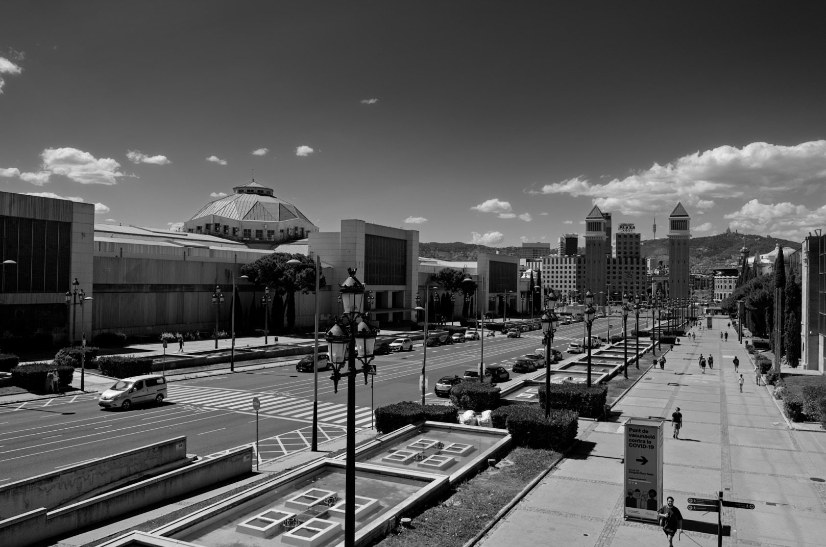
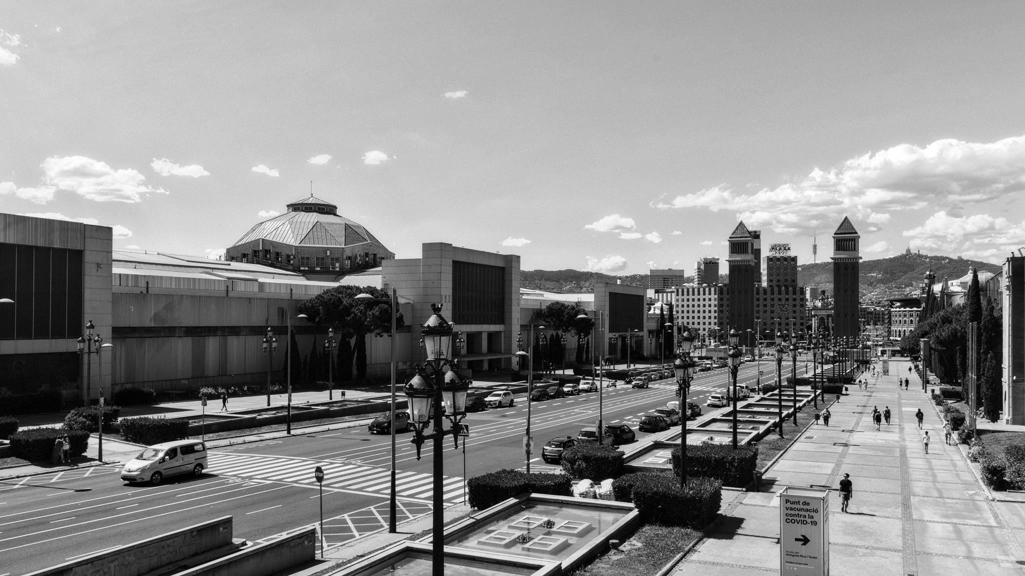
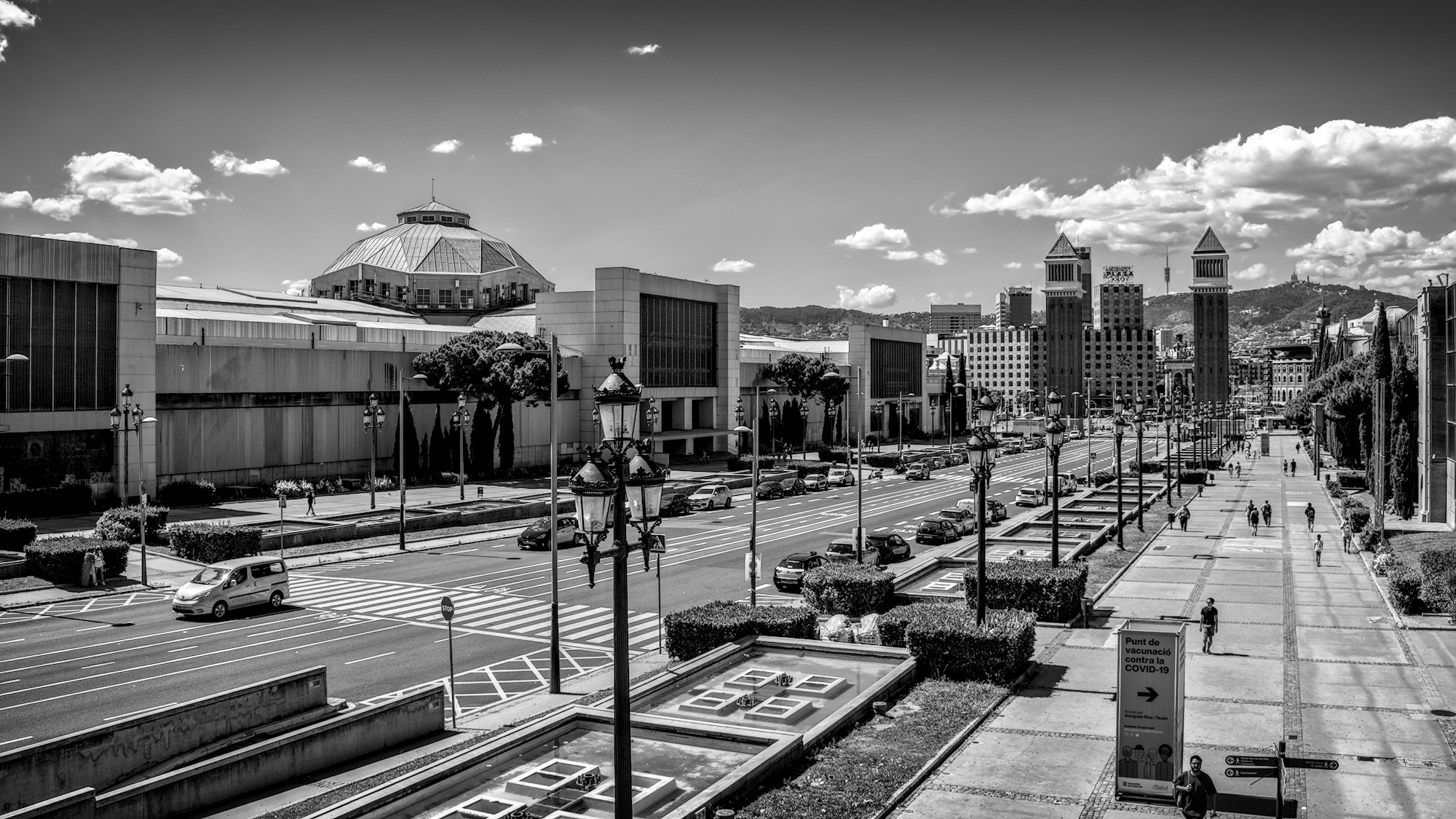
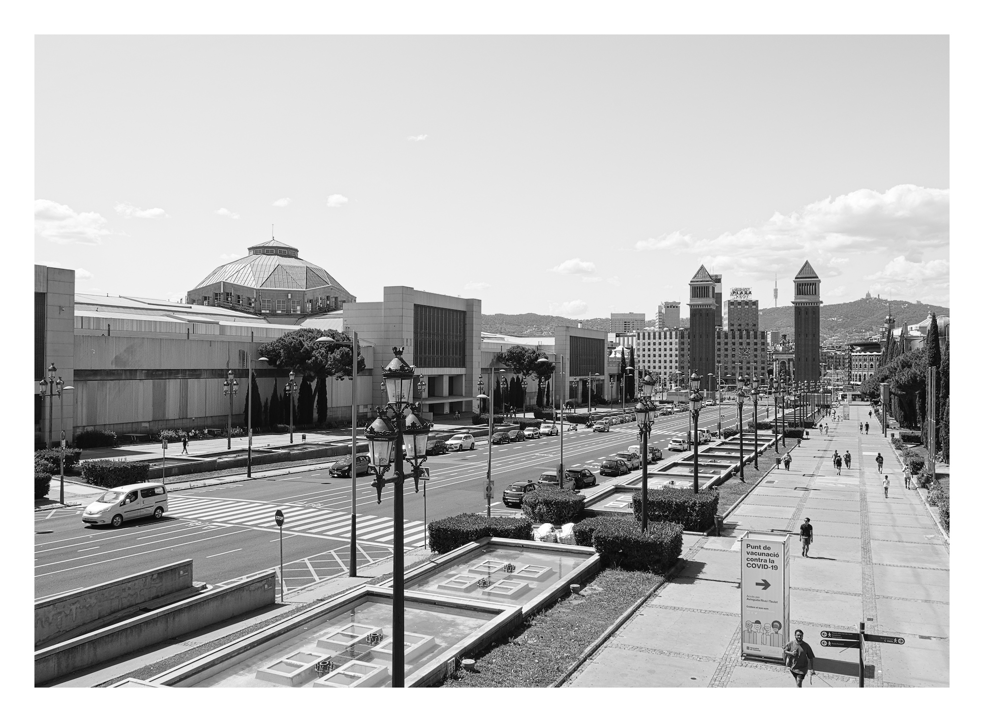
Not really happy with this BW from me. Still learning my way around Dt for BW. I did look at the first XMP file supplied here and thought that maybe using some of the green slider as well as the red slider for for the monochrome conversion might be worth trying. It replicates an orange filter on a film camera which is similar to the red filter effect. _DSF0731.RAF.xmp (11.1 KB)
You can also use negative values for blue. For some reason, it’s not shown on the UI, but once you right-click and enter a negative value like -1, the slider will accommodate the range. (This is for color calibration.)
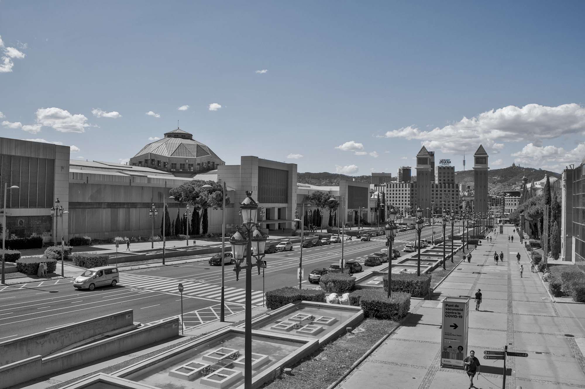
In my experience emulating filters only does so much, a lot of work has to go in to working with contrast to get punchy black and white. Starting from a decent exposure and filmic duo, to get a good contrast baseline with only as much black crushing as you really want, followed up by either exposure blended with multiply, diffuse or sharpen local contrast, the contrast equalizer or a combination thereof.
edit: then again, I had no idea that what @kofa says is an option…
whaaaat… apparently you can also use values higher than 1. I always thought that that tab is hard constrained to 0 - 1. Oh the dark skies this will produce for me…
I’ve used the simulate line drawing preset in multiply mode and played around with the opacity and interactions to give it more contrast and also more ‘noise’, but hey, sometimes it’s worth it.
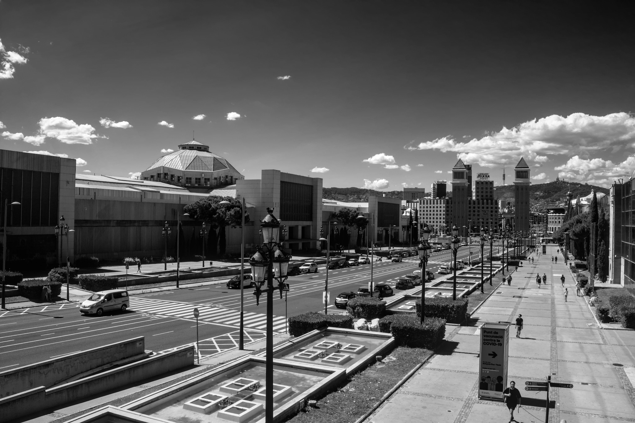
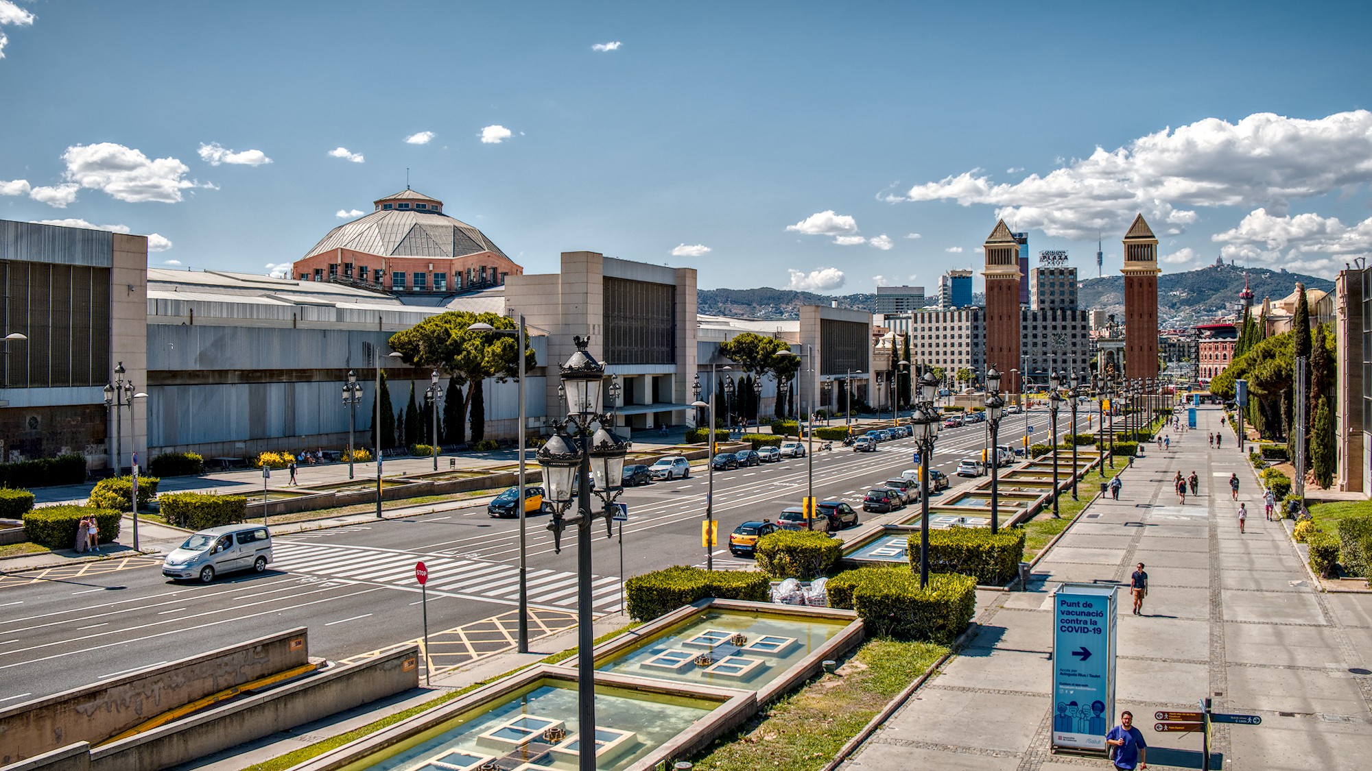
From a technical point of view, Tom, there are not many midtones in the capture apart from the sky, taking midtones to be between 0.4 and 0.6 brightness (see whites below) according to the GIMP Threshold function:
Image > Accuracy > 32 bit (floating point) > Line light
Replace with LAB colors: Colors => Components => Unfold… set color mode a LAB
Fill layers A and B with each color neutral gray RGB 128/128/128 or 128,000055 and remove !
(The results are not too far off if we use the value of 0.500000 (128, 128, 128), but the red channel will be a little low, the green channel almost right, and the blue channel a little too high).
If we prefer a simplified, approximate version, using the removal of channels A and B
then:
Select the Lightness (L) layer containing all the brightness and contrast information,
Brightness is very interesting because it contains all the luminance information (while in RGB and HSV some of this information is spread over other components). Very often you can see the extended tonal range and discover hidden details in the shadows by examining this component.
Sometimes we don’t like the B/W image, but you shouldn’t get upset about it, then:
We duplicate the layer and I change the mode of the top layer to Multiply, the effect will become absolutely spectacular.
We will get a very good black/white photo. Now we can adjust the Opacity, (and sharpness Filters/Alignment/High Transition… (Sharpening Mask) as we like.