I ask this question because I cannot seem to correlate the names of film rolls in my ‘catalog’ with the method I used to import images. The result is that I have a wide ‘architecture’ of film roll names , ranging from something like (in the Windows install) “\Pictures\Digital\Year\Month\Day” to “Day” - the latter being most confusing. In the Linux install things are much better, with names ranging from “/Pictures/Digital/Year/Topic” to (the majority) “Year/Month/Day”
The preferences, in import; session options (characters translated into local currency because a) this web-site plays funny games with the US currency symbol and b) I’m jingoistic) are:
I do not understand why a significant proportion of film roll names do not include the base directory name. or why there are some film rolls named “Day”, which is not helpful.
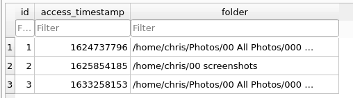
If you look at the film rolls table in the library database, you can see that they are just the same as folders – see for example the film rolls table from my development instance:
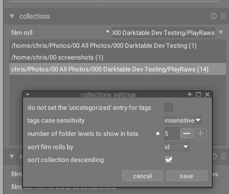
The way that the film rolls display is dependent on the “number of folder levels to show in lists” setting (available from the preferences option in the presets menu of the collections module). For example if I set it to “5” it displays the entire path for all except the last entry (where the path is more than 5 folders deep):
If I set it to 1 it just displays the first part of the path:
It’s as simple as that – it doesn’t depend on how you imported at all.
Magnificent! Enlightenment dawns. Thank you for a splendidly straightforward explanation which correlates nicely with my intellectual capacity.
I had completely forgotten about this additional set of preferences; as a suggestion would it be ‘better’ (meaning in the mind of the beholder) for these settings to be shown/set only in the general preferences - so they are not forgotten, or indeed unknown, because the stupid user didn’t really RTFM ?
These were moved out of the general preferences dialog on purpose in order to not overload it with too many options. But I very much agree with you that this is at the expense of discoverability and overall I’m not convinced it was a good idea.
Having now re-specified the ‘number of folder levels to show’ parameter, suddenly the usability of the collections module has changed dramatically, for me. I wish I had asked for this clarification months ago. It may well be that the general preferences were made a little more wieldy by removing these collections presets, but couldn’t there have been a very-easy-to-implement alternative that just reminds users that these additional presets exist? How about a pop-up message associated with the two ‘import option’ buttons?
True; forgive my ineptitude, but focus on the principle: “a very-easy-to-implement alternative that just reminds users that these additional presets exist”
A settings button in the module UI (cog icon) would be more discoverable but there’s also vertical screen real-estate to consider for some modules (we don’t want to give over a whole line to one button) and we want something that’s consistent between modules. The presets menu was the least invasive and most consistent alternative but perhaps too non-invasive. I haven’t thought of any better alternatives yet but I’m sure we’re open to suggestions.
I had decided to make no further comment on this topic on the basis that I would be repeating my usual mistake of discussing a topic of which I have no relevant current experience, understanding or knowledge (by at least 40 years). But …
This design decision (of locating of collections preferences under ‘presets’ in the collections module) seems quite at odds with the rest of the design of dt, and contributes to the overall feeling that I had during my 18 month learning curve that dt is not the most intuitively obvious application to use. (I have to say, though, that the long learning experience has not detracted at all from the value I now place in the product). So, instead of moaning about the product, I looked at the design of the general preferences ‘panel’ to see if I could make some (well-intentioned) suggestions:
I don’t see a vertical real estate problem, even on my ‘experimental’ install of dt, on a minimalist 1080p display. There seems plenty of room for at least one other clickable ‘category’ of preferences (e.g. named “collections”) in the left hand column, possibly between “import” and “lighttable”. And having clicked that link, there certainly would be more than enough room on the resulting (blank) screen.
I do not see that adding the ‘collections’ preferences to the ‘presets’ category is appropriate, even though that category already contains an entry for ‘collections’ - these truly are presets and not really preferences.
What have I not understood ? (answers on less then 10 A4 pages, please).
Here’s a link to the original pull request that introduced the presets/preferences menu item. The first post in the PR contains a link to the feature request that prompted the change. Probably better to read that than recap the discussions here. If you still think it should be changed back after reading all that, you can raise a new issue.
Thanks, I don’t think I’ll do that. The 5% of the discussion in the link which I did understand left me with the idea of trying to definitively identify the angels dancing on the head of a pin, with a view to determining how many there are - so I obviously have a bad attitude and haven’t understood.