I may not re-edit many of my photos but I find as the years go on the software becomes more capable and I become more capable. The new AgX module in DT 5.3 is a perfect example of the software becoming more capable. The sharpening options (presets) in the diffuse or sharpen module is another example of the software becoming more capable.
2 Likes
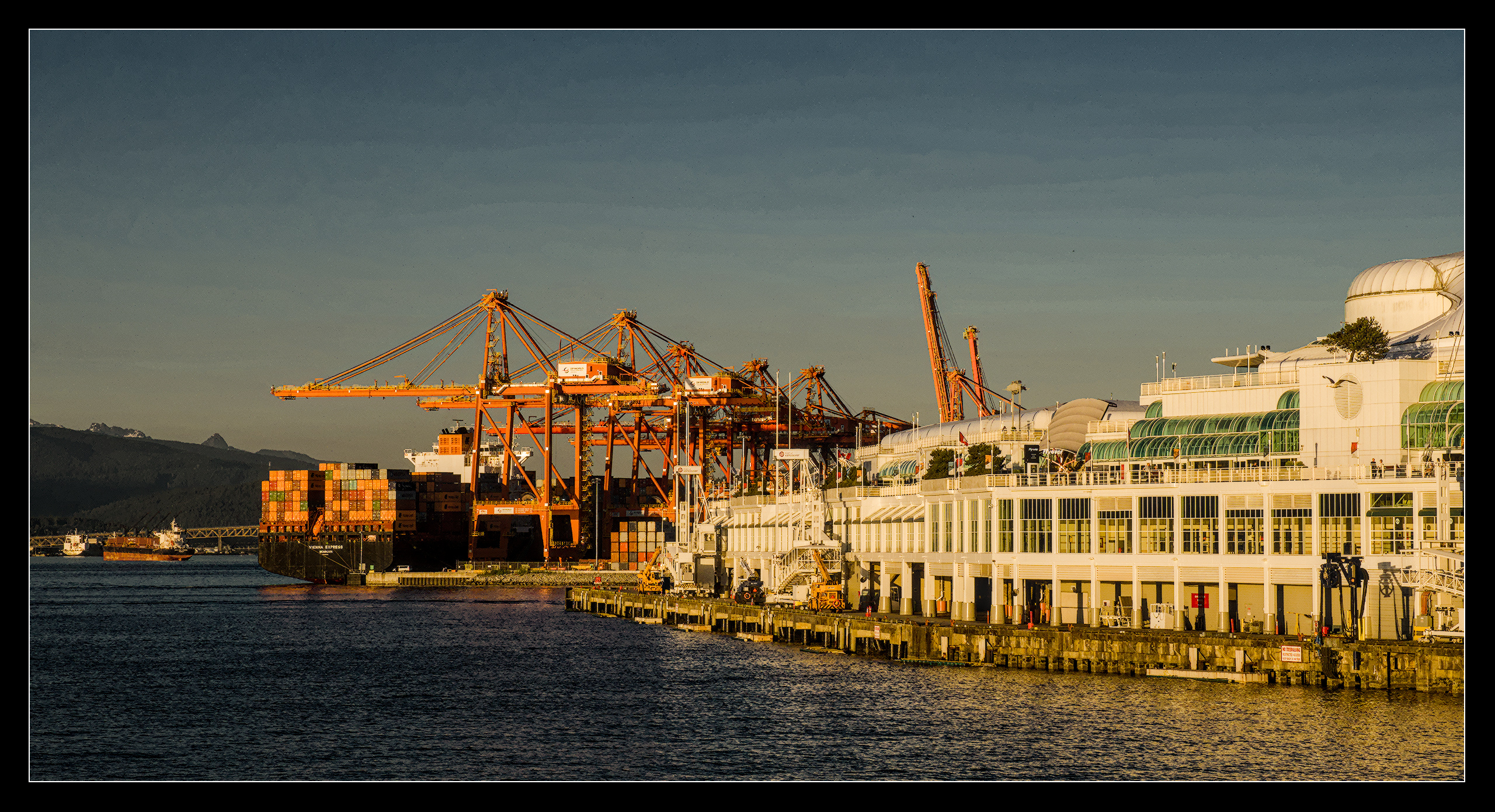
I’ve chosen for to make the blue’s rather dark. Quite some contrast, chroma and saturation in color balance rgb and a second instance of it to add orange. Switched of AgX (and no Filmic or Sigmoid either).
The sky looks dirty, there are vague bands of clouds up there. At first thought I messed everything up… which I do on a regular basis ![]() so maybe it is true that I caused this…
so maybe it is true that I caused this…
Hope you like it, regards Jetze
4 Likes
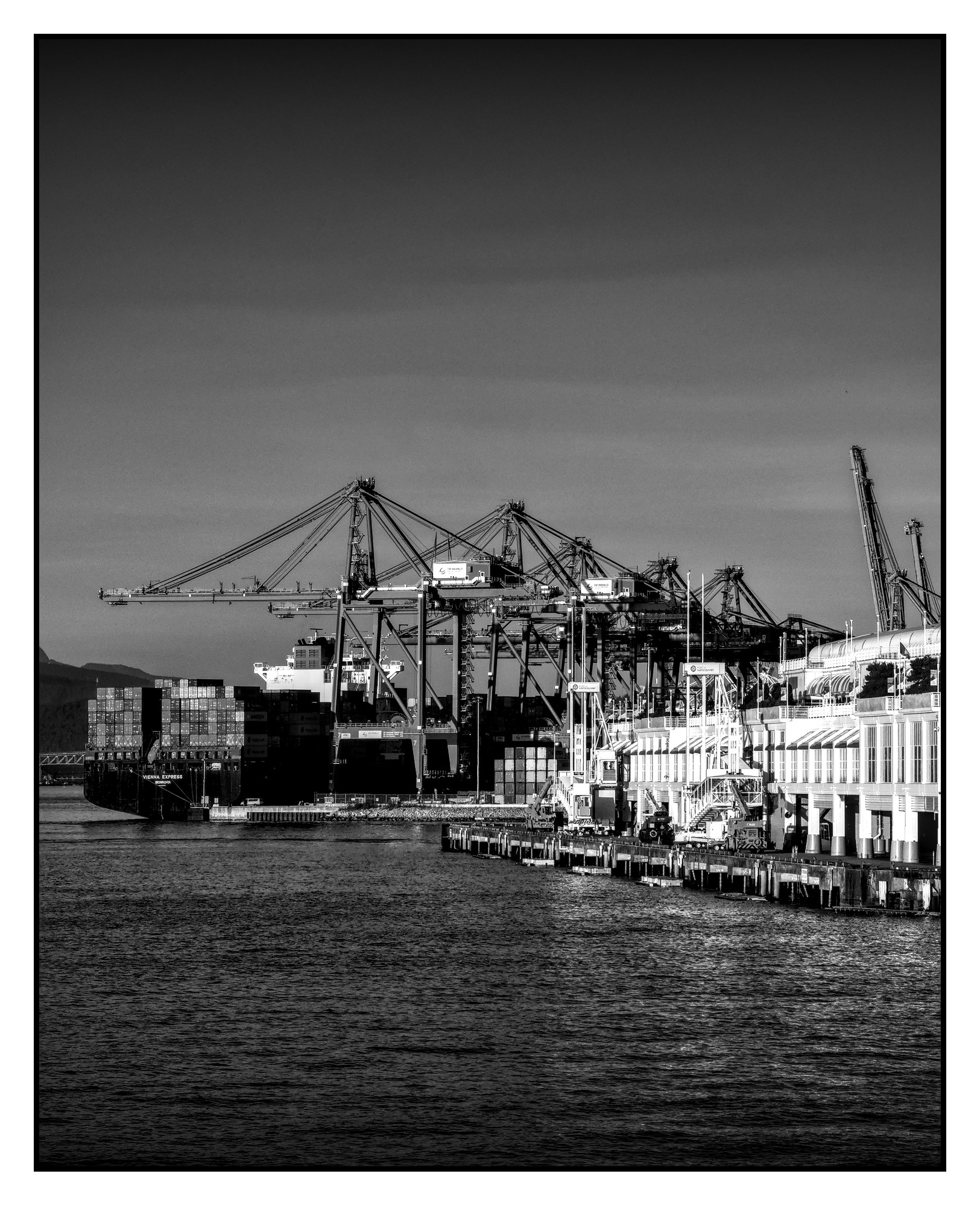
Another Monochrom. I hope far enough from @AtaraxicShrug’s version to be justified to post:
20250608_Walk-Vancouver-Dock_01.ORF.xmp (17,4 KB)
or making profit of this nice camera lens combination:
20250608_Walk-Vancouver-Dock_01.ORF.xmp (17,9 KB)
3 Likes
Tried to do a painting but just didn’t look aethetically pleasing, so decided to do a simple line-art like render. Might try (or not) something else later. ![]()
2 Likes
Your edits are like kinder surprise.
You never know what you get. Sometimes it’s rubbish, more often it’s great, but no matter what it is, in the end it’s always a joy to see.
Thank you for your always very creative contributions. ![]()
There are images that I have edited five or ten times, or maybe even more.
1 Like
Thanks, Popanz; just having fun before I do my 40 (well 48 hour since I have to do 8 hours overtime) weekend starting tomorrow. lol
![]()
3 Likes
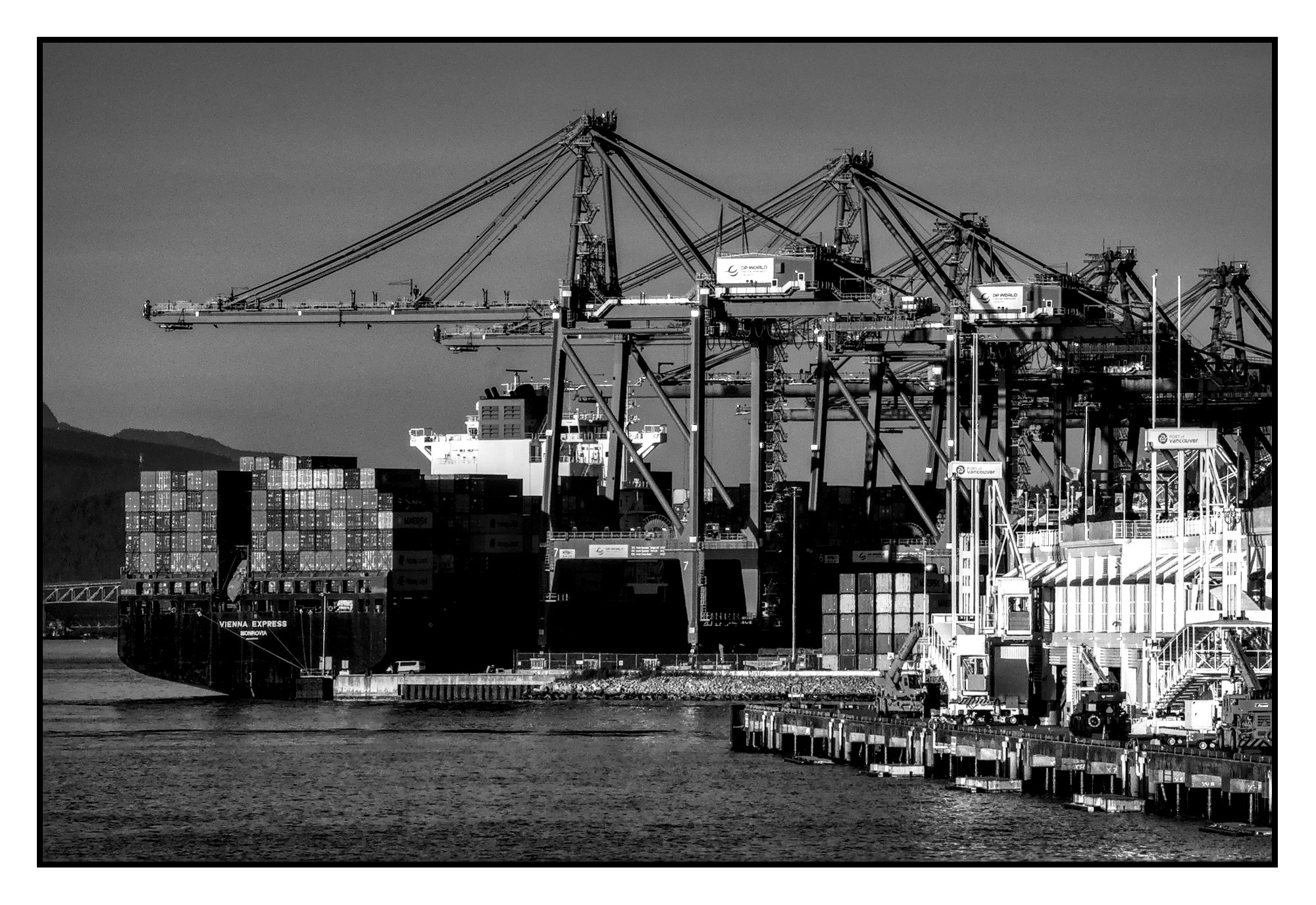
Was not happy with the sky - forceful use of Contrast Equalizer helped.
And for the fun of it I added some bloom with Diffuse or Sharpen.

3 Likes
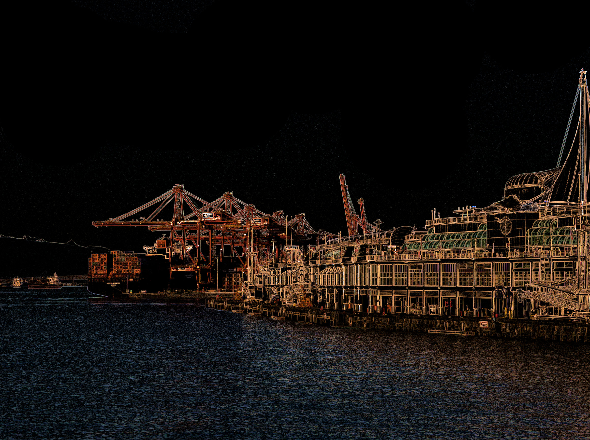
A panoramic view:
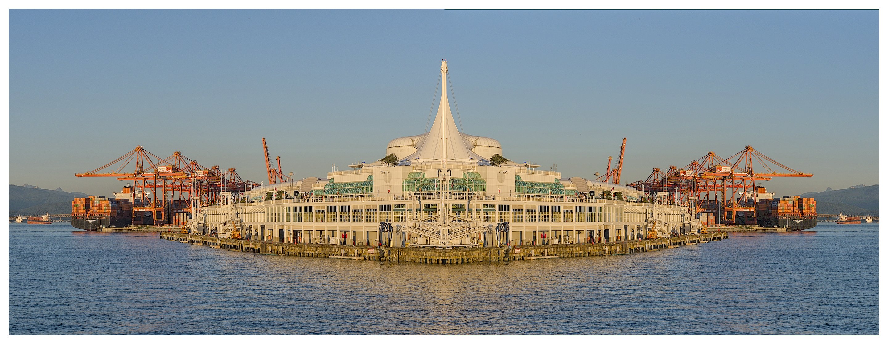
DT 5.2.1: 20251113_20250608_Walk-Vancouver-Dock.ORF.xmp (10,8 KB)
Made with: “Composite” and “Enlarge canvas” modules.
Greetings!
12 Likes
Really interesting since that spire is so plaisable ! Great work.
1 Like
Just took the chance to look through all the edits again, so much variety, all equally enjoyable.
It strikes me how different they can all be from a fairly simple photo, you guys are so good at this! ![]()
2 Likes
Most images, i just want to “correct”: Get the white balance in order, set an appropriate exposure compensation for the intended subject, adjust contrast and saturation to fit the aesthetic, perhaps crop and rotate to correct for inaccuracies in the field.
In this mode, there’s not much artistic thinking, it’s fairly mechanical. I often adjust one shot per scene in a bit more detail, then copy-and-paste those adjustment to the rest of the shots in the scene.
But occasionally, there are a few shots that spark my imagination. Something about them tickles me and gets me excited. Sometimes, the cause is obvious, in which case I try to highlight it through editing. Sometimes I can’t quite put my finger on it. If that happens, I start playing with the edit and try to hone in on that feeling. In the best case, this leads me to discover something, like a new style I didn’t know I liked, or a new editing technique.
These are moments of excitement in editing. They are rare, but they’re why I do it. Learning and improving.
5 Likes
Whole heartily agree, I do pretty much the same thing. Most of my creative moments are when I am actually taking the picture. My major attention then would be the composition.
Sometimes, I take an image with the intention to make it B&W later.
To me most important thing is the composition and the honestly of the image edit to maintain and preserve the condition/mood of the scene at the capture time.
1 Like
I’m writing this before I make an attempt at editing your photo.
98% of my images are for “artistic” purpose (probably 95% of those are nature, with the vast majority being landscape) and the other 2% are travel/family photos. Travel and family photos are usually edited to try to recreate the moment, so very little editing is done.
For the “artistic” shots, it depends on if the image “speaks” to me…how did I feel when I took the shot (why did I capture that image in the first place) and how do I feel about the image while looking at it on the screen? A lot of time that feeling is just, awwww…that’s pretty!, which is good enough for me.
In the initial culling process, in lighttable, there are two easy categories for me: keep and reject. But then there are the next two categories: leaning toward keeping (I color label these yellow) and leaning toward rejecting (I color label red). Images from these categories I have to eventually open in darkroom (because I need to do a bit of fiddling before deciding) to see if I keep or reject. Sometimes it’s a long time before I get back to looking at these two categories and it’s more clear when I get back to them because I immediately feel keep/reject about them.
When I actually open the images to edit, the images with the red label are more often the “no preconceived direction” images for me. And for those, I usually don’t really feel drawn toward those images a lot or I probably wouldn’t have given them the red label in the first place. So I look at editing as a process to see if I can feel drawn toward the end result.
4 and 3 are probably my go-to method. I’m a black and white guy (95% of my prints are black and white, I have a couple of analog cameras I only shoot black and white film on, etc.) so I start there with almost every image I ever take, and odds are that was the initial intent anyhow (that’s “recreate the moment” for me—recreating what I thought the picture might achieve as a B&W landscape image). I have quite a few black and white styles saved in darktable (some are shortcuts), so a lot of times I can quickly use those styles to get an idea if I keep or reject. (If I know for a fact when I took it it was because of the colors, autumn leaves, sunsets, etc., I probably don’t go to black and white style first.)
Next, I do 1, a lot, often in tandem with 2—2 usually makes me do certain things for 1.
5 Pretty much never…that’s why I have styles—I planned in detail what to do with that kind of image a long time ago, so I created a style for it and now I only need to tweak the results of the applied style. ![]()
I don’t spend a lot of time with the images that don’t speak to me fairly quickly upon editing, and tend to end up rejecting a lot of the red-labeled images, especially if I already have images that are similar enough that I do like.
So I look at your attached image and wonder to myself, what was drawn to your eye/mind/heart in the first place: the colors, the contrast, the lines, memories (of visiting there, a person who is close to you worked there, you worked on a similar ship, etc.), documenting how much has changed since last time you were there, what-the-hell-I-have-a-camera-so-I-might-as-well-take-pictures-of-something, etc.
I really don’t know what your reasons were and what you felt when you took it. I really don’t, because for me, it makes me feel nothing, so my approach may be entirely different than yours.
My approach will be fairly similar to how I approach my red-labeled images, 4, then 2, then 1.
So my first thought is black and white (4).
I see potential in the lines and contrast (2) because I’m imagining it in black and white.
So my method for editing your image will be to play around with it a bit (1) by trying several different B&W styles to see which sparks the most interest in me. If I find one I like I will tweak it further. If I like the end results enough, I will post it here. If you don’t see an image here, that means I have culled your image because I wasn’t happy with my end results.
Okay, I just finished editing the image.
My first thought, as stated above, was to go B&W, but nothing I did there really satisfied me (@AtaraxicShrug and @Popanz have done nice work with B&W on their edits, so kudos to them!).
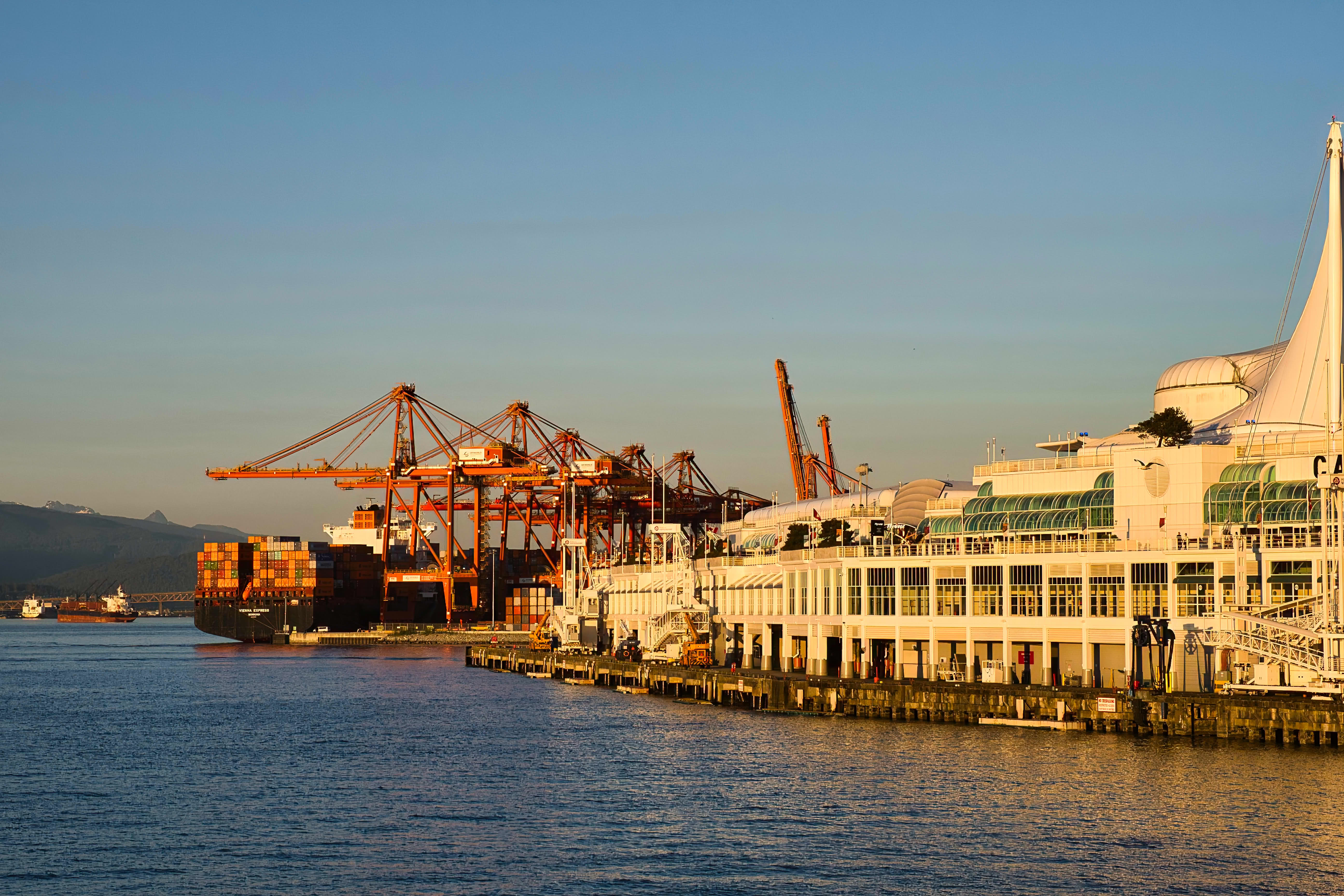
But as I fiddled with the photo, it reminded me of my childhood in the early 70’s at the naval shipyards (my father was in the US Navy) and it gave me a feeling of nostalgia, so I decided to focus lean into that nostalgia: I focused on the ship/cranes and of course, early 70’s reminded me of my Kodak pocket instamatic with the 110 film so I decided to let that guide me to the color, grain and crop (4x5) choices.
Soooo… I ended up going with something that brought a certain feeling to me — and it really doesn’t matter whether anyone else likes it or not, it’s about how I feel about the image.

5.3.0+860~g53ff7cb039 nightly :
20250608_Walk-Vancouver-Dock.ORF.xmp (9.9 KB)
4 Likes
4 Likes
I find it so interesting that you mention getting the photo “correctly” before even attempting editing because it is not something I even considered when I was formulating my original post.
It’s just so interesting because trying to preserve the photo and ensuring there were minimal adjustments done is a form of editing.
In hindsight, I had a bias/assumption that editing must always involve some sort of process where the image might or might not resemble the original photo which might have been born from all the exposure to overdone images online before I made the jump and got myself in these deeper parts of the hobby.
We have at our disposal a few fundamental limitations:
- a 3D world is pressed into a 2D projection
- the frame only shows a particular slice of a 360° scene
- the full range of bright and dark is flattened into a 5-10 stop screen or print rendition
This necessarily simplifies. Through that simplification, we get to choose what to show, what to imply, and what to hide. We choose our exposure to retain contrast on the subject, but lose detail in highlights and shadows. We compose and crop to show only part of a scene, perhaps omitting aspects, perhaps emphasizing them. We position our camera such that some things are obscured by others, or stand out from others.
There is, in that sense, no objective “correctness”, beyond the artistic intent of the photo. So when I speak of “correcting” things, I mean exposing, toning, and cropping to an arbitrary artistic goal. Still, the process is largely mechanical in that I’m simply using the tools of raw development (crop, expose, tone) to turn a recording into a rendition. But I’m not changing the nature of it, I’m merely following the necessary steps to render an image much like my camera also applies these steps to render a JPEG. Just with more control.
To me, this is different from the creative act of turning a rendition into a creation. As soon as I’m selectively changing colors, retouching or splicing, or selectively highlighting things, I’m taking creative license to change the photo into something else. I don’t mean this as a value judgement in any way, there is nothing right or wrong with that at all. But to me, it is a different activity, that uses different parts of my brain, and requires different tools. Thus I draw this line between “corrective” actions and “creative” ones.
1 Like
I had sort of gotten a hint from that distinction on the previous post but to see articulated in detail definitely clears up some things I had assumed.
Very interesting, much food for thought, will take me some time to process it for sure.
2 Likes
I agree and disagree at the same time. As soon as I do sharpening, exposure, contrast or any of these ‘basic’ settings I depart from whatever rendition otherwise being possible. At my will. There is an infinite number of possible combinations at hand and the developer makes the choices. Lots of renderings are close to neutral - whatever that might be - and therefore not considered artistic. But in my feeling there is no - sharp - border between artistic / non-artistic.
Kind regards Jetze
1 Like