IT took me a second to realize what you did! nice! It looks a little ghosty in the corner, but I think anyone not seeing the original would not notice.
I like the foreground, But I find the sky color unrealistic. But, still more color and definition that I got!
This is a good point. For many years I was “that guy” who would wander around in broad daylight with a tripod, and everyone would wonder why I was doing “night photos” during the day. I currently don’t but perhaps I should again.
The contrast is good but I think the wood color seems too saturated. What do you think?
This a good take. I need to study this one closely as well.
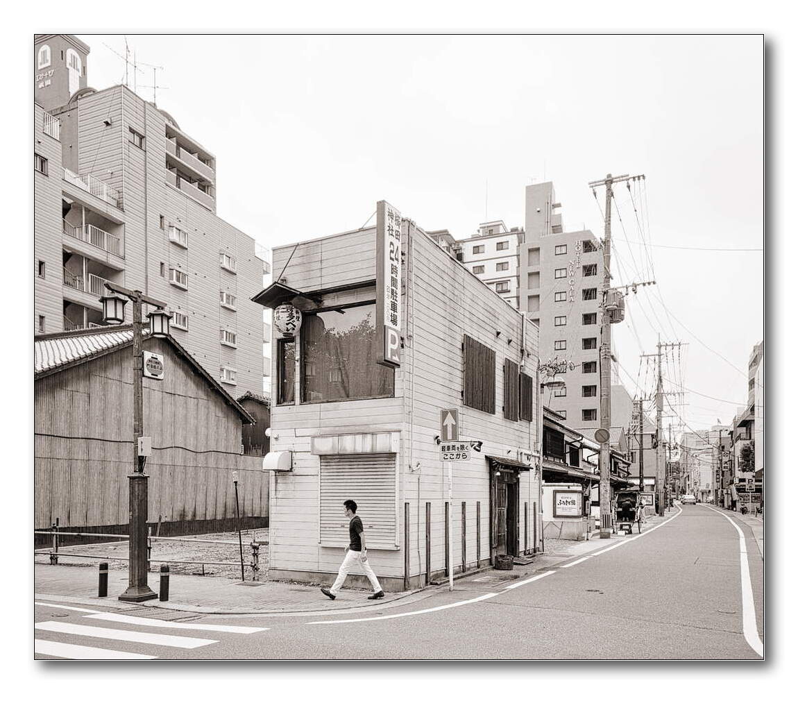
No fun allowed! Why does everyone want to remove things from this photo. haha Maybe someone will remove the building and only leave water next.
I suppose we could duplicate the walker a few times and put him in the crosswalk.
Thanks. Very nice take as well. It’s hard to keep the background buildings from fading away.
Your use of masks in the multiple iterations of the color calibration module is very interesting. I wonder why color calibration and not color balance rgb?
I had another look at Val Timmermans work and realised something super odd. New topographic is the term for a group of photographer in the seventies that took photographs of everyday man mane scenes with the rigour and seeing of early landscape and architecture photographers.
When I look at their instagram I notice most cars in the scenes are old, like from the 70’s or so, models. They are re-creating the new topographics content only in style. Clearly looking for scenes that look like their forerunners but ignoring that the intent and power of New Topographics is that they looked at contemporary society. The power is in looking at and presenting, with stark “objectivity”, the landscapes we live in but fail to see. Timmermans seems to do the opposite, these scenes are not of our society but a past one.
I’m glad that you enjoyed Japan, but maybe I am tired of living in the heaven haha I’m sure I must think that heaven is where you live
You are right. I initially tried to apply the Kodachrome emulation by Boris Hajdukovic (https://www.youtube.com/watch?v=zlfy8Nx_OCI) as I wanted to enhance and make use of tension and harmony between reddish and blueish elements in the photo. That’s why the wood color is too saturated. And later I changed the strategy, which made my edit confused.
Wow. Really nice appearance here. Very soft and nice colors.
I initially did not like the high saturation, but the more I look, the more I like this. Really nice definition where the big cranes in the background are hidden behind the trees.
Looking at Val Timmermans’ shots, I saw a lot of color, but I admit saturation might be cut down a little in the greens, but I would not change the rest.
For color work, the flat scanned film look is popular. Whatever you do, don’t even go close to crushing the shadows. Compress the highlights. I’d say 24 mm is too wide. Back off use something longer to reduce perspective distortion.
Oh you have done something here. I will be taking at this LUT. thanks!
A bit after I made this post I completely paused all editing and took a break. The current DT release was really dragging on my ancient PC and editing time was mostly spent just looking at the “working…” message. Now I have new machine with a GPU so I will be getting back to this shortly.