editing landscapes to get the Val Timmermans / New Topographic "look"

Less a challenge and more of “help me learn”. I shoot landscapes + architecture and edit to get a high contrast look with selectively saturated colors, but most of the photographs I view and enjoy are actually not like this and more realistic. Composition aside, I have no idea how to describe the way these photos are edited in post so after spending this weekend searching I found tutorials on every editing technique aside from this.

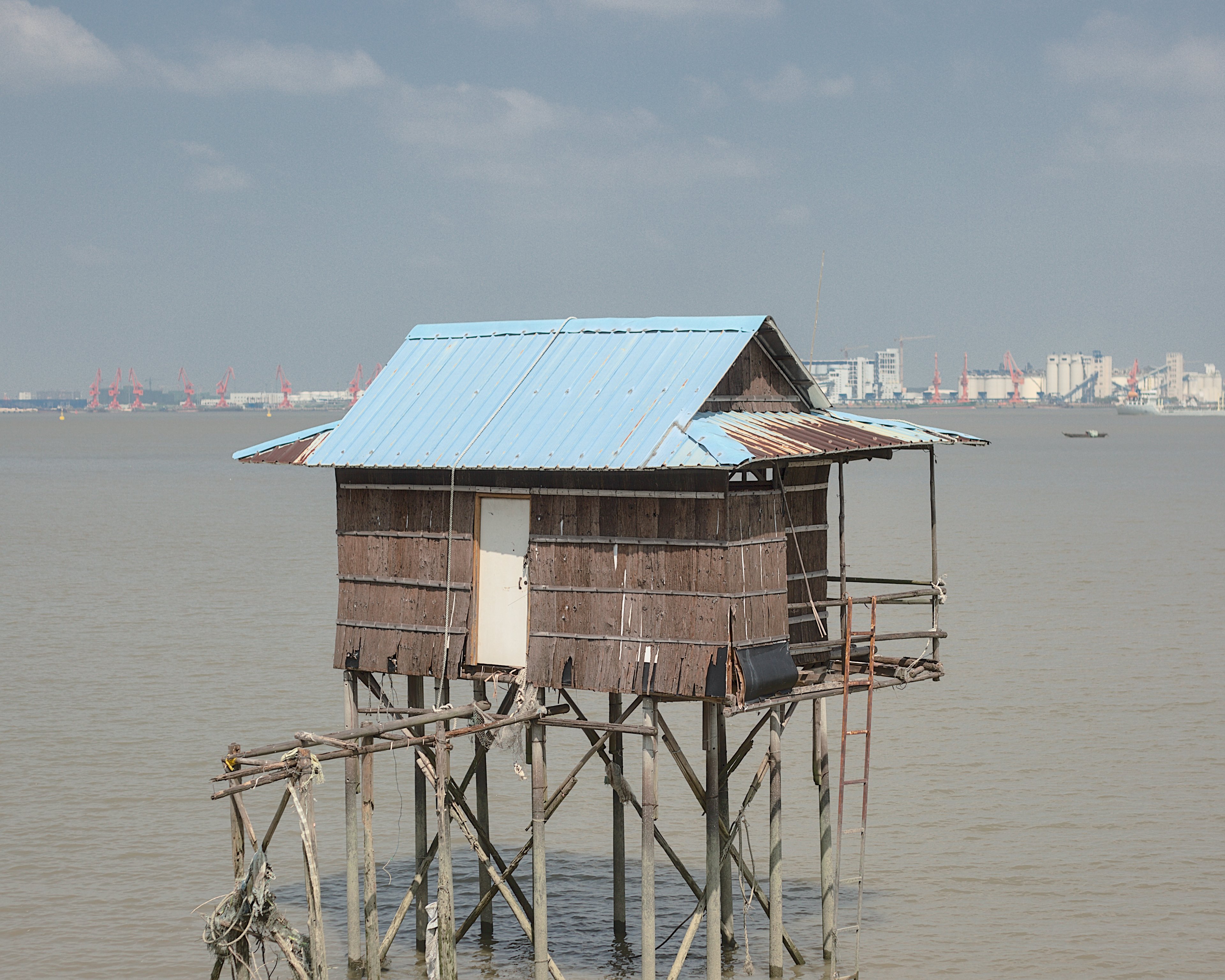
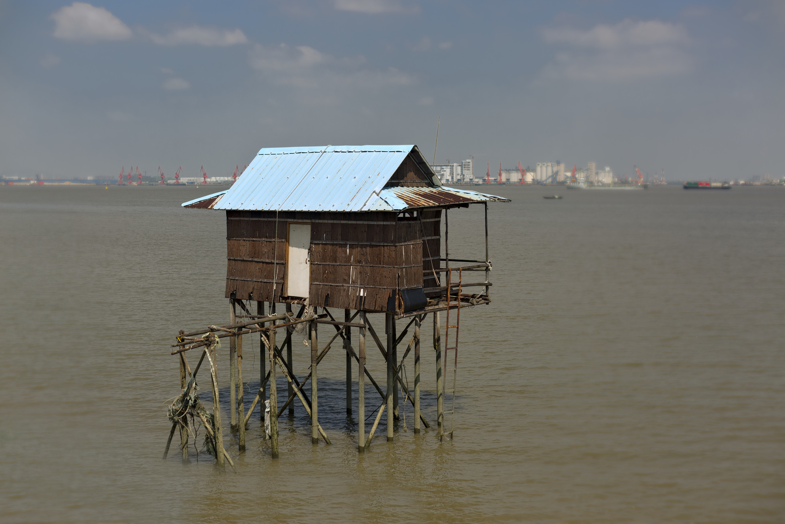
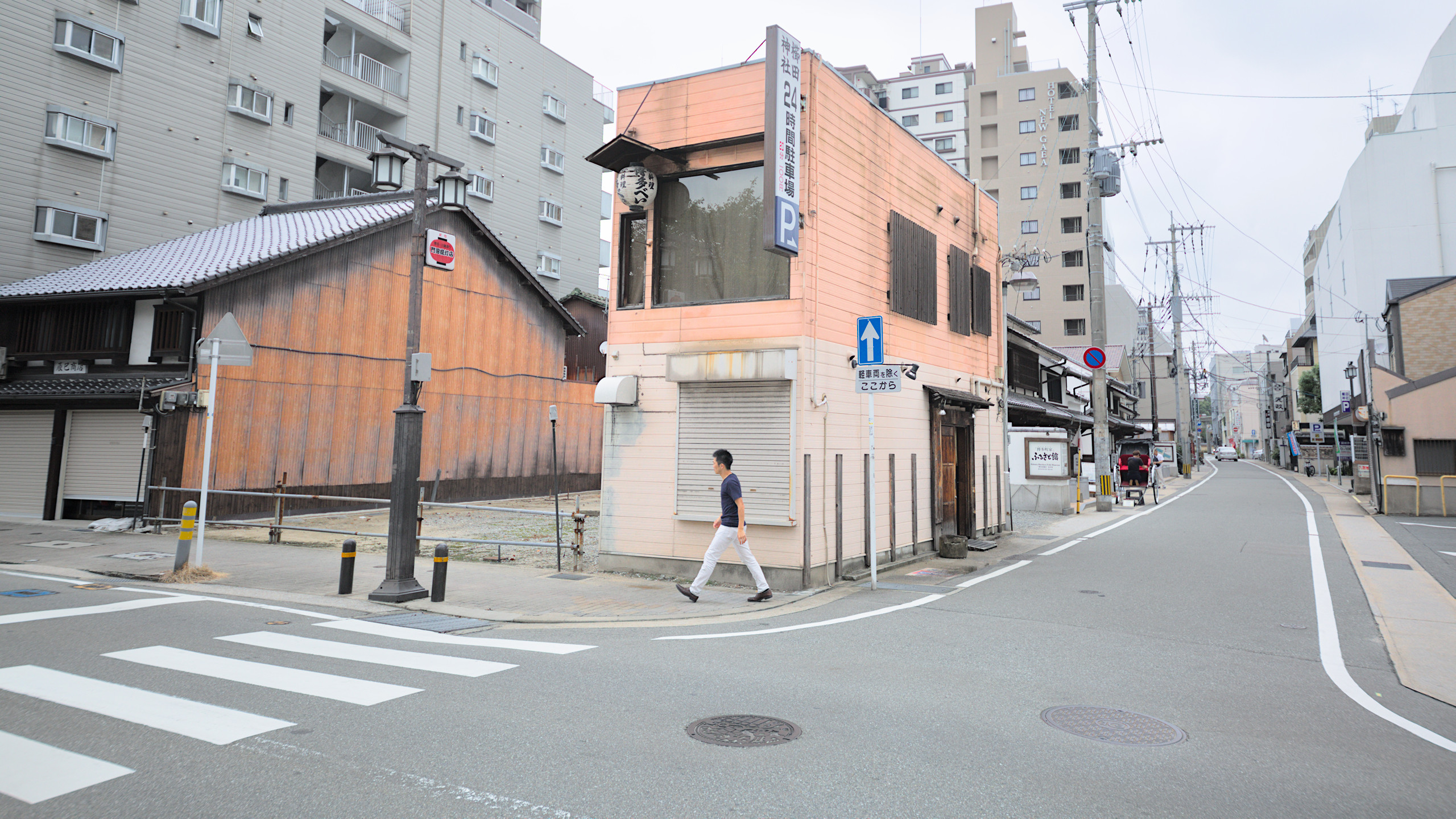
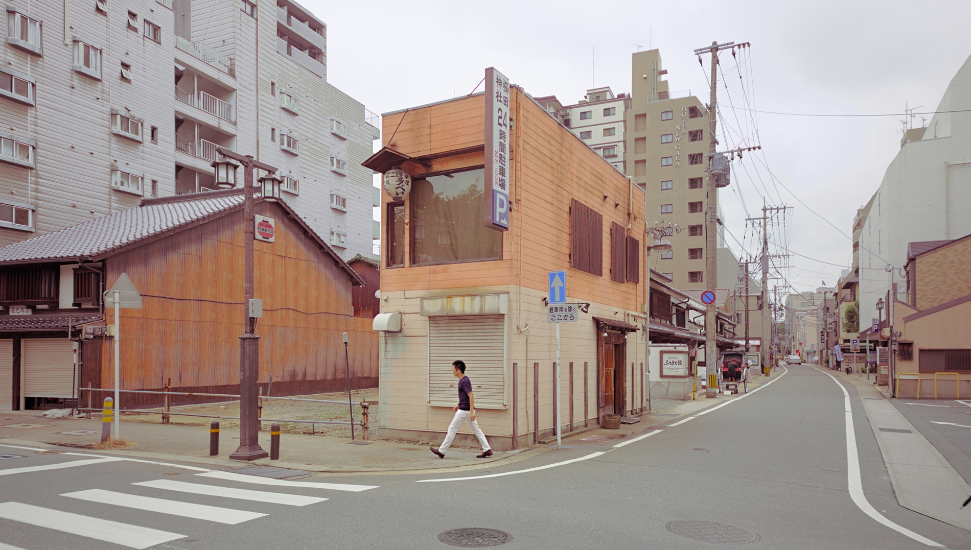
The closest name I could give it would be the look of many daylight shots of the “new topographic movement” and often seen in the Subjectively Objective books. Found commonly in landscape and architecture, but very distinct from the touched up perfection of real estate photography and architectural projections and dramatic colors and contrasts of typical landscape photography.

You can see some examples to illustrate better than I can describe:

Val Timmermans: https://www.instagram.com/p/CRzaFWTLEE8/

Paul Frederiksen

Sandy Valley Road, Sandy Valley, Nevada. August 28, 2021 by Paul Frederiksen, on Flickr

Capochiani-Armando: https://www.instagram.com/capochianiarmando1464/

Obviously, some of these are film. First impression is that these shots are nearly unedited but actually seem pretty tuned. They are overall very bright even in the shadows, but with nothing overexposed and crisp definition of details. The colors are muted but well defined, often with a emphasis on pastels.

Every time I try this, it seems simple but I have a hard time balancing between overexposure and a grey or white cast over the whole image. It ends up not realistic at all. I am wondering what you talented folks could do.

BTW, I am using DT 3.6 and sticking to scene referred workflow, so avoiding tone curves and shadow-highlight module. I am still trying to master filmic rgb and tone equalizer.

playraw3

I have 3 different scenes in RAW (CC-0), at least one of them might speak to you.

Lastly, here is a jpeg of an old edit of one (done on dt.3.2)


that I realized was so grey and ugly. I have a real problem with my overcast featureless skys looking an unnatural grey color.

4 Likes


x0thrmc-exe_IMG12420.CR2.xmp (15.4 KB)

A nice challenge.
I used my current exposure/filmic/local contrast/contrast equalizer default.
For the edit i adjusted exposure and used tone equalizer without masking.
The rest are a few selected color tweaks in color look up table.
And a 5:4 crop. What else… :upside_down_face:

3 Likes

Nice topic!

First, these type of shots are primarily made in camera (as it should be… grump) . Its about the chosen scene and the lighting conditions. Second the school comes from film photography so a film like soft handling of tones should be strived for. It seems to have developed a more extreme aesthetic as in your link above. Super pastelly !

I loved using Kodak Portra nc film which was excellent for this type stuff. Now shooting digital the look is less “interesting” but I aim for soft span of lots of tone.

2 Likes

This looks really nice! The best part is how defined the blue metal roof is. Mine was always getting overexposed or totally devoid of detail.
I will be studying your xmp very intently.
Are you using dt3.6?

dt3.7.0


IMG00069.CR2.xmp (23.0 KB)

Speak Japanese maybe?

2 Likes

I couldn’t resist having a try at these three images. I am sure I have not produced the results that were requested, but it gave me an opportunity to experiment. All done in GIMP.

IMG14354: Auto Input Levels.

IMG00069: Perspective correction. Used Saturation Mask plugin to increase saturation in the least colourful areas.

IMG12420: Auto Input Levels. Luminosity Mask plugin to increase contrast in the darker areas and increase saturation in the lighter parts.

2 Likes

I think the technique is mainly based on composition. Simple almost abstract motifs, very flat with little detail and few colors. A lot of light in the shot but few shadows.


IMG00069.CR2.xmp (13.1 KB)

1 Like

Yes, dt 3.6.
Have fun … my current usage of filmic is rather unconventional.
The roof has been enhanced within the color look up table tool.

1 Like

Great info. I know many of the shots are film, while others it’s not stated and either film or really nice emulation. Of course composition and lighting are key.

Nice that you pointed out Portra NC. Less contrast and softer compared to velvia. Had a look at the Portra Flickr group and a detailed look at some of the photos that attract me and immediately found one that was Portra. The Portra film LUTs available for DT look pretty ok too.

Not Darktable unfortunately but did something in Rawtherapee. Tried cleaning up the composition a bit applied Portra 160 NC lut, tweaked contrast a bit.


IMG00069.CR2-67.pp3 (17.6 KB)

The light, subject and colours of your shot is quite good imho. To get into the topographics thing the framing has to be much more rigorous though. The way you’ve caught the person smack bang in the shutter is great. All elements should lock in like that.

The building in the background left with the bay window has been cropped so that the wall space at either side of the bay window is approximately equal. Ideally you can do lots of stuff like that on site by taking tiny steps back and forth side to side an observing how the lines and layers move with the perspective. You can then construct lines space and surfaces that get flattened in the image. The right edge of the pink building lines up with the false windows of the grey background building. This sort of stuff can be exploited further in the manner you’ve done with the person.

Many of your examples are desert situations where there is much less to force into the composition. It’s more difficult in messy urban locations but it’s also even better when it falls into place.

Did a landscape version as well but it’s less rigorous.

IMG00069.CR2-WIDE.pp3 (17.6 KB)

Super quick edit of the boats. A bit muddy and overly filmy but anyway.


IMG14354.CR2.pp3 (17.7 KB)

1 Like

Not exactly the look you were looking, but it’s my own impression processed with ART


IMG00069.jpg.out.arp (10.5 KB)

The verticals are not perfect because that Sigma lens in not in my current lensfun database. It should have taken in consideration the top corners. This could be finished and corrected in gimp

I’ve always wanted to visit Japan, hopefully a couple of years after the current “unpleasantness”

1 Like

To me, this is a scene that screams BW :innocent:

2 Likes


IMG12420.pp3 (26.8 KB) RawTherapee 5.8 Development

Another non-darktable edit.

Have been trying out some new stuff lately and decided that this would be a nice opportunity to use it. Not able to help you with the look you are going for, but others seem to be on the case.

Anyway: Thanks for sharing!

1 Like

IMG00069.CR2.xmp (21.8 KB)

1 Like

You should study how they expose on flickr. They normally use something around f11, never f3.5 as you did. And you definitely need a tripod.

1 Like

I’m still not satisfied but hope this maybe helps you.


IMG12420.CR2.xmp (29.7 KB)

1 Like


IMG00069.CR2.xmp (11.7 KB) darktable 3.7

Intention: Emphasis on the main colours, rest is toned down while keeping the details, blacks and whites.

1 Like

And just for fun (I hope fun is allowed)…

2 Likes

IMG00069-walker-street-scene-V3-SSN-sRGB.xmp (76.9 KB)

(reminds me of the iconic Abbey Road pic)

1 Like

Thanks for sharing, very nice pictures.

My take.


20210912_0003_01.CR2.xmp (15.8 KB)

1 Like