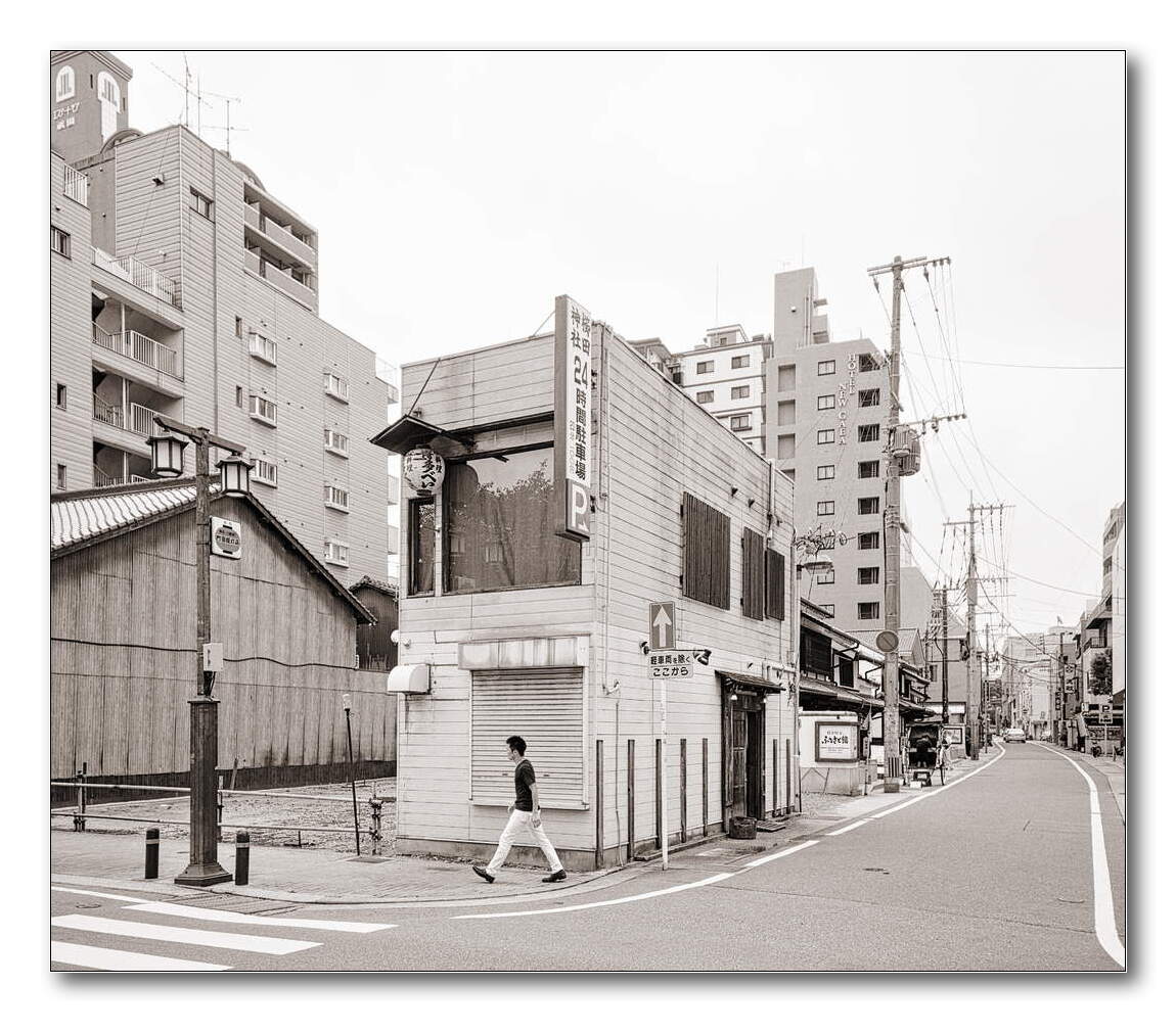
I liked the B&W version from foto. I thought I would try adding a colour cast to the mid-tones to see how it alters the mood of the picture.

2 Likes
I’m glad that you enjoyed Japan, but maybe I am tired of living in the heaven haha I’m sure I must think that heaven is where you live ![]()
You are right. I initially tried to apply the Kodachrome emulation by Boris Hajdukovic (https://www.youtube.com/watch?v=zlfy8Nx_OCI) as I wanted to enhance and make use of tension and harmony between reddish and blueish elements in the photo. That’s why the wood color is too saturated. And later I changed the strategy, which made my edit confused.
This is an interesting observation. Perhaps it should be called the new old new topographic movement.
Good interview with Noah Waldeck here.
You see, I learn something everyday. I didn’t know that.
Thank you
1 Like
I can’t control what the website or the browser do. But to me, I don’t see the over-sharpened, over-compression.
I’m using 78.13.0esr on Opensuse Leap 15.3 but I could reduce the output sharpening with jpeg: 65% and balanced subsampling.
Here’s with a lower output sharpening. Is it better?
2 Likes
Only a minor different. I also see some banding in the sky as well as a touch of magenta blobs in the sky. Quite odd.

that’s nicer!
Following the instructions of aurelien Pierre, I think


IMG00069.CR2.xmp (7,6 KB)
IMG12420.CR2.xmp (8,9 KB)
IMG14354.CR2.xmp (9,3 KB)
Cheers
2 Likes

Wow. Really nice appearance here. Very soft and nice colors.
I initially did not like the high saturation, but the more I look, the more I like this. Really nice definition where the big cranes in the background are hidden behind the trees.
Looking at Val Timmermans’ shots, I saw a lot of color, but I admit saturation might be cut down a little in the greens, but I would not change the rest.
1 Like

I’m a sucker for the new topographic school! https://newlandscapephotography.com/ features some great work, if you haven’t seen that yet.
For color work, the flat scanned film look is popular. Whatever you do, don’t even go close to crushing the shadows. Compress the highlights. I’d say 24 mm is too wide. Back off use something longer to reduce perspective distortion.

editing landscapes to get the Val Timmermans _ New Topographic _look__02.CR2.xmp (24.8 KB)

2 Likes
nice I like this one. Muted but defined colors.
Oh you have done something here. I will be taking at this LUT. thanks!
A bit after I made this post I completely paused all editing and took a break. The current DT release was really dragging on my ancient PC and editing time was mostly spent just looking at the “working…” message. Now I have new machine with a GPU so I will be getting back to this shortly.
do you mind sharing your xmp?
sure, no problem! (FYI the edits are embedded in the jpgs exported by Darktable, so if you load the jpg as a development on an image you can see it)
IMG14354.CR2.xmp (22.4 KB)
Oh my, I had no idea! Thanks
Thanks all.
I’ve gone back and reprocessed some shots again after studying ya’ll’s edits. Now, much more satisfied with my results and more familiar with the modules.


3 Likes
Would you post the sidecars for IMG00069.CR2 and IMG12420.CR2?