I was attempting to use it for creative edits rather than correcting color cast; creating color separation between a dark background and a light foreground.
The examples you give (in particular the woman with the yellow cast from the umbrella) help clarify how to use it to target specific colors without using masks.
@s7habo I noticed that you have sigmoid activated for all the examples in your latest video. Is this something that you always have “on” by default, being that your in a scene-referred workflow?
If you mean sigmoid preset, then yes, I use this sRGB preset because I mainly export to the sRGB color space, almost never process the photos after the sigmoid and often have to deal professionally with difficult lighting conditions (e.g. concert lights with LEDs)
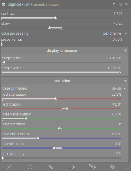
The one I use is my version, where I have only increased the contrast because it suits my camera better.
Are you able to always avoid clipped highlights, since you know much better than most of us how to set the settings on your camera? If not, do you do all reconstruction with highlight reconstruction, or do you switch to filmic rgb?
I take great care not to overexpose the photos. If one or the other photo is overexposed, it is only in very small areas and the standard setting is enough to correct it without having to do anything.
Thanks for another great tutorial. I especially love the demonstration of equivalences between color calibration and rgb primaries. I learned to use the former to a certain extent from your videos, and the new module just has a more convenient interface (in that I don’t need to manually counterbalance channels), but essentially does the same thing.
I find that automatic WB in color calibration is a bit overenthusiastic, so for most shots it is better to restrict it to a small area and/or experiment with a Planckian illuminant manually (it would be great to be able to say “do automatic WB with a Planckian illuminant”, but I am not sure that is possible). Then casts can be corrected nicely with rgb primaries, no need to do all in WB.
This would not be necessary if you do not want to brighten shadows. Since I take care not to overexpose the photos, I sometimes have to brighten the shadows where the noise is strongest, so I have to make sure that the shadows are taken into account more when denoising.
I’ll start by saying thank you for all that you do and all of the fantastic videos you put out and the support you provide to the community. I love darktable and the foss community. I’ve found myself emulating a certain style for a while now, most easily and simply described as film simulation giving an old school feel. Would you be able to take a deeper dive in this style of editing? I think you might have touched on some film simulations in the past, but I think it would be a good theme your series. I’ve included a good example by photographer luke gram. It typically has good micro contrast(?) but still maintains a soft look, vibrant colors and seems to use (for the most part) a high dynamic range. I’ve provided a link to his website that gives good examples of this style.
This photographer seems to keep this style across most of his photography. His style also reminds me of the look that one of my favorite film photographers produces, Robbie Maynard. His work can be found on his you tube page. I highly recommend checking him out.
Very nice photo work, and seems a bit like the Dave Hill look discussed in the the PIXLS Highlight Bloom and Photo Illustrative Look article, but with a much more subtle approach.
Hi’ Boris
Thank you for another excellent video.
I have tried to follow your examples on using the channel mixer and observed something that I don’t understand. I hope you can help me …
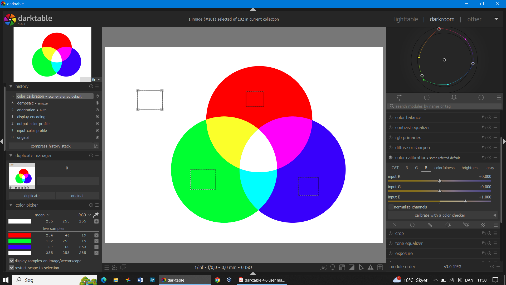
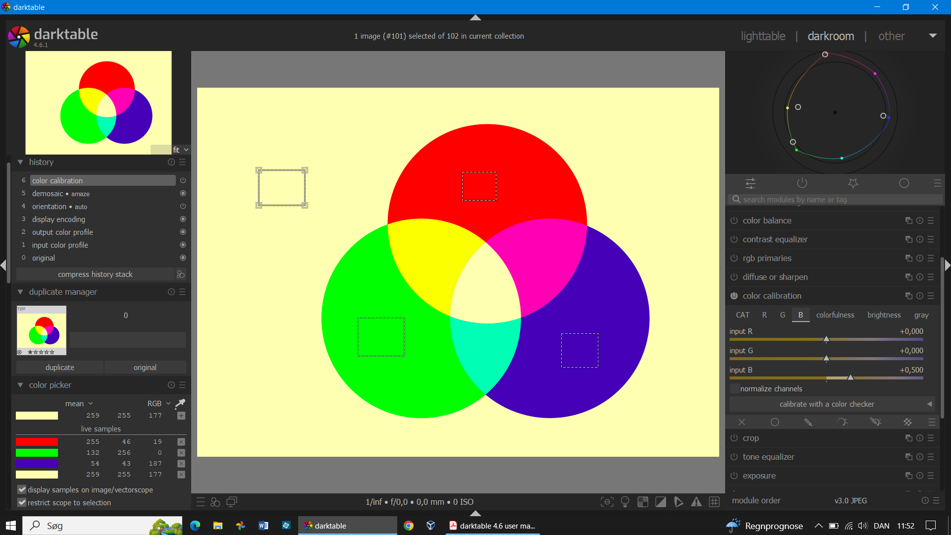
I have created a tiff file with the tree overlapping circles in pure red, green and blue like the one you use for demonstration. The channel mixer (in an old version of Photoshop) works exactly as you explain it. When I open the tiff file in Darktable I get this:
The transparent areas are converted to pure white (ok - understandable) but the circles are not pure red, green and blue anymore (see the color picker readings). Maybe this can be explained - even though I don’t understand the explanation - by the software working in different color spaces.
What seems really strange is the following: When I pull the blue slider in the blue tab down to 0,5 I would expect all blues to be reduced but that’s not the case. I get this:
The blue component is reduced in the green and blue circle and in the whites but not in the red circle??
And the red component in the blue circle changes from 27 to 54 and the green component in the blue circle changes from 60 to 43??
To me this is because withing darktable (which is color managed) the red green and blue are not pure colors (seel RGB values in the global picker) so you cannot expect to change only a single color.