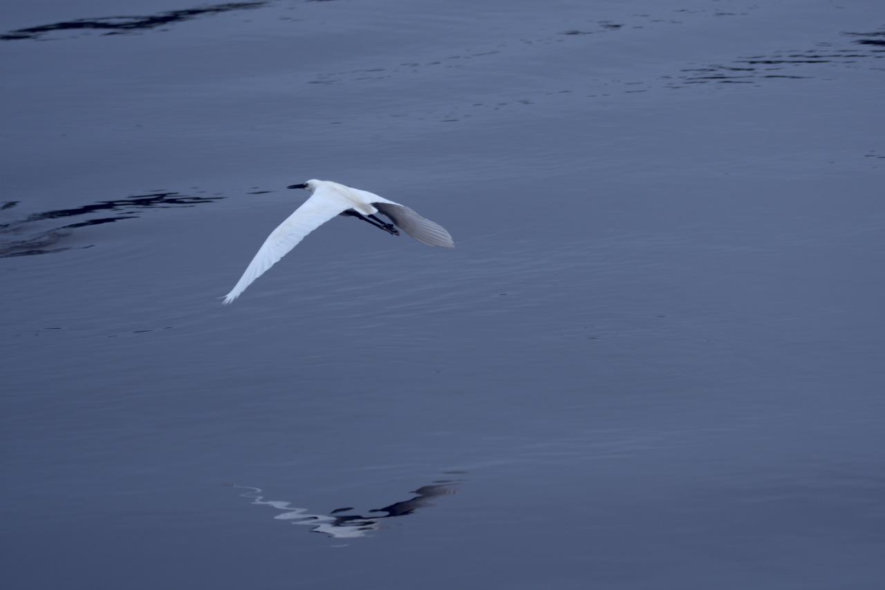
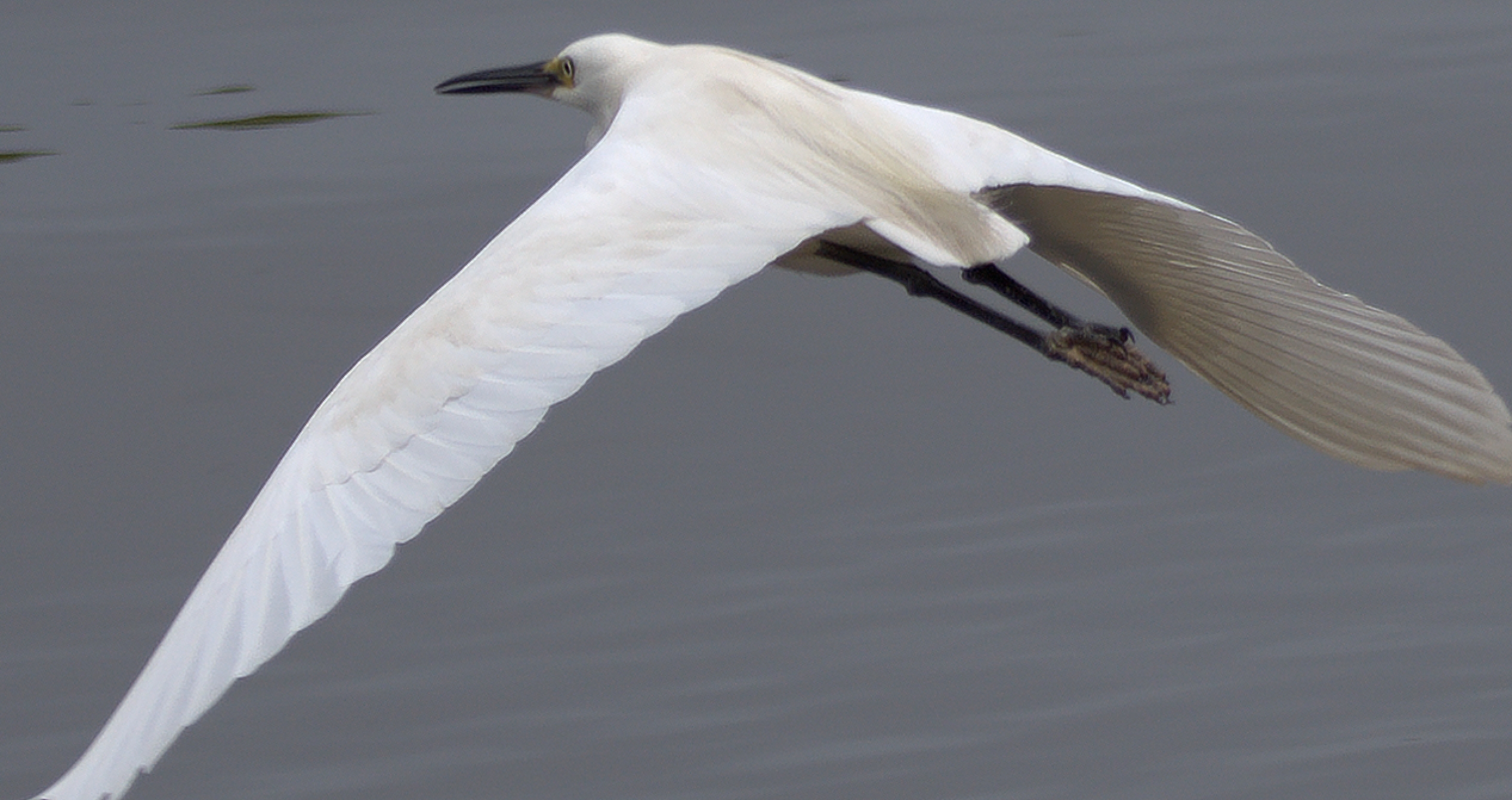
2020-02-07_12-13-22.35_DSC9547.NEF (20.1 MB)
Hello all,
I really like this capture from yesterday, but I am struggling to come up with a helpful way to present it without the result seeming horribly (or at least partially) cliched.
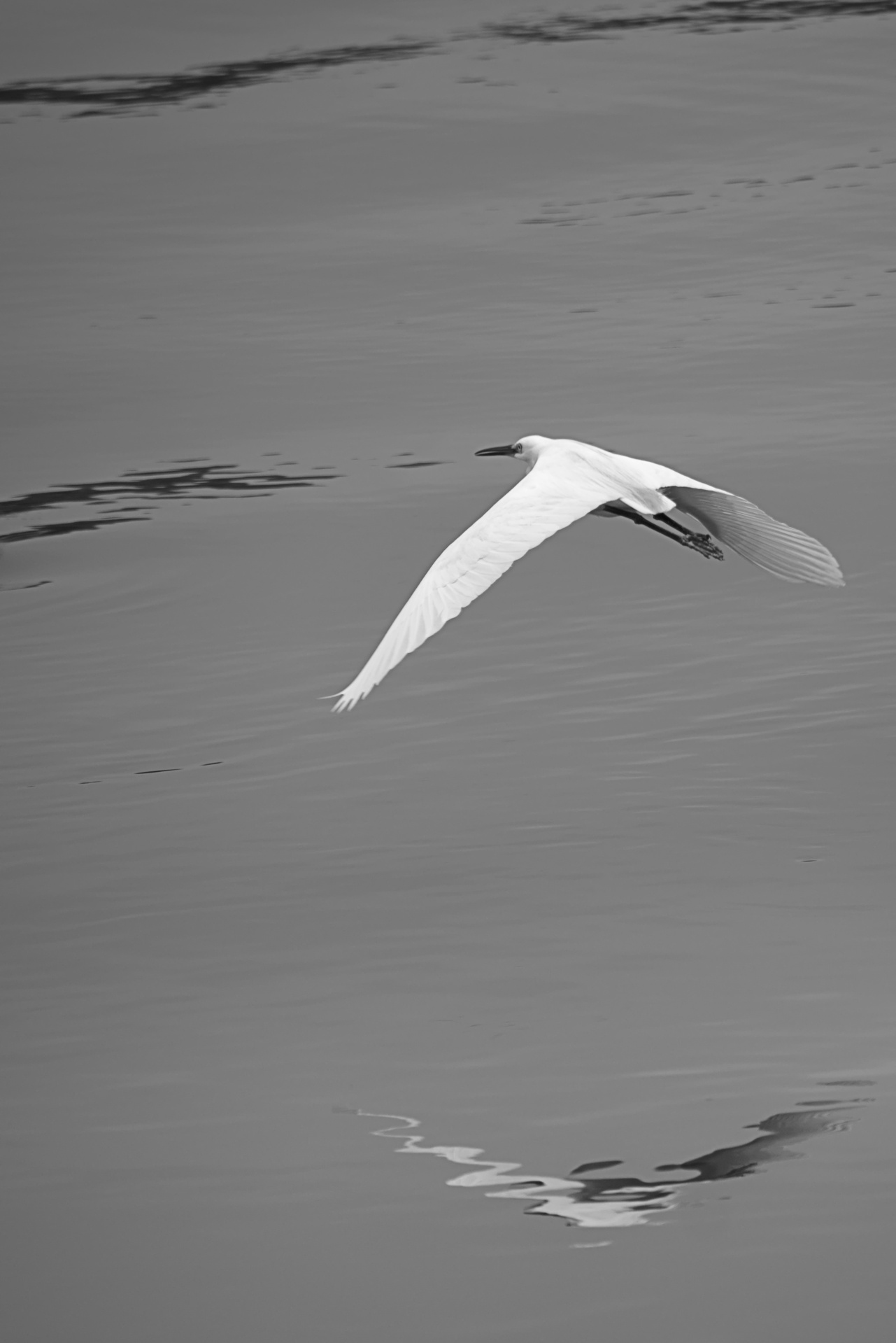
Below is my current attempt in darktable. Without color correction, it looks bland, but I find there isn’t enough tonality to make a nice monochrome.
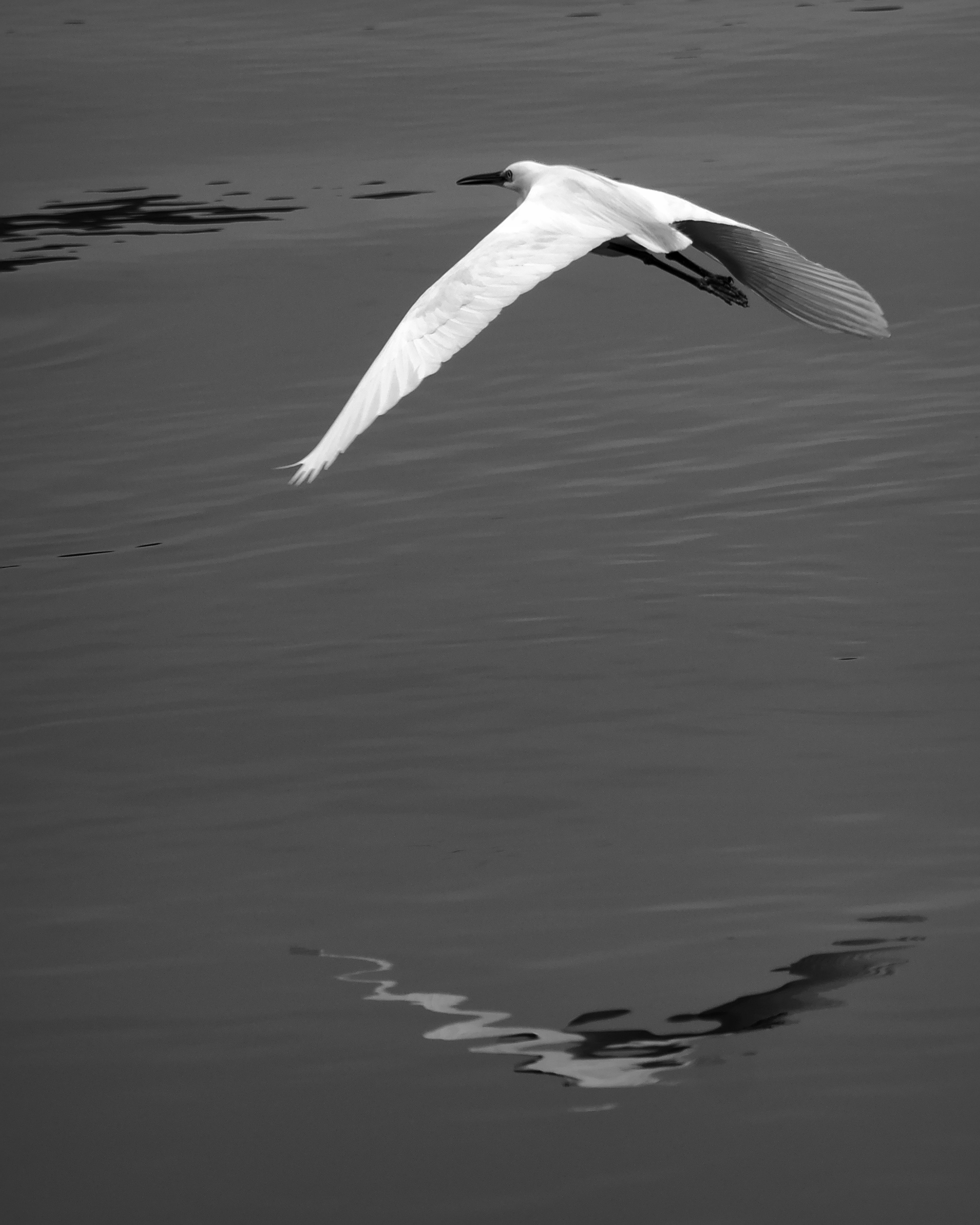
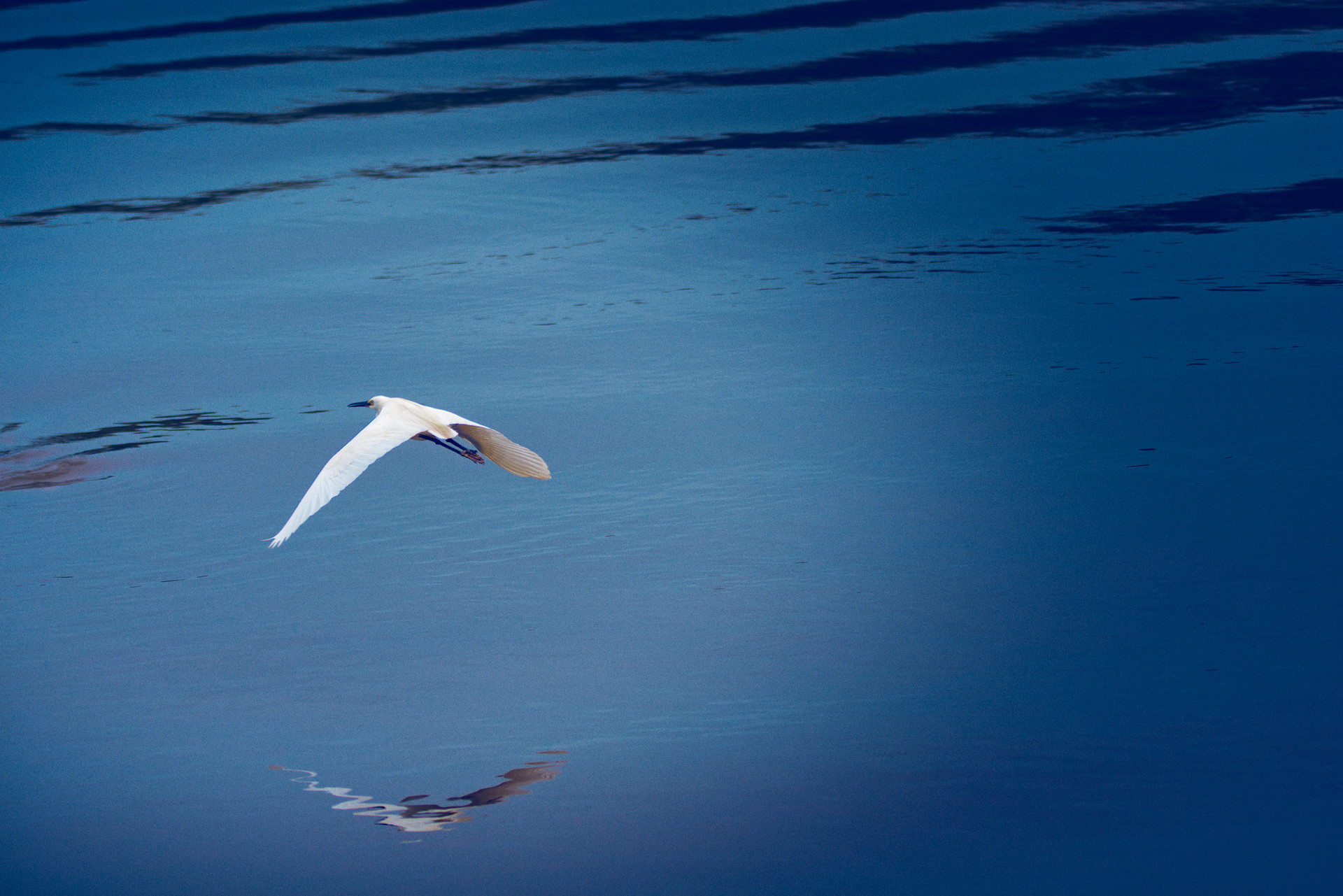
Wow @sls141, your colour rendition is exactly the sort of thing I was looking for. I can’t wait (but will have to!) to download your .xmp sidecar and check out how you did it.
I like the noise added, because it gives texture; my problem with B&W had been paucity of distinct tones, but this treatment of yours answers that very nicely. Thanks!
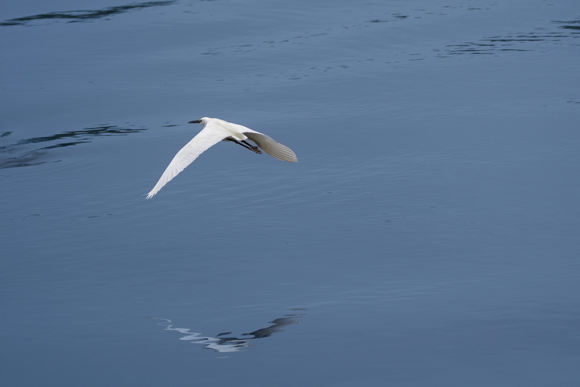
Hi @age, thanks for sharing. I like this from the heart, but my head has an issue with the intensity of vignetting drop-off. In a counter-intuitive way, it’s because my eye keeps beings drawn into the brightness, I find myself deliberately going the other way and inspecting the darker areas closer. Bizarre! However if I obscure the rightmost portion leaving approx a square crop I find the vignetting helpful.
The vignette looks egg shaped directing the eye toward the right. If @age rounded or flattened it more, you might not have the problem. Example: if you placed the plane in this SVG on the other side of the cone, it wouldn’t look right.