Lets face it pixels are pushed all over the place with each module and slider added. For sure efforts should be made to avoid unwanted side effects. If I have a hazy image that needs more contrast or saturation then I will apply the dehaze filter… if it gives a nice pleasing result or a visual improvement I will use it…no way I am going to edit thinking about rgb ratio’s. I know the math is there and I know there are things that can introduce potential issues but even one of the most math anal guys, ie Aurelien says over and over in many video’s… just use your eyes… in the end I am not creating reproduction renders and I am not going out of my way to distort things but I never think twice about rgb ratios when using dehaze. I will use the default, if I like it keep it and if not I try my presets blended in lightness to see if I get the contrast bump with less change in saturation… if neither works I have a varitey of local contrast presets, a couple of tone curve presets in subtract mode and some D&S presets that I will try to hit the sweet spot… In the end for me its a pleasing blend of contrast and color that dictate what I will do and not rgb ratio’s… The good thing is that there are tools to help manage that sort of thing for those that might be or need to be that precise…
Some more image evaluations, this time with module settings. Sigmoid continues to impress. I need to get my color checker out and do some more quantitative comparisons but for now qualitative will have to do. There are times where it feels like I spend an inordinate amount of time bouncing from Filmic to Color Balance RGB to Tone Equalizer on those edits as once I change one setting I have to tweak another, Sigmoid seems simpler in that regard. I’ve also done some comparisons with Filmic v5 and Filmic v6. These are also Nikon NEF files instead of Fuji RAF files like from the post above. I find I like the way Sigmoid handles reds and more gracefully goes to white with blown out backgrounds with less tweaking than Filmic needs.
I find for me the reason I am using v5 is for the look I can get with no for preservation, some amount of latitude and mid tone sat with v5 as the added control or benefit to using it instead of v6 and of course it doesn’t have the gamut clamping so I think its not surprising at least at first glance that there is not a lot to choose between those in these particular examples since you kept the settings pretty similar for the two…
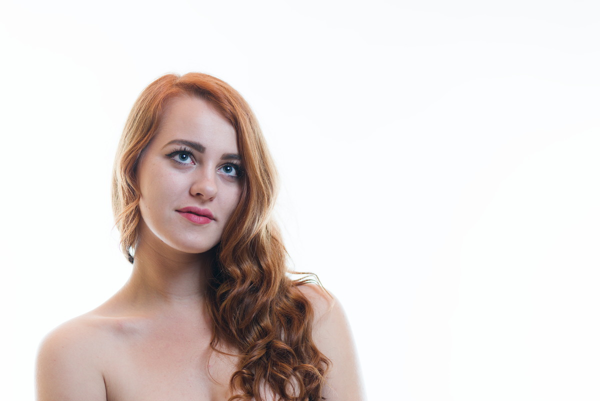
Is the girl masked… the border between background and her outline is quite different … I was wondering if that was down to the tone mappers or a slight difference in processing or exposure?? You can see it on for example her hair or arm when you toggle through the images…
Good catch! No masking, just fly away hairs on a blown out background. In Filmic I trimmed in the white exposure point along with some Tone Equalizer to have them disappear. If you bring the skew in Sigmoid over more to the right and tweak Tone Equalizer a bit the ghost effect disappears. Still learning Sigmoid workflow. If I were shipping these out again (these images are several years old) I’d remove those with the GIMP or Krita. What’s funny is they aren’t near as visible in darktable with the RAW just on the resized output JPG. Intentionally blown out backgrounds seem to be a struggle point for a few tone mappers.
Could you share the portrait image (or any other intentionally “blown out image”) here or with me? It’s a good case for when the design of converging to white doesn’t perfectly align with the intention of the artist! I would like to do some tests to see if I can make a recommendation for this thread and later the manual.
It is a shame that the 2 concepts do not sit under the same ‘hat’. They both have differing strengths and I find myself messing about with each in order to feel comfortable with the end result. … bit of an unfortunate waste of time, I am never really sure which solution is going to best fit the image needs.
Maybe some of filmic’s options should migrate into sigmoid!
Personally, I’m quite happy having two separate options - filmic already had too many options in it, IMO. (not complaining, just thinking aloud!)
I suppose it wouldn’t hurt sigmoid to have slightly more control in some way, thinking highlight gradation especially, but I’m not sure whether that is something that could be incorporated into it’s function in a sensible way.
I’m quite happy anyway
I think you can match them most times… filmic just can have a bit more tweaking but then that gives it a few more options… the strength I think of sigmoid is that for many I think a fixed setting will serve as a good basic tone mapper without fiddling and people will finish the image with other modules… In many cases I think AP felt this should be the way to use filmic but because it had extra sliders people feel the need to keep tweaking… When you go through many play raw files its amazing the number of nice edits and people have not even bothered to adjust the white and black points from the defaults… I think speed and simplicity will be the real strength of the sigmoid module and cluttering or complicating it in any way could potentially remove that feature.
@123sg There was a discussion on ways @jandren could approach the module a third of the way in the original thread. At the time, there was much “hesitancy” on sigmoid, so he decided to make it a simple proof-of-concept module. I (and others) cheered him on: here we are now.
Thanks for the info Alan. I’m not sure if I read that bit… but in any case I’m really happy with how it turned out. I hope my post above didn’t sound critical - it certainly wasn’t my intention Well done to all involved!
Hello, thanks for the very nice module, been using it since yesterday and had some nice results with nice lights popping.
I was revisiting this old picture i first developed with filmic, and i noticed that using sigmoid defaults, the sky was very desaturated. Then using “rgb ratio” color processing the blue came back. I don’t know if thats an intended behavior, I’m ok with this, but i also havent easily found an explanation of the difference between “per channel” and “rgb ratio” (on the github merge page there are pages refering to this but it’s more on the technical side). I wanted to understand a bit more directly how to use those two color processing modes, or if its just “experience and trial and error”. But maybe it’ll be in the docs. Sorry if this question has already been adressed or is common knowledge but haven’t found easily information.


 I hope my post above didn’t sound critical - it certainly wasn’t my intention
  Well done to all involved!