Thank you to Phil, Sridhar, Luis, Kevin, and Andreas S for working with me on the release. As always, thanks to my wife Alison and our cat Lizzie for their support.
I would like to give a talk at LGM in Rennes in May 2021 and run an afternoon work-shop to talk about the book. I will be 70 in January and will retire after LGM 2021.
I hope the Community at LGM 2021 will discuss the future of Exiv2.
Thank you for your dedication to the community!
The book looks great, and I have learned so much on a brief vitual flick through the pages.
Retirement is a very fluid concept these days, hmmm?
Thanks, once again.
@clanmills Thank you for your continued motivation and work on a great library!
I think your book looks wonderful, great stuff there. That’ll be a good read for the upcoming holidays.
After reading your “Making this book” section, I had two questions:
Is the PDF version you mention available somewhere?
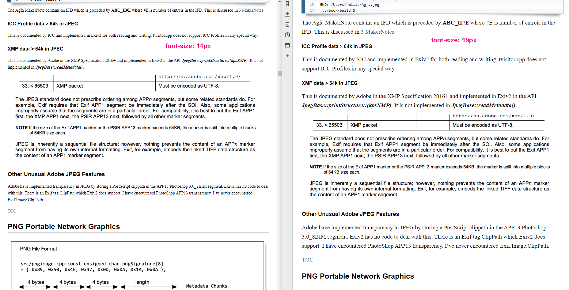
One tiny suggestion, could you please increase the default font size? On mobile things are nicely readible, probably due to some auto-scaling, but on my pc I find the Palatino 14 px serifed font much too small, even for my simple HD monitor. I think 16px would be the bare minimum, but even setting it to 20px doesn’t hurt imho.
Write some JavaScript to modify the font “on the fly”.
I don’t want to start a new software project to do dynamic book publishing. Perhaps ebook readers can do this kind of thing, however I don’t know anything about them.
I’ve thought of another way to deal with this. The code for the book is at:
svn://dev.exiv2.org/svn/team/book
Get the MacDown.app application for the Mac. You can change the style sheets. I modified GitHub2.css into Exiv2.css (to use Palatino) and it’s in the repos. If you’re not on a Mac, there are probably good MarkDown tools for your platform.
Typesetting is a big rabbit hole. I don’t want to push anything, but if you want to try for yourself here’s a patch I tested:
On line 14, change "font-size: 14px" to "font-size: 18px"
On line 318, add before "body { font-size: 11.5pt; }"
The first line changes the font size for normal screens, the second line changes it for printing conditions. I hope this is not what you mean when you stated in your beautiful document “When somebody provides a patch, they seldom provide test code, (…) The feature is often incomplete.”
I haven’t understood what issue this solves. Can you send a screen shot or something to explain why this should be changed.
I have a MacMini with a large monitor (3840x2160 pixels), a MacBook Pro (2560x1600) and a Samsung Tablet. The book looks really nice on them all. I was a little disappointed with it on my son’s iPhone, however it looks great on his iPad.
I looked at the book this morning in various browsers and simply using cmd+ to “magnify” seems to work well, although I’m happy with the “out of the box” appearance.
My comments about people sending incomplete patches refer to C++ code. I can back up my words with links to PRs which ultimately could not be accepted. I can also think of one patch which I wasn’t sure was needed and subsequently cost me a great deal of time. I’m sure the original contributor was unaware of the build and other platform issues that ended up on my back.
I opened the PDF and viewed in 1366x and 1920x at 200% zoom. I think it is a problem with the font itself. I am half your age and have good eyes but I find my eye straining. Anyway, good work!
Just offering you my thoughts, not telling you what to do. I don’t mind what you decide. It is your work after all. (Personally, I prefer non-serif or light slab.)
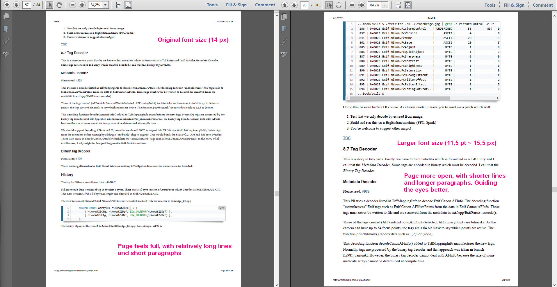
I’m going to change it. It’s pumped the book from 85 to 96 pages. However, I agree that it looks better because there isn’t so much text on a line and therefore easier to read. The text of the book and the graphics seem to be in better harmony.
I personally like serif for text, sans for titles and I’m happy with Consolas for code.
Strangely, I see MacDown is reluctant to change the style sheet. I’ll hit him about the head and face and he’ll surrender.
I’ve been blessed with very good eye-sight. It’s only the last couple of years that I have to wear glasses for working.
Thank You for your feedback. If you come to LGM, you’ll get a printed copy of the finished book. I’ll get 20 or 30 copied printed in B/W and bound at the local print shop.
While I was writing my reply to @afre, your missive arrived. You are both right and you’ve been very helpful and constructive. Thank You both for your input.
And if I don’t do exactly what you want, it’s because I haven’t totally understood. It’s not because I’m resisting your suggestions. So you are welcome to ask me again!
Thanks, that would be great. I looked today at Designrr and thought that looked really good.
Alison and I will be delighted if you (and your family) can visit/stay with us when you’re in Europe for LGM/2021. We’re 30km from Heathrow Airport in the beautiful County of Surrey.
I generally agree with @afre and @Thanatomanic. I looked at the document on my 15" laptop at 1920x1080, and was uncomfortable reading it at less than 200%.
For my eyes, which are still pretty good unless I’m tired, the Palatino font needs to be quite large in order to be easy to read. The small margins result in lines which are well over 100 characters long, which makes it harder for the eyes to pick up the start of the next line after the end of a line is reached.
About two years ago, I spent a great deal of time tuning the appearance of the manuals for the products I develop/support at work. We finally reached a consensus on Deja Vu Sans 10 point for a body font and Liberation Sans for headings. We used a left margin of 2", a right margin of 0.5", and outdented the headings 1.5". We also bumped the line spacing from single spaced to 1.15 lines. Lines are a comfortable length, and even the boring stuff I wrote myself is dead easy to read, even when tired.
Without a doubt, the number of pages will increase significantly. But how many people actually print hardcopy of manuals these days? Legibility is king.
The first point is a major one. I didn’t write about it but you did. Not only are the figure’s fonts larger but they are also heavier. Besides reducing the discrepancies in font properties, increasing the padding may also help.
I tend to set wrapping to 70 characters length when writing and then set it back to whatever is the expected afterwards. Line spacing is tricky. There are recommendations out there but it is mostly eyeballing and getting a relaxed compromise.
I am not a typesetter or copy editor. Just interested in everything as usual.
It’s 7:30am in England. I’m out of bed. The cat has jumped into bed with Alison. I’m full of enthusiasm to deal with this stuff.
I’m OK about changing the fonts if they are ubiquitous. Being an old PostScript guy, I like to stick to the 35 fonts we shipped in 1984! I know Google have been active in fonts (and everywhere else). Can I assume that Deja Vu Sans and Liberation Sans are available everywhere?
I had noticed that the graphics aren’t well matched to the text. Perhaps they should be rendered at higher resolution. I’ll have to investigate. I have tried to be consistent in my use of colours: Green for data, yellow for offsets. The drawings are “fruity”, however they are also “chunky”.
Would anybody like a screen-sharing session to eye-ball this together?


 I don’t mind what you decide. It is your work after all.
  (Personally, I prefer non-serif or light slab.)