I opened the PDF and viewed in 1366x and 1920x at 200% zoom. I think it is a problem with the font itself. I am half your age and have good eyes but I find my eye straining. Anyway, good work!
OK, Folks. What’s the conclusion? Should I change it?
Just offering you my thoughts, not telling you what to do.  I don’t mind what you decide. It is your work after all.
  (Personally, I prefer non-serif or light slab.)
Same for me! It’s supposed to be constructive criticism on readability of your document. Of course you can do whatever you think works best
A few of my thoughts visualized:

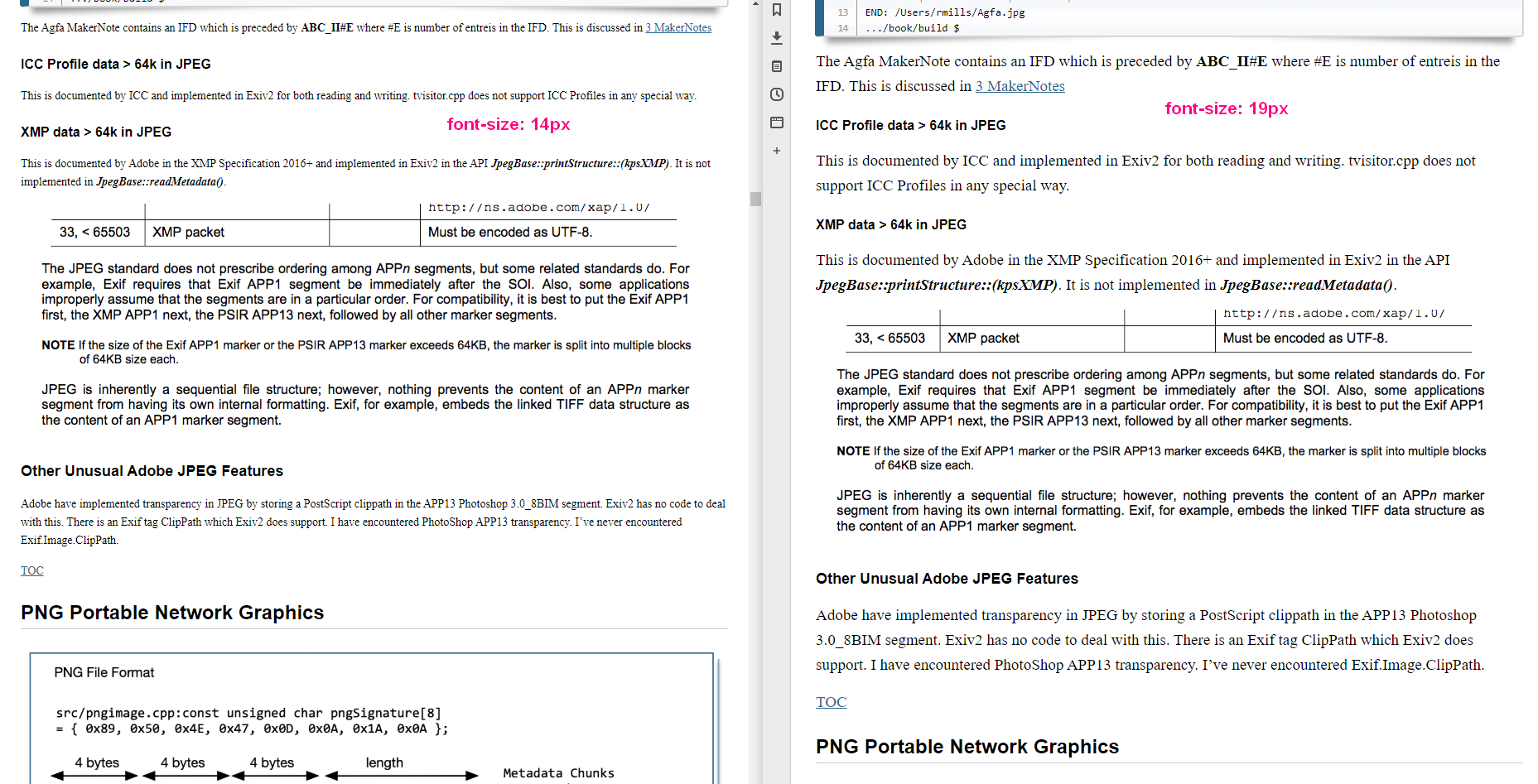
Side-by-side of the original and with a larger font. I find the larger font much faster / easier to read, even though it takes up more screen space.
Side-by-side of the PDF with a few thoughts again:
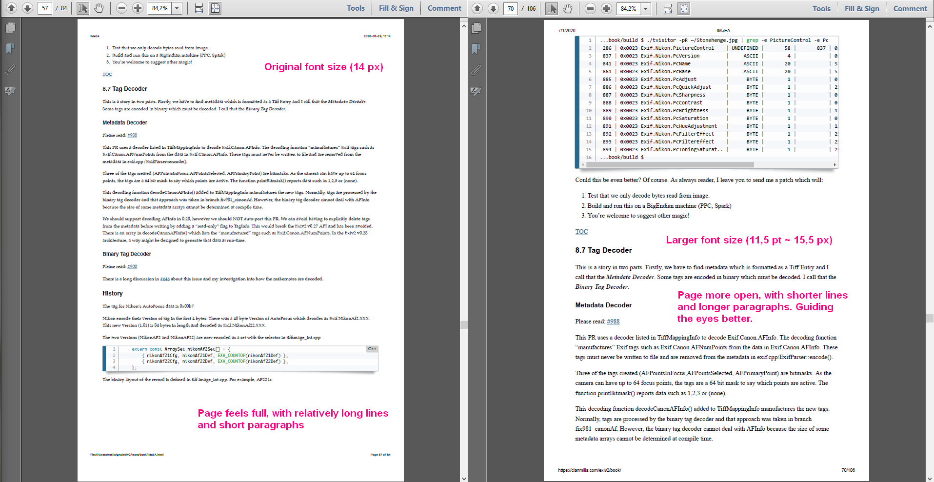
I’m going to change it. It’s pumped the book from 85 to 96 pages. However, I agree that it looks better because there isn’t so much text on a line and therefore easier to read. The text of the book and the graphics seem to be in better harmony.
I personally like serif for text, sans for titles and I’m happy with Consolas for code.
Strangely, I see MacDown is reluctant to change the style sheet. I’ll hit him about the head and face and he’ll surrender.
I’ve been blessed with very good eye-sight. It’s only the last couple of years that I have to wear glasses for working.
Thank You for your feedback. If you come to LGM, you’ll get a printed copy of the finished book. I’ll get 20 or 30 copied printed in B/W and bound at the local print shop.
Thank You @Thanatomanic for such a solid reply.
While I was writing my reply to @afre, your missive arrived. You are both right and you’ve been very helpful and constructive. Thank You both for your input.
And if I don’t do exactly what you want, it’s because I haven’t totally understood. It’s not because I’m resisting your suggestions. So you are welcome to ask me again!
1 Like
@clanmills I can take a look at the book source and can probably get some automated production of HTML, epub, and PDF if you’d like.
Thanks, that would be great. I looked today at Designrr and thought that looked really good.
Alison and I will be delighted if you (and your family) can visit/stay with us when you’re in Europe for LGM/2021. We’re 30km from Heathrow Airport in the beautiful County of Surrey.
I generally agree with @afre and @Thanatomanic. I looked at the document on my 15" laptop at 1920x1080, and was uncomfortable reading it at less than 200%.
For my eyes, which are still pretty good unless I’m tired, the Palatino font needs to be quite large in order to be easy to read. The small margins result in lines which are well over 100 characters long, which makes it harder for the eyes to pick up the start of the next line after the end of a line is reached.
About two years ago, I spent a great deal of time tuning the appearance of the manuals for the products I develop/support at work. We finally reached a consensus on Deja Vu Sans 10 point for a body font and Liberation Sans for headings. We used a left margin of 2", a right margin of 0.5", and outdented the headings 1.5". We also bumped the line spacing from single spaced to 1.15 lines. Lines are a comfortable length, and even the boring stuff I wrote myself is dead easy to read, even when tired.
Without a doubt, the number of pages will increase significantly. But how many people actually print hardcopy of manuals these days? Legibility is king.
The first point is a major one. I didn’t write about it but you did. ![]() Not only are the figure’s fonts larger but they are also heavier. Besides reducing the discrepancies in font properties, increasing the padding may also help.
Not only are the figure’s fonts larger but they are also heavier. Besides reducing the discrepancies in font properties, increasing the padding may also help.
I tend to set wrapping to 70 characters length when writing and then set it back to whatever is the expected afterwards. Line spacing is tricky. There are recommendations out there but it is mostly eyeballing and getting a relaxed compromise.
I am not a typesetter or copy editor. Just interested in everything as usual. ![]()
It’s 7:30am in England. I’m out of bed. The cat has jumped into bed with Alison. I’m full of enthusiasm to deal with this stuff.
I’m OK about changing the fonts if they are ubiquitous. Being an old PostScript guy, I like to stick to the 35 fonts we shipped in 1984! I know Google have been active in fonts (and everywhere else). Can I assume that Deja Vu Sans and Liberation Sans are available everywhere?
I had noticed that the graphics aren’t well matched to the text. Perhaps they should be rendered at higher resolution. I’ll have to investigate. I have tried to be consistent in my use of colours: Green for data, yellow for offsets. The drawings are “fruity”, however they are also “chunky”.
Would anybody like a screen-sharing session to eye-ball this together?
BTW. You’ll all get a mention in the book. Thank You very much for your thoughts and ideas. Very helpful.
Folks: This is all very helpful. I really appreciate the screen shots by @Thanatomanic which really explain your ideas. A picture is worth a million words.
I will not fuss about the user experience on a phone or paper. The tablet/laptop/computer experience is the target.
I’ve increased the text to 18px, and the code snippets to 15.5. The lines are shorter and easier to read. When I mention an API, I use bold Helvetica/sans. It’s less effort to digest. I’m going to keep the Palatino as I much prefer a serif font for body text. I think this look nice on-line and on the tablet.
Having pumped up the text, I only get about 40 lines of code snippets per A4 page. I can get that back to 60 using my fake 275x389mm page and get the macOS print system to scale it to A4. So I think that will print nicely. I intend to get it printed on B5 which is about 250x180mm (10"x7").
The text in the drawings looks small compared with the body and code snippets. I’m not sure what to do about that. Suggestions welcome. I’ll update the on-line PDF and html later today.
You can understand my surprise at this discussion. I thought I had dealt with the publishing challenges. I’ve had no feedback about the content of the book, however those bug reports will arrive later!
“Best” font, font size, line spacing, column width?
They all interact. Here is a tool to show what happens when you alter the parameters:
Have fun!
Claes in Lund, Sweden
1 Like
I’m not sure that I’ve understood what GRT is telling me. I know about the Golden Ratio - it’s something like 1.59 and very important in Architecture. When things are subdivided that way, they look right.
I’ve reluctantly decided to drop the Palatino to make the Table of Contents look better. I don’t like body text in sans-serif (Helvetica, Arial etc…), however I’ll use it. The text lines are too long. Usually about 100 bytes per line. If I make the screen font bigger, the print will be huge. Can’t change one thing without disturbing everything else.
Why don’t we shift focus to the actual text.
Folks
I’ve spent most of today on this matter and concluded that I am in an ambush. We’re discussing how to convert markdown into PDF and now we’re in the in the land of typography. HTML version looks fine on my tablet and computers. The PDF has long lines and short paragraphs. Only a few copies of the book will ever exist on paper and I will pick up the bill to pay for printing.
The purpose of the book is to enable me to retire. I have written a simplified version of Exiv2 in 1500 lines of C++ to make it as painless as possible for somebody to learn quickly how Exiv2 works. I hope somebody will maintain Exiv2 in future, or (even better) write a nice new/clean metadata library.
I released the current text to coincide with shipping Exiv2 v0.27.3 to spec and on schedule on 2020-06-30.
There are about 14 undocumented image formats in the book and about 20 sub-sections with the text “To be written.”. It’s my task to complete the substance of the book. And it’s a distraction to discuss how to create the best possible PDF. I have found and documented a method. If somebody would like to polish and improve that method, or work on another method, I will not oppose them. However my aim is to complete the book and retire.
Thank You to everybody who has contributed to this discussion. Your enthusiasm and helpful suggestions are appreciated.
@paperdigits Can you lock this discussion, or at least check “unfollow” so that I can focus on my project to document Exiv2 and retire.
2 Likes
Apologies for being so pedantic. There is always reader mode. (Oh no, it starts at section 8…)

Good luck!
Reader mode? That’s a browser thing, right? You know Perl’s TimWoody - There’s more than one way to do it! My version is Twittie: “there always another way that doesn’t work!”
1 Like