There is a distinct difference in the color shade and sharpness of this red flower between how it appears within RT on the screen and the exported jpeg (or tif or png). Wondering why this may be happening…
RT 5.8 under Ubuntu. (Never calibrated my laptop screen and haven’t touched any color profiles.)
Edit…the reds are out of gamut so I guess there must be a difference between display and output gamut handling…if you use a different model for the tone curve other than film a couple were closer but still different
I just loaded it in DT with no adjustments and I don’t see this oversaturated preview so I think it might be the camera profile and or curve used by RT driving those colors …here from DT (screen shot of preview) you can see it is fine and not like the RT result…
I must admit that I am less than a newbie as far as color/profiles/gamuts are concerned so need to spend time on your analysis, but I do “feel” your analysis may be closer to what the answer would be …
I have another question: are those viewers (Mate, GNOME, shotwell) color managed? i.e. are they able to take into account the ICC color profile that can be enbedded in a photo?
At least Geeqie (FOSS) and XnviewMP (free but not FOSS) are.
What is puzzling is that in two sites listing viewers for Linux (learnubuntumate and image-viewers-Linux) they never speak about color management!
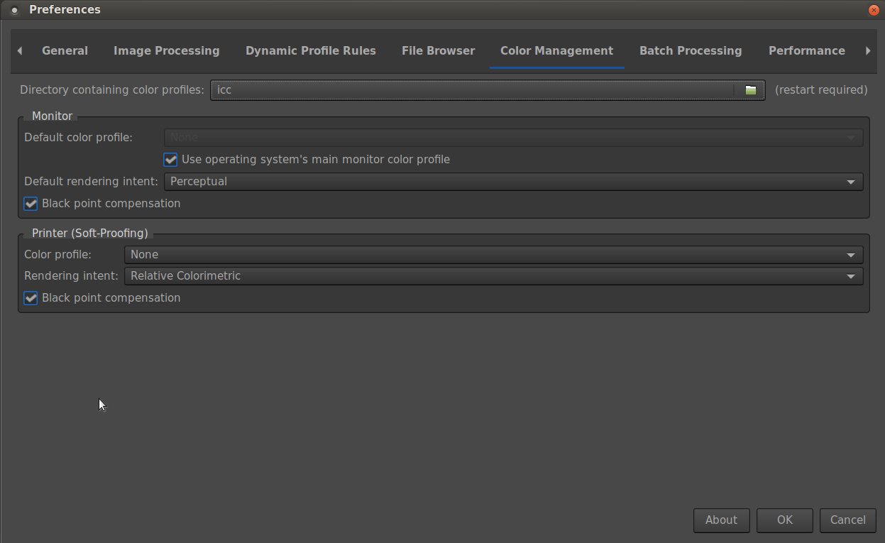
If you have calibrated your monitor you end up with an icc file. The screen-shot you show above is where you tell RawTherapee where to find this and how to handle this profile (the monitor part, ignore the Printer part). If you do not have a calibrated monitor leave the defaults as they are.
Input, working and output profiles for a RAW are set in the Colour tab and then the Colour Management section. Here’s an example.
In general you do not mess with the working profile. ProPhoto is nice and big and suffices in just about all the cases.
Unless you have a specific profile for your camera(s), as shown in the example I posted, you can leave the Input Profile mostly alone. If available you can try to see if the Auto-matched camera profile gives a better result then the Camera standard
The output profile is a bit different: RTv4_sRGB is a good one if you post your images on-line, it is a “small” colour space though. You might want to change that to ProPhoto if you want to do some work later on in say GIMP or Krita or Photoshop. You want to do this because ProPhoto is big and so you do not loose anything going from one editor to the next.
EDIT: I did not mention the Abstract Profile part. Ignore that section for now. You can do some rather interesting things with it, but it will only confuse and complicate if colour profile knowledge isn’t present. It might even be questionable if this section should actually be seen as colour management (It’s colour manipulation, not management). I did include a link to the documentation, just in case.
And if you’re curious about all that color management «thing», you may wish to translate and read the Spanish version of the Color management documentation, which is more up to date, complete and explained from a user point of view.
Note that in that page there’s no mention to the Abstract profiles part, though.
If you don’t make a calibrated display profile and insert it in the proper places, you really can’t count on your display showing any consistent color. Absent that, if you KNOW your display is close to sRGB or some other export profile, you might get away with use that as a display profile, but that’s not going to totally eliminate fine-grained questions. I’m doing just that on the tablet with which I’m typing this, but for any serious color work I go back to my desktop computer with the proper display profiles.
Edit: Oh gee, I’m not really “serious” about any of this…
Thanks @Jade_NL. That is helpful. I see that I am using the default rtv4_sRGB. The default output profiles does not show ProPhoto but rawpedia mentions ‘xxx Large’ as being similar to ProPhoto. That should be adequate for a non-professional small-screen photographer like me I suppose.
On the main issue I discovered this - if I disable the color toning mask (and instead change say global saturation just for trial) the jpeg output quite closely resembles the RT Preview. Alternatively If I use local adjustments in Dev to fine tune the red color, the jpeg is good and matches the RT preview. So perhaps I used the color toning mask improperly somehow that has made the image rendering go in an abnormal direction? If correct, then it may explain why just this picture faced this issue. Of course why the RT preview remains unaffected is still a question. Based on this I guess the cause may not involve color profiles.
As you probably should. This is the default for good reason and except for special cases (I mentioned one of those) there’s really no need to change this. Your colour “issue” isn’t caused by this.
I just had a look at your RAW+pp3: Three things are playing here that push things way too far:
You applied a Standard Film Curve.
The Tone Mapping setting is rather extreme.
The Colour Tonig module is pushed relatively hard in a rather small area (the mask).
These three combined, especially the last 2, push RawTherapee to a not-to-be-used-like-this point. RawTherapee does not protect the user from extreme settings, it tries to do what you ask but you might end up with unwanted/ugly results.
In this case you are pushing about half the image out-of-gamut. RawTherapee might be able to show you a (somewhat reasonable) interpretation while you are editing, but once you export this and open it in another viewer you might be in for a surprise.
So, your conclusions (not involve color profiles and made the image rendering go in an abnormal direction) are basically correct. You need to be a bit more subtle when editing and massaging the image into what you want.


 so need to spend time on your analysis, but I do “feel” your analysis may be closer to what the answer would be …