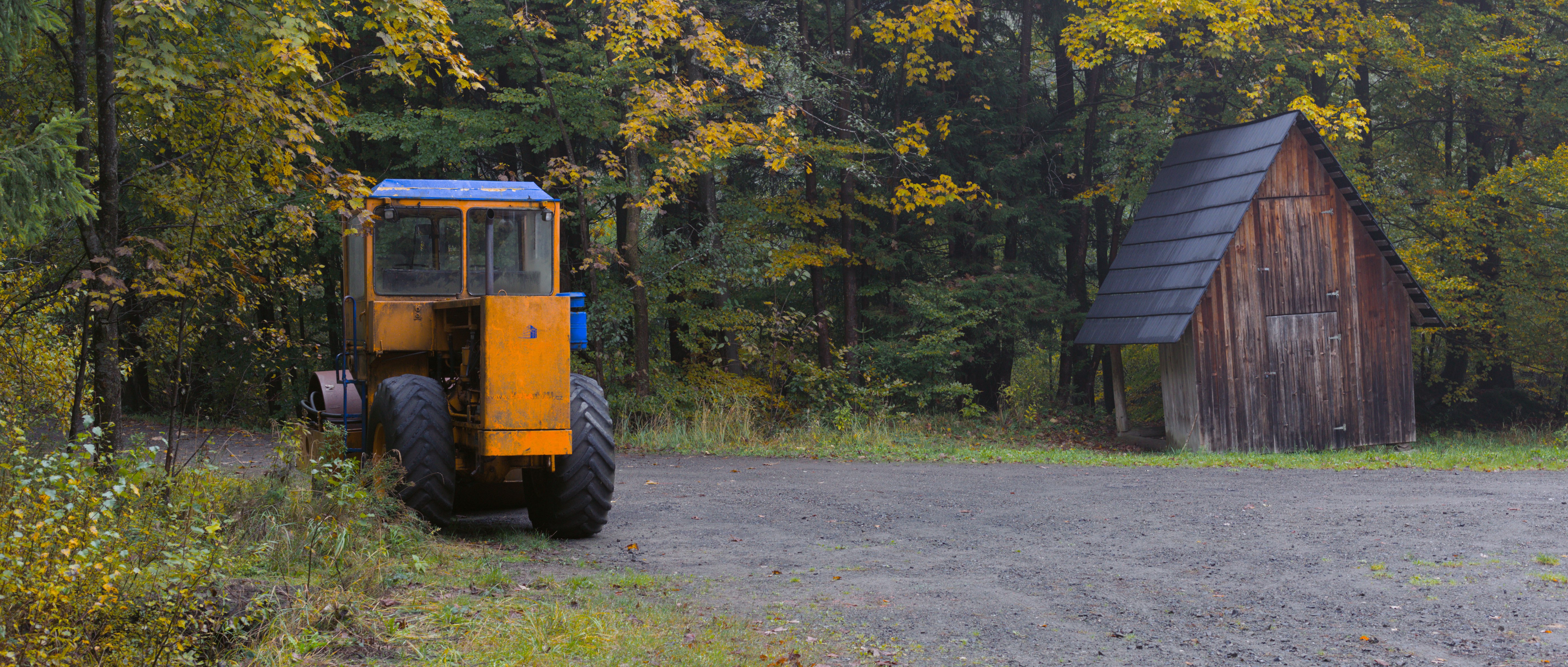
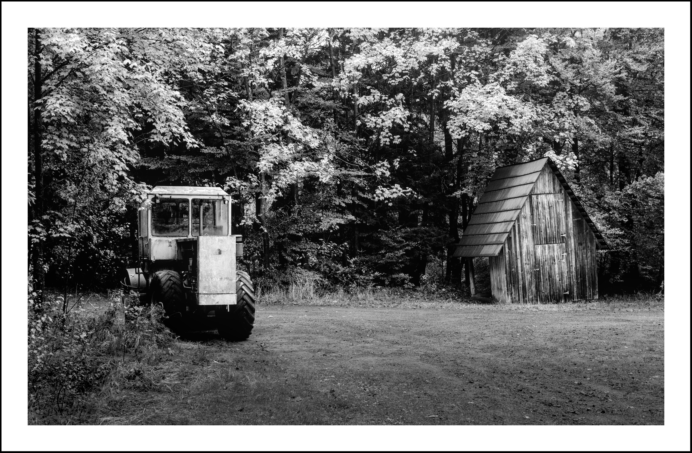
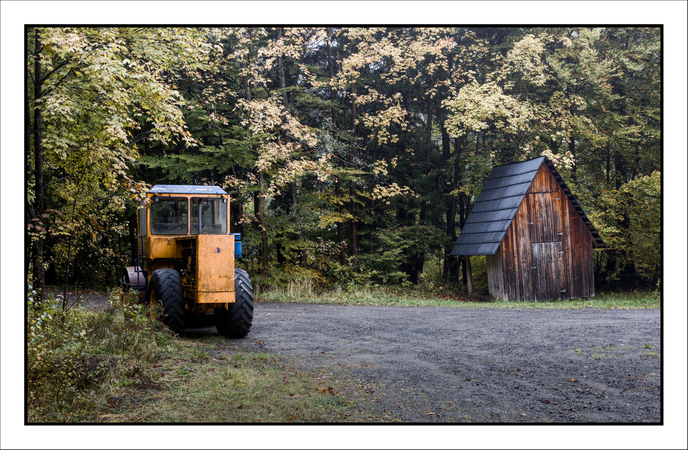
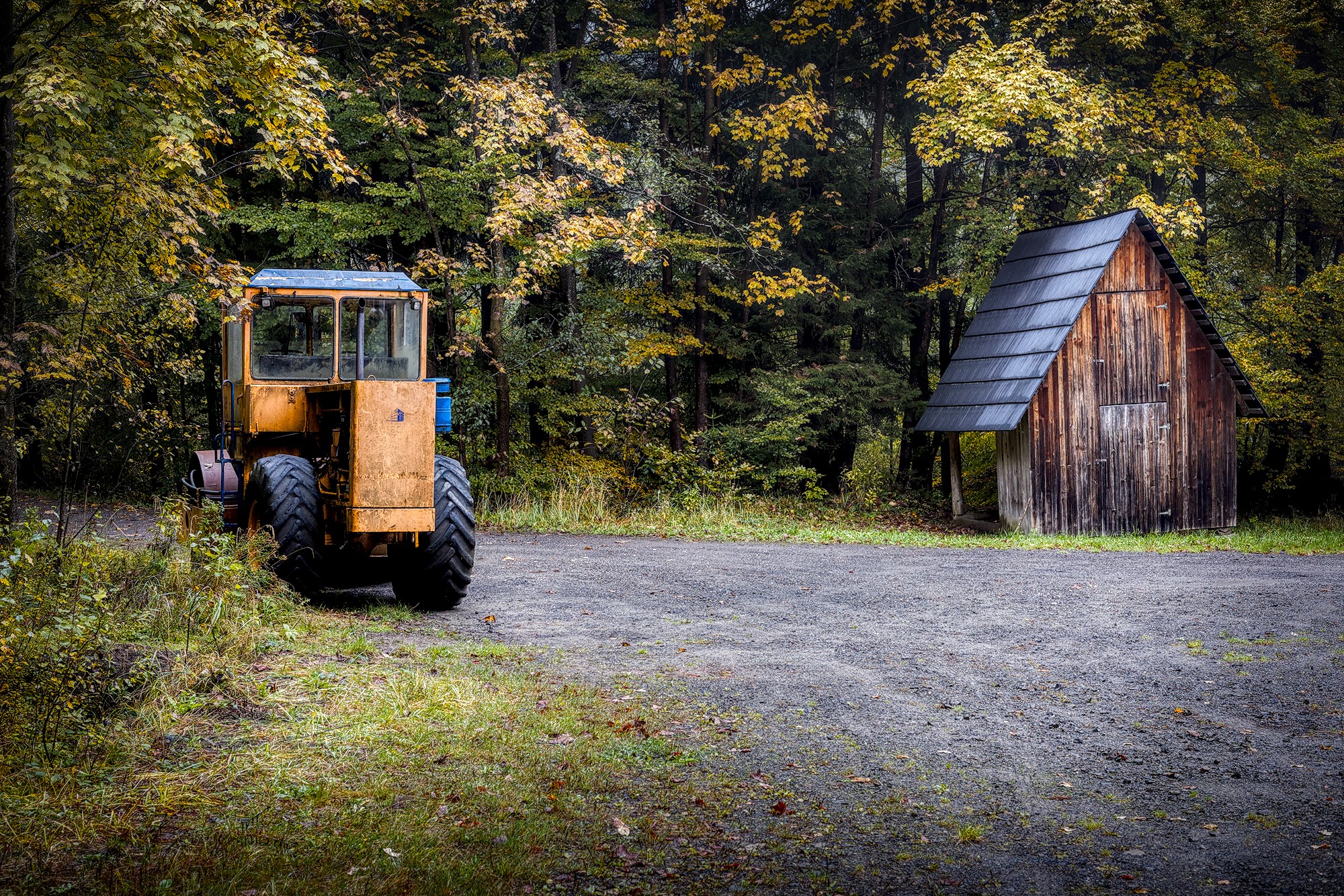
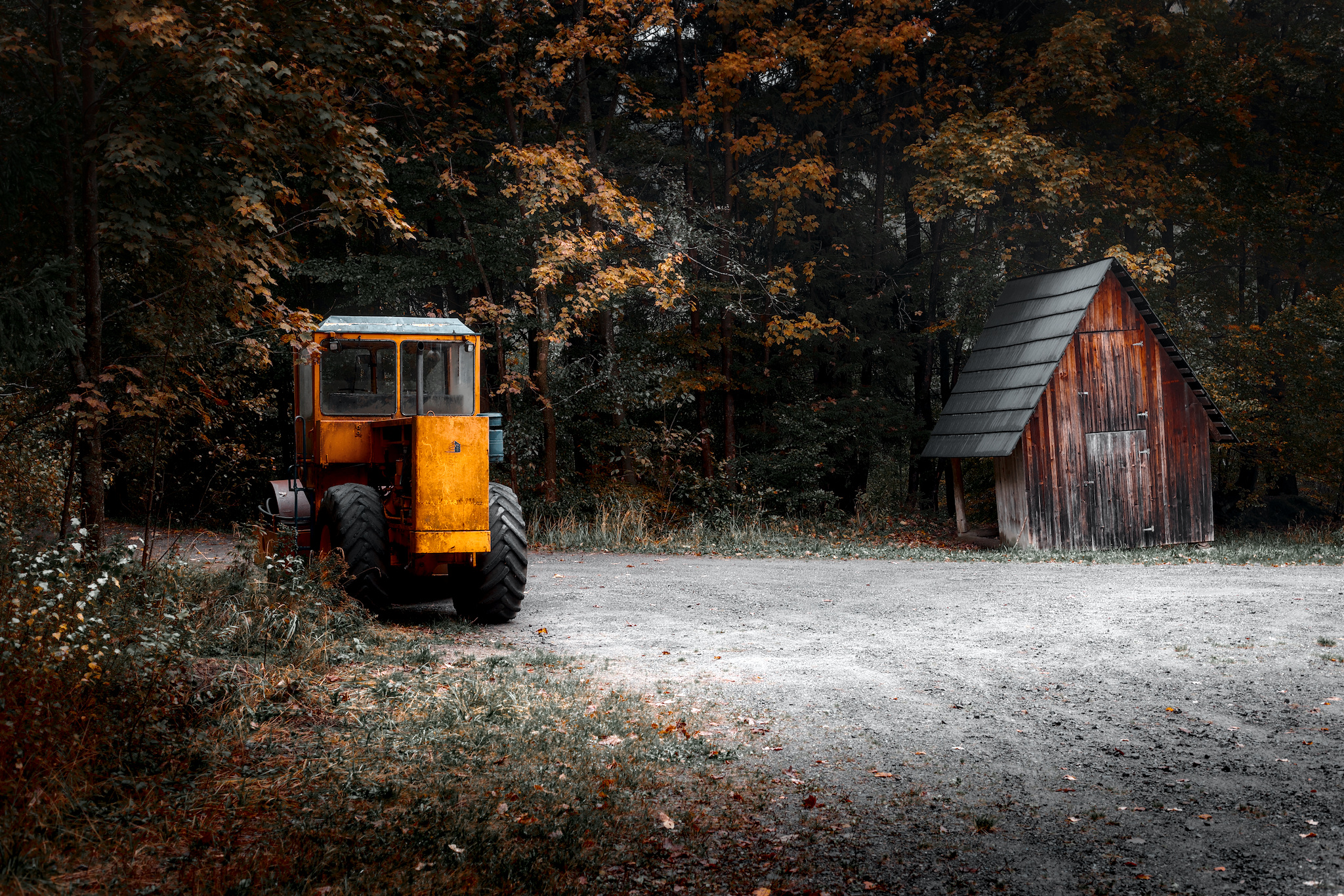
I’m quite satisfied with the final result. I cropped the image to give it a more cinematic feel and to emphasize the main subjects. I also boosted the yellow/orange and blue tones to bring out the vintage steam roller.
I’d really appreciate your feedback:
How do you feel about the color grading — are the colors too saturated?
Would you approach this edit differently (e.g., adjust contrast, exposure, etc.)?
And one more question: when preparing a photo for print, do you edit it differently than when posting it online?
I am new to advanced photo editing, but I’ve been taking photos for a very long time. So I’m not the expert here, but I hope I have a grasp of the basics.
I found your raw file at the link, but somehow I missed finding your edits. That’s probably my fault. Anyway, one idea is to add “PlayRaw” to the category. You will be flooded with other interpretations of your image - and their sidecars to allow you to see what was done. This is a great online community.
About how I feel (which isn’t actually important): I might have increased exposure just a little. But I think the crop and the colors are great. You should be proud of your work here.
I’m preparing to start printing a few of my own digital images. Like editing, printing is also a big topic. I’d suggest you read up on monitor calibration and ICC profiles for your printing service (or your own printer, as the case may be).
Welcome to the forum. Participating in the PlayRaw category is a great option for learning. Maybe post this image there with an appropriate licence and see what others do with it. I do find the orange color in your edit very strong and dominating in the edit.
I’m thinking that, depending on the tone mapping, colors may desaturate with an increase in exposure. As you suggest, a PlayRaw might bring things to light.
That is a good article. But a new user may be at a bit of a disadvantage with respect to fine details of color grading.
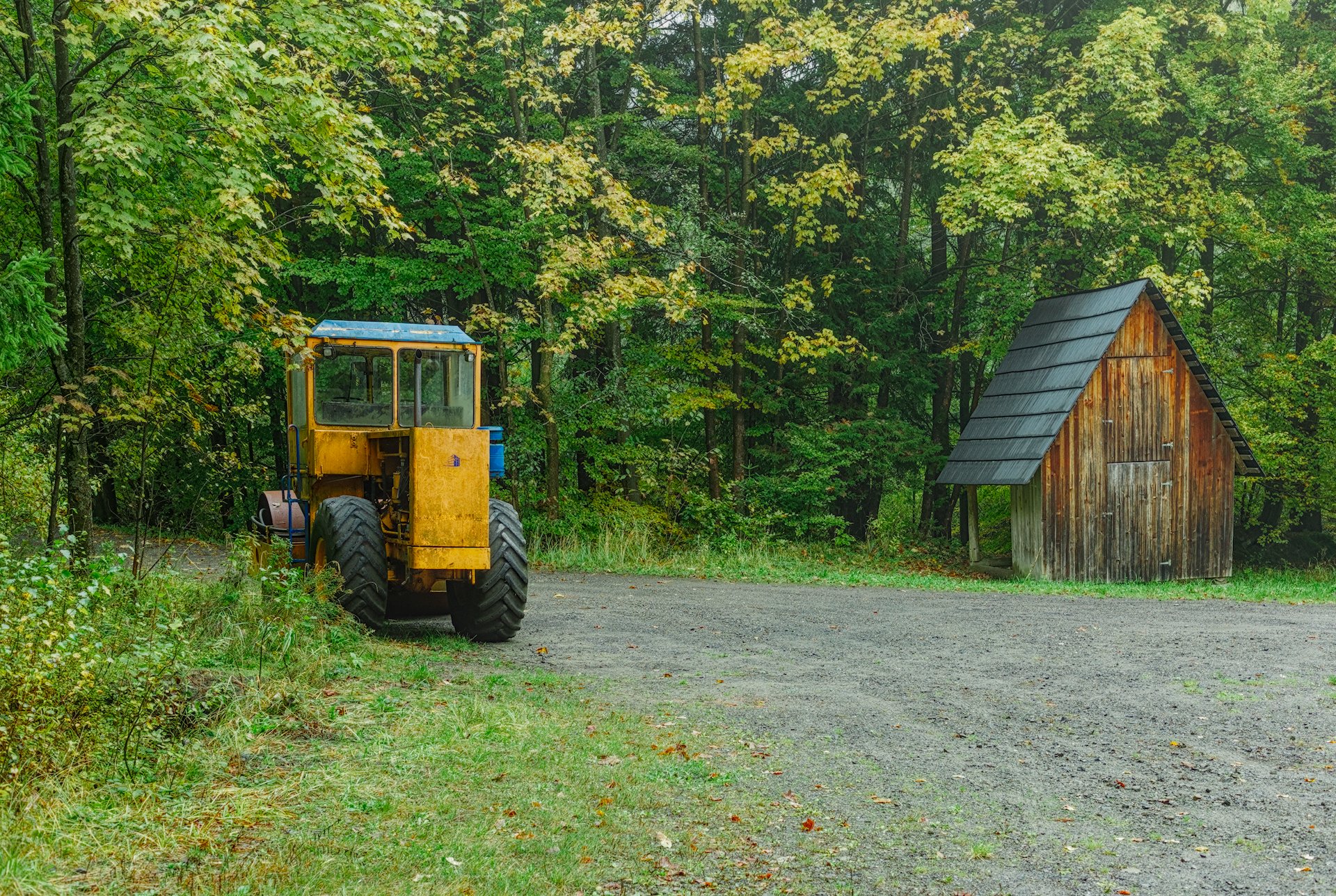
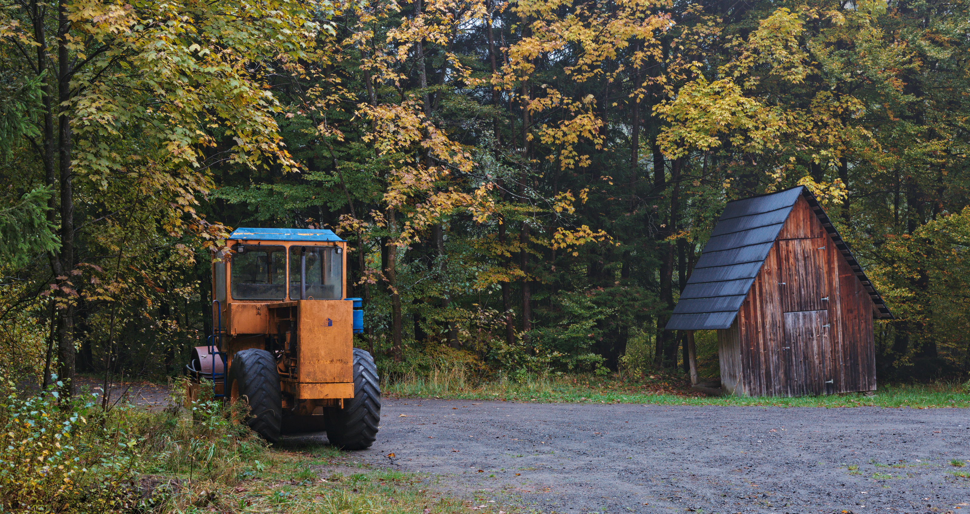
If, for example, I darken the exposure of the raw to about -0.1, and in Sigmoid select the recommended “smooth” preset, then crank up contrast and skew in this module, I get almost the same colors and tone as you see here. So, without intending to color grade, I have done just that.
The “smooth” preset rotates and attenuates the primaries, and increasing contrast and skew enhances the shifted colors. It’s not intended to be used that way, I think, but it can be tempting to crank up the color contrast and skew for that “pop.” I’m sure you might go in a different direction with an edit, but of course you have years of good experience and technical skill/insight.
I often do similar things (as above) in my edits, but with less contrast and skew, and I often tweak the primary rotation (especially blue) and attenuation (more red attenuation) to my taste. I’ll probably have a hard time adjusting to AgX…
I think this photo would be a fine candidate for a PlayRaw to give the OP a good sense of what folks here can do. And I think he did a better job than I did when I first started, and that it is a good edit of a nice photo.
Thank you guys for such a support! Sorry for confusion with my edits file, here it is. Since it seems that I cannot edit the original post, I will add the Play Raw tag here.
Welcome!
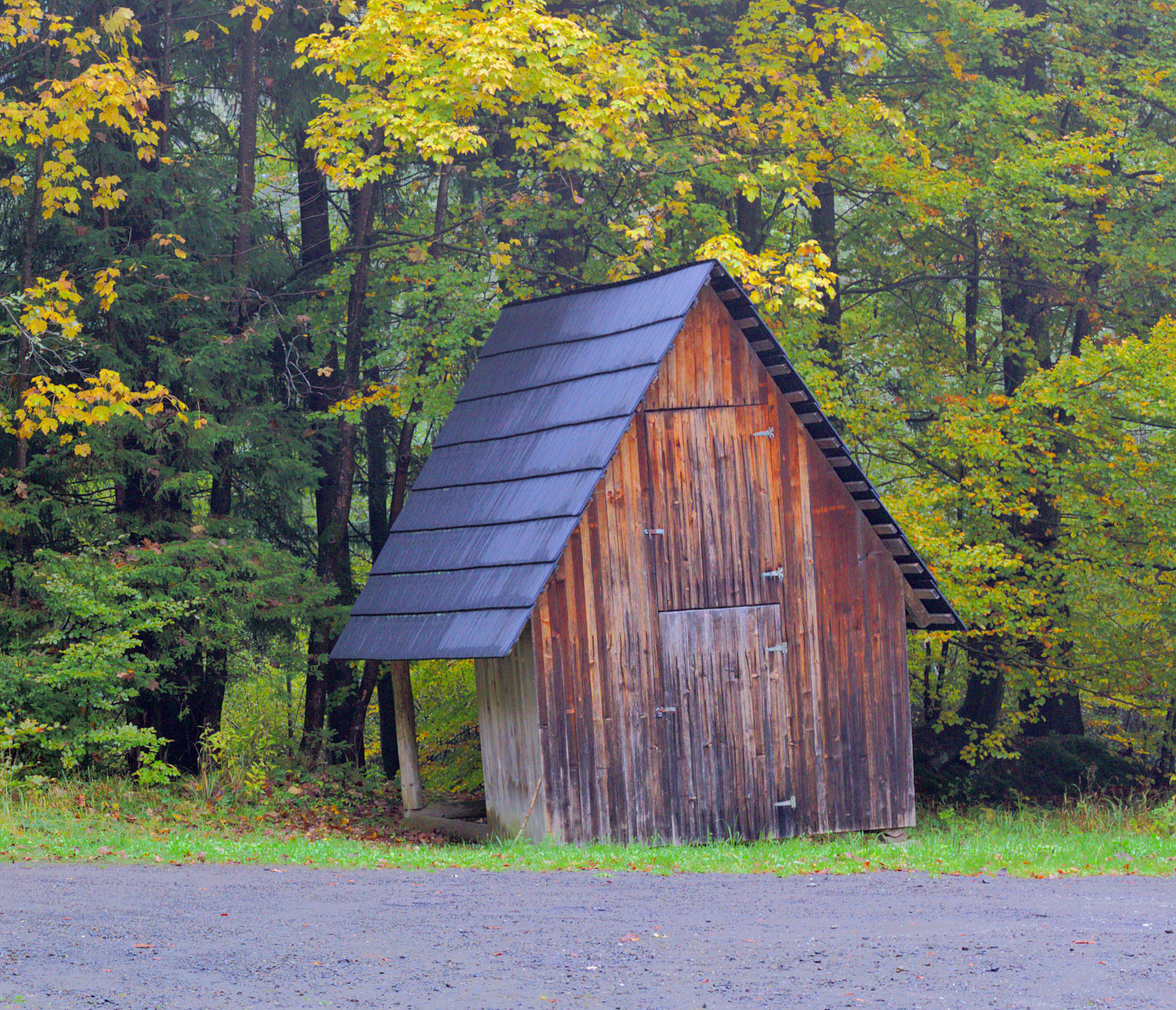
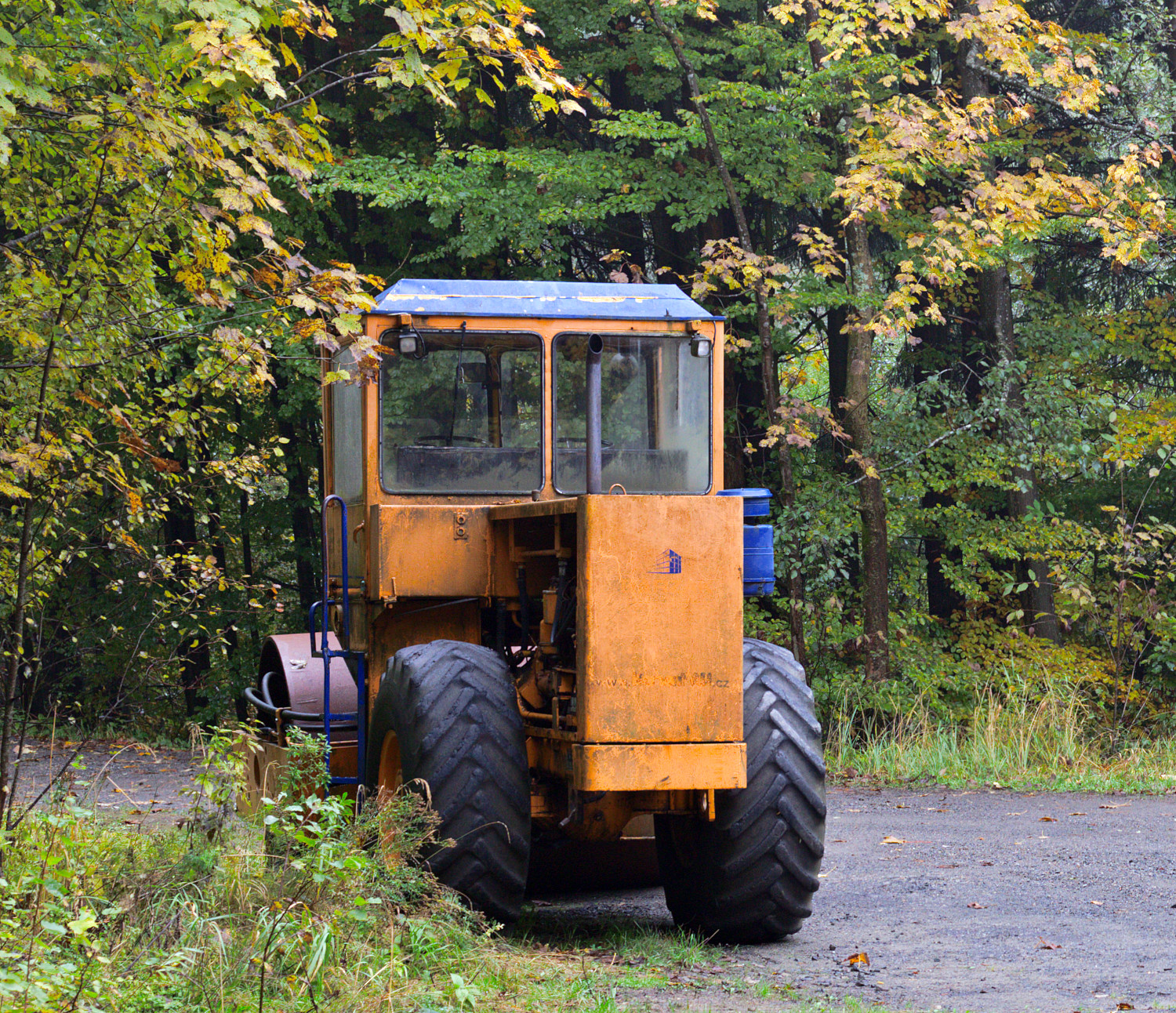
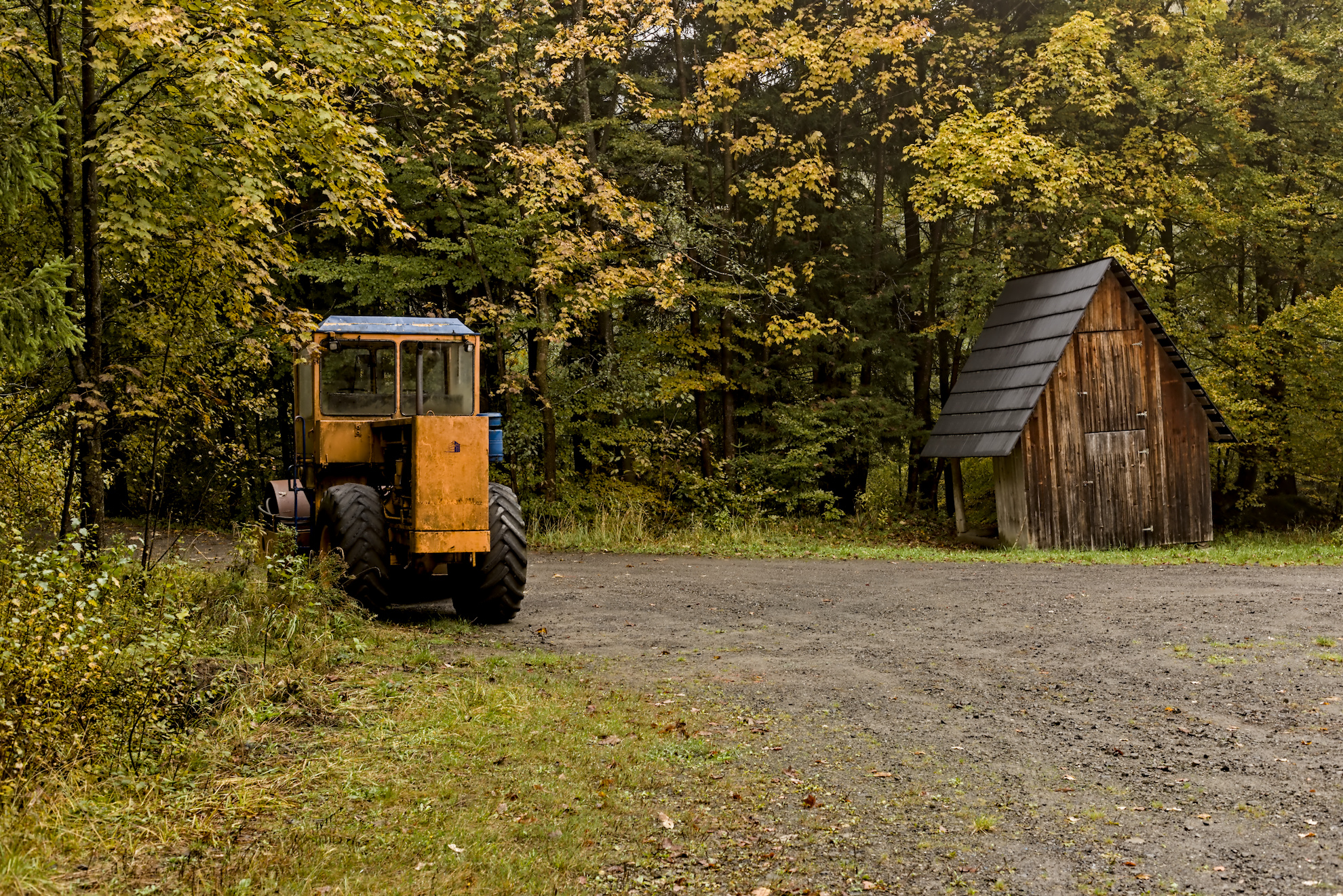
I am not qualified to comment on your processing, but I couldn’t resist the temptation to have a play in GIMP. I saw it as two images, the old hut and the road roller.
Colours all in all are not too saturated. but for me the yellow of the machine is a bit dominant compared to the rest of the photo.
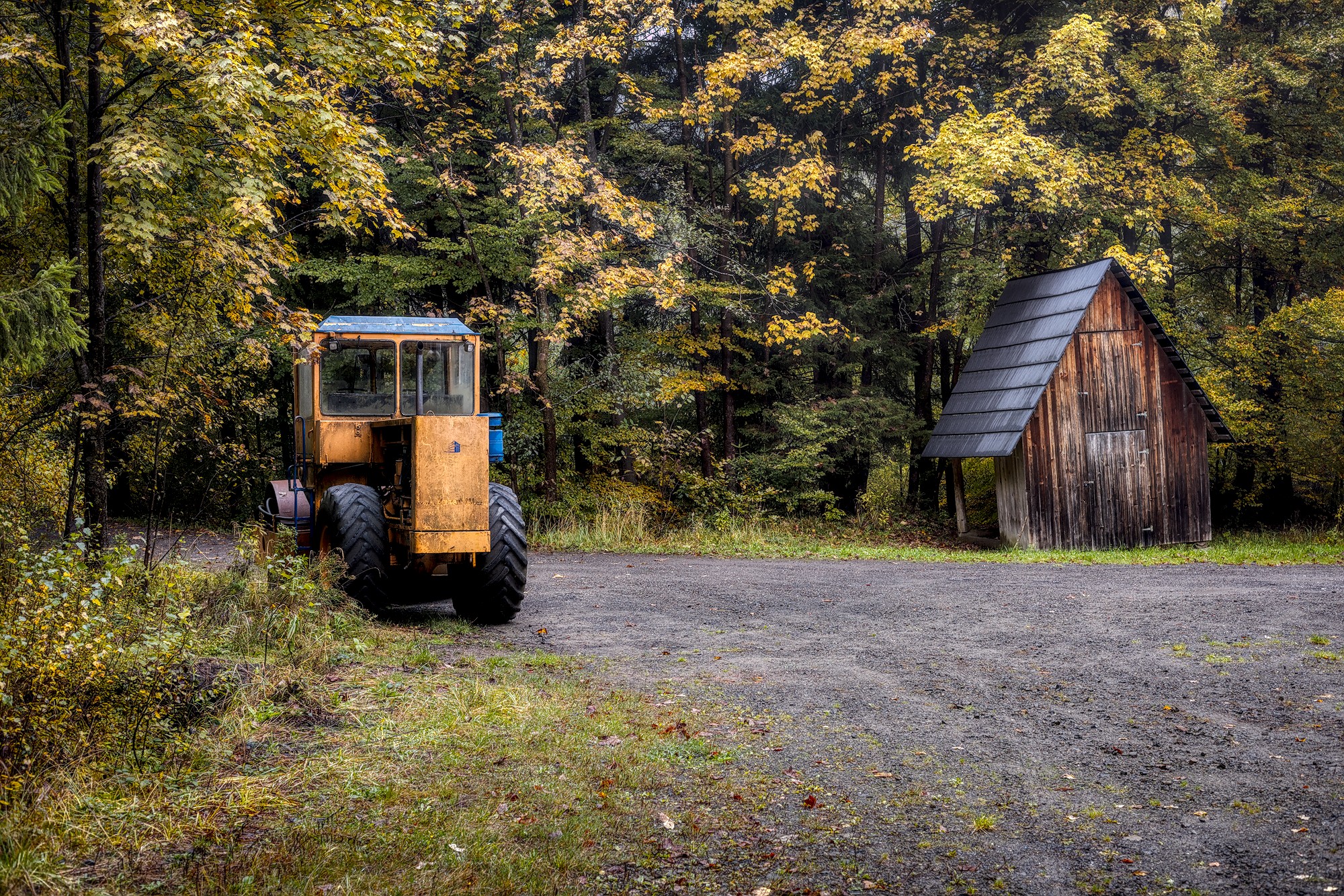
Yes, see below. For me the original format is more attractive. I think heavy contrasts and deep shadows are fitting quite good…
I can just speak for myself. Most of the time I treat pictures separately before I give them into a print process. Often I lift brightness a bit and I raise saturation. But I do it individually. A very bright picture doesn’t need further brightening. If a darker picture is hanging later on at a darker place, It’s definitively worth thinking about raising brightness. And then you have to think about the paper which is used. On a matte paper pictures usually look less brilliant. So there is no standard editing before printing.
I think you need some experience to be able to judge what have to be done.
For me, your questions should maybe start with questions to yourself:
What is my intent for taking this photo and composing it the way I did?
What is my intent while editing this photo?
In my final image, were my intentions met?
If your image is meant to convey the reality of the scene you saw while taking the photo, only you can judge the color grading…to a degree (others can probably give good input if your depiction of the scene is out of balance with others experiences of similar scenes, or if an image conforms to expected photography/art ‘norms’, etc.).
If your image is meant to convey an artistic interpretation of your experience, then it is only up to you as to whether or not your intent was met. (I usually fall into this category and treat nearly all images as a canvas for artistic expression, especially black and white renditions.)
Play Raw is a great place for seeing how others interpret the scene, and how they used darktable to create that interpretation.
For your image, I personally thought your crop was a bit tight on the top and bottom, so I kept mine a little closer to the original image (the original had a bit too much of the road, so I cropped some of that and kept the original space at the top; I darkened the road a bit as well to keep it less predominant). I thought there was too much space to the left, so I drew that left edge in a bit. Your edit seemed a little flat for my taste, so I added a bit more contrast. I enhanced the colors of the hut as I thought the hut was a bit lost in your edit and I wanted it to have a bit more prominence in the scene.
Do know that many of us on PIXLS.US are using versions of dt that incorporate the AgX module, and if you are not using that, you won’t be able to see our edits. For example, both of my edits use dt 5.3+556 nightly build.
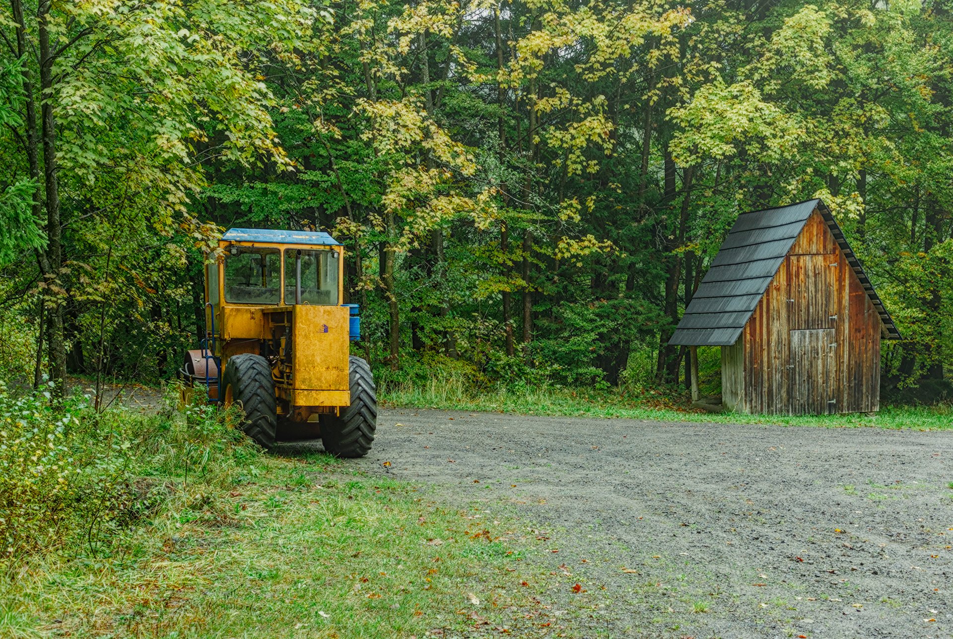
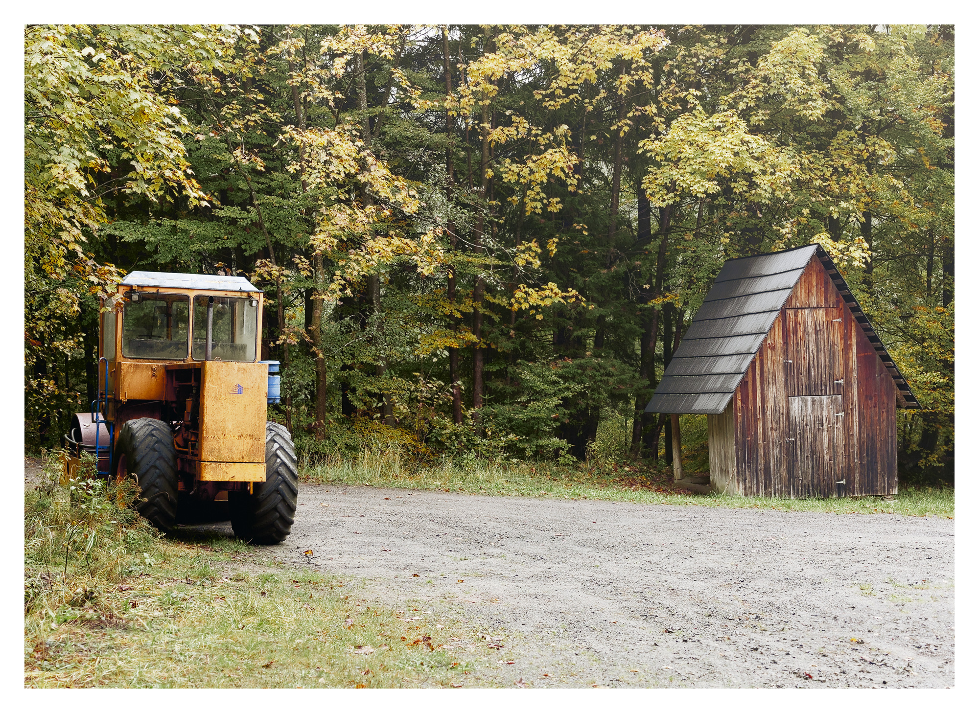
Here is my play. I thought the original colors from the raw were just great. I intensified them only slightly and didn’t mess much with their balance. I did bring down the green just a little. I really like your image. And welcome to pixls!