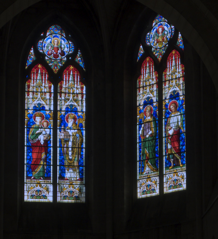
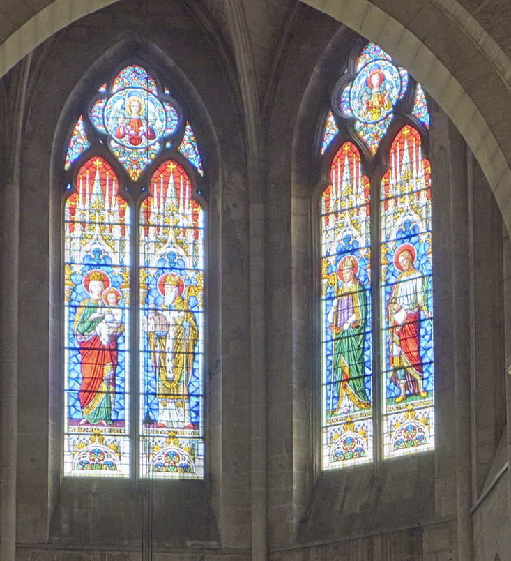
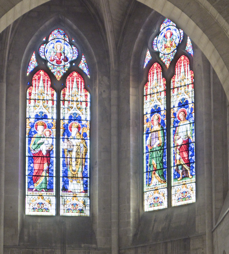
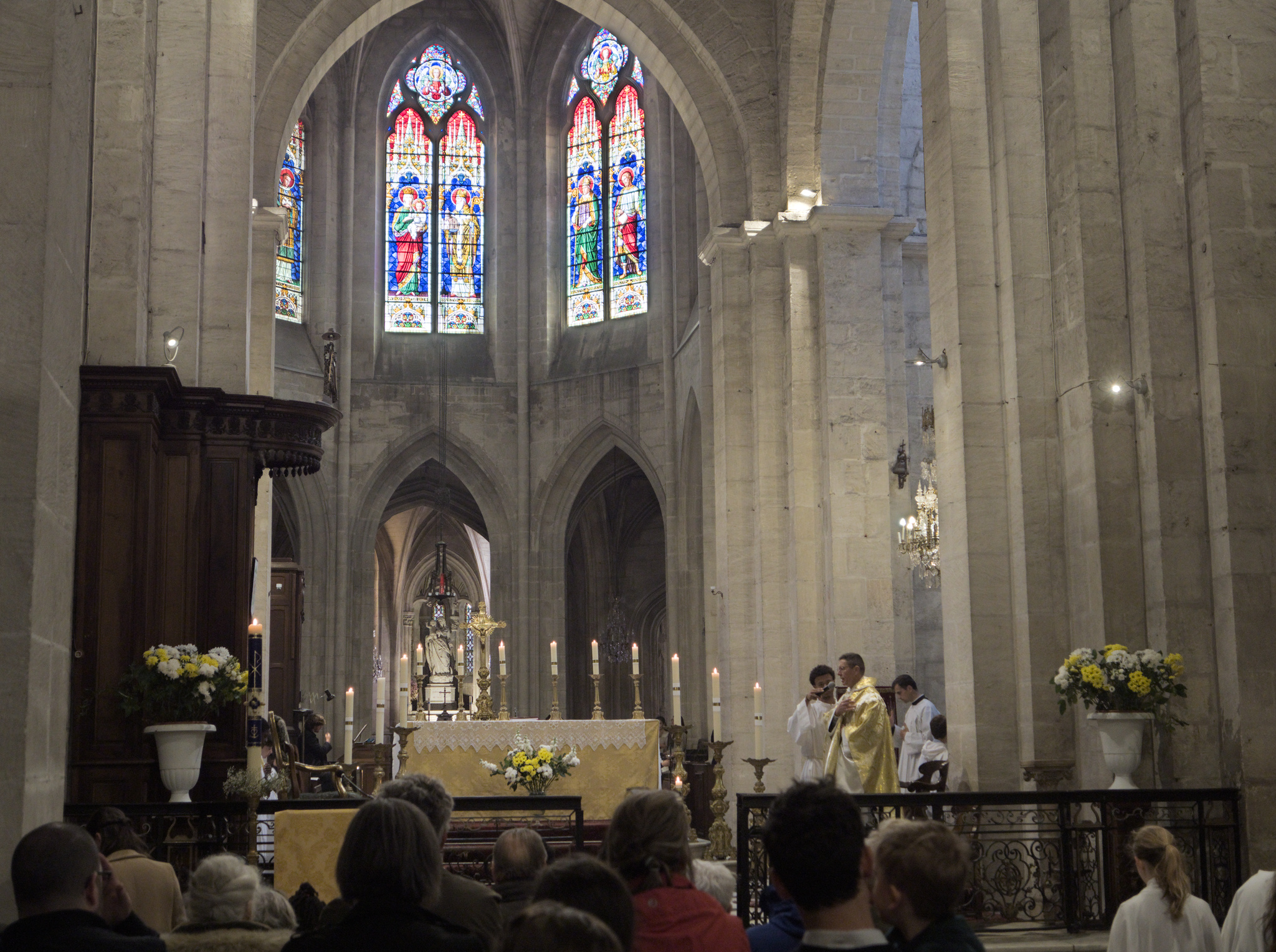
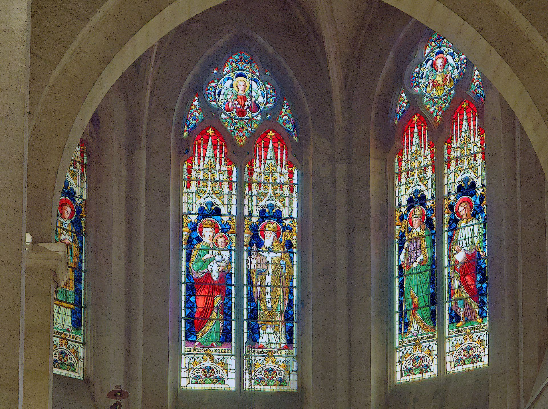
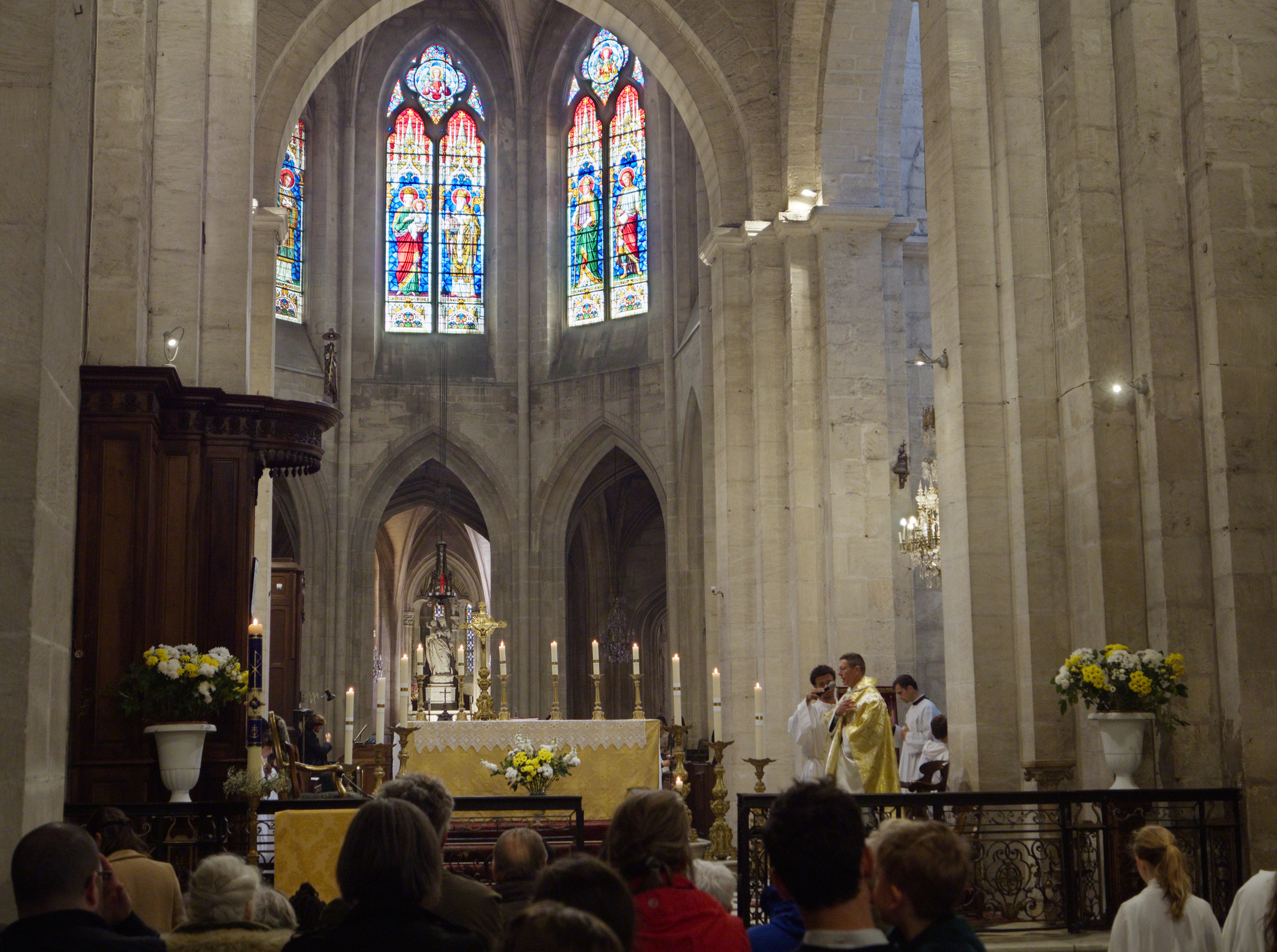
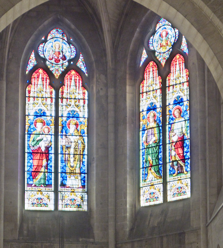
I think that by now I have a pretty good understanding and quite some experience with Darktable’s basic modules, but here’s something that I do not understand. This is with Darktable 4.6.1.
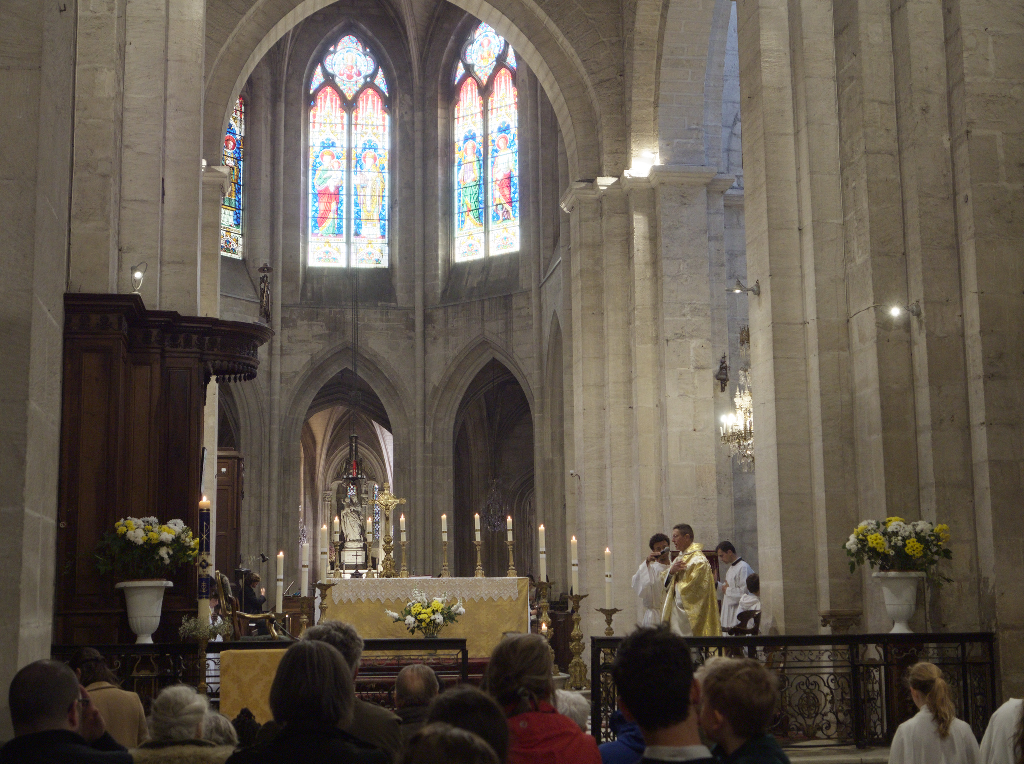
I attach an extremely minimal edit of the attached RAW file (I hereby put it in the public domain) of a church interior with some inevitably clipped highlights (lamps).
Only the absolutely necessary modules are active, and they are all set to default values. The only value that has been adjusted is that filmic’s “white relative exposure” that has been increased to 7.0 from its default of 6.16.
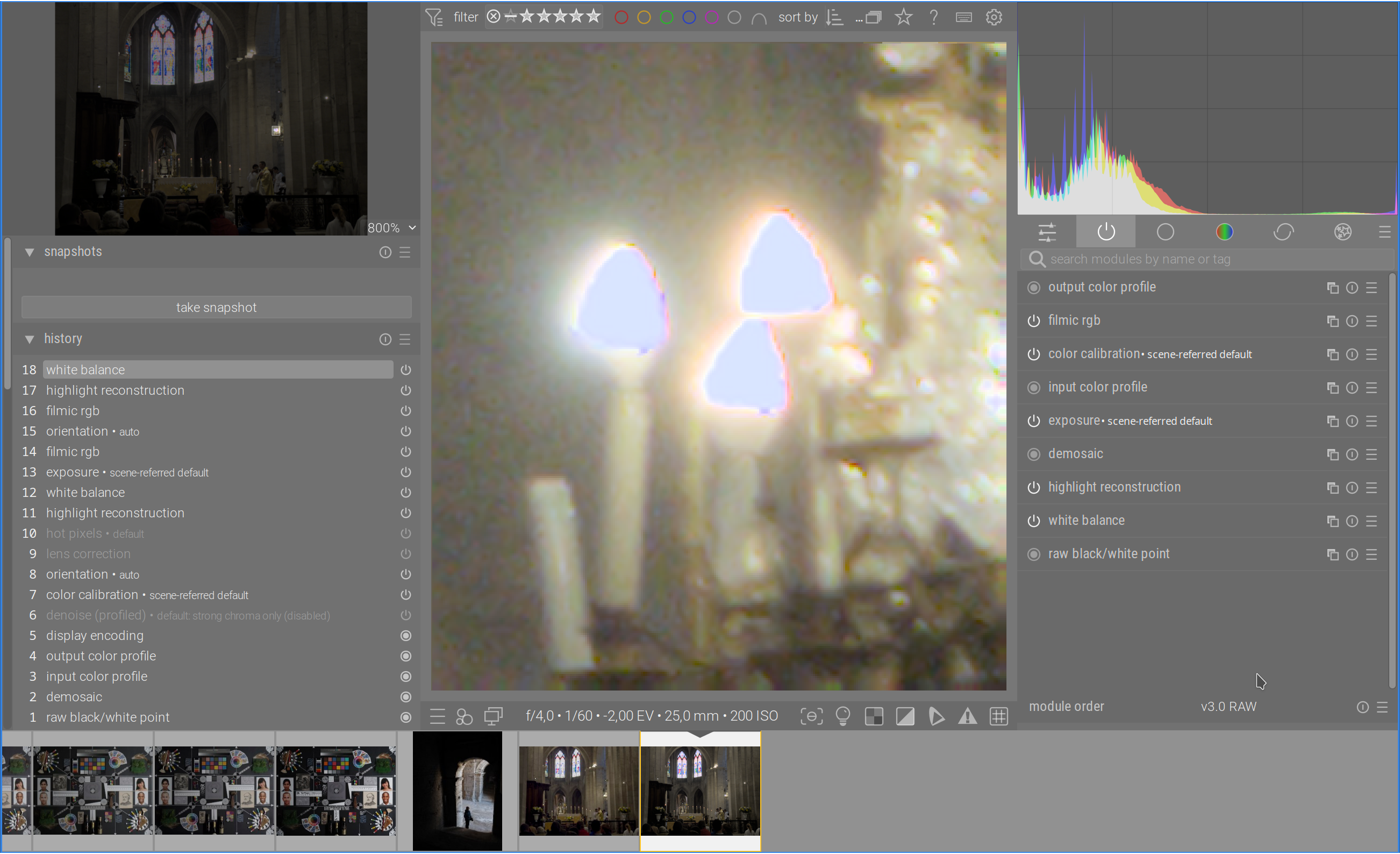
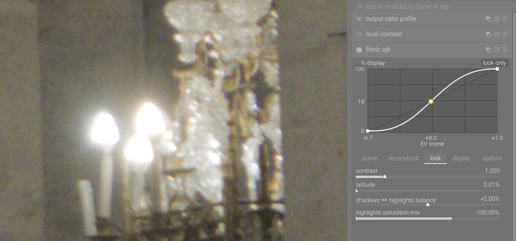
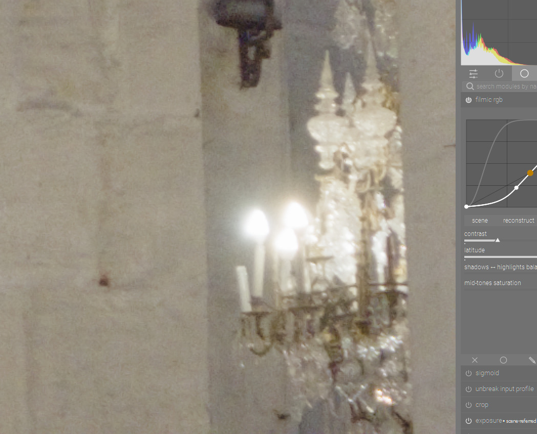
Now observe that the reconstructed interior of the highlights (inpaint opposed algorithm) appears darker than the surrounding halo:
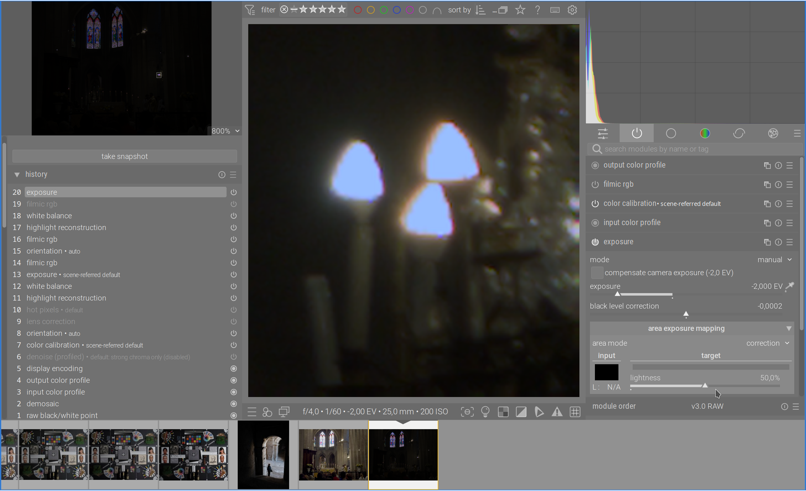
Why is this? (This is with filmic color science v7.) I mean, if I disable filmic and turn down exposure some 4 EVs, I can see that the reconstructed highlights are not darker than their non-reconstructed halo:
Why does filmic end up making the interiors darker? I understand that it tries to preserve colors, but if I understand highlight reconstruction, the inpainted region should be about the same color and at least as bright as the immediately surrounding region.
For sure, I can (and should) dial down filmic’s white point until the highlight interiors become pure white, but I’d like to understand what’s going on here. Moreover, the chromatic aberration on these lights is very strong and I have some trouble arriving at a nice rendering with filmic.
(Sigmoid does a decent job on this picture, but here I’d like to focus on filimic. In particular because it seems to better preserve the colors of the stained glass windows.)
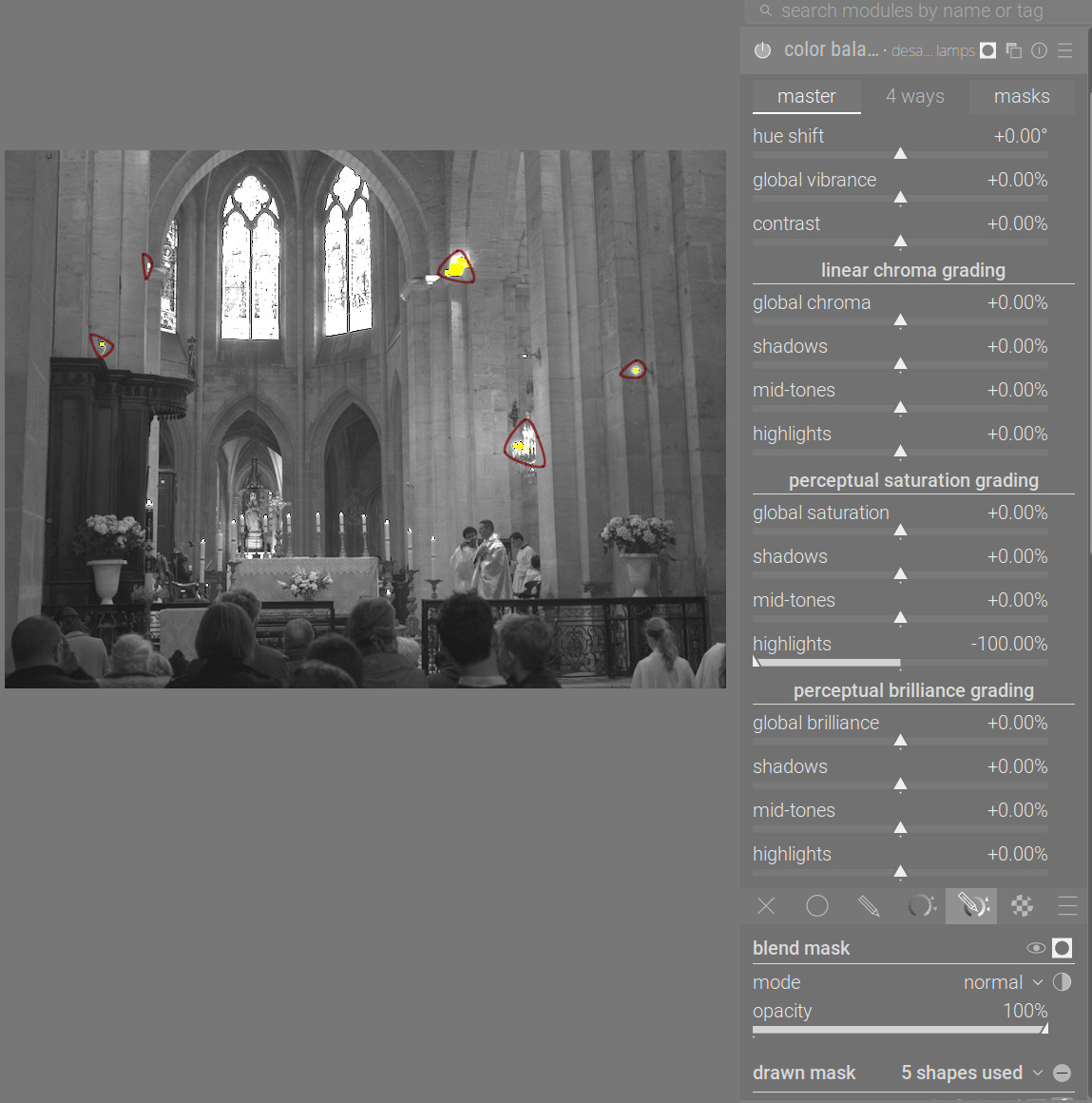
Thank you very much @kofa. I didn’t know that slider.
I think I start to understand what’s going on. It seems to me that the color of the inpainted highlights is wrong due to chromatic aberration. Since the inpainted areas are not white, and filmic tries to preserve chrominance, it chooses to render them at lower luminance.
If I adjust color calibration such that the inpainted areas become white, they also become much brighter. However that white balance is totally off for the image. So your solution seems much better.
By the way, I imagine that this would be difficult to do, but I guess that a display transform like filmic should try to preserve chrominance, but it should even more try to qualitatively preserve luminance gradients, e.g. not replace a luminance maximum by a luminance minimum.
Its also part of the v6 v7 filmic math…some have called it the gamut hand-cuffs… if you use v5 filmic with color preservation set to no…you don’t see the blue…
I learnt to consider filmic V7 and filmic V5 with color preservation as two alternative versions of filmic. V5 tends handle color problems like posted here better.
Filmic v7 removes chroma preservation norms. The saturation parameter drives an user-defined mix between the former max RGB chroma-preserving norm and the “no chroma preservation” mode:
+50 % saturation is equal to the former max RGB chroma-preserving mode,
-50 % saturation is equal to the former no preservation mode (at constant hue and luminance),
0 % is an equal mix of both (mean),
values beyond ±50 % are linear extrapolations.
In any case :
saturation is forced at most the the original value (the algo is forbidden to resaturate),
hue is forced at the original value, gamut mapping is the same as before in Yrg.
The saturation parameter therefore controls only the amount of saturation bleaching,
especially on skin tones and skies.
for the non-chrominance preserving method (independent RGB channels), we still enforce hue to be passed along from input to output. We still keep the desaturing behaviour in highlights but we set the original chroma in shadows to avoid resaturating.
Bottom line is all methods now preserve hue. Chrominance-preserving norms preserve saturation as well.
The reason v5 hides it better is that the ratios are massaged to degrade progressively to { 1, 1, 1 } when we reach display white. Problem is that this “desaturation” is not hue-linear… (pick your poison).
So v5 distorts colours. Which can be OK, as our eyes also do. RGB curves in most software also do that, and so does sigmoid, unless I’m mistaken.
If I understood correctly, filmic first does the tone mapping, and then tries to re-apply colours using the selected norm (now norms + mix). If one thinks of this as multiplying the RGB channels by numbers smaller than 1, based on the ratios in the original colour (the exact numbers depending on the norm), then that means darkening. At least that’s how I interpreted the black-and-white and colour-only images in that post by Aurélien.
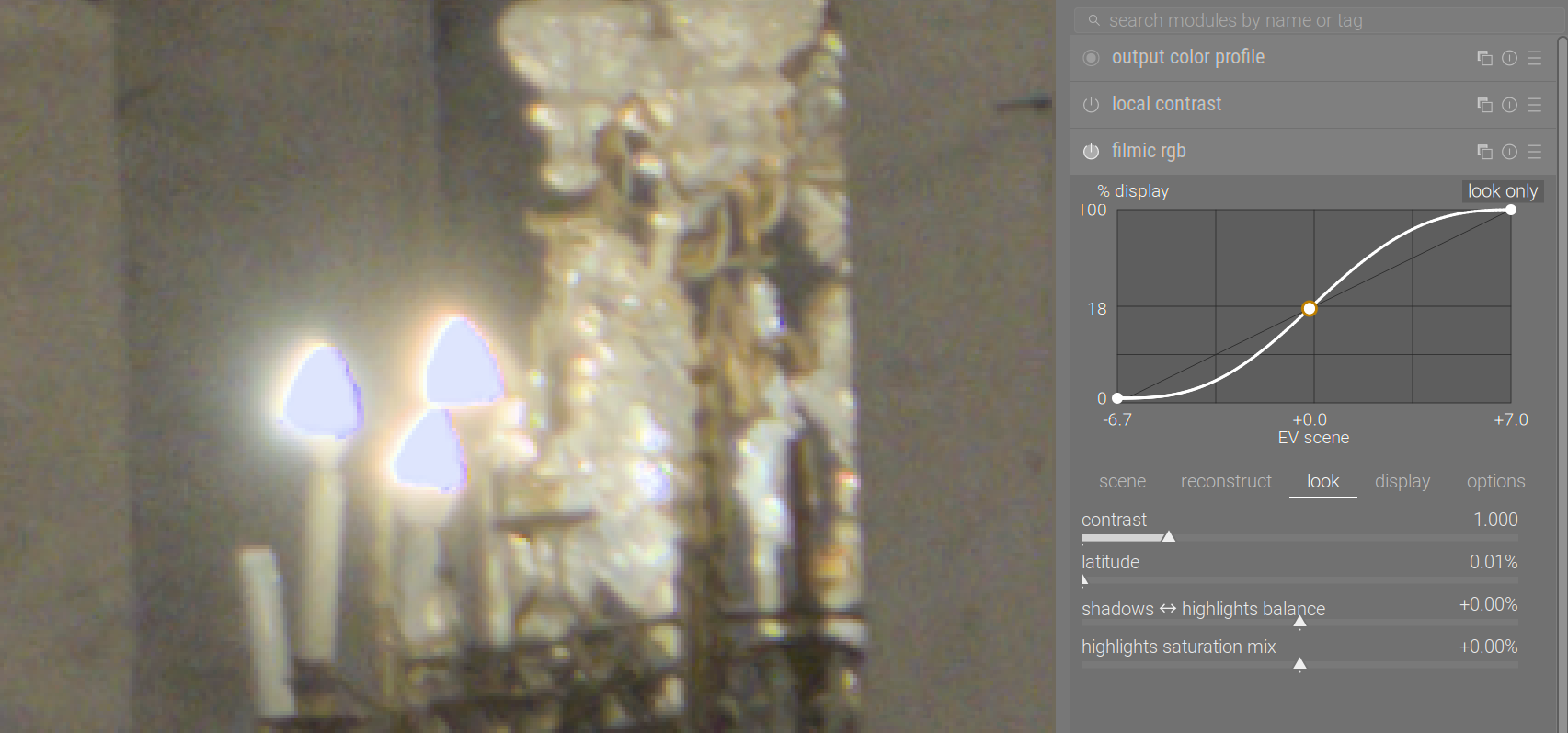
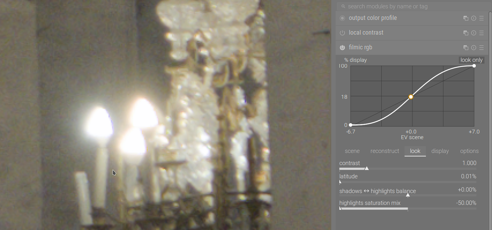
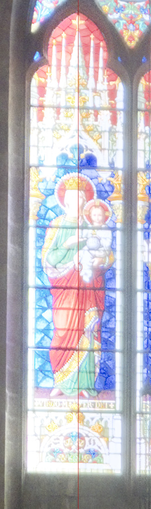
Notice how not only the saturation, but the hue also changed in the highlights. Left: sigmoid, right: filmic. This demonstratest filmic’s ‘hue preservation’ and sigmoid primaries controls:
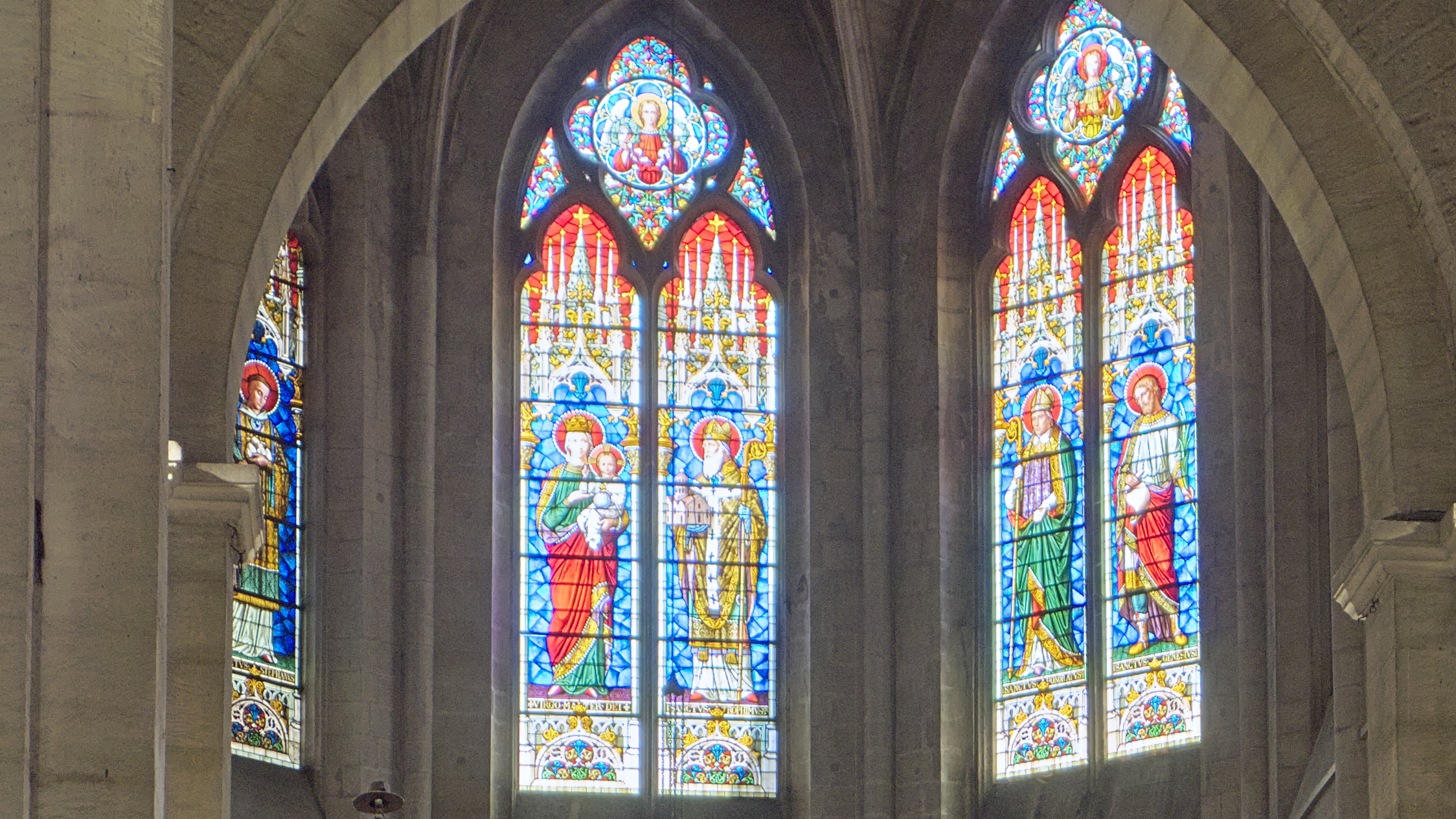
I like how filmic renders the stained glass windows with the “mix” slider to the right, and the lamps and candles with the “mix” slider to the left. So I think I’ll try to apply two instances of filmics, separated by a drawn mask around the windows.
Thanks! Perhaps considering the complete photo the windows need more desaturation (in order to avoid an overdone-HDR-tonemapping look), but if the aim was to focus only on the windows, I find this result extremely impressive.
I’m unable to achieve anything similar in darktable (but that doesn’t mean much). I struggle to achieve a pleasing transition from the totally clipped regions (like the saint’s beard) to the less overexposed zones. I played with filmic’s reconstruction tab, but with no good results.
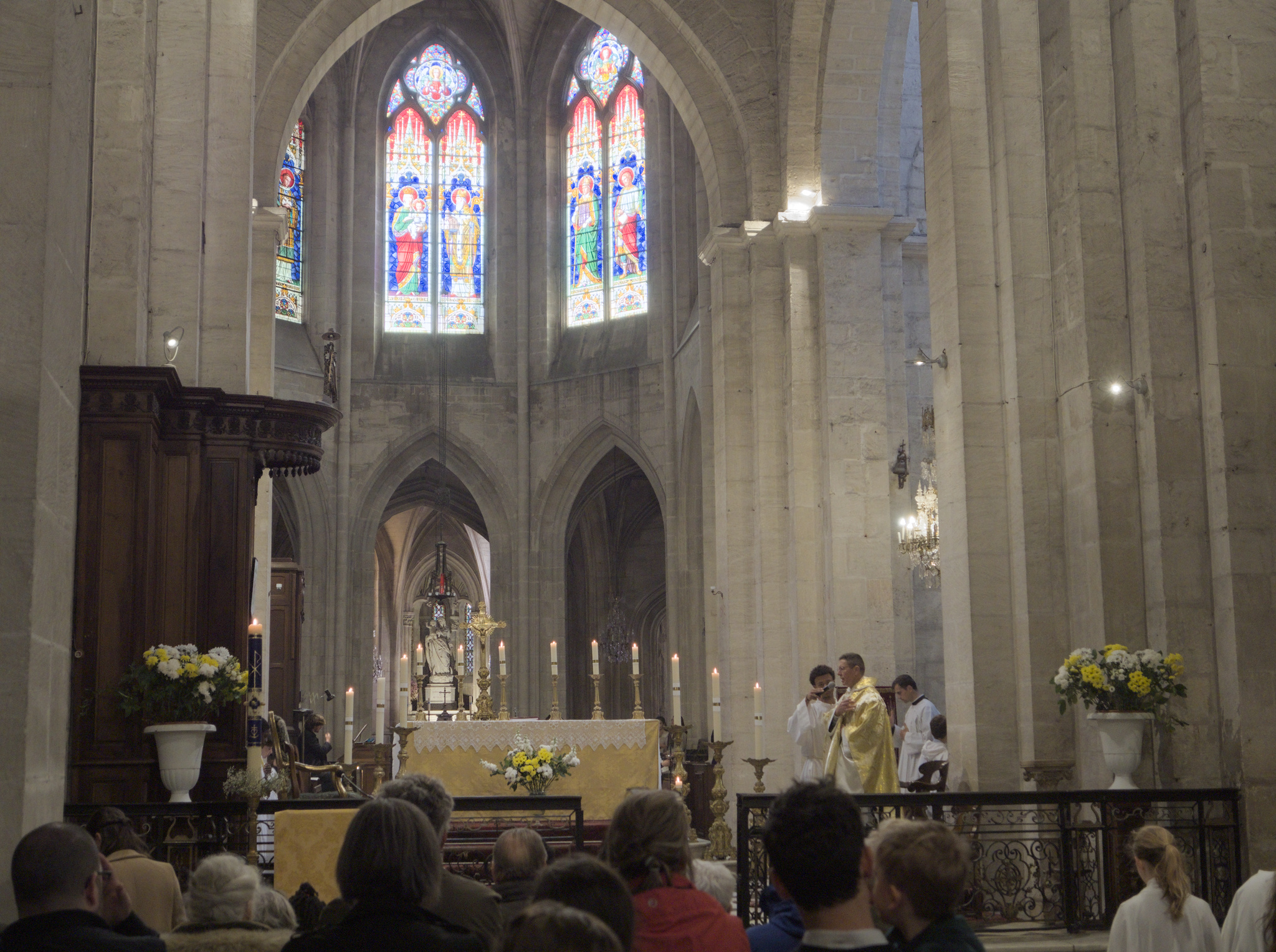
Excellent! To me this does not look overcooked at all. Quite the contrary, it resembles the impression one has when being there. (I think that it’s also impressive that this is a single shot from a Micro-Four-Thirds camera.)
Did you have to resort to drawn masks and such tricks, or is this just the result of basic adjustments?
Does this result prove the superiority of ART (in this domain) over darktable, or could a similar result be reached with darktable as well (without too much effort)?
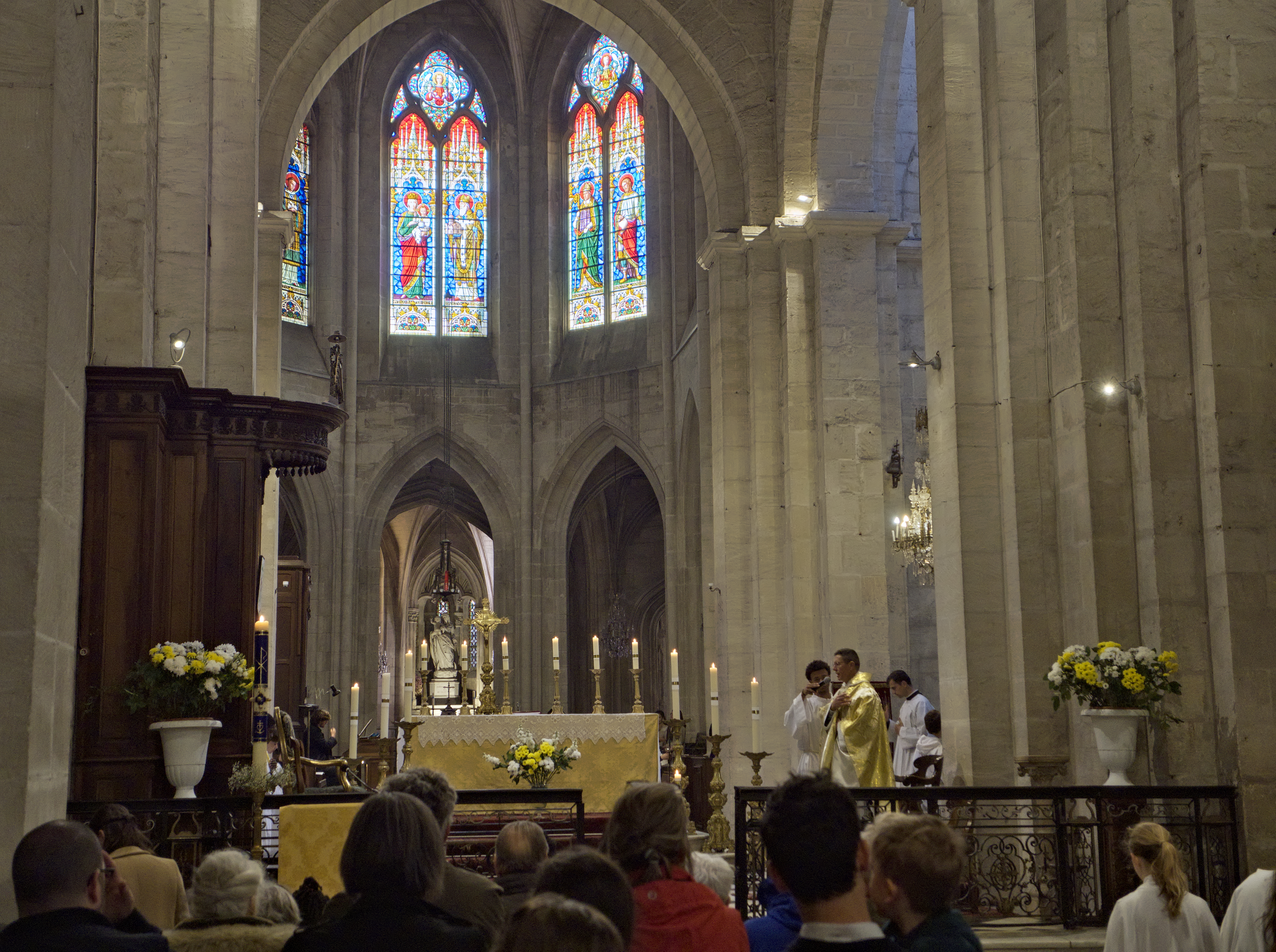
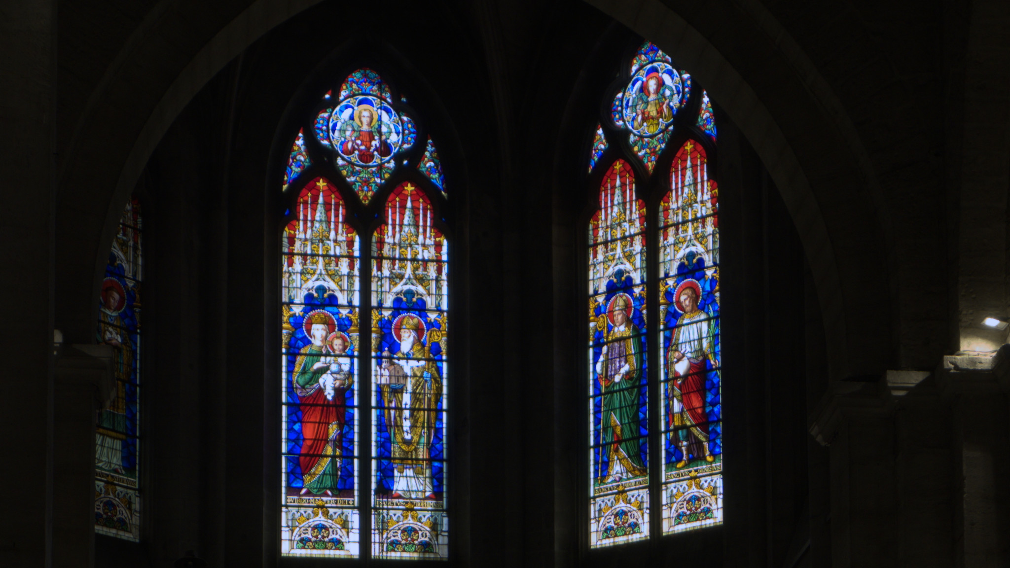
I think ART gives very pleasing results. Highlights and saturated colours are always difficult, and some kind of trade-off is always involved. If you turn off all modules but the most basic ones (you have to demosaic, you have to set white balance (either with white balance = as shot and no color calibration, or with the scene-referred defaults), and drop exposure so the windows are not blown, you get this (yes, it’s very dark):
I think darktable did a better job with the blues, while ART did a better job at retaining detail.
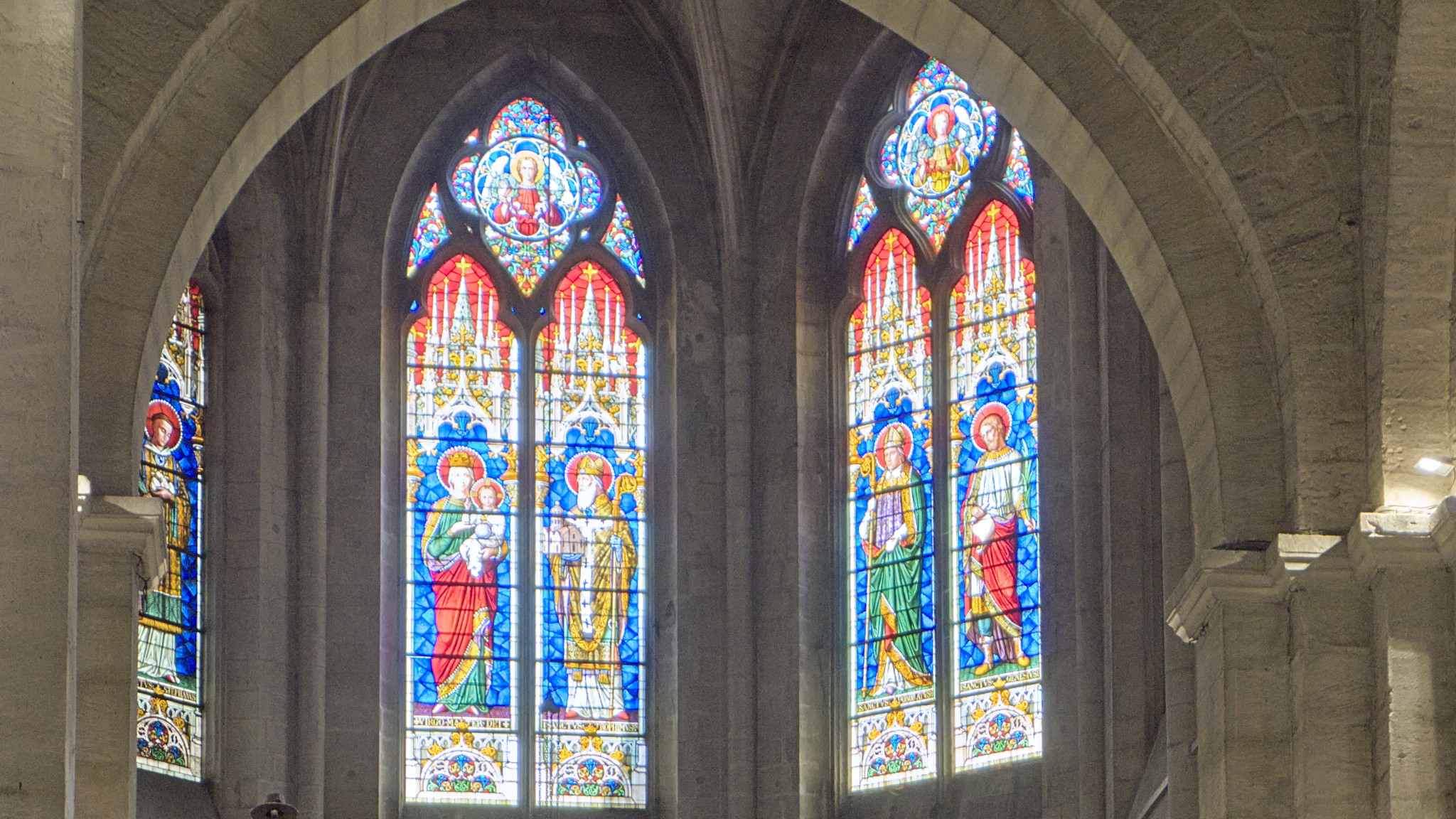
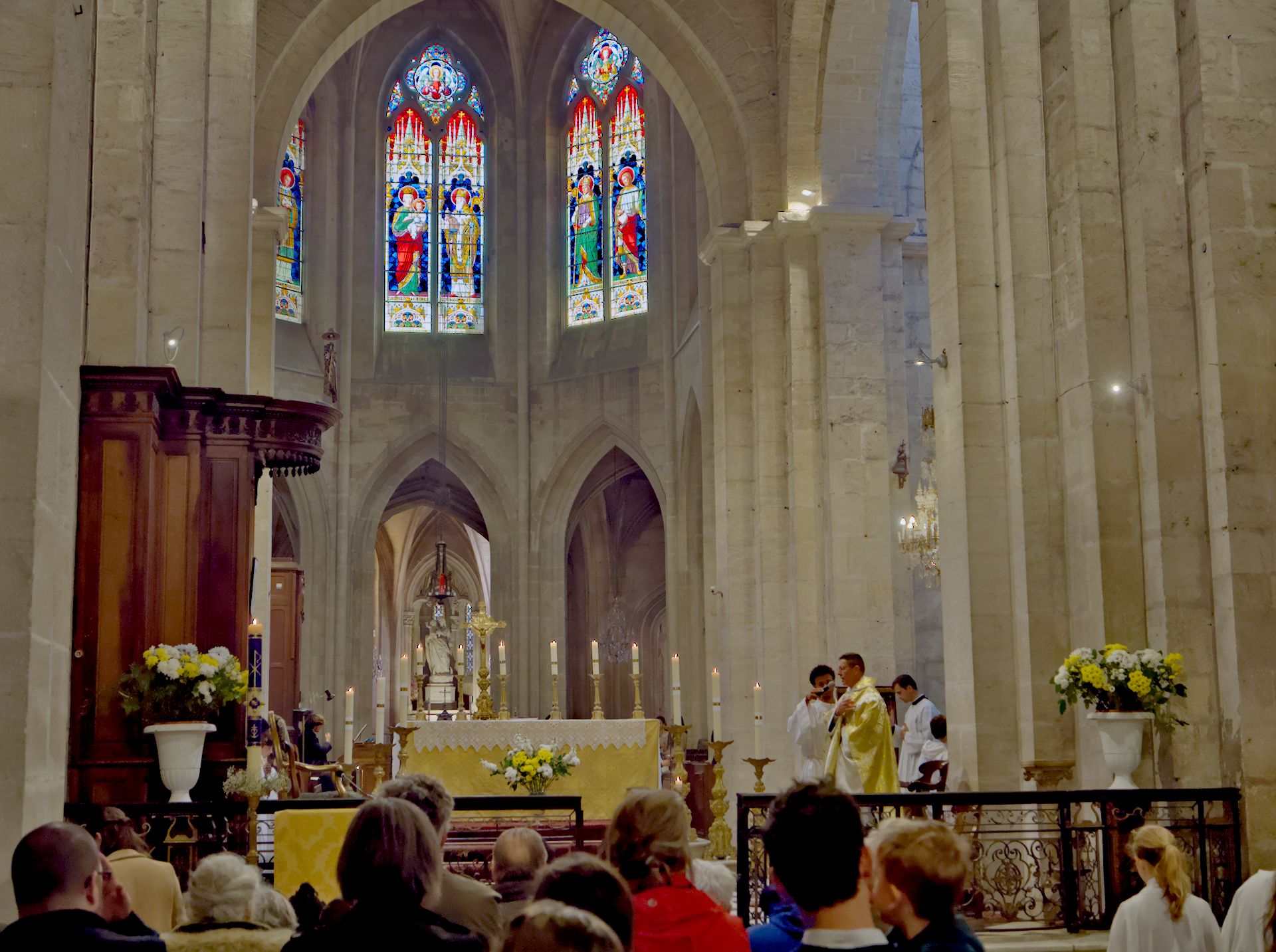
Here is a darktable version with no drawn masks (not that drawn masks, especially if combined with parameters, require a huge effort): 240421_110504_04.orf.xmp (10.3 KB)
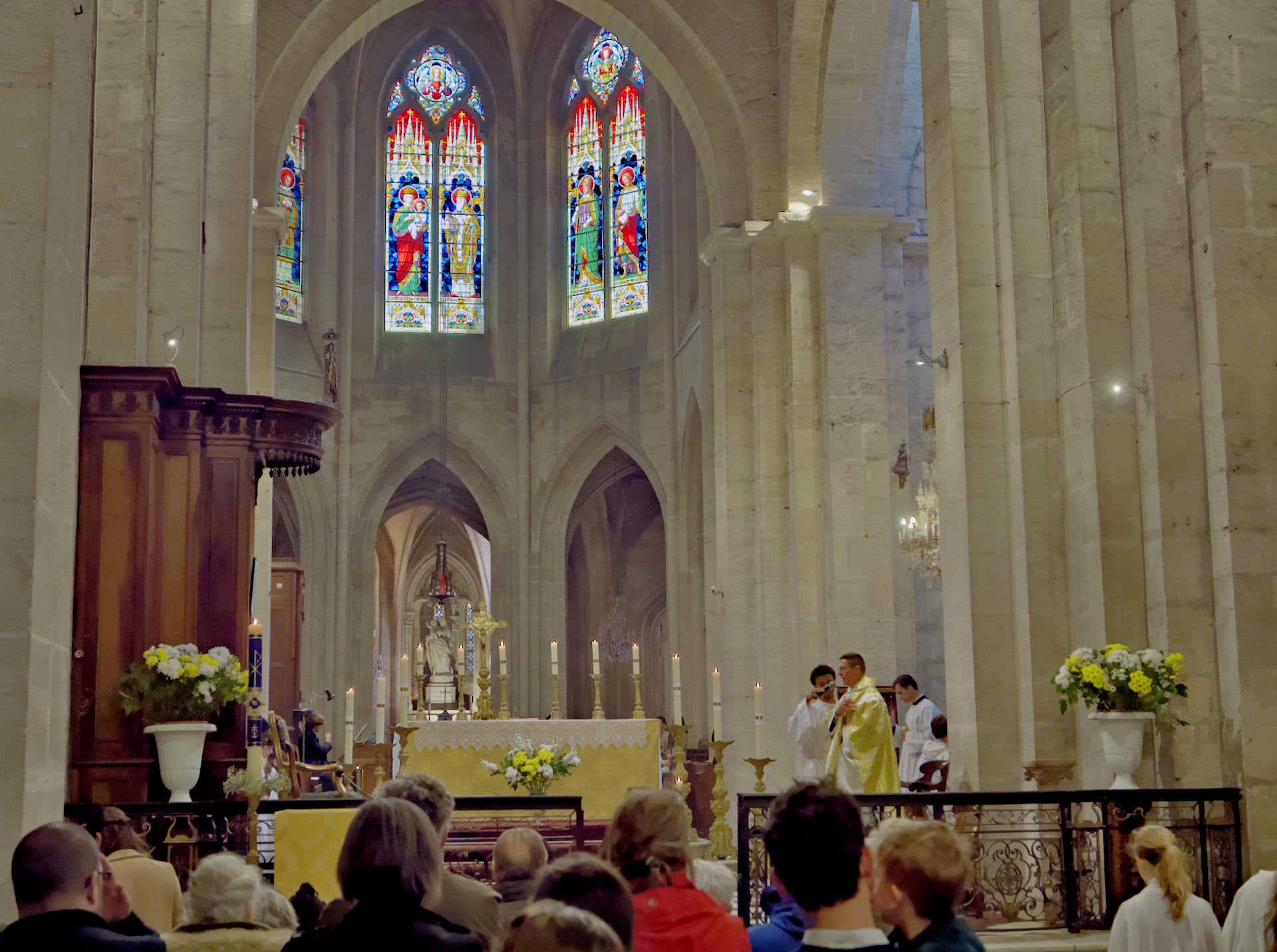
Yep. And a darktable sigmoid (the same stack as my previous attempt, but with sigmoid instead of filmic, based on the smooth preset, but with recover purity at 100%, and skew at -0.72 to keep more highlights): 240421_110504_05.orf.xmp (11.4 KB)
I’m sure it was. Your shot was exposed for those windows so it’s really dark from the beginning. I guess you had to be there to nail it… I was fairly happy with the result on the windows …