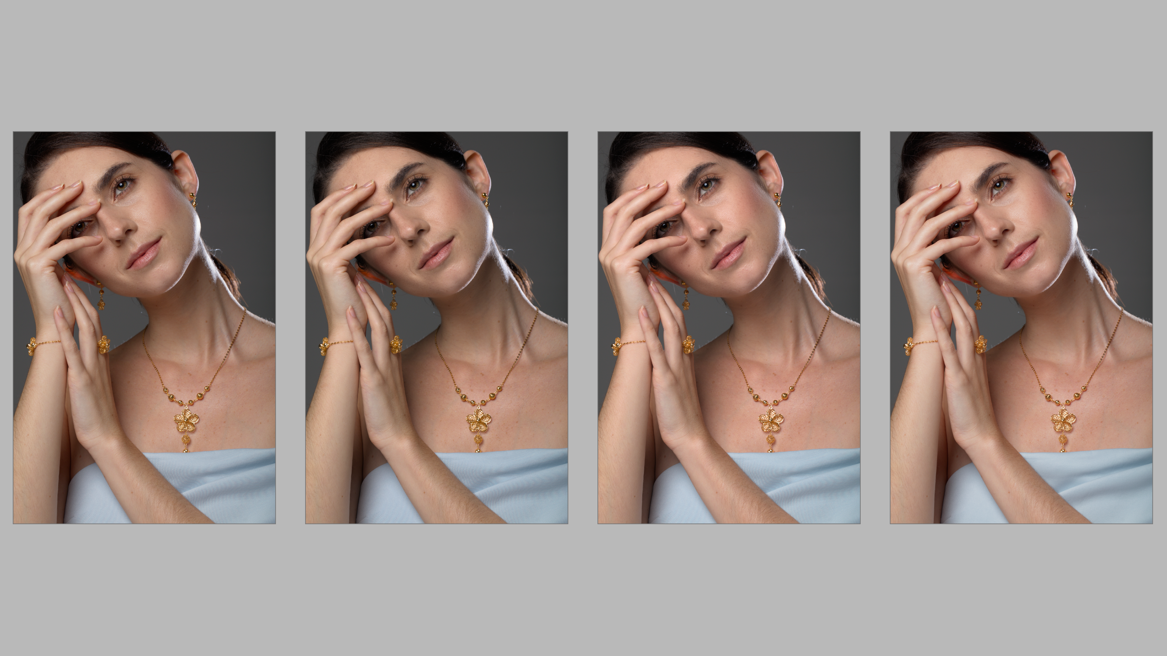
here is a series of the same images using various combination of filmic + color calibration + color balance RGB or just filmic + color calibration or filmic only.
From left to right 1 to 4 let’s see which one you thin is the best and which one uses which modules
Not going to try and guess which image uses which module (though I am interested in the result), but my favourite is 3. I like its shine. 2 is good for something more muted. Its hard to split them viewed small. I had to view each one at 100% to form an opinion.
The one on the right. It may be softer but that mitigates some of the problems. My sense is that the differences are small enough to matter compared with the glaring (pun) problem of the specular light, the moire in the dress and the pose evoking the tight neck muscles and a slight headache
I don’t know why the last one the does not exhibit moire. Upon checking all files does not exhibit moire at 100%. I just select all 4 of them and enter culling layout in dynamic mode. then I screen capture it and upload here. so it could due to the resizing in DT
Without comparison side by side all of them look nice to me, however, upon closer inspection number 3 and 4 look better than the first two. If I was to pick only one, I would go for number 4, i.e. the rightmost image. I really like the warmer skin tone.
I’m also not going to hazard a guess which is done using method X, Y or Z. After your (@eyedear) last reply about the moire I’m also going to ignore that part.
That leaves me with the following:
Starting from least liked: That would be the third one for me. Too reddish and soft for my taste. Number 4 also has this softness but the red is better than no 3.
I’m having a hard time deciding between 1 and 2. After a quick “first impression” scan I initially choose no 2, but after looking more carefully at both I’m not at all sure about that. I like the eyes and how the lights are handled in the first one but the overall look and detail in the second one.
Then again, this subject is a human being and most of us do not like to be shown with all the details as clear as possible. So I do get it why people tend to like 3 or 4 better.
Without looking at others’ responses, and on my non-calibrated 1080p monitor, I think I prefer the second one from the left for color and detail, and the third one second best.
Because the differences are quite subtle, I wonder how much our difference tastes can be attributed to different monitor calibrations, or even viewing conditions. Given that, I’m not sure this exercise will tell us much about which process is better or worse than another. Especially as there has not been a consensus on which is best.
And in any case, the “best” processing choice would be valid for this image, not necessarily for another image. So a bit limited to decide if color balance and/or color calibration are to be used…
E.g. this looks like a studio image, so single colour lightsources, probably flash. Afaik, that’s a situation where color calibration isn’t strictly necessary, old-fashioned WB works well enough there.
Image 1 (left most) - Filmic only - Color preservation - NO
Image 2 Filmic - RGB Norm Color preservation, Color Balance RGB -Add basic colorfulness preset
Image 3 Filmic - RGB Norm Color preservation, Color Balance RGB -Add basic colorfulness preset+ color calbration( grey area selection)
Image 4 (right most) - Filmic only - Color preservation - NO + color calbration( grey area selection)