filmic v4 on the way

However, I found that saturation in filmic pushes deep blues (like the one for example in blue hour pics) out of gamut much more (for the same % increase) than CB does, while it should be less. At least according to the gamut checking in DT.

One example:

  1. no additional saturation

  2. +15% saturation in filmic, gamut checking

  3. +15% saturation in color balance, gamut checking

Also visually, the effect of saturation in filmic is much stronger than CB one, specifically on the blues.

1 Like

If that happens, go in the filmic module to optionspreserve chrominance and change it to luminance Y.

Yeah, that helps, thanks.
Next question is: what are the pros and cons of the different preserve crominance modes ?

Gamut checking against what color space ? The pipeline is supposed to be a master edited in an ideal color space (visible locus). The color spaces that are the closest to that are Rec2020 and Prophoto RGB (although this one overflows the visible locus).

It is to be expected that sRGB and other media spaces will be overflown by the pipeline values since they are so small, and it’s usually not a problem since the output color profile takes care of that. So, gamut alerts (done at the end of the pipe) tell us nothing about the pipe if they are done against sRGB and AdobeRGB.

The point of gamut caring in pipeline is not to comply with whatever output gamut, but to avoid pushing colors that used to be in the visible locus, outside of it, because that would be a shame if editing just made the image worse at the end. Things like white balance can push pixels outside of the visible range. But the master should not care about the output medium color space, or you will end up with 3 different edits if you print on 3 different media, and that’s unnecessary plus cluttered.

The only constant thing among gamuts of any color spaces is their 100% luminance end is pointy, so they all degrade to 0% saturation at 100% luminance.

Should the soft-proofing profile be set to Linear Rec2020, if that is your input profile?

  1. Input profile should never be Rec2020 since Rec2020 is an output medium color space.
  2. Soft-proof profile has nothing to do with input profile.
  3. Rec2020 is used in soft-proofing only as the closest match to visible locus.

I goofed; I was using the name of the module. Input is standard color matrix; working profile is Linear Rec2020 RGB. But use Rec2020 as soft-profile, yes?

And I don’t know what it means by standard color matrix.

If you want to check the gamut clipping against the closest match to visible locus, then yes.

Input color matrix is only the raw sensor profile.

I would say no if you are going to display on a monitor or the web sRGB as it seems even if softproofing is not turned on it can affect your histogram that is displayed with default settings so it matches softproofing by default I think and so if you want to use it as a guide then setting to rec2020 would be misleading I think…There are a lot of profiles to track under that soft proofing profile tab and the histogram display also changes between showing the whole processing pipe at any given time in the top corner to that representing the input into a specific module when you look there…I am sure there is a good walk through of this somewhere…

A bolded “never” sounds a bit extreme, surely the input profile should be linear Rec. 2020 if the input is effectively in that space (e.g. it’s an OpenEXR file with those primaries in the “chromaticities” attribute)?

The trend around here is to use Rec2020 in place of the camera input matrix when out-of-gamut issues appear. That magically solves nothing but hides problems, and people have taken that bad habit. Sure, if you open rasters, use whatever profile they were saved with.

2 Likes

Personally I would use softproofing as sRGB as that will be my output. Then if you set the histogram profile to REC2020 or working if that is what you use then you will see that histogram when softproofing is off and sRGB histogram when it is turned on…I think that is a good approach

Softproofing as sRGB is a no-operation, it’s simply displaying to sRGB. And gamut alert against sRGB is guaranteed to be meaningless, it’s small, we already know that.

So clearly I don’t understand. If I was trying to use the histogram to edit and I had softproofing set at sRGB and histogram profile to working and my working profile is REC2020. So I edit my photo but now it comes time to export and I am set to output profile of srgb. Would I not want to turn on softproofing to get an idea of the actual histogram of the exported file to see if I was happy with that?? And cerainly there would be gamut clipping but if it was extreme would I not rethink my edit…maybe I just don’t get how all the profiles represent data…So if I am processing to archive as JPG files and perhaps sharing some online what would you set the profiles to ???

The histogram of the exported file is meaningless.

darktable has 5 profiles :

  1. input, which usually is the standard matrice if you retouch a raw file,
  2. output, which is either the monitor ICC profile for previews or the file space for export,
  3. histogram, which is used for both the histogram and ill-named “over-exposure” alert,
  4. softproofing, which is used to preview the color appearance of the image printed on some medium (that is not the monitor) and display out-of-gamut alerts.
  5. working color profile, which is used for pixel operations in RGB.

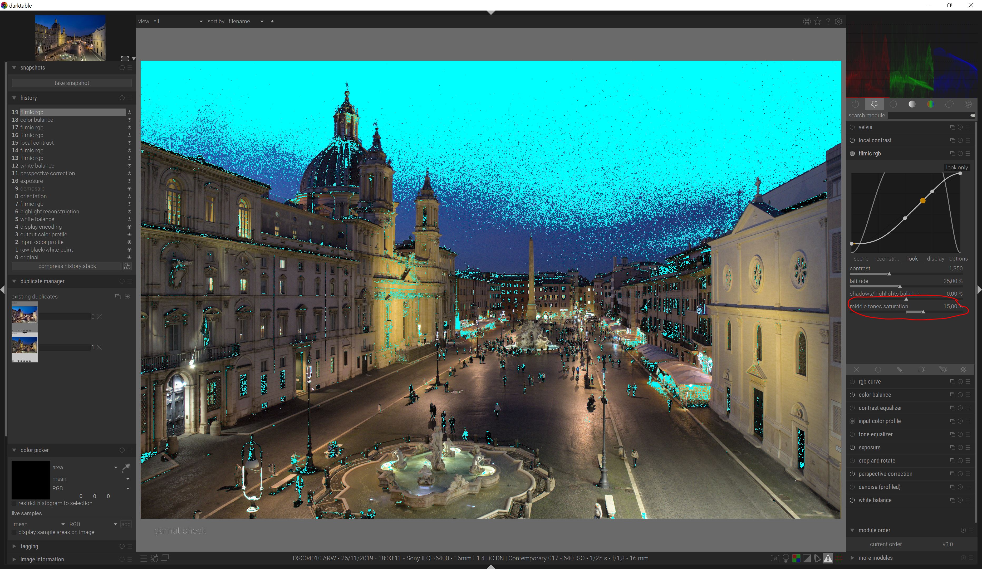
Softproofing is meant only to preview the appearance of the printed image, noticeably when the printed medium has a much smaller dynamic range and gamut volume than the monitor. It is only to assess the quality of the gamut mapping result and black point compensation, and ensure no weird posterization, clipping or other gradients flattening happens.

Gamut alert is meant only to display pixels having a color in the current pipeline which has no target in the destination color space. But LittleCMS2 does gamut mapping, when converting to another space, so these pixels will not necessarily have their color clipped in the destination space, but they will get remapped to another color, chosen with the colorimetric intent. The gamut alert only says that these pixels will change color for the sake of preserving overall gradients in the target space.

So gamut alert ≠ gamut clipping. People really need to stop freaking out with the various misleading alerts presented to them in darktable to feed their anxiety.

As a hack, you can use the gamut alert against a large-gamut RGB space (like Rec2020), defined as your softproofing profile, because that large RGB space will act as an approximation of the visible locus, and it is generally good to ensure that your retouching doesn’t push any pixel outside of the visible range, because then, gamut mapping becomes a lot more difficult at export time.

But anything else is only mumbo-jumbo that looks scientific without having any real meaning.

The only histogram relevant to us would be the histogram of luminance, which will be color-space independent and present true over and under-exposure (unlike the current overexposure alert as of darktable 3.2.1, that got re-written last week in master). But we don’t have one.

RGB histograms in different RGB spaces don’t hold different meanings and I’m not even sure the histogram shows the file after the gamut mapping step. If the picture is over-exposed, you will get the same bump at the right of the histogram, no matter the space. If the picture is over-saturated, it will not necessarily show in the histogram, and anyway the gamut mapping should take care of most of it.

As long as the image looks good in the screen, forget the alerts, histograms, and engineer-style views, and trust your eyes.

I think that ICC color profiles, color spaces and science-y big words have lost people more than they help them. The only relevant question is to assess if you have nice gradients in your image or if some part presents a solid color blob or posterization. Everything else is irrelevant.

5 Likes

Speaking of which, what would you think of overlaying an input histogram on the “look” visualization of Filmic? Could this be useful?

It’s part of the long list of useful things that would need a partial redesign (and resulting non-foreseen bugs) of the pipeline to roughly work.

1 Like

@anon41087856 Thanks for your detailed reply. You are right it is easy to get lost as you watch the histogram and try to figure out what is really happening.

Ok, I didn’t mean to start a technical discussion on gamut mapping vs clipping, so let’s switch off the gamut alert and trust our eyes.
I was replying to @EC1000 observation about increasing saturation in filmic rather than in color balance and I notice a huge difference for deep blues, at least when using “RGB power norm”.

  1. no saturation increase

  2. saturation +20% in filmic, RGB power norm

  3. saturation +20% in filmic, luminance Y

  4. saturation +20% in color balance

The blue of the sky is much more intense with saturation in filmic with the default RGB power norm, while with luminance Y the result is more similar to what achieved with color balance.
Why so ? How to choose the best luminance estimator for the given situation ?