ART is really awesome, it is my exclusive raw editor of choise.
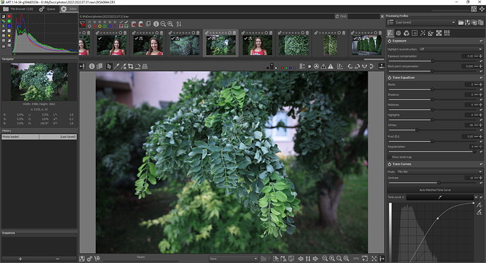
However, I have some observations/suggestsions about the filmstrip. I switched to single editor tab mode with filmstrip recently, because ART opens photos much faster in this mode. And so hence my feedback about it 
1.By default, filmstrip takes quite a lot of vertical screen space. I pull it up a little bit to hide some stuff like filter buttons and it becomes better and more usable for me. I think I’m relying on a non-documented feature here, so it would be nice to have this as an actual feature - a way to reduce vertical screen space consumption.
2.I also find the positon of the filmstrip on the top as quite unusual - most of the software have it on the bottom, or maybe it is just me, but I would prefer to have it on the bottom. Not a big deal at all though.
3.Thumbnail quality, or more like their resizing method/smoothness is realy poor. Before I open a photo (or apply a profile without opening) - thumbnail looks like it was resized with nearest filtering - it looks really bad, especially with portraits. It gets better of course once I open the photo (or apply a profile without opening), but still not great. I use embedded jpeg for thumbnail generation, because raw look without any editing sometimes is too off.
Again, these are just some suggestsions/observations. Thanks in any case!


