Really nice scene! You achieved your style very well. I went for a lighter rendition.

finding-my-style-DSCF6669.RAF.xmp (27.8 KB)
darktable 3.4.1
Really nice scene! You achieved your style very well. I went for a lighter rendition.
finding-my-style-DSCF6669.RAF.xmp (27.8 KB)
darktable 3.4.1
Hi @Toand007,
welcome to the Forum!
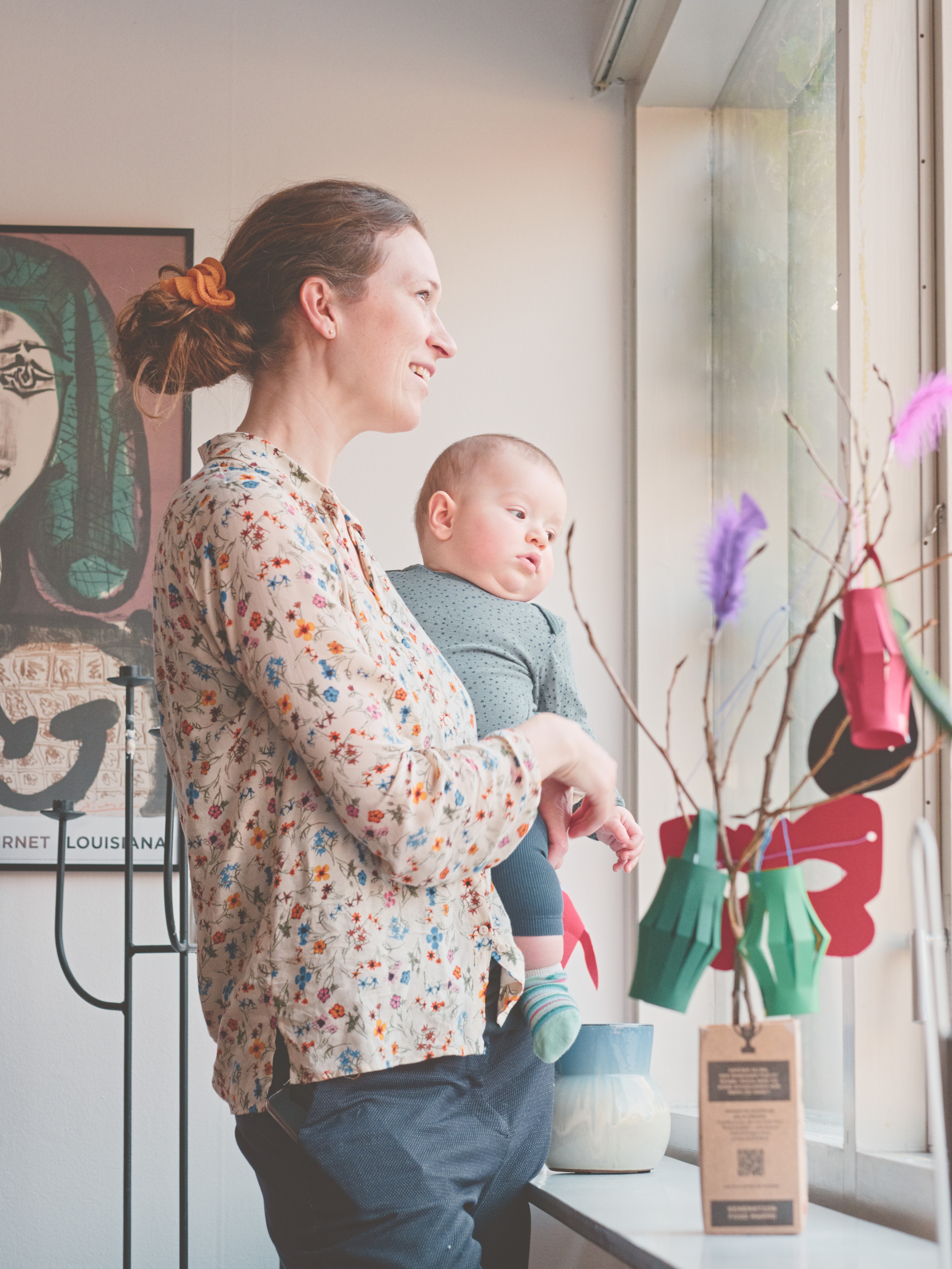
This is a beautiful photo! I like very much how the face of the woman and the child is illuminated. Combined with the woman’s smile it creates a very nice soft atmosphere.
I would definitely go black and white here:
DSCF6669_04.RAF.xmp (21,8 KB)
darktable 3.5.0~git1354.c9c8e3d34-1
With a Kodak Portra 800 HaldCLUT (I think I got it from Film Simulation - RawPedia):
Same edit, with lower exposure correction (0.5EV) and filmic contrast = 1.1:
With Filmulator:
Like this one to be a bit warmer. The dark spot/shadow on the window jamb and the purpleness of the feather I found really distracting.
Anyway: Really nice shot! Thanks for sharing this one.
@Toand007 Welcome! I am loving the facial expressions of your photo. I find the darkened / dirty window edge to be distracting. Perhaps, reducing it would make it less so? Another source of tension is the twig that is close to the baby / toddler’s face. Softening it may make it seems less threatening.  I like the Chinese lantern crafts in the background.
PS One way to find your style is to do as many Play Raws as possible.  We have lots available!
Yes, definitely B&W. Well done! I’m looking forward to seeing your .xmp file.
Really nice skin tones! I never used this LUT before
Welcome to the forum @Toand007. Interesting username! Interesting that you didn’t opt for Toandfro (since you are searching for a style !!!  ).
).
Here is an attempt using RawTherapee 5.8.
DSCF6669.jpg.out.pp3 (12.1 KB)
Hi @Toand007, and welcome!
Nice one!
How about testing with a slight vignette as well,
to make the background less important, and to
put a bit more emphasis on the child?
Have fun!
Claes in Lund, Sweden
Your description fits what I’m often going for. I just try to go easy on the crushing-the-blacks part and I also lift the black point quite a lot trying to find the sweet spot for a smooth contrast.
RT5.8
you made a nice job on colors. The picture itself has a nice color palette. Interesting that nobody else used it more.
It is a wonderful shot. Nice pastel-like colours and decent framing. There is no need for extensive editing.