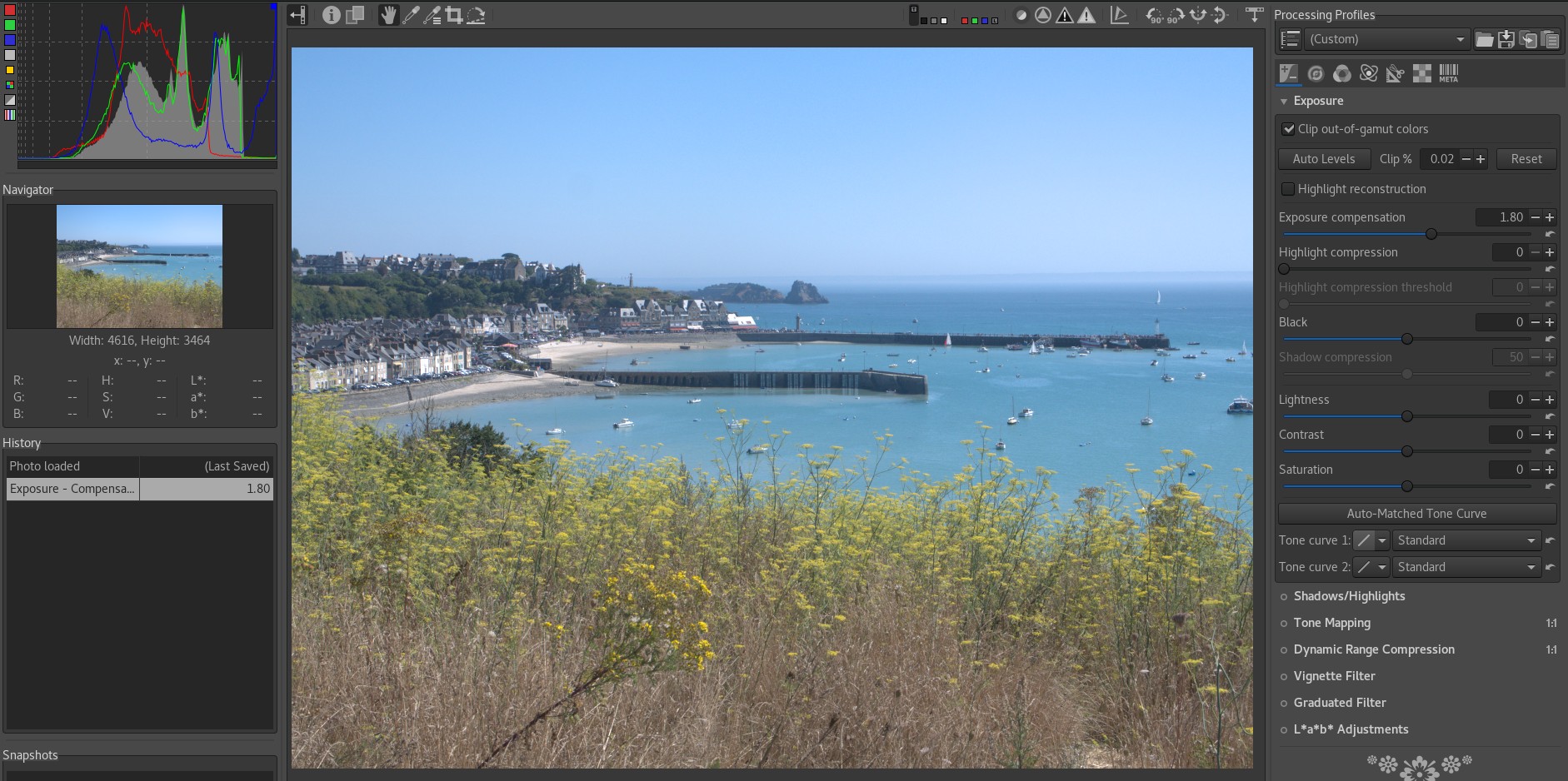
When I’m increasing exposure in Darktable, my histogram become often flat with my photos. In comparison with RawTherapee, with the same exposure of course, histogram does not produce the same result. It stays informative even if I push exposure.
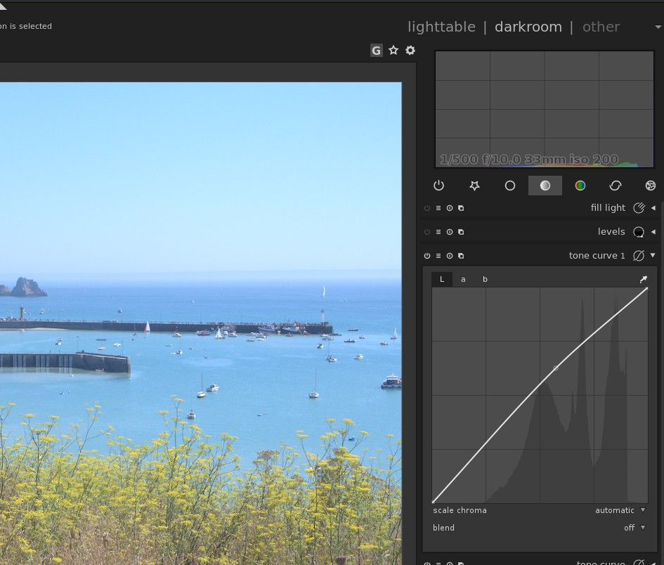
Moreover when I use tone curve module, I can see, I guess the right histogram in the background of the curve.
Have you an explanation of this behavior ? Do you know if it is normal or if there is a way to fix this ?
Regards,
Yann
ps: I have uploaded screen captures, so you can see what I mean. In these example I have increased exposure by 1.80ev in Darktable and in RawTherapee
I have encountered this behavior in Darktable 2.4.0
I just have done the same test on another computer with Darktable 2.4.4, there is the same behavior too.
As you increase exposure, you push more data into white. That column of the histogram grows to be the biggest one, and the histogram tool scales its vertical axis to fit that data. Accordingly, the rest of the data goes to the ground…
The histogram might get slightly flatter when increasing exposure but I never saw somthing like this. Can you upload an example image together with the corresponding xmp sidecar file after exposure correction?
I have encountered the same behavior with the raw file attached found on ephotozine website.
I have tried the logarithmic histogram, it seems to work but I find it less usable.
Moreover when I look the curve in the background of the tone curve module, with logarithmic histogram I can see the same curve as in histogram, whereas with linear histogram the curve is not the same.
And in RawTherapee, the histogram seems to be correct.
Please find raw file and xmp files of Darktable and RawTherapee.
Log/ linear is about how the X axis is scaled, ‘tallness’ of the buckets is the Y axis and how the data is distributed. dt is probably more ‘correct’ in that regard, just not as insightful to you.
Still, the ‘flattening’ of the histogram as you increase exposure is an important indication that you’re pushing tones out of the display range, blowing out the highlights in what you intend to print or display.
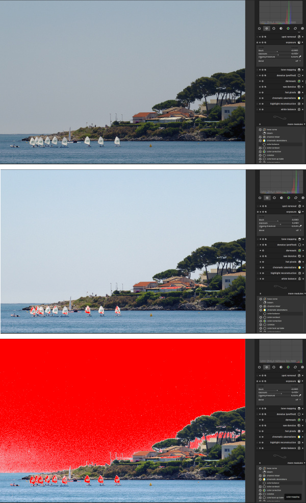
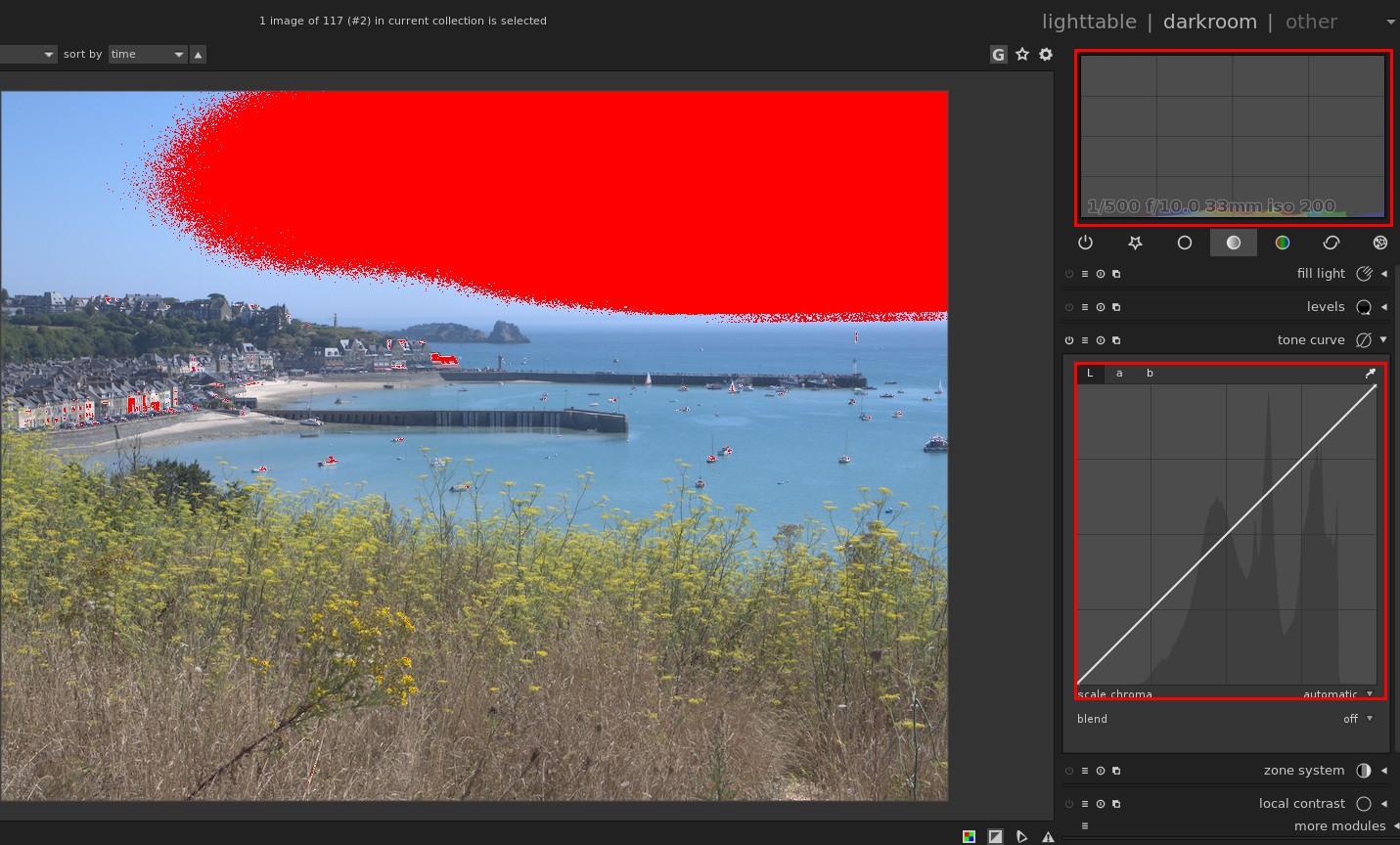
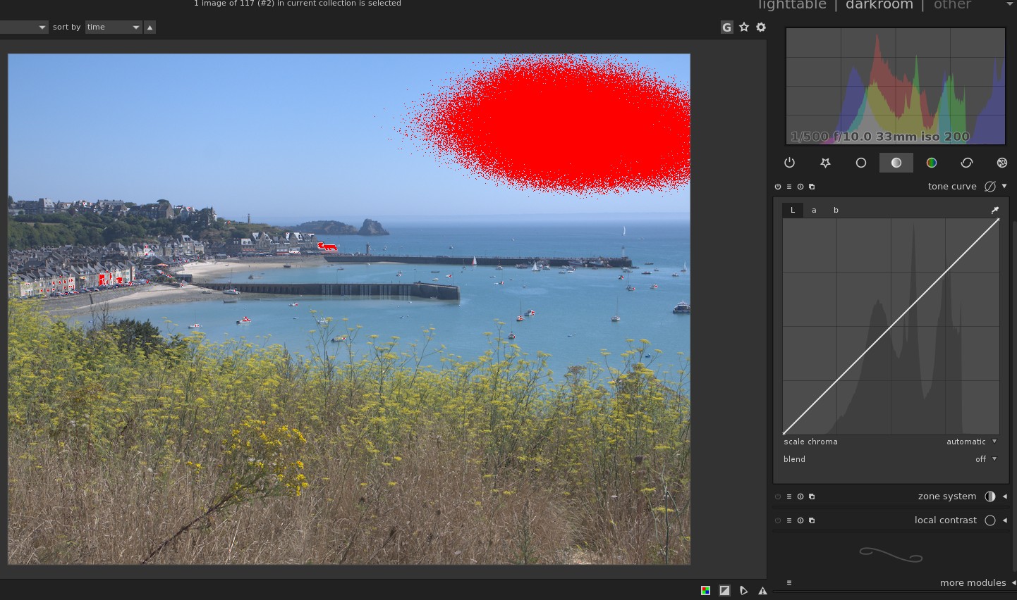
[Edit: For copyright reasons, I changed the image and used one of my pictures]
In the upper image overexposure is completely absent. The histogram looks “normal”. In the middle image, there is some indication of (near) overexposure, see the indication marker in red, e.g. on the sails. In the histogram all main peaks are still present. In the lower image there is massive overexposure (red color). The main peaks have been shifted to the left and are “outside” the histogram. That’s why it looks so flat in linear mode.
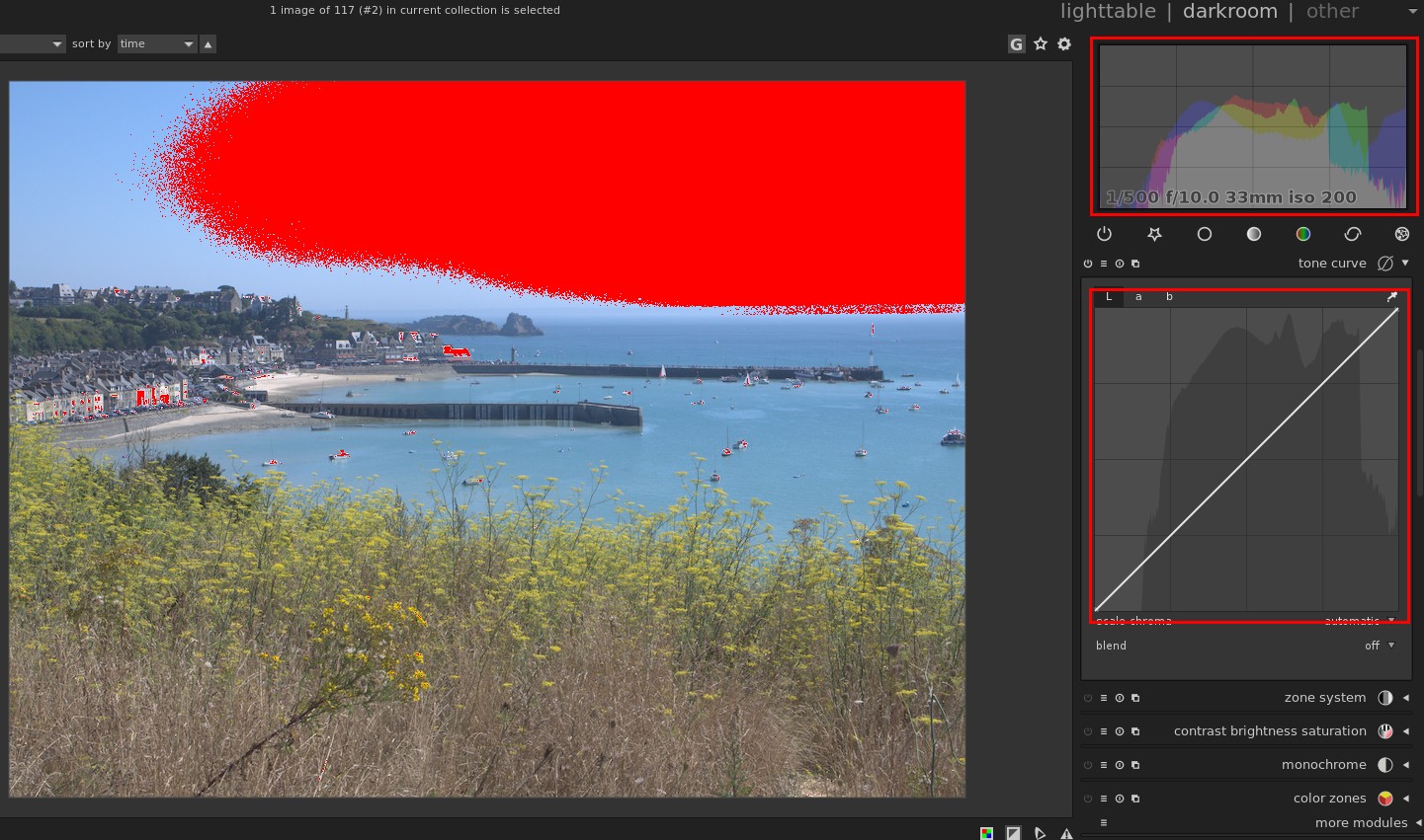
But in Darktable, I have compared these two cases.
When histogram is set to logarithmic, the curve is the same in the histogram and in the background of the tone curve module (cf. screen capture below).
When histogram is set to linear, the curve in the histogram is totally different with the curve in the background of the tone curve module (cf. screen capture below).
That’s why I’m wondering if the flat histogram is a normal behavior. And if this histogram is representative of the picture. Because, for a specified pixel, even if the Blue channel is clipped, normally there is information in the Green and Red channels.
Moreover when I decrease the exposure of 0.20ev (to go to 1.60ev), I find that the curve is really different with so little change (cf. screen capture below).
If I don’t make a mistake, I feel that the histogram become flat when one of the three Red Green Blue color is clipped. I can use Darktable with this behavior but I would liked to have the same behavior as RawTherapee.
Regards,
Yann
ps: I have attached the raw of my first exemple and the xmp files of Darktable and RawTherapee.
I don’t have either program to test, but it looks as if dt is vertically scaling the linear histogram to fit the tallest peak. I would call that nominal behavior, in order to continue to display all data as the image is changed. If there is a large peak, the rest of the distributed data will appear ‘small’ by comparison. For a three-channel, histogram, that peak would be the largest of the three channels.
I can’t make out what’s going on in the log histogram, but it may be that the log X scale now comprehends all the data that’s blowing through display white.
I wouldn’t count on the curve histogram following the X scale of the histogram, as the curve histogram needs to correspond to the linear range of the curve tool to be useful.
I’m going through all this because I think what you really need is some sort of configurable Y scaling for the histogram, something that’d let you select ‘largest peak’ or ‘median peak’, etc to use in fitting the data to the plot, Y-wise. It’s not a bug, it’s a feature…
You cannot compare the histogram shown in the background of the tone curve iop to the main histogram for color images. The reason is that the first one is lightness histogram but the second one is RGB histogram (different curves for different R, G, B channels). If you enable channel mixer with its BW preset, you will see the main histogram becomes exactly as tone curve’s is.
Let’s get back to your original question. The B channel of your sample image has high values for B channel (the blue peak in the histogram with default history stack). When you increase exposure, these B values get clipped as the red areas in your screenshots indicate. Since the whole histogram is scaled based on the max value of all three color histograms, the histogram looks flat. B channel contributes the least to the lightness values compared with R and G channels.