Sometimes things pass me by without my even noticing, especially when I don’t keep up with the forum. I knew about the neural restore that was coming in darktable, but not the AI object selection, for example.
One thing that flew totally under the radar for me was “color harmonizer”.
Whoa…
Where did this come from?
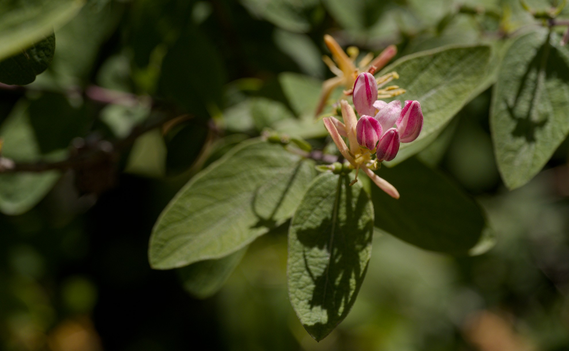
There are definitely some side effects to watch out for if it’s used without care. I originally tried to use smoothing to address some issues near the bottom of this photo, but in the end decided to just mask it away, along with darkening and de-saturating the distractions.
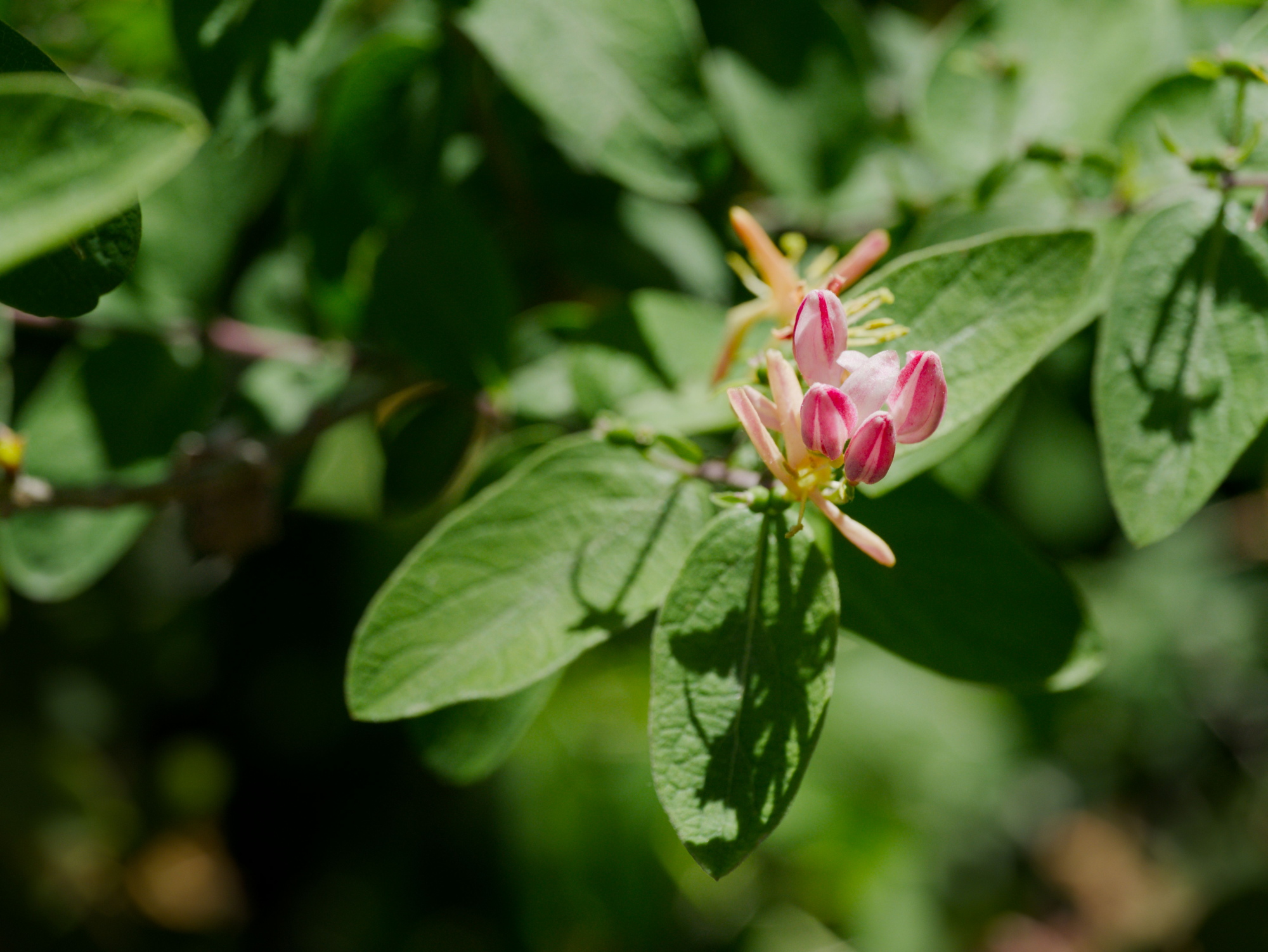
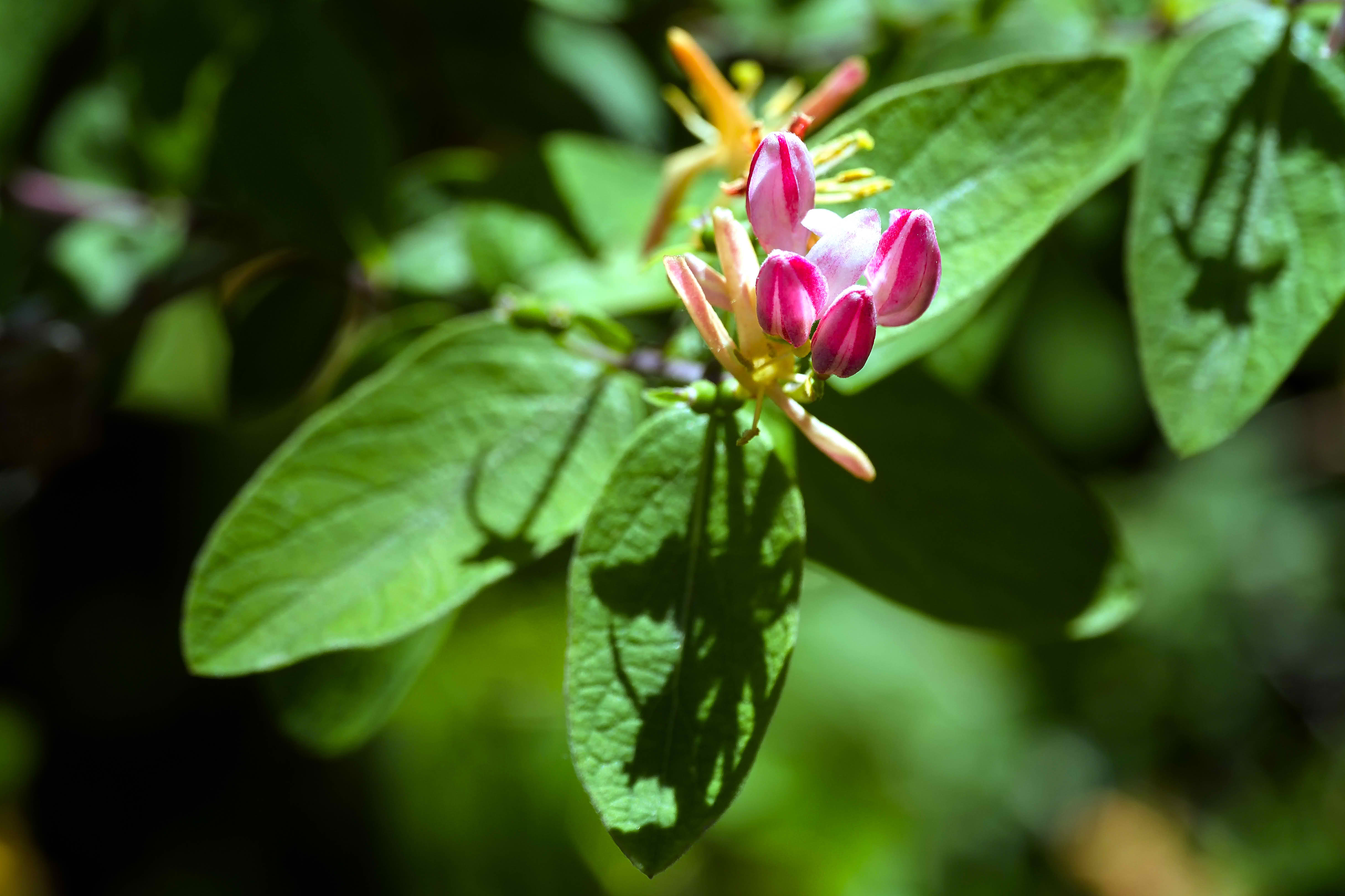
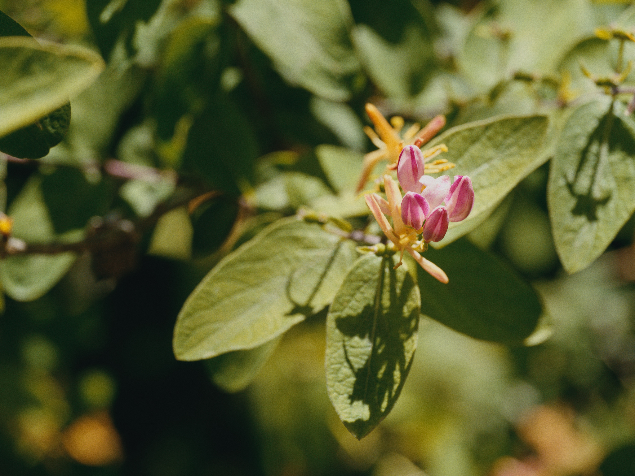
I know flowers can be a popular play raw subject, so I thought I’d share in case anyone else would like to play?
Honestly, I was extremely happy with 5.4. Considering I still use parametric masks on color balance rgb instead of color equalizer most of the time, who knows if I’ll keep using the new module?
I am looking forward to seeing color harmonizer being used in PlayRaws. I welcome new modules and innovations but I have not yet worked out how color harmonizer will help my edits. That is my bad and I am here to learn. No color harmonizer in my edit 2026-05-11 134014-4766.rw2.xmp (18.0 KB)
While I appriciate all the work the devs put into the new version, there is not much in, which triggers me to update immediatly. So this time I wait patiently until the new version shows up in the repositories of Debian Sid. Usually that doesn’t take that long. But therefore as well no colour harmonizer version from me.
Ok, I admit that your edit looks great, but I wonder whether the color harmonizer is changing the image to something that wasn’t there, or is it giving a better representation of the “true” colors?
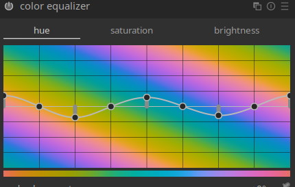
The color harmonizer is used for color grading, following artistic/perceptual guidelines discovered in the past few hundred years to make images pleasing and to create color contrast and/or “harmony.”
The goal of color grading is not necessarily to improve color accuracy. I think this is the case with the harmonizer.
It’s definitely an ‘artistic’ module that rotates hues and clumps them together. Every time you open the module, it forces the histogram to RYB vectorscope view (the art colour wheel, as opposed to the display primaries RGB wheel)
Oh yeah, I definitely see it as an artistic module, not an accuracy one, ha…
On the other hand, it does allow you to use a “custom” mode that lets you pick two to four hues, and set them individually at any angle you want, so if you want edits that use the colors already in the photo, but still want to enhance some color contrasts by pulling the in-between hues one way or another, it can do that.
It’s tricky to get it to look good, though, and I need more practice.
Yes, this. I did some early testing of the module when it was first created, and some of my feedback was to mention how it could be used to increase colour contrast and whether we could lean into this a bit more. I found it really useful and in some ways more useful than its main role of creating harmonies. I think it’s a fantastic addition to the toolbox.
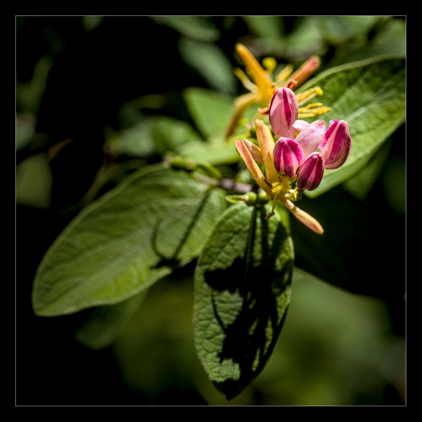
For some reason I like your latest version better as a small photo, maybe because the flowers dominate too much when I expand it to my screen. As a smaller one, the bloom effect seems a lot more obvious.
These are the kinds of considerations that drive me crazy.
I’m at the moment at my Laptop, so all I have to judge my edit is a quite small 14 inch OLED screen. For me it looks good. But maybe it changes when I see my edit tomorrow on the big calibrated 32 inch screen.
Fun Play_Raw for me as I do not consider myself a ‘color’ man meaning I’m not overly sensitive for or picky about colors.
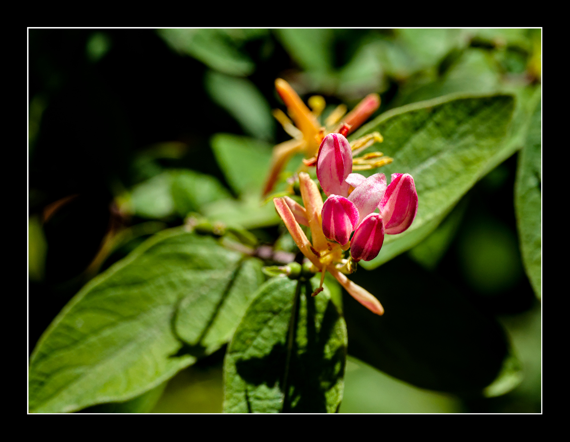
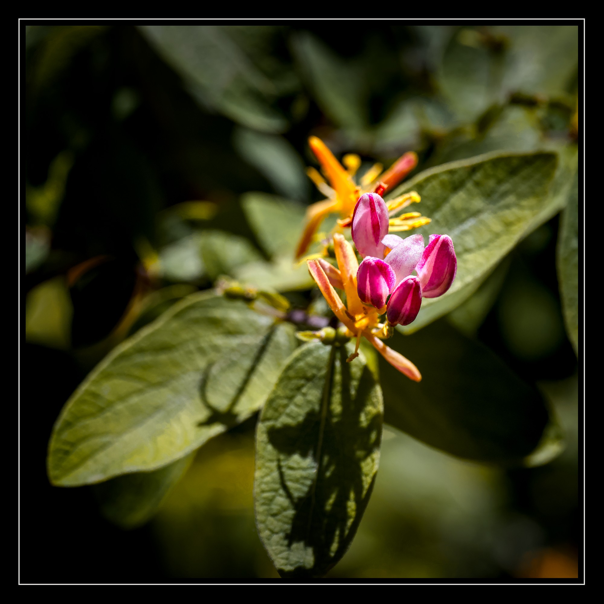
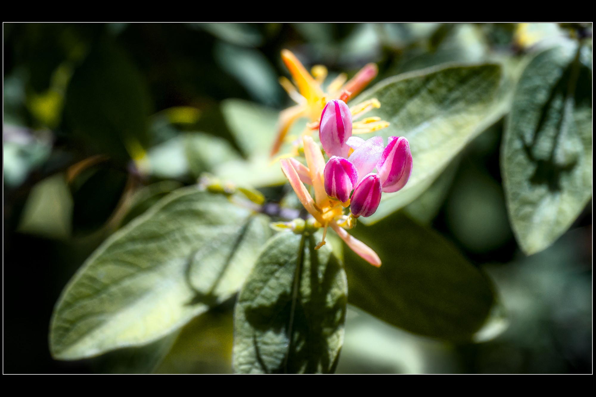
My first attempts at using and understanding this new tool which I do believe to get using more…
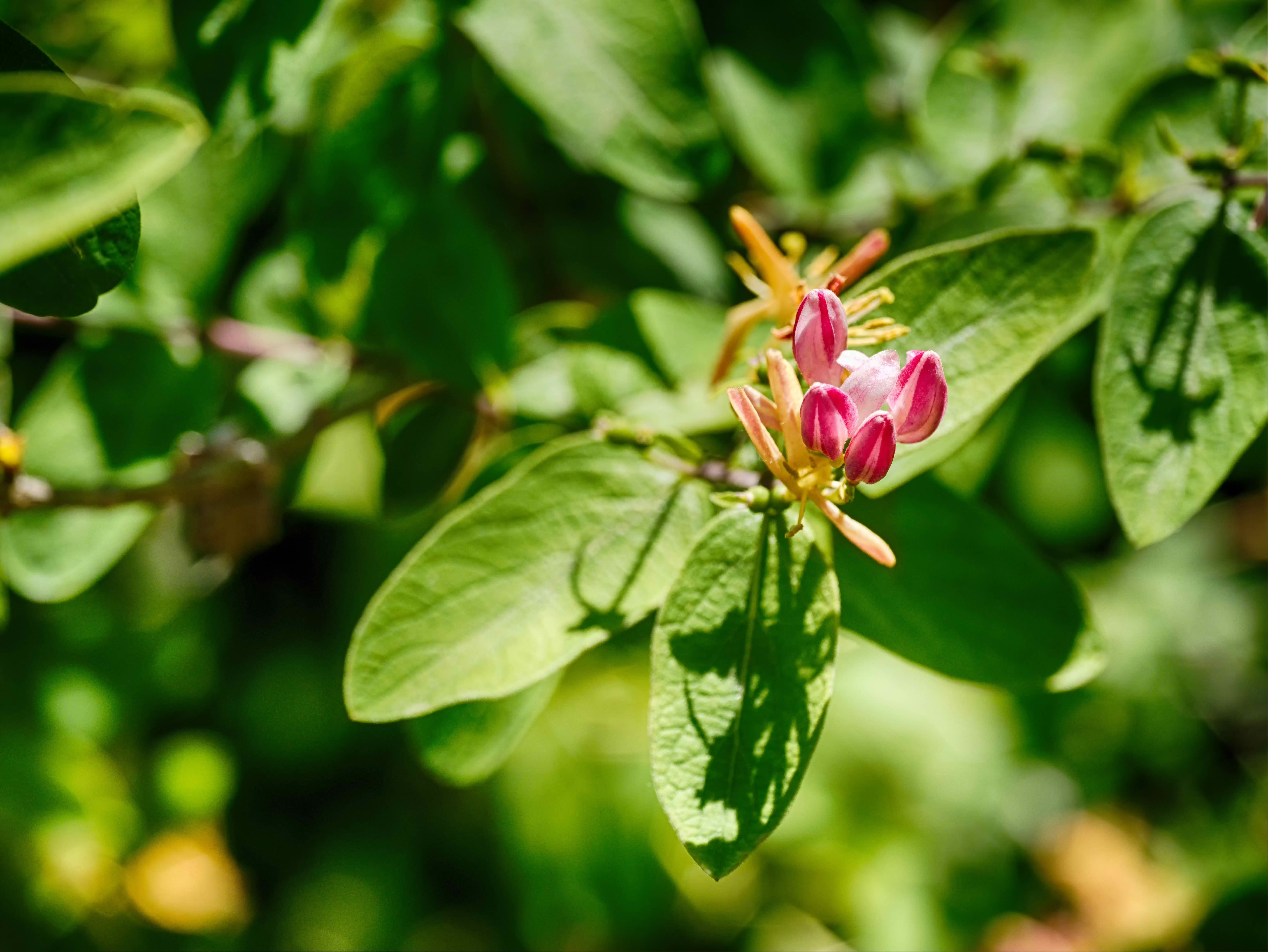
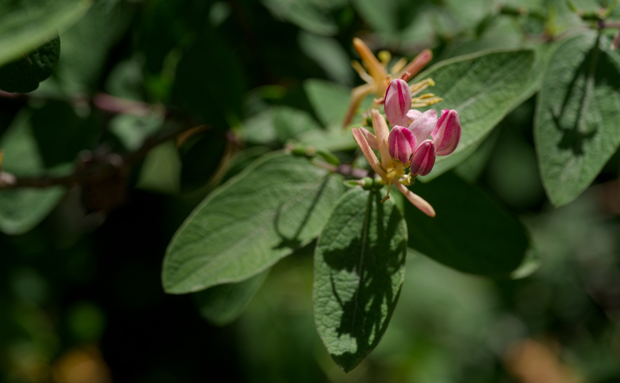
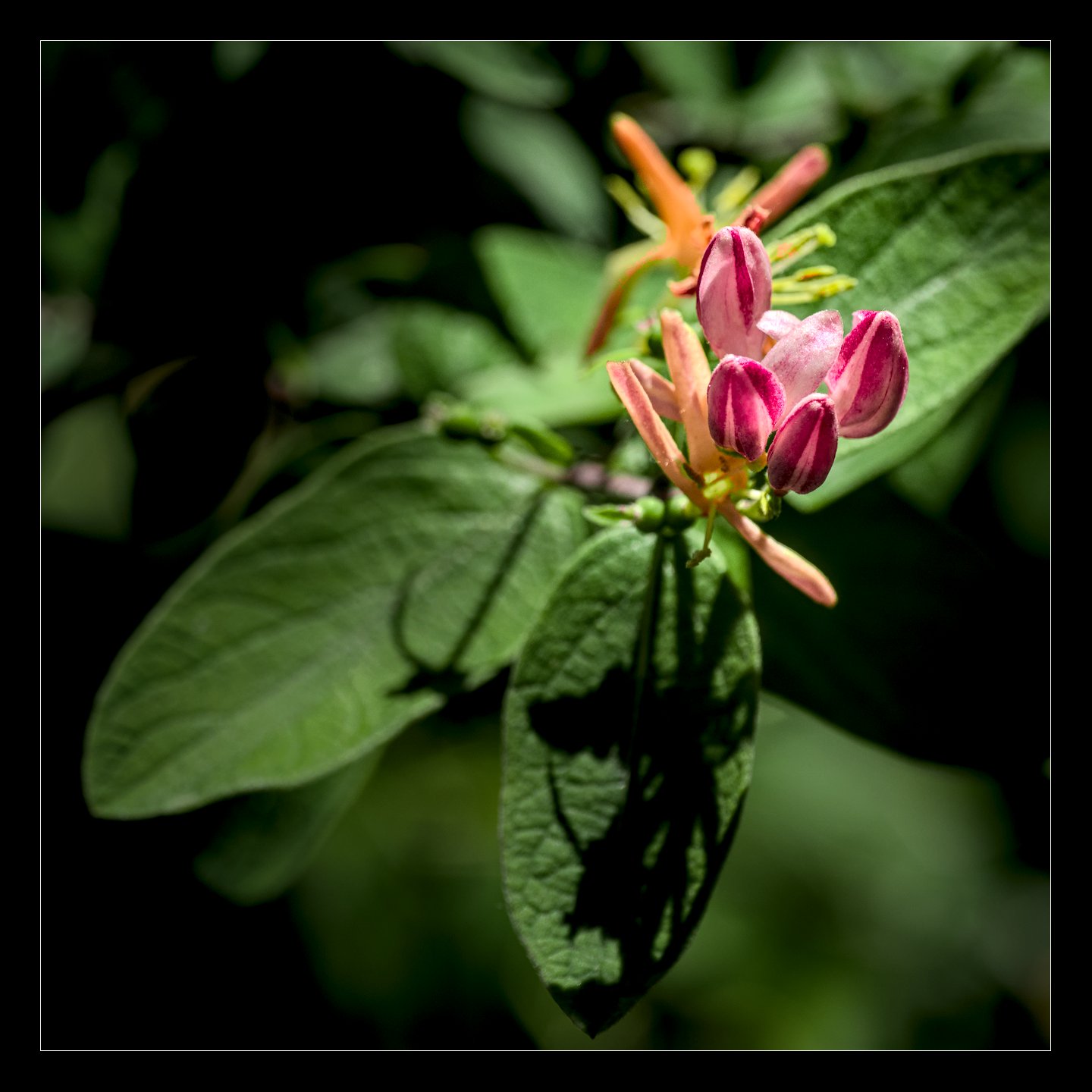
First with, second without color harm (read here as you like).
My intention was to lessen the yellow cast over the greens protecting flower’s colors.
For the rest nothing special.