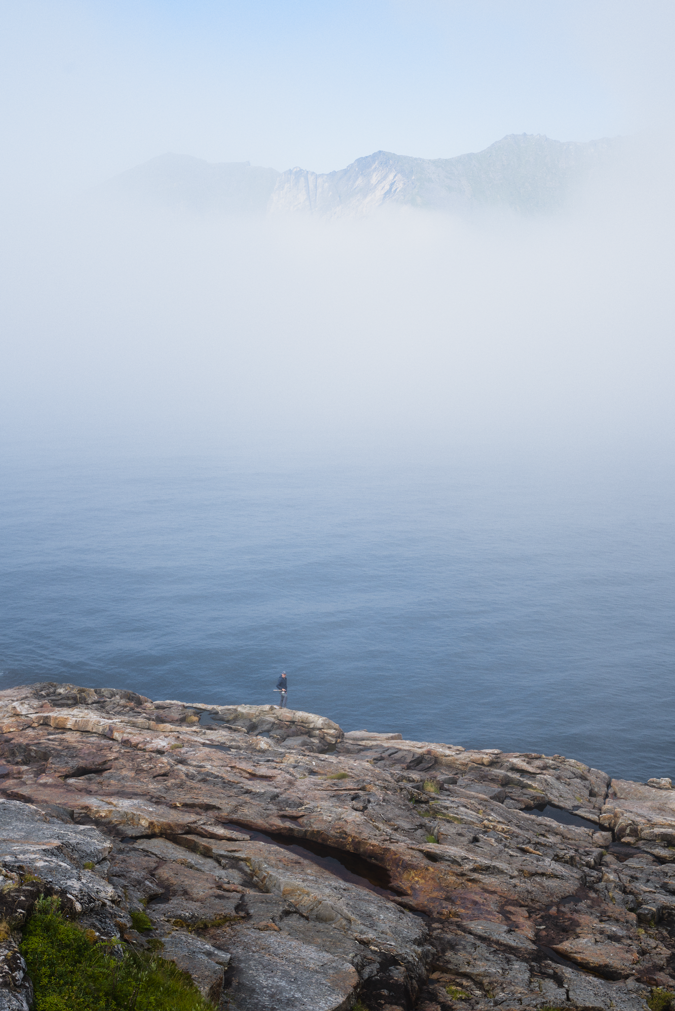
A image from our recent trip to northern Norway that I found to be an interesting editing experience. Using a local dev version of the sigmoid module and color editing module that I have been tinkering with.
interesting, lots of additional blue colour shift in this? can you summarise to what effect you used your new code and why it wasn’t possible/easy with existing tools?
here’s my try to reproduce something similar to your rendition in vkdt in a minute or two (used the spectral input profile from the 7SM2 because i don’t have data for the 7SM3):
That is an impressive view and some very smooth clouds.
Here is my entry. I did a preliminary flat conversion with darktable.
Then with a custom python script, I applied curves, a little color shift, and a chroma boost.
It’s a tool I have been thinking of recently, something like color-zones+curves but with more control and smooth desaturation when pushing highlights.
Really fun to see you interpretations! Black and white really had a different punch to it which I hadn’t thought about myself before.
About this mysterious module that you ask for more details about. Its so far me tinkering for learning and exploring not anything that could be merged to darktable in its current shape. Mostly wrote it to say you won’t get much by trying to open the embedded sidecar. I think the most promising thing what I have done so far is to enabled rgb weighted exposure change a bit like the brightness tab in the color calibration module but more numerically stable. I am also experimenting with doing saturation editing by power functions on the rgb data similar to what happens in the sigmoid module. Has some nice sides to it (never goes out of gamut) but requires a hue preserving step which makes it a bit backwards, fun thing but unsure if it actually is something I want to recommend anyone to use.
Kind of the same as in the sigmoid module but without the need to take a upper bound into account. So no regard to abney effect or similar so far.
Here is how it looks with settings cranked up after seeing you all pushing for higher saturation and contrast then what I did. sigmoid hue preservation set to 50% to have some hue shifts which makes it better in my eyes.