The category column is way too wide.

When posting, I had to switch between portrait and landscape in order to access the category dropdown box.
The category column is way too wide.
When posting, I had to switch between portrait and landscape in order to access the category dropdown box.
Lucky you are, on Opera Mini it does not even load properly 
Your mobile Firefox looks a lot different than my mobile Firefox, probably due to different screen resolutions. It would be useful to know your screen resolution in order to diagnose the problem, since responsive designs work based on the size in px of the area they have to work with.
@CarVac thank you for the heads up. I’ll have a look later today and report this upstream if needed.
I do not have this issue on FF mobile on my Nexus 5x.
I checked with @darix, and he was doing some updating of discuss recently - could you try again with a hard refresh to see if it persists, please?
to me the stuff looks normal in Firefox on Android … some fonts might have gotten a little smaller but other than that … it looks normal.
I did set the “Display Size” to “small” in the Display settings.
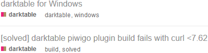
Not worth starting a new thread. On https://discuss.pixls.us/latest,
I just noticed that the font size has increased. In particular, the thread titles are too large.
Another problem is that the categories, tags and activity times do not have the same baseline.
@paperdigits can you have a quick look at this on FF mobile? I don’t have it to test.  Screenshots help.
Does this demonstrate the problem correctly?

With the help of the brilliant @houz:
@patdavid yes that’s it.
Unrelated (perhaps) but on chrome/chromium mobile, the site header cuts off the post title in the post view:

Not the end of the world, but I often forget which post I’m looking at, lol!
I think this might be from the elements for the “home” etc links directly to the right of logo in the desktop version, I bet they need to be set to 0-width in the mobile.
Sorry for the delay. This is what I see.
Nothing is cut-off, off-screen or butt ugly, but the layout could improve  .
.
Pinned threads didn’t use to take up so much space on the screen.
a) Looks like font size increased, along with line height and maybe element border / padding.
Content balance is off. Speaking relatively,
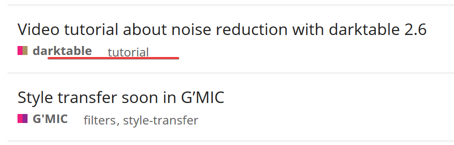
a) Profile pic and category name appear to be a bit too high.
b) Tag names appear to be a bit too low and awkwardly spaced apart.
c) Activity time is sometimes slightly higher and other times low.
Desktop Firefox: see tags.
![]()
Looks like the tags are back on the proper baseline and the overall mobile appearance has improved. Thanks!
The baseline is off again. This time in desktop Firefox 64 but not in mobile.