Fun with RawTherapee versus Lightroom

I’d like your opinions on this…

So it all started with me playing with some images from a while back in Rawtherapee. I edited them and it really impressed my friend Ashley, so I offered to show her how I did them. Problem was she uses Lightroom exclusively since she got used to the interface (worst excuse ever :stuck_out_tongue: ) so me explaining it in Rawtherapee wouldn’t have done much good. I decided to go with it and see if I could get anywhere close in Lightroom. Many things I can do in RawTherapee are simply missing. I don’t think I got anywhere close, but I produced an edit in there which I liked and now am struggling to make it happen in Rawtherapee. I’ll list a few notes I took from the process and perhaps we can figure out the reason behind some of what I find the biggest differences between the two software.

1. RGB channels versus Primary Red, Green, Blue
Rawtherapee has the channels, while Lightroom as the primaries.

2. White balance
The white balance seems to be affected by the RGB channels in RawTherapee whereas not so much in Lightroom.

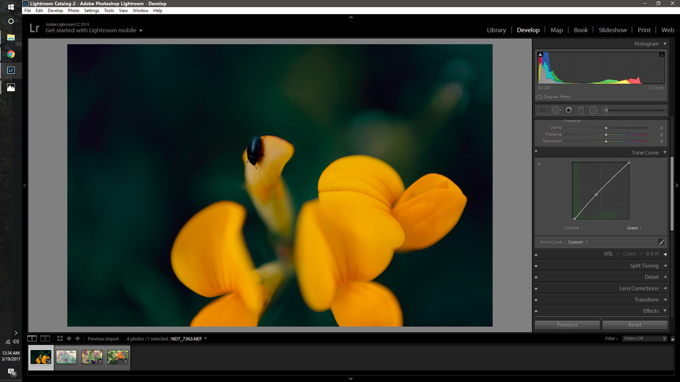
3. RGB Colour curves
They seem to act a little different between Lightroom and Rawtherapee. Now I understand two software can employ different algorithms but shouldn’t the two do the same thing really?

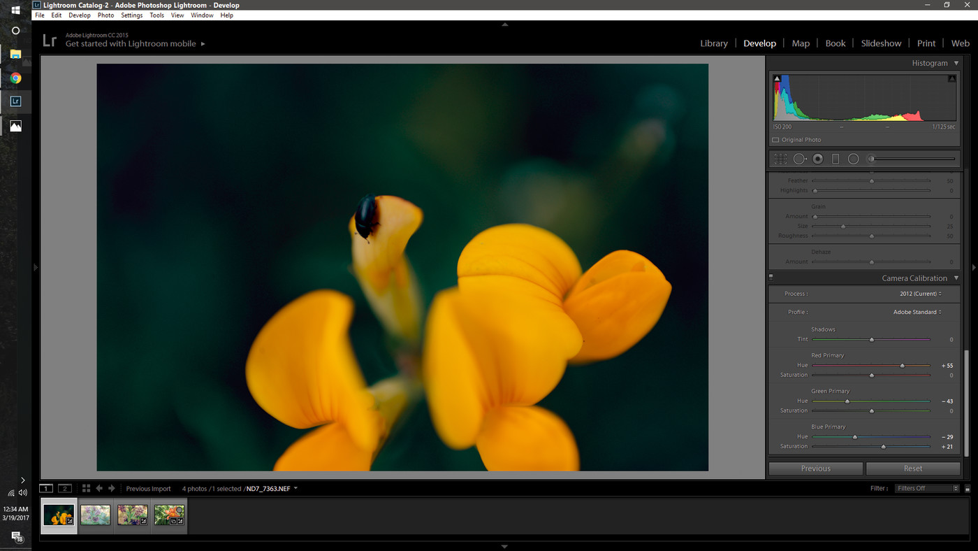
4. The yellow-to-orange conversion
The yellow of the flower became more of an orange in Lightroom, I believe due to the modification of the primary red; but I can’t seem to find a way to do that in RawTherapee without affecting the rest way too much.

So basically, if anyone more skilled than me can figure out where the discrepancy is and perhaps how to translate this look into the more capable RawTherapee, I’d love to know how.

Thank you so very much in advance. I know it’s a lot of work and few of you might care about this as much as I do; so any effort is greatly appreciated. And please don’t be too frustrated if my question is stupid or obvious :stuck_out_tongue:


Here’s what I got:


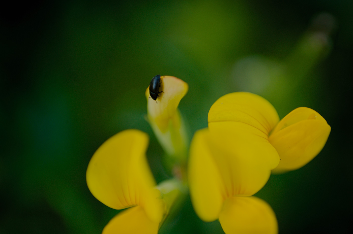
The original RawTherapee edit which I tried to mimic in Lightroom.
Here is the RAW file and the corresponding PP3 file.


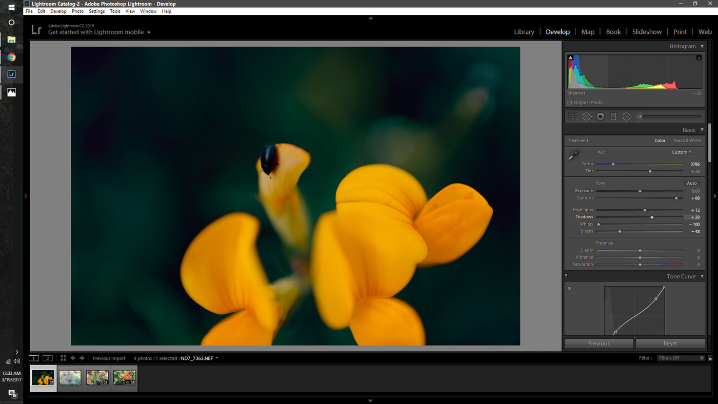
The edit I ended up producing in Lightroom once I gave up trying to mimic.

The screenshots of how I did the Lightroom edit:
I only included the items I changed. In a nutshell, here’s what I did: I wanted a bluer greens background, so I moved the white balance toward blue (screenshot 1), then compensated with curves (screenshot 3 ) and primary colours hues (screenshot 6)

1 Like

Disclaimer: I’ve never used Lightroom – of course I’ve heard about it but I’ve actually never seen it in person :smiley:
But I got this in less than 5 minutes in RT. I think it is in the same ballpark as your edit, and I’m sure you can get even closer by working on it a bit more.

EDIT: forgot to add the pp3 (11.1 KB), in case you think it can be useful.

@agriggio this is great! I love it. Could you please share the PP3 cause I’d like to see how it got there. I have myself tried further and got this: my best attempt - 1 - ND7_7363.NEF.pp3 (9.3 KB)

@agriggio Oh you posted it below the image. My apologies, it appears I am blind. Thank you so much!

Sure, I just edited my post – I simply forgot to add the pp3 initially :slight_smile:

Essentially, I used a film simulation and further tweaked the flower color with the HSV tool. Then increased the black level, and that’s it. The rest are settings that come from my default (dynamic :-)) processing profile

@agriggio Ah that makes more sense. I was wondering why when I applied your edit mine didn’t look the same. It is because I didn’t have the film emulation file. Here’s what it looked like when I applied your edit:

What I wanted to achieve was a look as similar as possible without a film colour preset (since they themselves are just colour tweaks as is). So here’s my closest result with just RT settings: the PP3 file

Here’s without the film simulation.


ND7_7363-2.jpg.out.pp3 (12.4 KB)

1 Like

@agriggio this is awesome! thank you so much!

This is how the photo looks in Lightroom Android app (Default import):

@Andrius the lightroom edit I meant was done on desktop version using the settings in the screenshots. :slight_smile:

OK, here’s my crack at the image. All in RT.

ND7_7363.jpg.out.pp3 (9.6 KB)

1 Like

And another go, pretty much the same as the first one but I tried a bit of split toning.

PP3: ND7_7363-1.jpg.out.pp3 (9.6 KB)

2 Likes

Hi @stefan.chirila, as a coincidence I have a friend who were using Lighroom and she did not want to switch to any FOSS because of the interface excuse. Then I asked her out and it fixed a lot :smile: )

That occasion also let me check Lightroom as I never used it before. What I’m tracking is that Lightroom tends to automate things where open-source image processing software does not. It will never be possible to get the same results because: a) Lightroom uses camera profiles different from any FOSS. period. you’d never get the same anywhere outside Adobe environment b) perhaps this applies to WB settings too c) the most important, Adobe software uses their own image demosaicing method, and they have fine-tuned it in their own way too.

So, multiply those original differences on each Lightroom tool and you’d get unpredictable results.

3 Likes

@mosaster thank you so much for the awesomely good laugh I’ve had reading this. I doubt dating this girl would cause her to put the effort into learning the new interface; I mean, I’m a pretty great guy, but not that great hahahaha.

To be honest overall I find Lightroom annoyingly restrictive. I mean they only implemented colour curves in 2010? RawTherapee had them for quite a while …granted they probably sucked but still. Anyway. I find it interesting how Lightroom seems to group various colour hues together …for example, if you look at the image we are editing here: the yellow parts have quite the variety of lightness in them, especially on the top left side of the flower …whereas in Lightroom it’s all mostly the same shade and lightness of orange. This also makes skin tone editing easier I suppose, although most likely not accurate at all from a colour point of view. Any attempt to mimic this and average out tone ranges to show as the same tone in RawTherapee just causes tons of noise in the transition area :frowning: Would be nice if we had a solid algorithm to fight this for the HSL and HSV tools. Also the Lightroom speciffic feature that allows to change the hue of Primary Red, Primary Green and Primary Blue would be hugely useful, since as we stand now, it would need to be done by carefully adding or subtracting values in RGB channels. I guess I should pick up a handbook and learn to actually code rather than complain.

Thanks again for throwing in your take on the situation. It’s nice to see people care :slight_smile:

@plaven this looks great! I’ll try the PP3 once I get home to see what it does!

@stefan.chirila, once again, particularly Lightroom and RawTherapee use different image development methods and, they incorporate different approach to colors/hues/sharpness/lightness/demosaicing and white balance(pipeline) and even more. Lightroom tends to apply such things as basic sharpness, matrix color, etc automatically with no way to control them. yeah, you can control some of those basic things in RawTherapee, but it uses it’s own algorithms. that is to say you’d never get the same image from either program.
Moreover, each image is unique, so some settings might work for this image, but would be useless for another. Lightroom tends to apply default processing that a user cannot control. Also Lightroom’s processing is mostly profiled and comes mostly with no chance of fine-tuning. That’s why control of basic development available in RawTherapee and most FOSS is beneficial, because you can adjust the development pipeline for any given image. Also, that’s why you’re getting different results with the flower and the noise - the noise threshold you’re not satisfied with here might be entirely OK for other, maybe more sharp, image. Just try not focusing on matching the results - they must be instrinsically different.
Hence you have different tools with diferent methods(formulas) for further processing - so it’d never ever be alike.
If you’re not satisfied with the basic level of noise or colors - try adjusting them in development steps and looking what might influence them. For example, too much basic noise is caused by a higher sharpness threshold applied automatically on in basic development stage. Just hoping I can save you from wasting your time :slight_smile:

1 Like

@plaven man I love this! amazing what the split tone managed to do. bravo!

1 Like

Glad you liked it.

The first image tended towards too warm across the whole image, due to pushing the white balance to get the flowers a similar colour and by fiddling with the red channel.

The second image came about because when I checked your image again for reference I could see the cooler tones in the shadows… So it made sense to try the split tone.

Slightly off topic: Anybody have issues with getting white to actually be white in RawTherapee; as in without any colour casts? I don’t have any samples on hand right now; but I feel like Lightroom is trying to be somewhat foolproof, and making sure that when you’re close enough to the right white balance, it makes what’s white, definitely white - while RT may embrace the colour accuracy thing and keep a tad of a cast if any is there.

Question 1: Anybody else think this?
Question 2: Any idea how to get RT to remove slight casts from the white end (and while at it, the dark end …so I can tweak my colours the way I want, while keeping, say a wedding dress white, and the guy’s tux pants black)

@patdavid @heckflosse @afre

1 Like