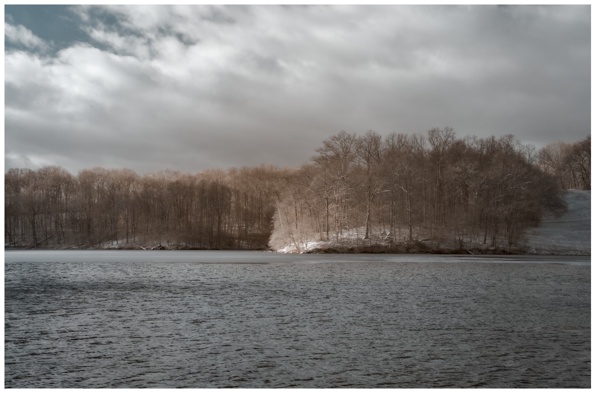
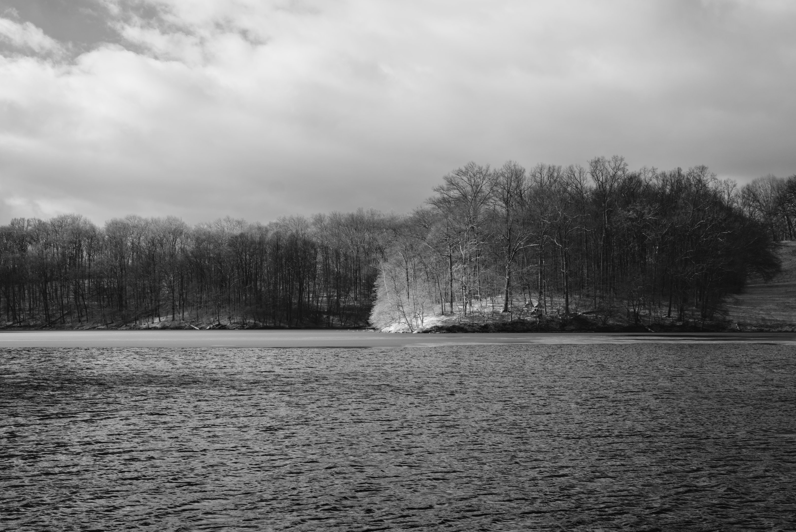
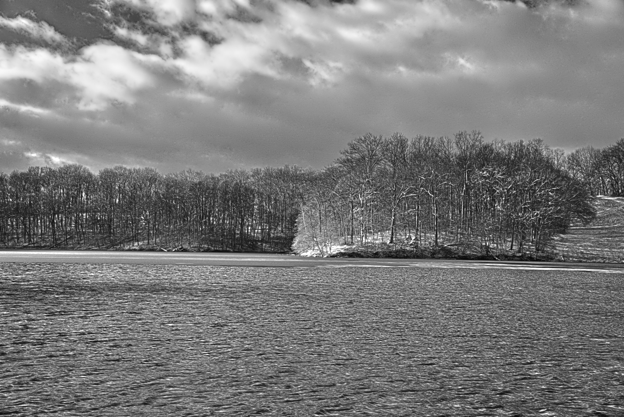
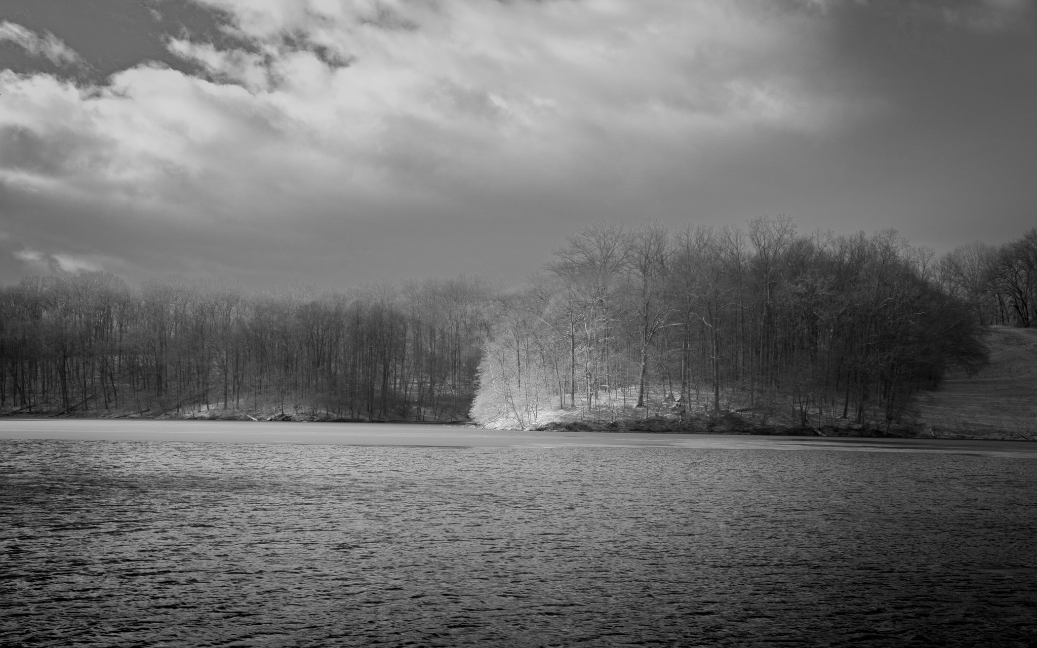
I am looking for help with converting images to B&W. The attached jpg is an (IR) image processed in color. To my eye, this image has a certain depth to it. Meaning that it feels like the sunlight penninsula is closer to the viewer than the darker landmass on the left and right sides of the frame. No matter what I do, I cannot seem to get the same feeling of depth in B&W. I can get seperation, but it feels 2D…like overlaying cutouts from magazines on top of one another.
Maybe this is lack of depth is merely an artifact of how my particular brain processes depth, as a great many famous B&W photos seem “flat” in the same way. It seems equally (if not more) likely that I just don’t understand what makes depth in an image.
So I am opening this up to see what I can learn from you all. Obviously, B&W images processed in darktable are preferred, but please have fun in whatever way/program you want!
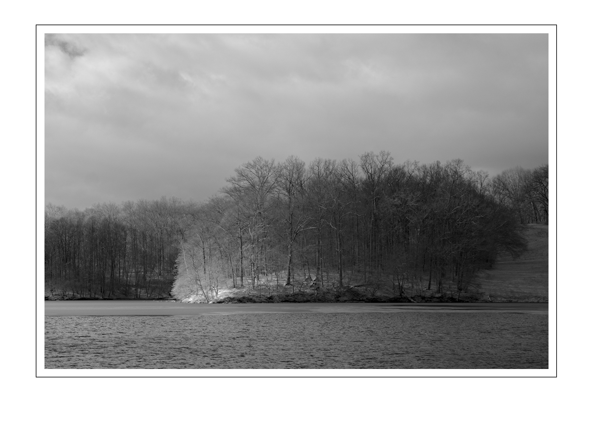
I really like the transition you have from sunlit spot to end of the wooded area on the right. Cropping does help. Maybe the way around my problem is to get rid of it! lol
Oh, such a cool solution. Take that flat foreground and put some distance-leading gradation in it.
No matter color or monochrome, depth in a flat image is conveyed by lines and structures leading from a foreground into the image. Color is a cheap depth leader, conveys depth only on its difference; it takes some thinking to compose to create depth.
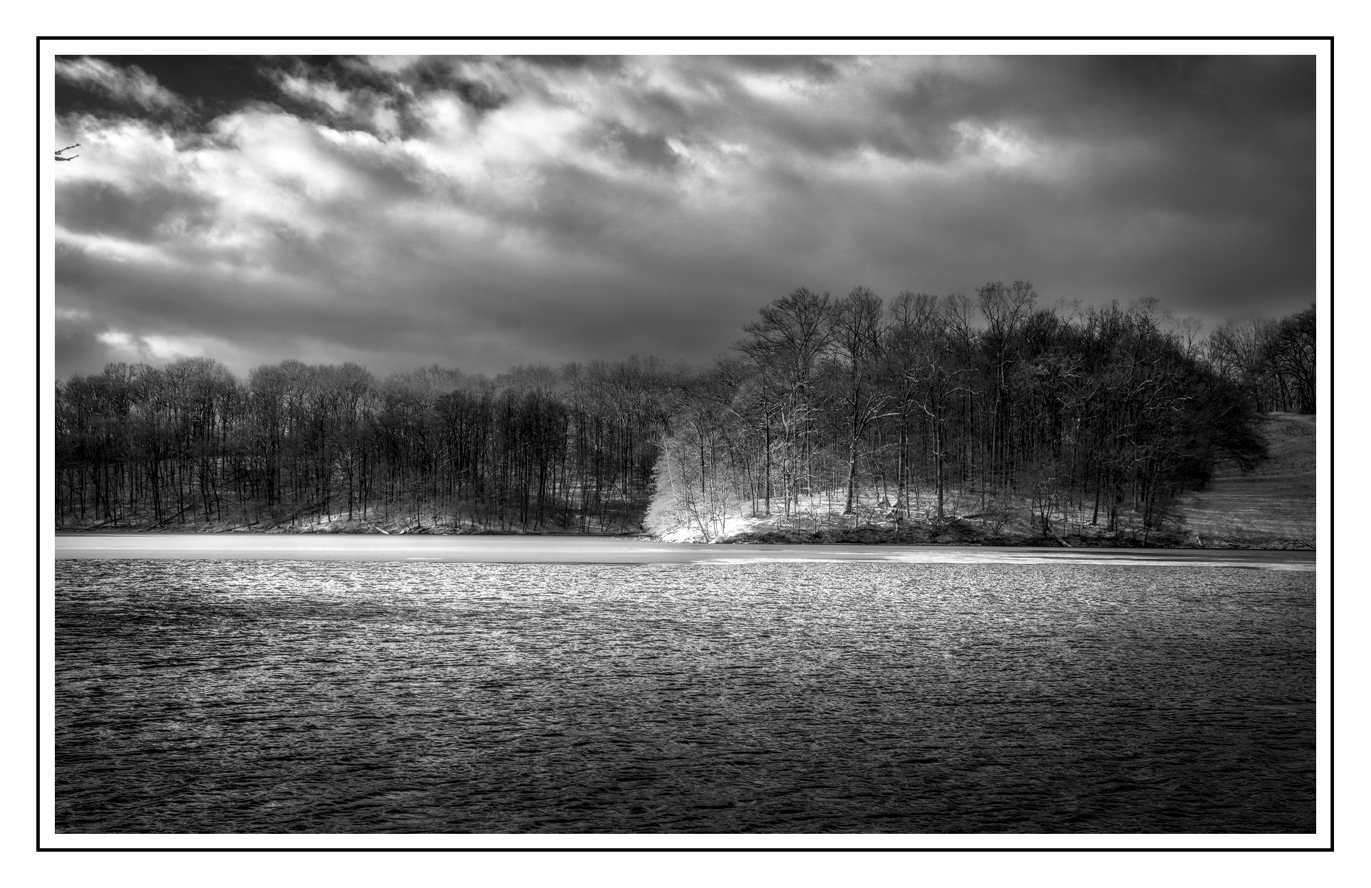
Lots of G’MIC presets (autobalance, dehaze, Local Normalization) blended to taste and used wavelet denoise filter in the sky to get rid of some of that noise. Way too many ways to skin a cat. Of course I removed all color as well. Finally, dupped the result and set top layer to darken and smudged down on the trip tips to get rid of some white artifacting.
B&W is most definitely not my strong point. In my mind I know what I want, but I have a tough time getting there (usually don’t). Plus today my brain is still very foggy coming off a week of flu and the assorted delights that brings…
I have been trying to puzzle out your meaning here, but to no avail. But perhaps we are talking past each other? I very well could be using the wrong vernacular.
We can have an image of a simple rectangle (four connected line segments), change the top and bottom lines to curves and get a cylinder (which has more depth), and add a color or value gradient to the sides to increase the perception of depth even more.
Using lines and structures we can create the perception of distance from viewer to given element, certainly, but I am more interested in the perception of depth using…for lack of a better term…color and value gradients given the direction and intensity of a fixed light source.
What I have in mind is something like the art exercise where one makes an image (in some form) from an arrangement of geometric volumes (cones,cubes,etc) that are tightly grouped together. It is the use of gradients that we both separate the objects and increase the “3D-ness” of each object on its own.
I often try to enhance apparent depth by taking advantage of inherent differences in color, tone and detail in real world visual distance. For example:
Near
Far
Darker
Lighter
More saturated
Less saturated
Warmer
Cooler
Lots of contrast
Little contrast
More detail
Less detail
Reds, yellows
Greens, blues
Well-sharpened
Softer
Local contrast
N/A
Clear
Hazy
Obviously not every “rule” will apply in every instance, but in general it can be used. Other techniques can help, such as superimposition of a near object over (part of) a distant one. Using a subtle (!) “light path” can reinforce distance but it’s very easy to overdo.
As @ggbutcher noted a gradient can lead the eye, creating depth. In some cases a vignette can help.
Yeah, I say a lot of stuff, not much gets understood. Ask my wife…
I would think of gradients as a form of ‘structure’. The endeavor at hand is to make the viewer think there’s a lot of distance between foreground and background, and one way to do that is to instigate the notion of different lighting between the two. I think @Popanz did a great job of that in his rendition.
Color provides a notion of object separation that is lost when the image is devolved to monochromatic tonality.
Hmmm… I wrote this yesterday, got distracted and forgot to hit Reply…
I think calling it “structure” makes sense. So I think it was a case of me not articulating things well.
The object separation loss when “devolving to monochromatic tonality” (I love saying this aloud lol) in conjunction with the loss of structural information is what I am struggling with.
Well, a scene is painted in lots of wavelengths of light that reflect differently on various materials to produce color, at various luminances. When you record such with the oh-so clever Bayer mosaic, you capture some of that rich color and luminance. Then, when you strip out the color information to make an image out of just the luminance, monochrome, I think of that as a ‘devolution’. A nice one, with lots of potential in its own right, but with only a fraction of the information that was in the original scene.
Prose written while sipping coffee, probably need to switch back to decaf…