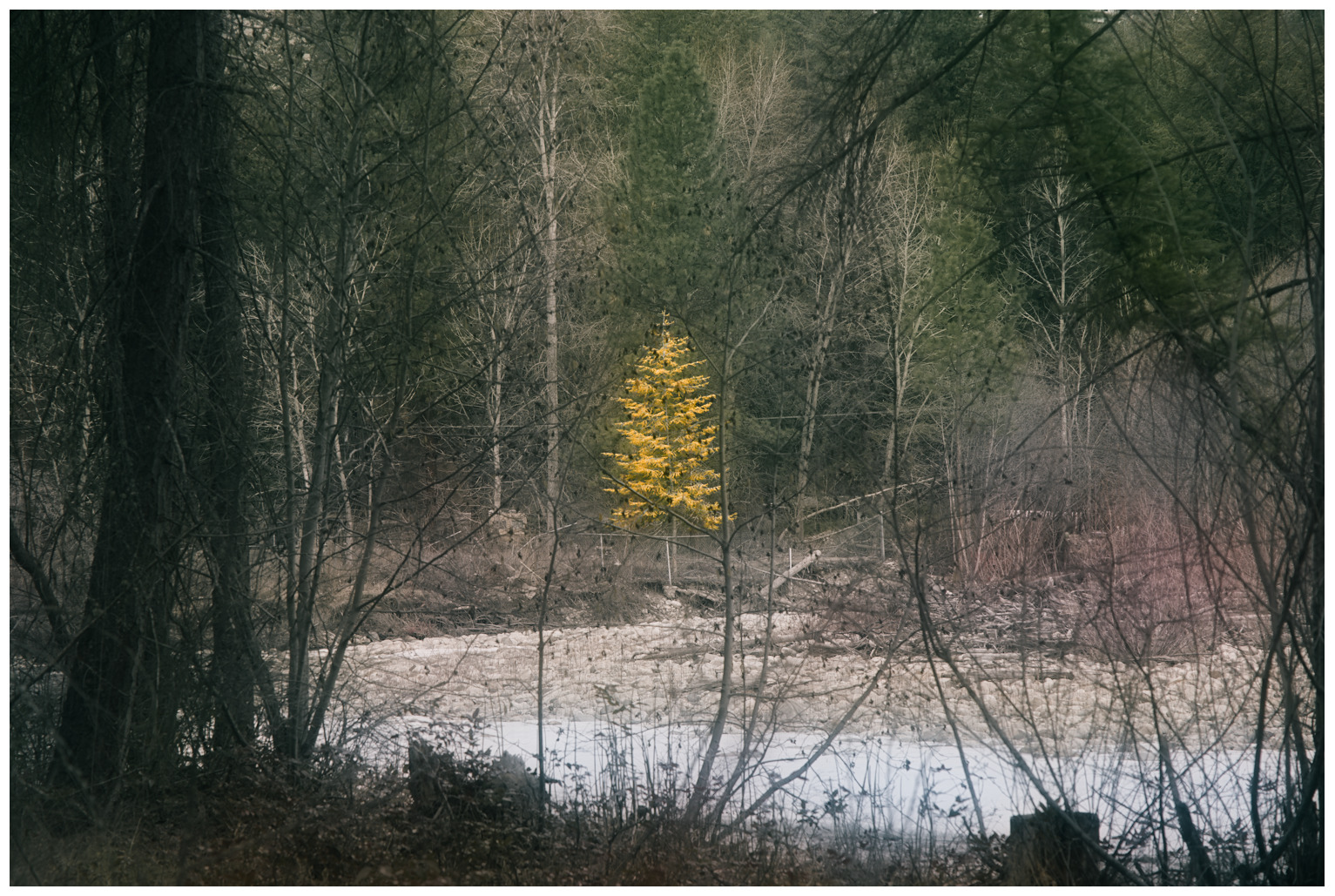
I spotted a lone tree through a tangle of branches. It was such a busy shot, and I thought it was one for the discard pile. But for a challenge, I decided to try and calm down the chaos through processing and go for a painterly look.
I’m not sure if it works so I’d like to hear others’ thoughts. @paperdigits: I’m asking for a critique!
I like it. Kind of a “order in the middle of chaos” theme, and the random scattering of tree limbs give an interesting texture. Great use of ‘color contrast’.
I have so many shots like this and you have done a better job than I have ever done in processing! I am also not a great photog. so take what I am about to say with all that in mind.
For me, and on this screen:
The trees closest to camera (both left and right edges of frame) are distracting becuase of the color intensity of the green. I like the idea of having a rich color in those locations so maybe decreasing the value of the mids/darks in that area would help. Bonus of doing that would be the increase in pop of the yellow treen due to contrast.
Second, when I view the inset at 100%, you can see lots of random leaves/pine cones which show up as black specks throughout the middle of the frame. I dont know how you plan on displaying the photo, but keeping it small removes those specks…or I guess you could clone them out too. It depends on how much work you want to make for yourself.
I love how the yellow leaves pop and the comp is good given the obstacles of the scene!
I really like this image, it fees like a play on a very classic nature shot, but with the added interest of all the little branches reaching towards/for the young, golden sapling. It feels like a social commentary about coveting youth to me. I generally don’t like the main subject so centered, but it feels appropriate here.
I like all the little branches in there, you don’t see them in the thumb nail (or you wouldn’t see them from far away if this was a print), but you see them all when you get the full size image. A very nice discovery when getting closer to the image. An art teach I had said “you want something to draw them to towards your work, then reward them when they get closer” and this is a nice example of that.
If I were to suggest some improvements, I’d say the darkening of the trees in the foreground, on either side of the frame look a little smudgy to me, I might see if some local contrast can pop a tiny bit of detail in there, or some capture sharping style sharpening.
I might grade the color of the yellow and green, pushing the green a bit more towards blue, this will help with the yellow popping. I’d also add some chroma to the yellow if you can keep it in gamut.
The thing I’d concentrate most on is the snow/water in the foreground. If you can find a way to make that darker while keeping it natural, I think that’d really add to the yellow tree poping. As it is now, it is pretty light and white and draws my eye away from the tree.
Thanks for all your comments!
This is the first time I have ever asked for a critique, and I think part of the reason why I haven’t before is because I’m rarely looking for ideas on how to approach the image differently, and some critiques I’ve seen on other forums tend to devolve into this, e.g. “I would add more saturation”, “I would crop out X”.
I’m generally more interested in just whether people like my interpretation or not, and maybe tips for how to improve on the direction I took it. So, I decided to seek critiques on this photo as a bit of an experiment to see how much I like the critiquing process. So, thank you for taking part!
As for this particular image, as I briefly mentioned, I wasn’t even sure how well it works, so I didn’t spend much time on it. My treatment of it was almost like a quick interpretation to see whether there was mileage in continuing to work on it more.
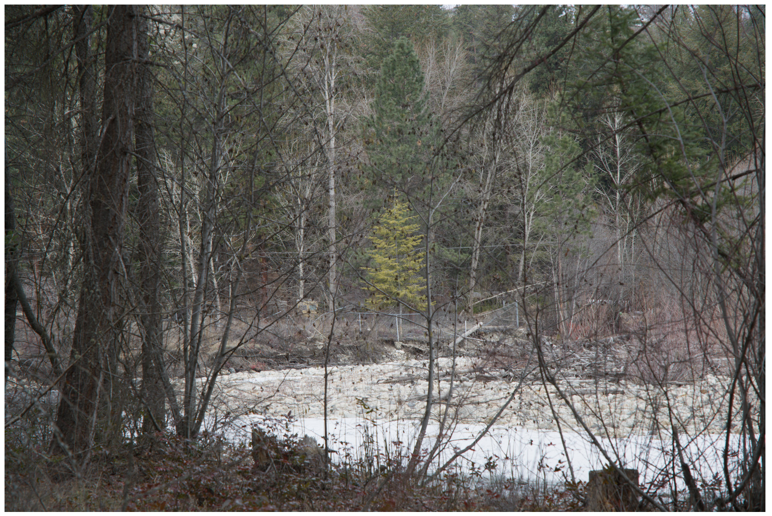
Anyway, I thought it would be interesting for you to see the original RAW (below) so you could see what I’ve done already with the processing. And I’ll respond to some of the points made individually.
I think I had the same idea as what you are suggesting, which you may be able to see by comparing to the RAW. I tried to darken the greens and make them more splashes of dark, rich colour, rather than obvious foliage.
My own philosophy with photography is to capture the scene as it is and refrain from cloning unless particularly egregious. With this image, I think the chaos is part of the image, so I want to keep it chaotic. But I definitely take your point!
Thank you! It’s obviously great to hear that someone likes your image, but I particularly like that you added something on how it speaks to you and what it makes you feel. That is something about this whole exercise that I wasn’t expecting, but I now realize is a major part of the value of critiques. I haven’t even analyzed how this image makes me feel! I think what interested me was the chaos of it, which is something in woodland photography that we normally try to avoid rather than embrace.
I know what you are saying about the centering of the tree, but it was a conscious choice with this particular image. I wanted that tree in the bullseye, but it’s something I usually avoid.
Yes, this is something I wasn’t sure worked or not. As you’ll see from the RAW below, more detail was captured, but I wanted to tame the detail so the chaos was still there, but not too crunchy. I used Contrast Equalizer to remove tonal contrast all over the image, and then I added colour contrast back in to make the tree pop.
I actually did a bit of that as you’ll see from the RAW. Maybe I could have done it even more? I added some blue in the shadows, but it is subtle I agree.
I think I agree. Looking at it again, the snow is too bright and glowy. I think it is distracting from the main subject. Thanks!
Yes. I think it should be a standard critique component to talk about what you like about the image and how it made you feel. i think that’s the “art” part of it and I think about it a lot while I’m editing. I’ll often start with thinking about some broad themes and then talk my way (in my head of course, never out loud) thru the image and what I want to try to convey to the viewer. Editing is then an exercise in mapping those feelings and thoughts into the choices you can make while editing.
Anyway, I find it useful to hear what others feel and think it means, because than I can measure that against my own feelings and my editing decisions.
Is the tree in your photo a larch or tamarack? My first impression was actually that it made me think of the Golden Spruce, which has a pretty wild back story, for a tree.
I think this scene would be good for hanging out for a few hours and seeing what different light options would do with the tree. You could probably get several nice compositions.
I then thought, “wouldn’t it be great if all those fences weren’t there” and “oh man, I wouldn’t want to try to clone all those fences out.” I agree that in this case the central placement of the tree just works; I’m also in the camp that seldom places subjects in the center of a frame.
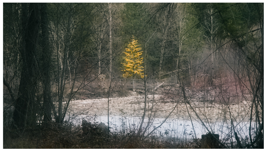
There’s no doubt what the subject is, which is great, and the foreground trees on either side make a good frame. I don’t find them to be “too much”. I used the top of the reply window to block out the bright snow (simulating a crop), and I found that this eliminated a distraction. I’m not sure trying to dull down the snow would achieve anything other than make it look dirty.
I’m not sure, actually. My instinct was that it’s a larch, but I didn’t get close to identify it.
Yes, absolutely, and that probably applies to 99% of my images! I sometimes go out on dedicated photo walks, but mostly it’s more of a case of taking my camera out when I’m going for a walk, if you know what I mean. I sometimes get frustrated that I’m not more of a dedicated photographer who plans trips and times, but I’m actually starting to embrace my style, which is an opportunist. I work with what I get, rather than go out seeking something. The payoff is bigger when you get a great image, whereas golden-hour stuff can sometimes be a bit of a cheat code.
You could have used a more shallow depth of field. I am generally not a big fan of this technique but in this case it could improve the emphasis on the subject.
i would have tried a 16:9 format and allow the tree to be vertically offset from the middle towards the upper end. In the upper 25% of the image there is not much to be seen anyway. At least for my taste .
Many thanks for sharing the image and putting it up for critique!
I just checked the EXIF data. This was shot at 80mm, 1/120, f5.6. This is just one stop narrower than the widest this f4 lens can go, so I’m not sure it would have made much difference. But otherwise, yes, this might have improved it, I agree.
That could have worked too, but I actually like the tree dead centre for this particular shot. I like the idea of it being totally surrounded by the chaos.
I would crop it the other way, following @elGordo 's suggestion, cutting up to the higher limit of the whitest snow patch. I find that crop puts more emphasis on the tree, as then it would be the brightest object by far.