OT:
It’s actually quite the fascinating, if completely off-topic, interlinguistic discussion. I feel like ordering a round of three beers now (IYKYK).
Uli was jokingly referring to the epistemological dilemma of whether he should first look at the ostensibly “Uli-typical edit” or first try doing his edit without looking.
The best English word is probably “stumped”, which doesn’t have a good German equivalent in the given context. Uli probably started with the German word “verwirrt” and went from there, trying to translate it. Google AI translate is of comfortingly little help here btw. It can’t grasp the context.
3 Likes

8 Likes
@europlatus That is a great use of the censorize module! What benefits do you see using the censorize module instead of the bloom module?

8 Likes

3 Likes

4 Likes
Hi @EmerS , I didn’t actually use the Censorize module with this image. Is it perhaps another module you’re thinking of?
A play it is, isn’t it…

20250628_0042.ARW.xmp (18,2 KB)
or a bit more intense:

20250628_0042.ARW.xmp (18,2 KB)
6 Likes
I was curious about the censorize module so I downloaded your xmp file and applied it to the raw original. It does seem to use a preset “censorize - Rob dreamy contrast 2”. Not sure about your workflow but maybe you changed your master after uploading the xmp and jpg. Anyway I did play around a bit and will use censorize if the need arises.
@europlatus @kap55
Yes, “censorize - Rob dreamy contrast 2” that was enabled. Thanks for checking it out, @kap55 — I figured I had confused europlates’ with someone else’s XMP, which wouldn’t be the first time I made that mistake.
1 Like
Thanks @kap55, you’re right! It looks like I changed my image after I uploaded the XMP file, so I didn’t think I used that module. This is not the kind of image I would usually use that module, but it looks like I did experiment with it.
So, @EmerS, I should properly answer your question now:
I sometimes use the Censorize module to add soft contrast. I use it with the Multiply blend mode, which largely removes the hazy diffusion added by censorizing, and instead adds contrast but with soft diffusion rather than crunchy contrast. It’s somewhat similar to the Orton Effect, although the blur should not be as noticeable.
It can produce effects similar to Bloom, but you have more control. I use the fulcrum to control the brightness and the opacity to control the strength. So, it can also apply to midtones and shadows if you want, whereas Bloom tends to just work on highlights.
To me, contrast is key to a successful image, so I’m always looking at ways to increase or decrease contrast in pleasing ways. Local Contrast and sharpening gives punch and clarity, but soft contrast gives texture and a nice 3D quality. I generally don’t like to use much sharpness, but I do like to add texture.
I was actually surprised I used Censorize on this image because I don’t feel it lends itself as well to architecture. But it can create a nice effect on clouds and soften highlights, which is probably why I experimented with it here.
1 Like
@europlatus Thanks for taking the time to explain the use. I’m always looking for ways that are more natural to create contrast, especially since I do so much B&W (from my non-professional eye, I feel B&W lends itself to a little extra contrast than would be typical for color without seeming over-contrasty…but I do love over-contrasty B&W too ![]() ).
).
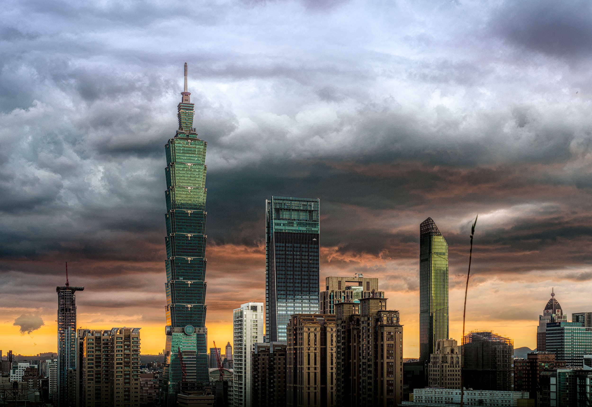
Where I really noticed the censorize use was in the space between these two buildings and the gentle blooming effect of bringing the light up on the buildings themselves:

I used it with my B&W and actually then added bloom on top of that. The results are with just censorize being the top half of the compare and both censorize and bloom the bottom half of the compare (circled in blue):

Keeping the options tweaked just right seems to have given a little extra highlight lift on the buildings, without overly blowing it out.
Again, thank you!
2 Likes
Yes, absolutely. I often really crank up the contrast in my B&W images, even to the extent of crushing. It’s often the difference between truly eye-catching and just meh.
It’s always a delicate balance between pushing it too far and not far enough, and I can’t say I’m always successful. Of course, it’s always subjective anyway. Some people like a more natural, flat look, whereas others really like the pop of more contrasty images.
One thing I love about Darktable is how many options there are and how it’s a true playground for experimentation. I used to get paralyzed with trying to do things the “right” way, but I’ve now embraced just following my eye and forgetting what is technically the “best” way. That’s why you’ll see me using both scene-referred and display-referred modules, and some of them in strange or non-standard ways. I know other contributors to Play Raw also do this, and I think they often produce the best images.
3 Likes

7 Likes
A more playful approach, quickly done using my earlier edits as a starting point. I combined two variants in GIMP.

20250628_0042-1.png.out.arp (13.1 KB)
20250628_0042-3.png.out.arp (13.1 KB)
I kept going back to this edit, knowing that something was still off. Luckily I still have the xcf, so I briefly went back in and brightened the top third a bit. You be the judge which is better.

Made a third edit by exporting the one directly above as a tiff out of GIMP and loading it into RT for some Selective Editing adjustments in RT.
20250628_0042 GIMP out 2c-1.jpg.out.pp3 (28.9 KB)
8 Likes
9 Likes
What magic did you do to the clouds to bring out that much detail?
It’s not that hard with dt to work out details. Mainly you can do that with local contrast and the diffuse and sharpen module (at least I do it this way). The difficult thing is to find the right amount, which @Dito_Budi served very well. Just an example for pushing it to the limit:
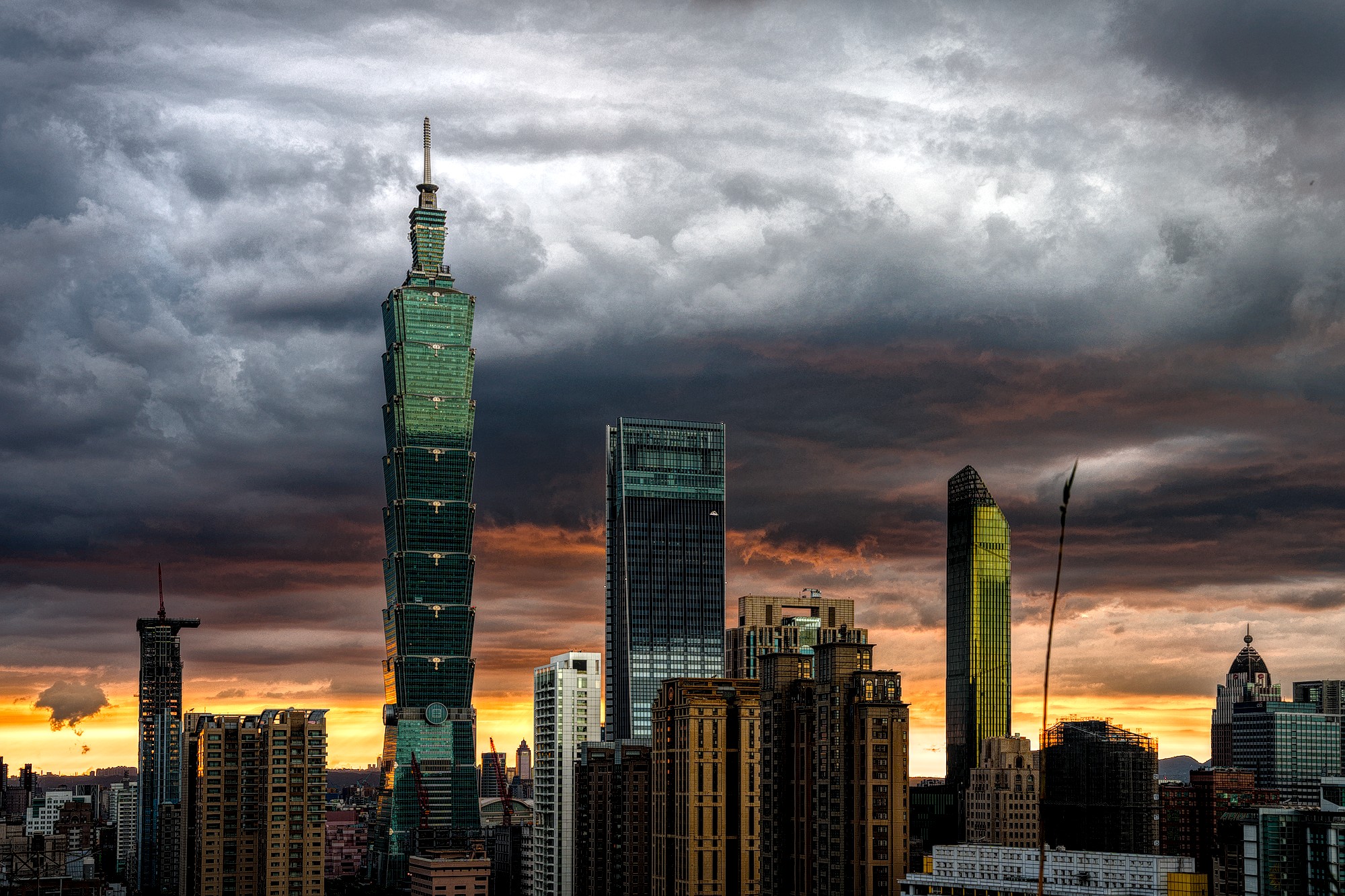
20250628_0042.ARW.xmp (19,7 KB)
a bit further and it starts to look unnatural:
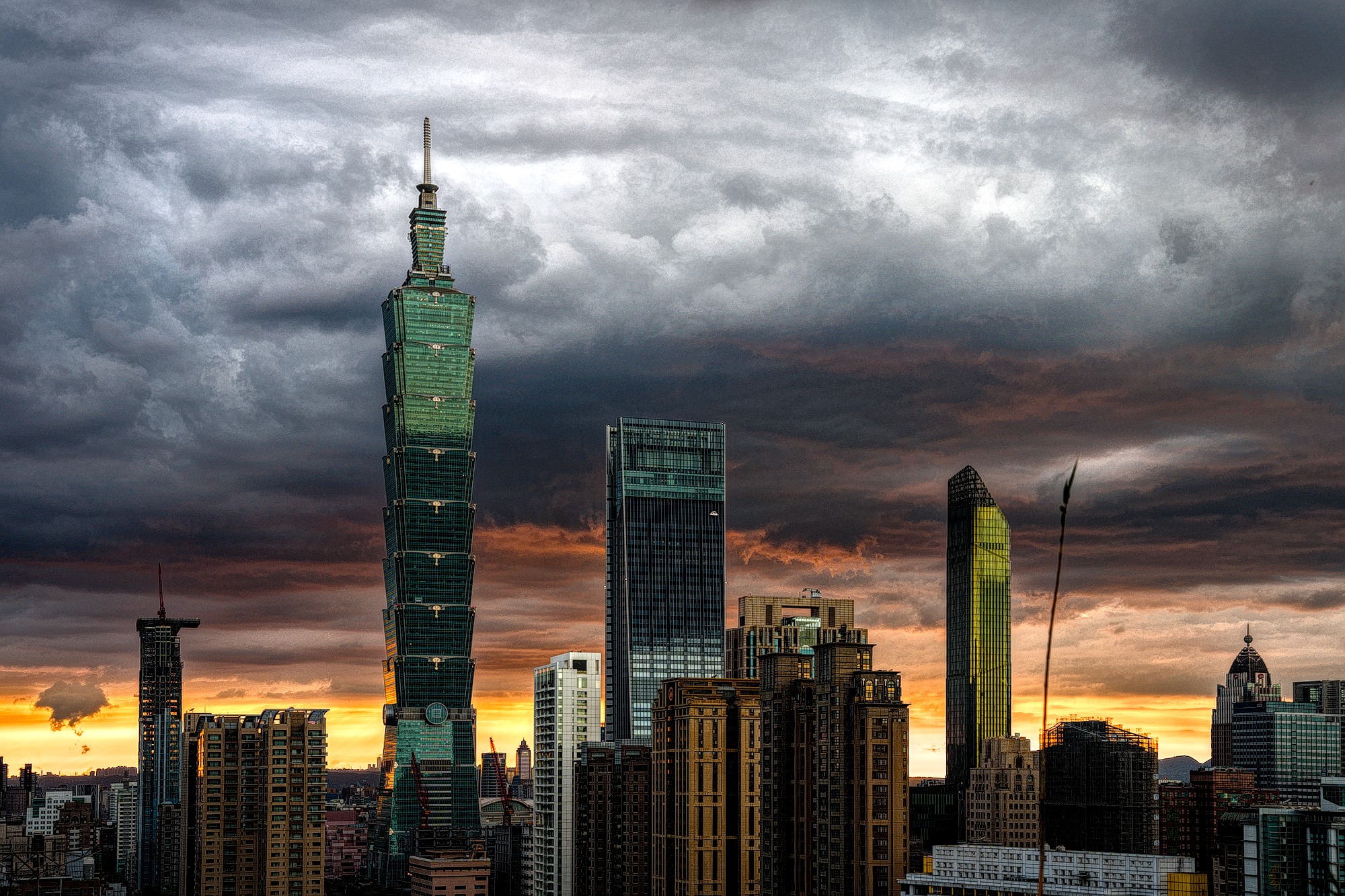
20250628_0042.ARW.xmp (19,6 KB)
3 Likes
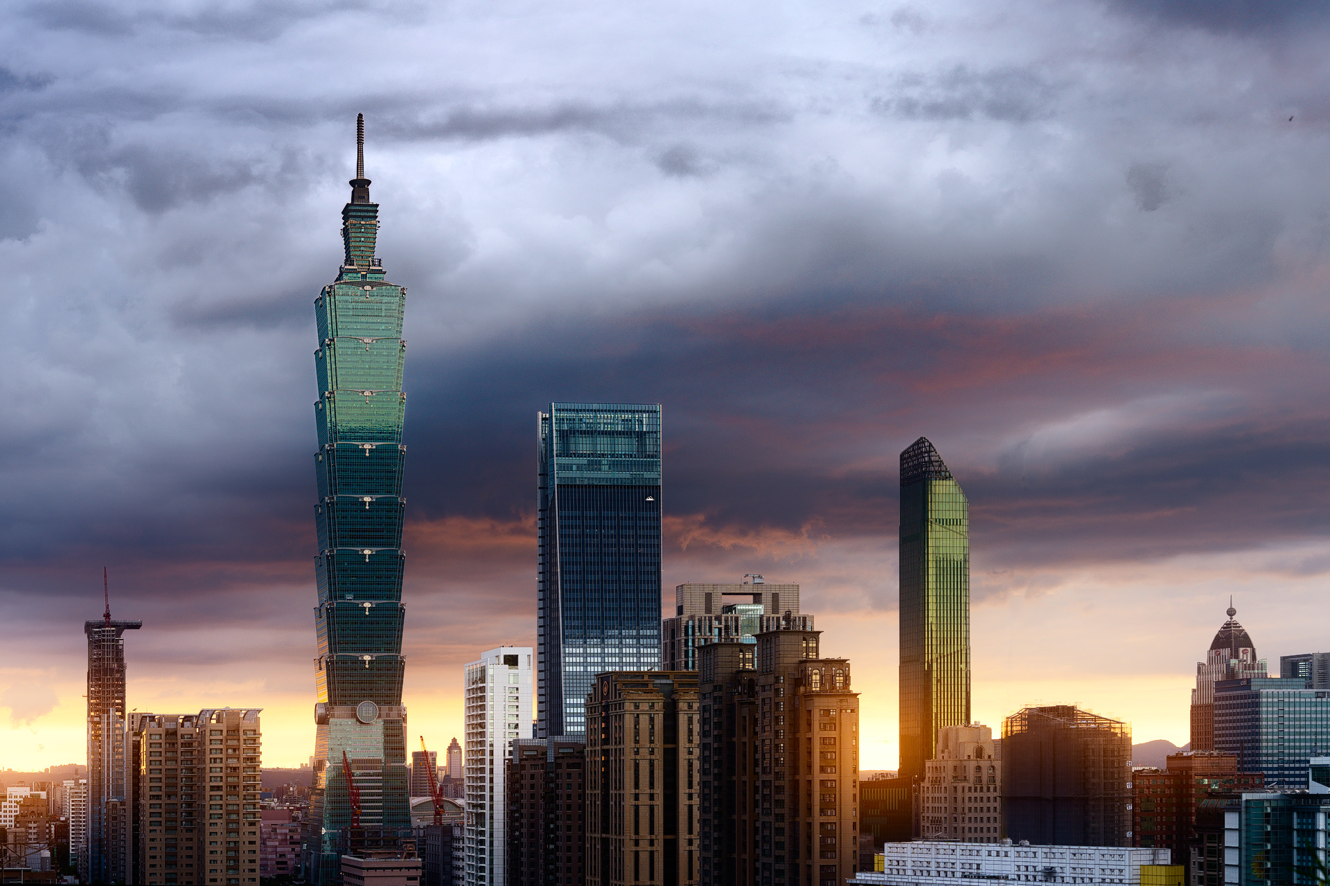
@streetfighter Nice shot! I used to live in Taipei and miss it a bit. ![]() Was this shot taken from Elephant Mountain or somewhere else if you don’t mind my asking?
Was this shot taken from Elephant Mountain or somewhere else if you don’t mind my asking?
It is from elephant mountain. I’ve been living here for 3 years now. Waiting for this horrible hot summer to end and finally be able to go out and start shooting again!
1 Like