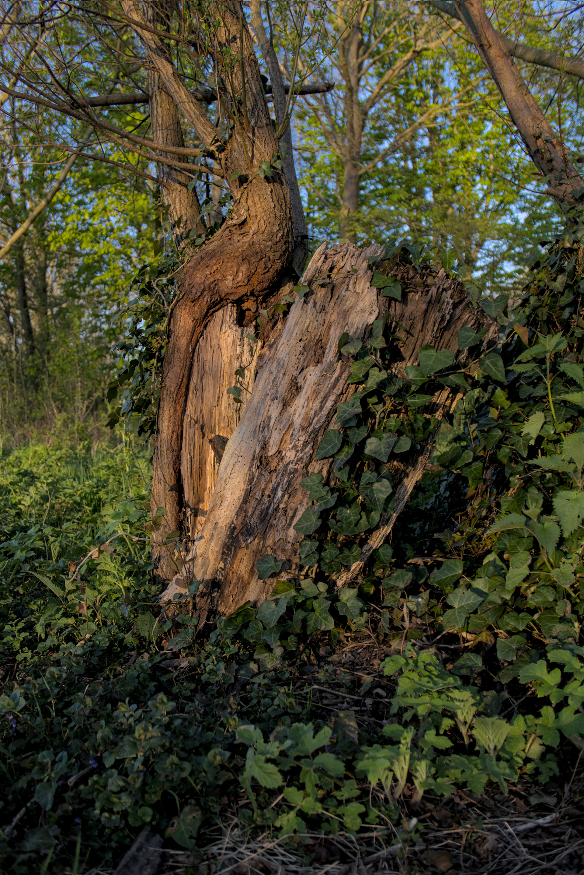
Yes, that seems to be the case. Noticed that already when looking at your Before the flying day,… edit.
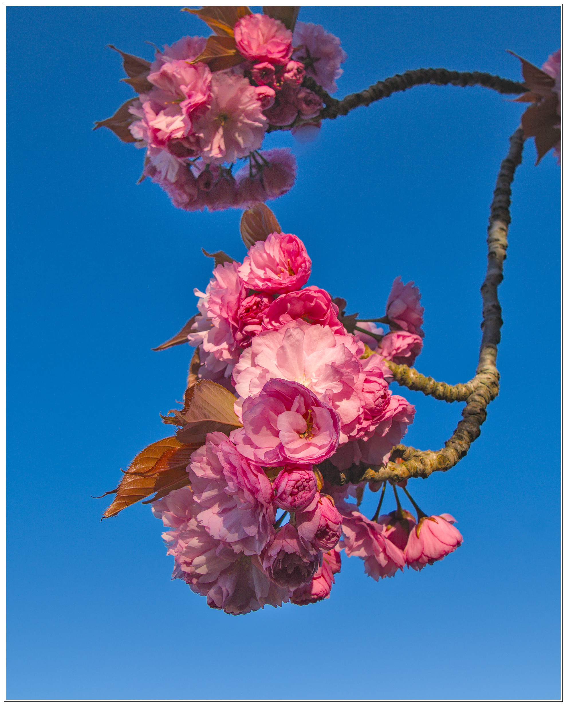
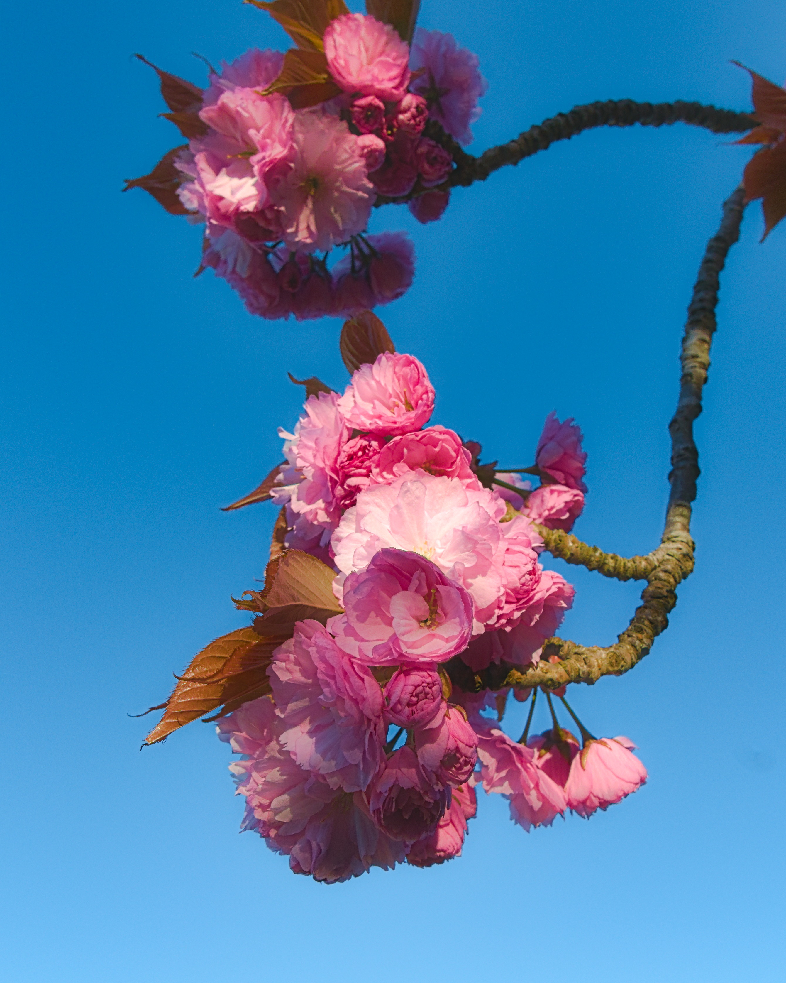
I’m not so sure about the first one. It is a very nice edit, don’t get me wrong, but tastes do differ at times.
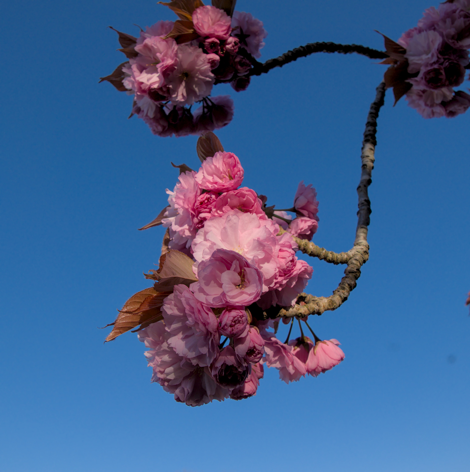
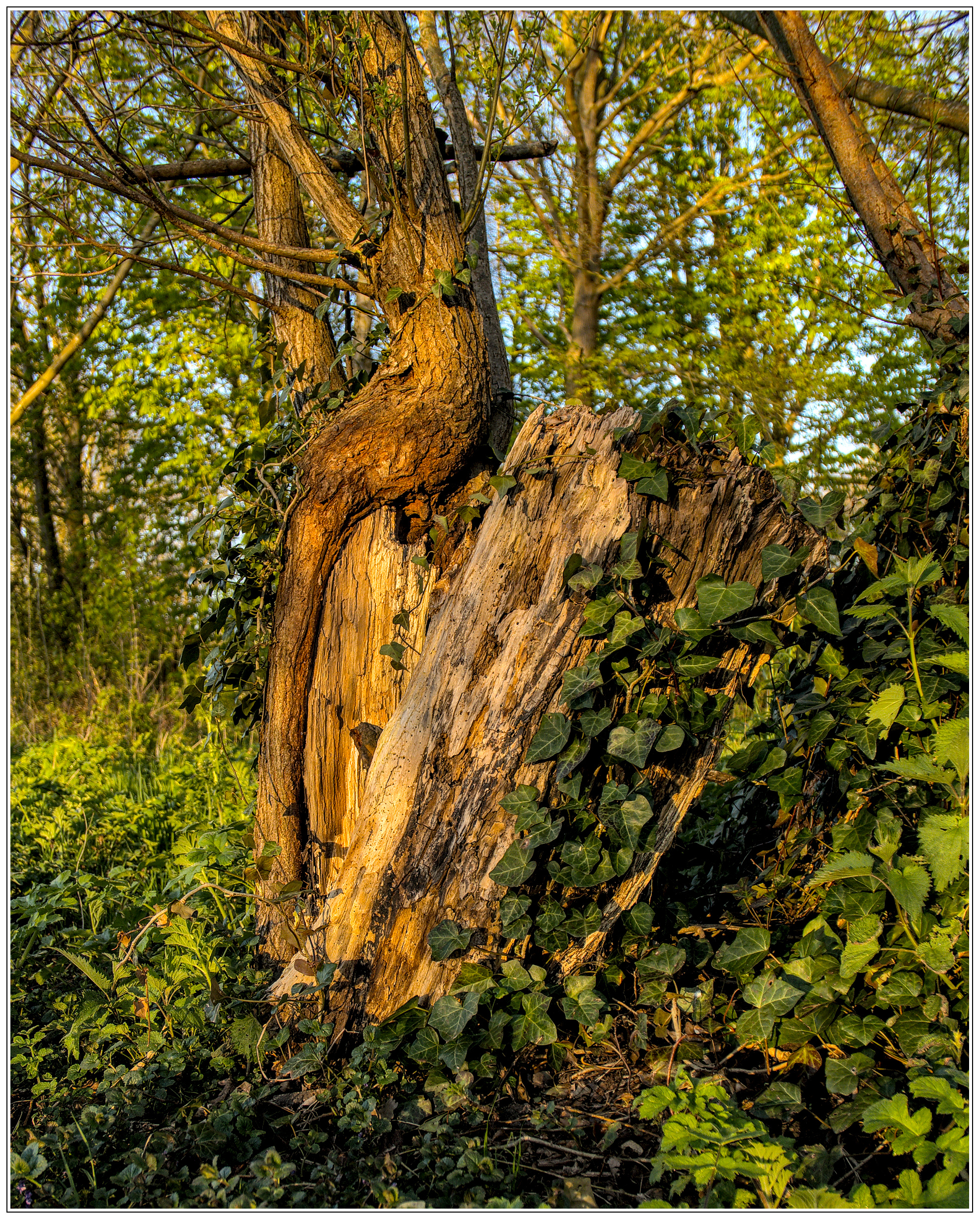
I really do like the second edit, just a bit too colourful for my taste, but that is your style.
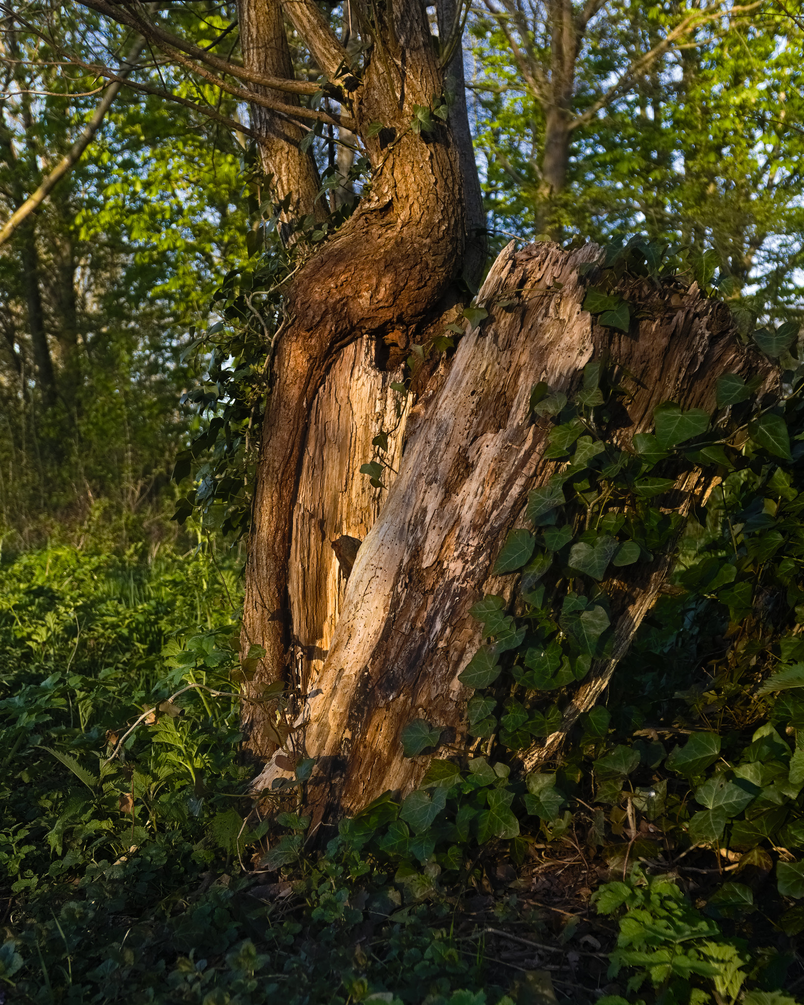
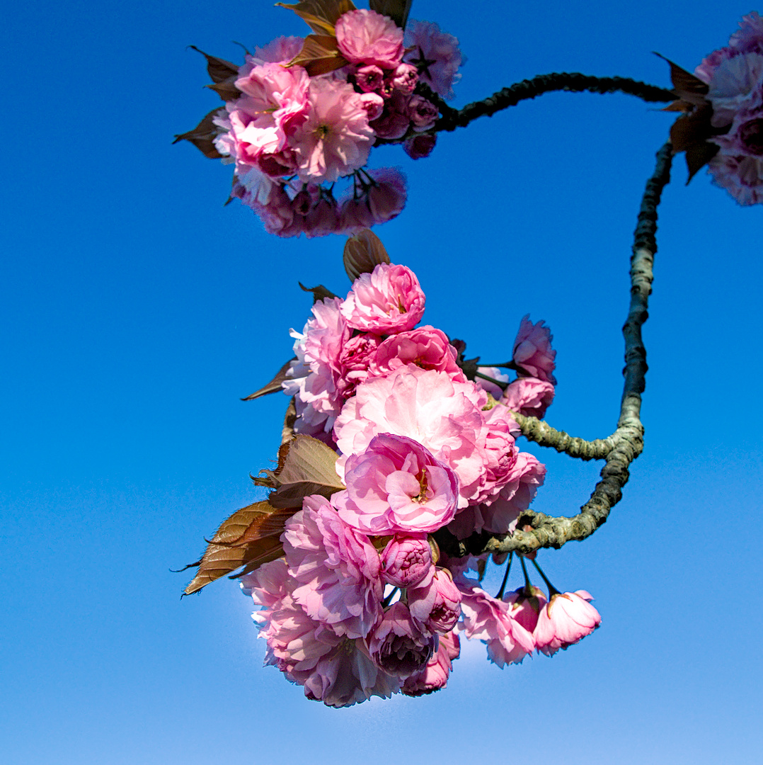
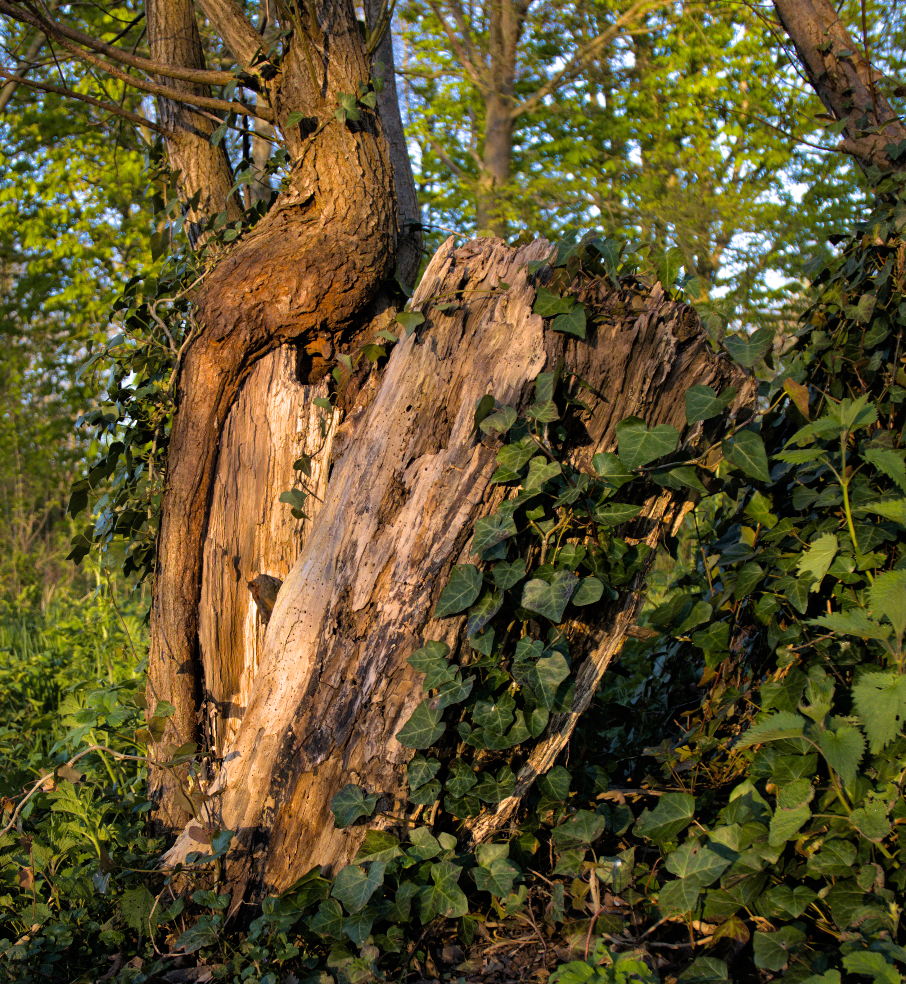
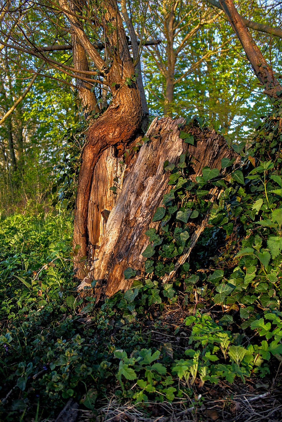
Had a look at your sidecar and I’m seeing some nice ways of tying it all together. Interesting how you darkened the lower part of the sky. I saw this one as Pink on a blue gradient when my eye fell on it. Did not try to emphasize it during editing though. I am seeing things in your edit that makes me revisit my edit. Thanks for inspiring!
To the other editors: Thanks and hope you had fun doing those edits!
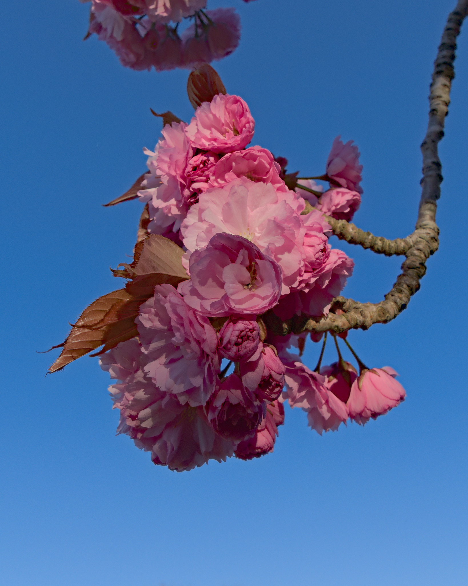
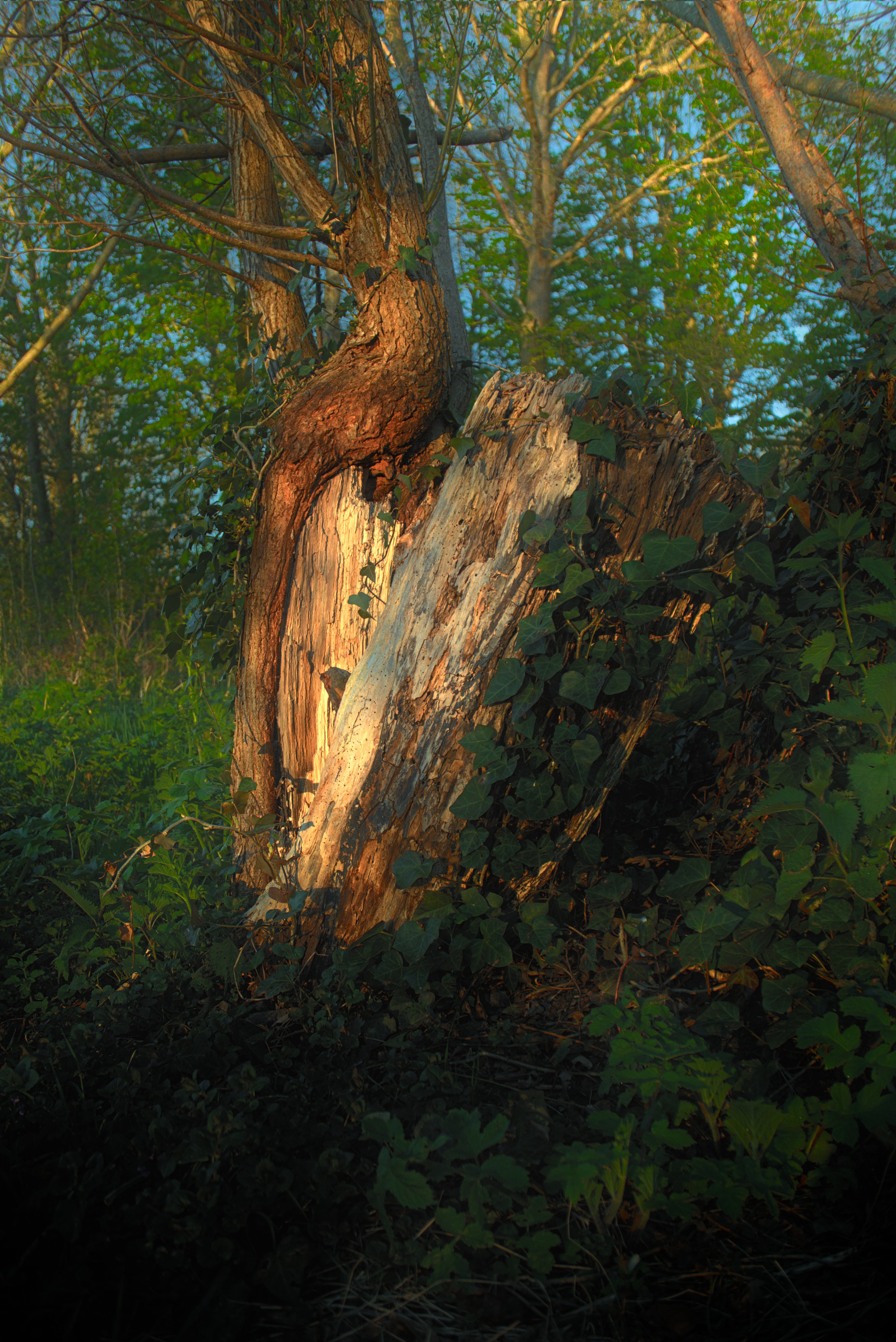
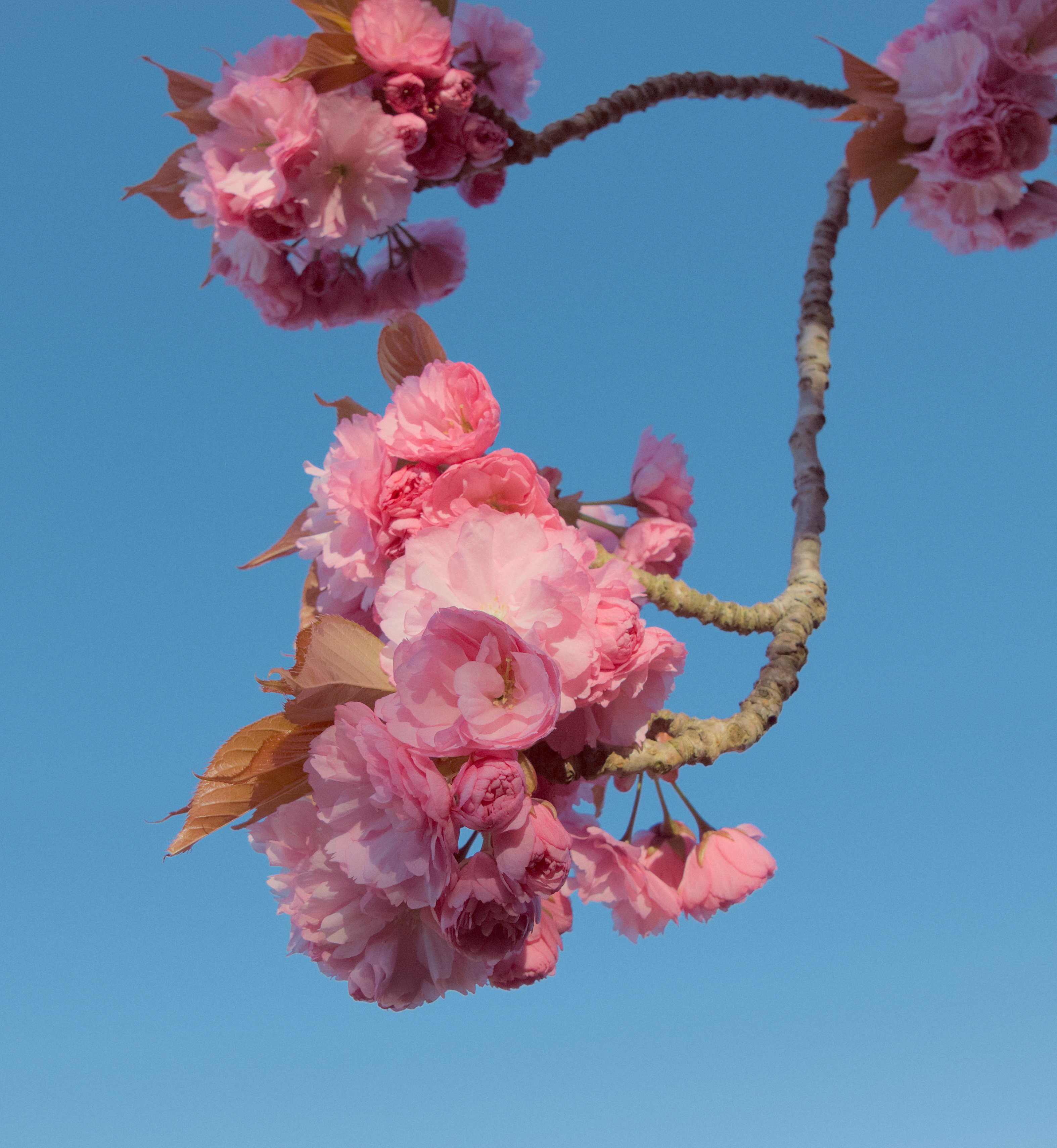
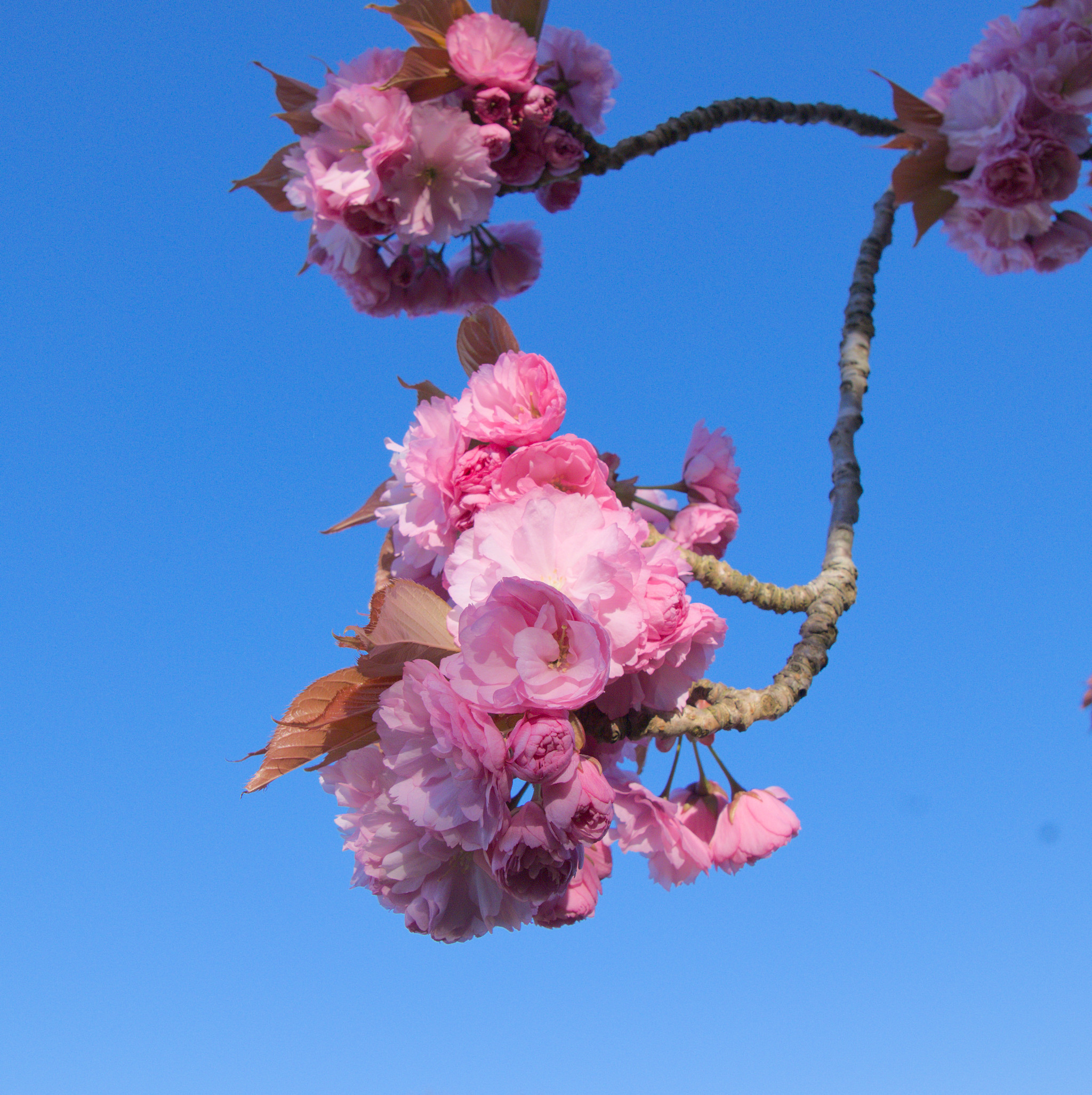
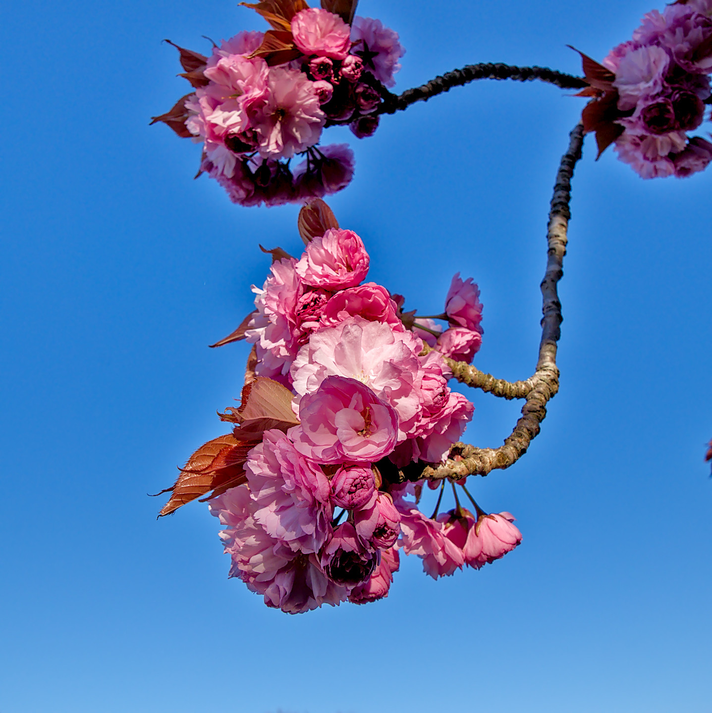
Here is my darktable edit. @Jade_NL Thank you for sharing it!
In my mind, I was loosely inspired by pastel-like colors of Kodak Portra film stock.
My monitor is not properly calibrated, and I have never shot actual Portra film.
So not sure what you will exactly see.