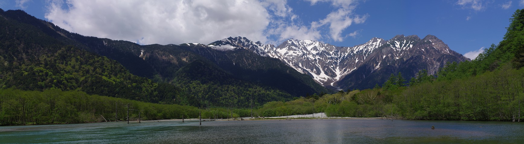
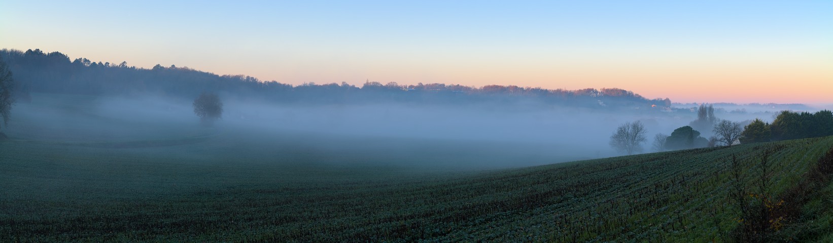
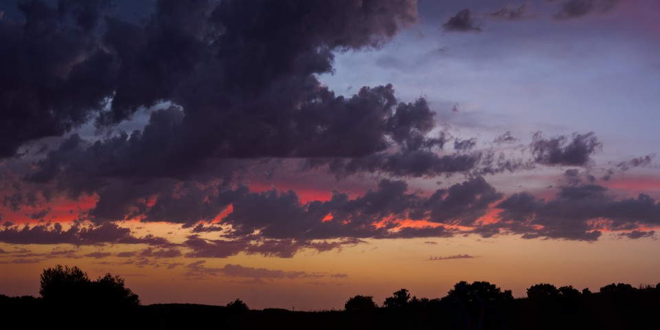
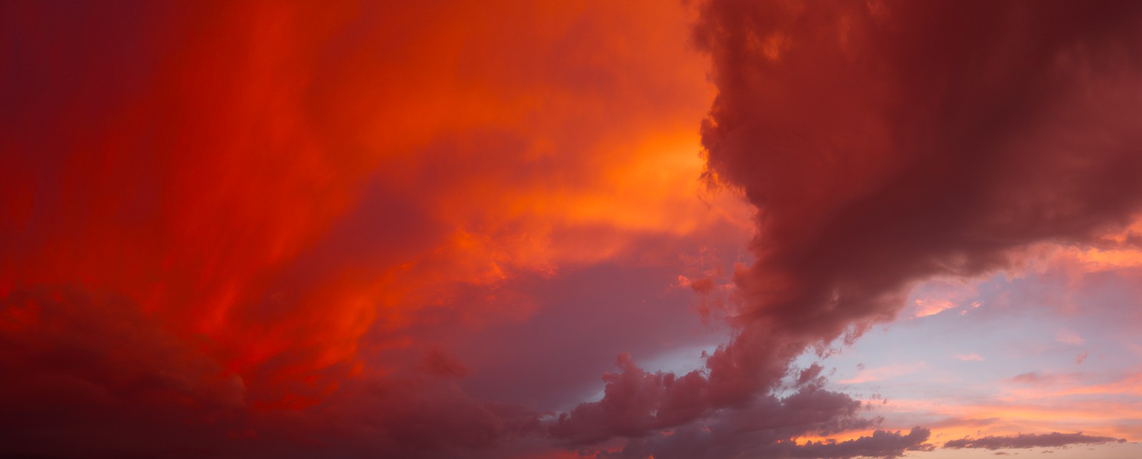
I’ve been having fun stitching some panoramas together. The aspect ratios can get pretty silly, but I’m happy with the results. Though I am not at all sure how I’d go about getting those printed.
Feedback welcome!
I’ve been having fun stitching some panoramas together. The aspect ratios can get pretty silly, but I’m happy with the results. Though I am not at all sure how I’d go about getting those printed.
Feedback welcome!
I like them,
would make the last two a bit less wide though. (the 3rd mostly on the left hand side and the 4th mostly on the right hand side)
For printing I think any good printer will be able to print you a nice big format … Just contact a few and present your pictures. Start with a small print to see how color, contrast and exposure work out.
I agree. When I shoot horizontal panoramas I turn the camera vertical to give myself more real estate in the sky and the foreground.
They are all good but the first 2 are the best in my view. What did you use to stitch them?
I’d be interested to learn a bit about the technique. For example - lens used (specifically the focal length) and if you had to use some special plate on the tripod to minimize distortion.
Same here - I shoot vertically for panoramas. I have not been able to stitch more than one line of pictures however.
@vbs I never ever use a tripod. The secret is to try and hold the camera close to level as tilting the camera slightly up or down causes huge problems. Unless using slow shutter speeds you can abandon the tripod in my view.
Nice shots! I personally think they could do with a bit more colour and contrast.
Concerning printing I’d recommend one of three:
1.) Print to photo paper and have them press-glued to a wooden board in a picture-frame-shop. Fairly pricy but looks awesome. Consider asking them what print medium to use before starting off.
2.) Somewhat cheaper alternative: Printing on PVC foam board. Saal Digital (if available in your country) offers those. (I’d take this route). If you go with bigger size consider the thicker option. The thinner (I think 3 mm) is usually fine, too.
3.) Even cheaper: Have 'em printed to photo paper, get a wooden board and some spray on/brush on glue, glue onto the board yourself (a paint roller could help with getting it on flat; don’t use two sided tape as that creates creases). Have the board slightly smaller and cut off the extra in the end with a sharp knife. Painting the edges of the board dark works nicely, too.
All are shot on APS-C (pentax K-7 or K-5), handheld, stitched using hugin, with individual shots taken in portrait. Technical details on each:
On the 3rd (Golden Gate bridge), I probably agree. On the 4th, I’m torn. Yes, the image is way too long, and yes, the right 1/3 or so of the image is less interesting. But I really like that it ends with the golden gate bridge.
I agree that being level makes things much easier, but then again, I have found that with some effort, I am able to compensate quite well for non level shots in hugin, playing with the perspective and projection.
All of the above are a single line of pictures as well. But I’ve had success with more. For example:
Wasn’t quite sure how to do that on these scenes while respecting the mood of the light as I saw it (especially Country-side sunrise, Golden gate bridge, San Francisco bay).
But yesterday, there was a nice sunset on a sky in the middle of setting the stage for a thunderstorm, and the colors were out of this world.
“how one percieves” a scene and how it can be transported to others if of course a highlty complex matter. Seeing your image probably evokes your emotions from experiencing the moment, which we lack (and thus maybe long for a bit more pop  ).
).
Stunning! Absolutely beauiful both in composition and colours  !!! Thanks for sharing !
Were the clouds drifting quite slowly or are you a swift photographer
In other words: how do you manage to stitch moving clouds well? Did you for instance work from left to right making each time two verticals?
Think we all face that ‘interference’ of our memory in developing our photo’s. I do not at all consider that a bad thing. At the same time it make me liking the ‘play_raw’ threads very much. More often then not people not knowing the feel of the scene come up with very nice unthought possibilities.
Then you are not obliged to do as I prefer 
For me that pano has beautiful light and haze on the left which the right simply doesn’t match and (thus) breaks.
By the way: Pentax rocks! 
I think 3 & 4 would work a lot better in a print, like those that span entire walls, but on a screen it looks a bit too wide imo. I really like 1 & 2, that format seems like the sweet spot
Yes, I took the pictures in this kind of pattern:
2 3 6 7 10 →     →    …
1 4 5 8 9   ↓ → ↑ ↓ → ↑
And operating without a tripod does mean I can be pretty quick about the whole thing.
There wasn’t that much wind, but not none either, so things did shift a bit. When using hugin, it will auto-detect anchoring points to link neighboring images together. Then it tries to allign the images based on that, and tells you how far off each anchor point is from the overall alignment. Moving clouds means it’ll get some wrong. So I review them manually, and remove clear mistakes, starting from those that are furthest off, and then realign. Occasionally, it has the opposite problem, and fails to find any alignment point between 2 neighboring images because the clouds have evolved a bit, and it cannot recognize them. In such cases, I add extra points manually. Knowing they won’t be perfect, but that perfection isn’t really needed.
I wonder if there’s something I could do to the right side (other than cutting it out altogether) to make it more interesting. A (progressively) different handling of contrast and color maybe?
You might ask us in a play_raw (or tiff…) …