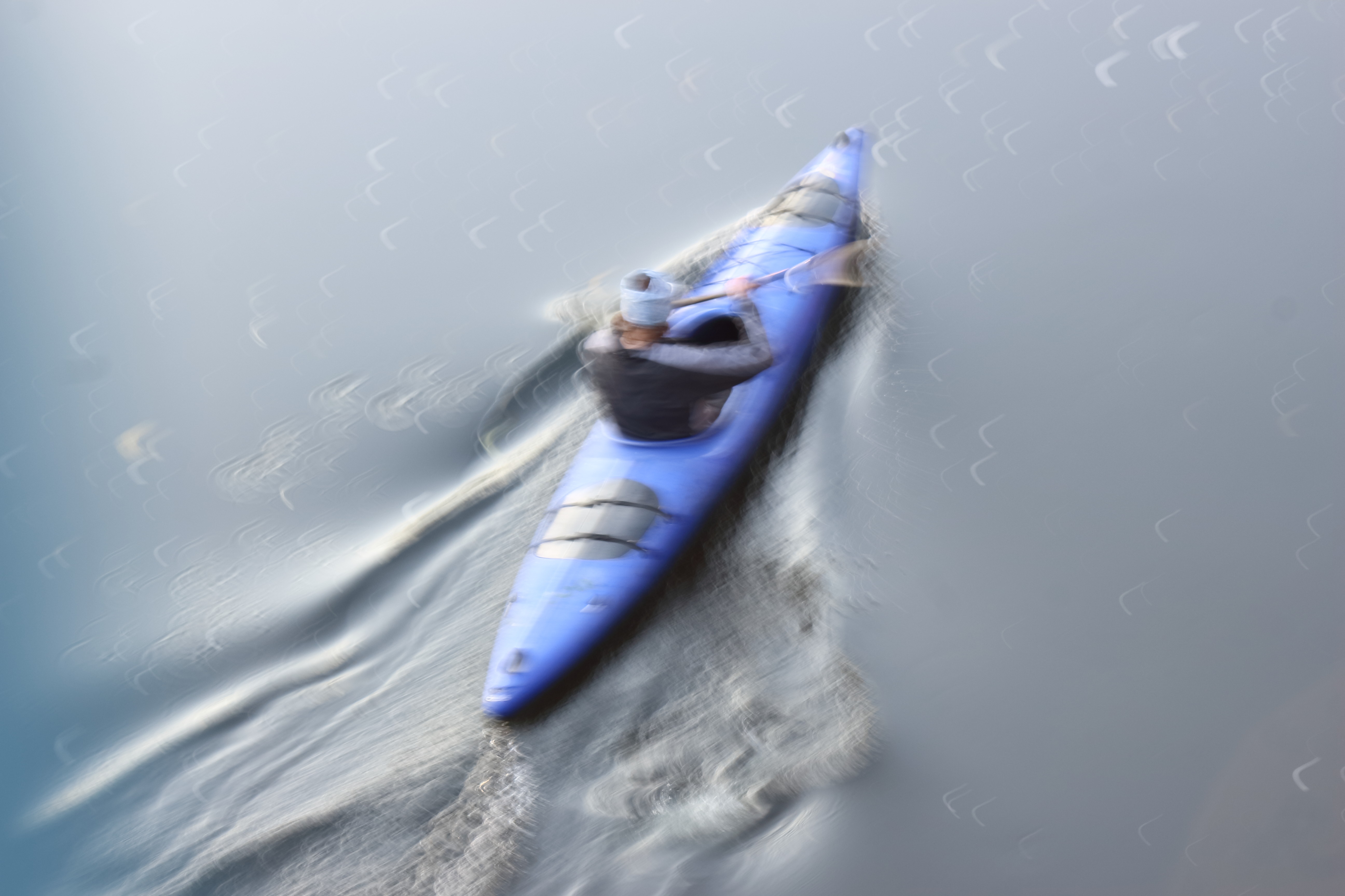
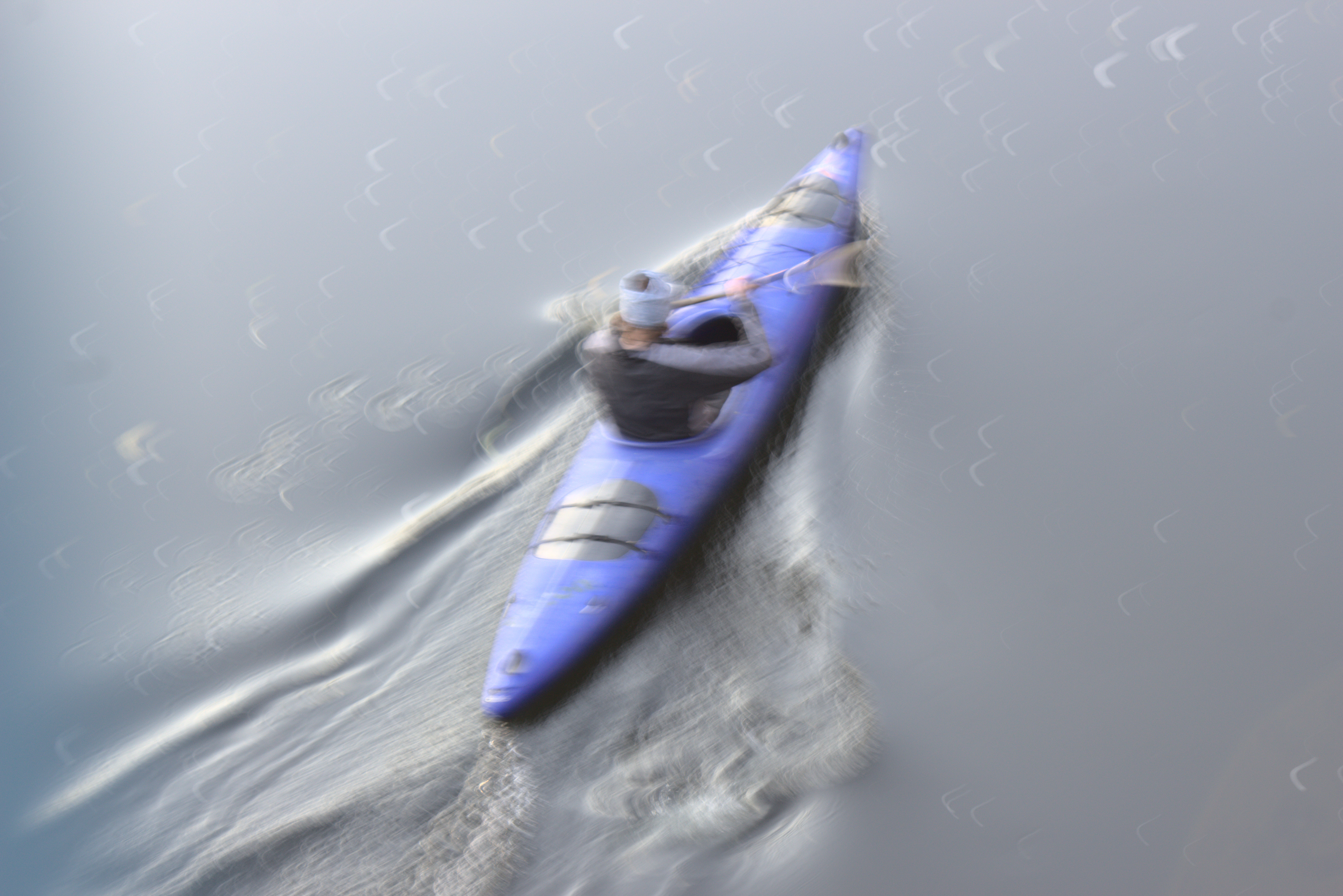
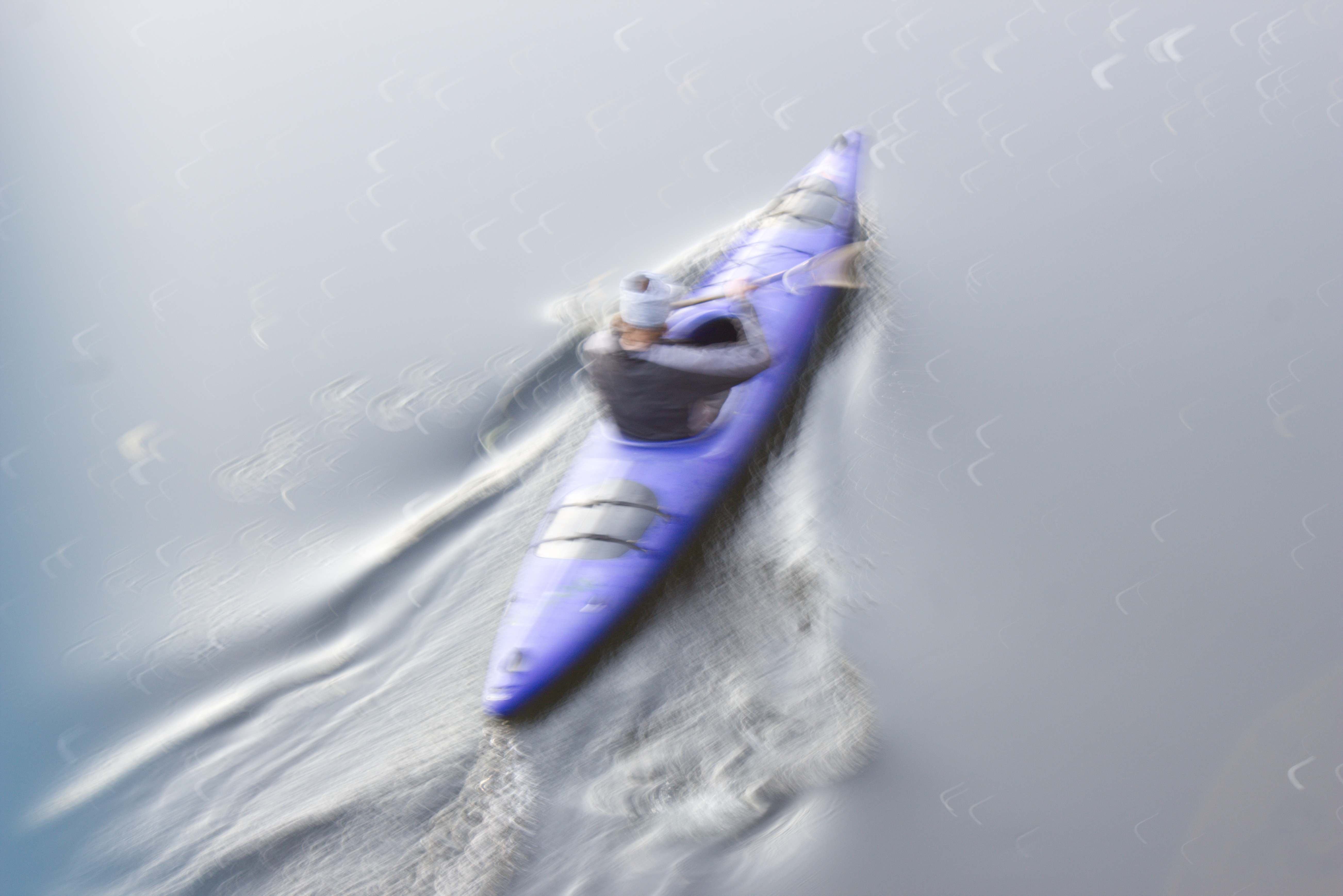
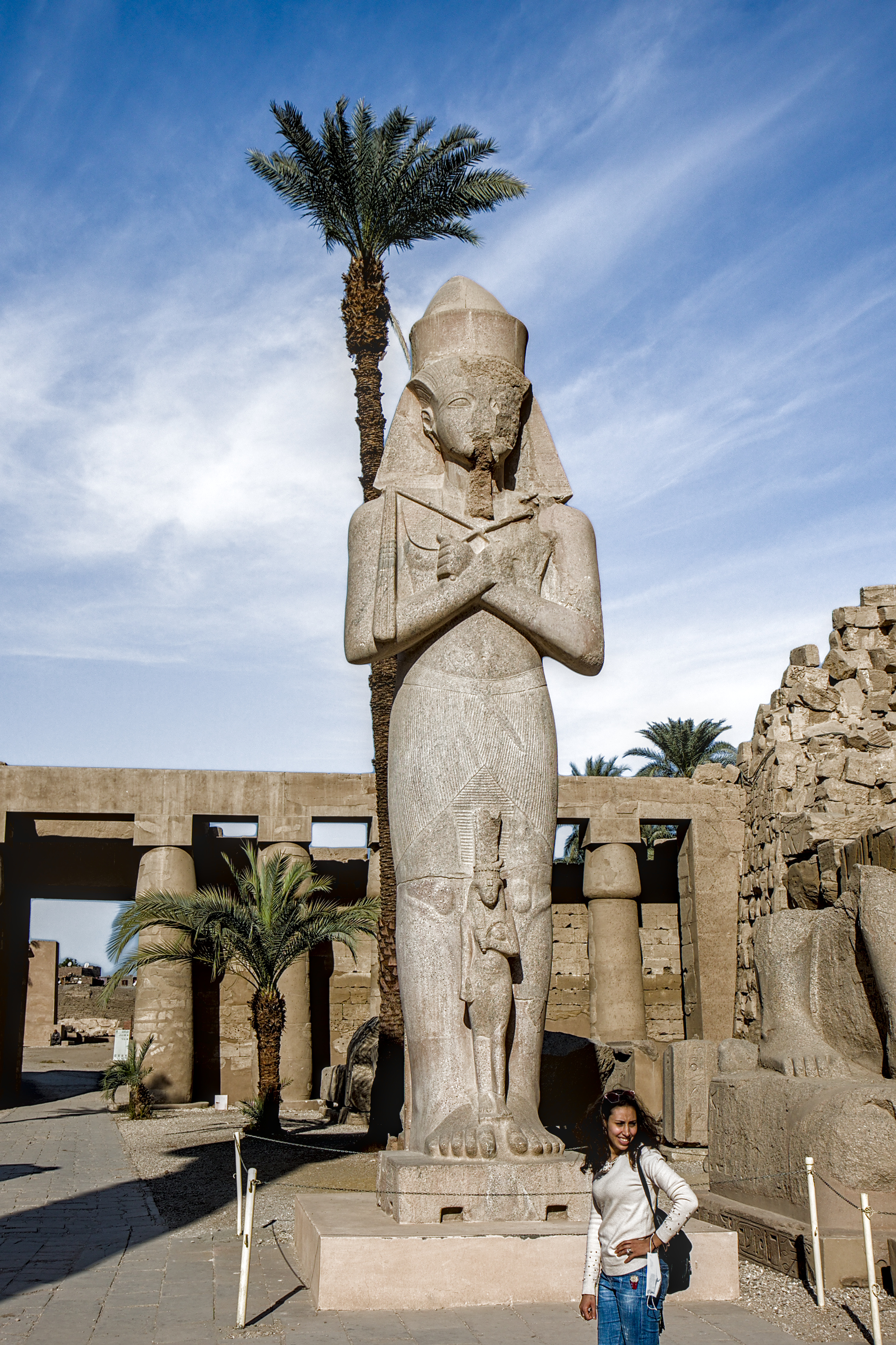
I know this ‘magenta thing’ and wonder about it for years. Here is another example of a IMO huge difference between the in camera jpg and a developed raw (BTW my camera is a Canon SL1 / 100D)
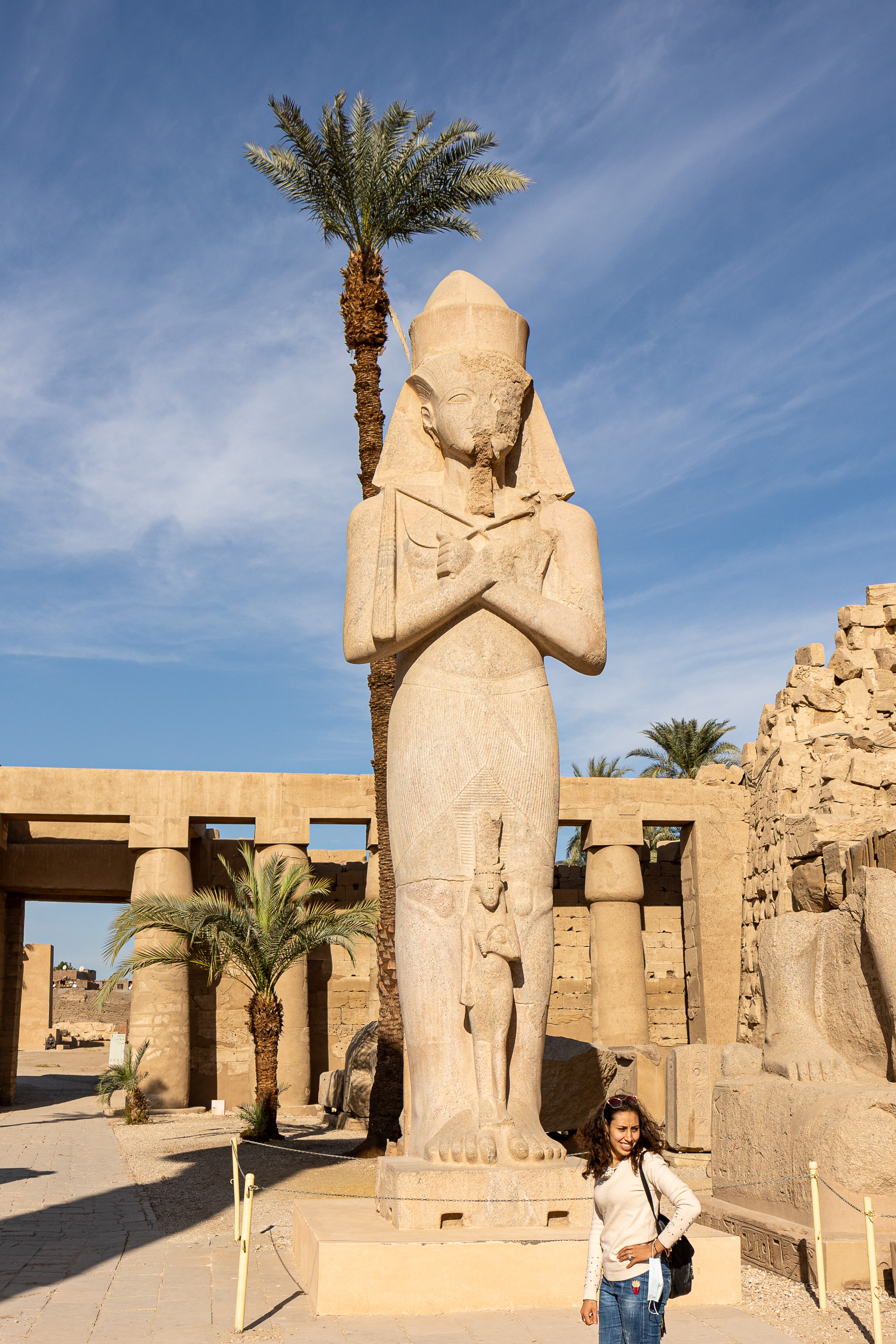
As far as I remeber RawTherapee gave a slighly better result and darktable 3.4 with modern setting is better (less magenta) but still a different blue than the original.
EDIT: Oh and here is the CR2. Of course the Canon software DPP give the exact colours of the in camera jpg
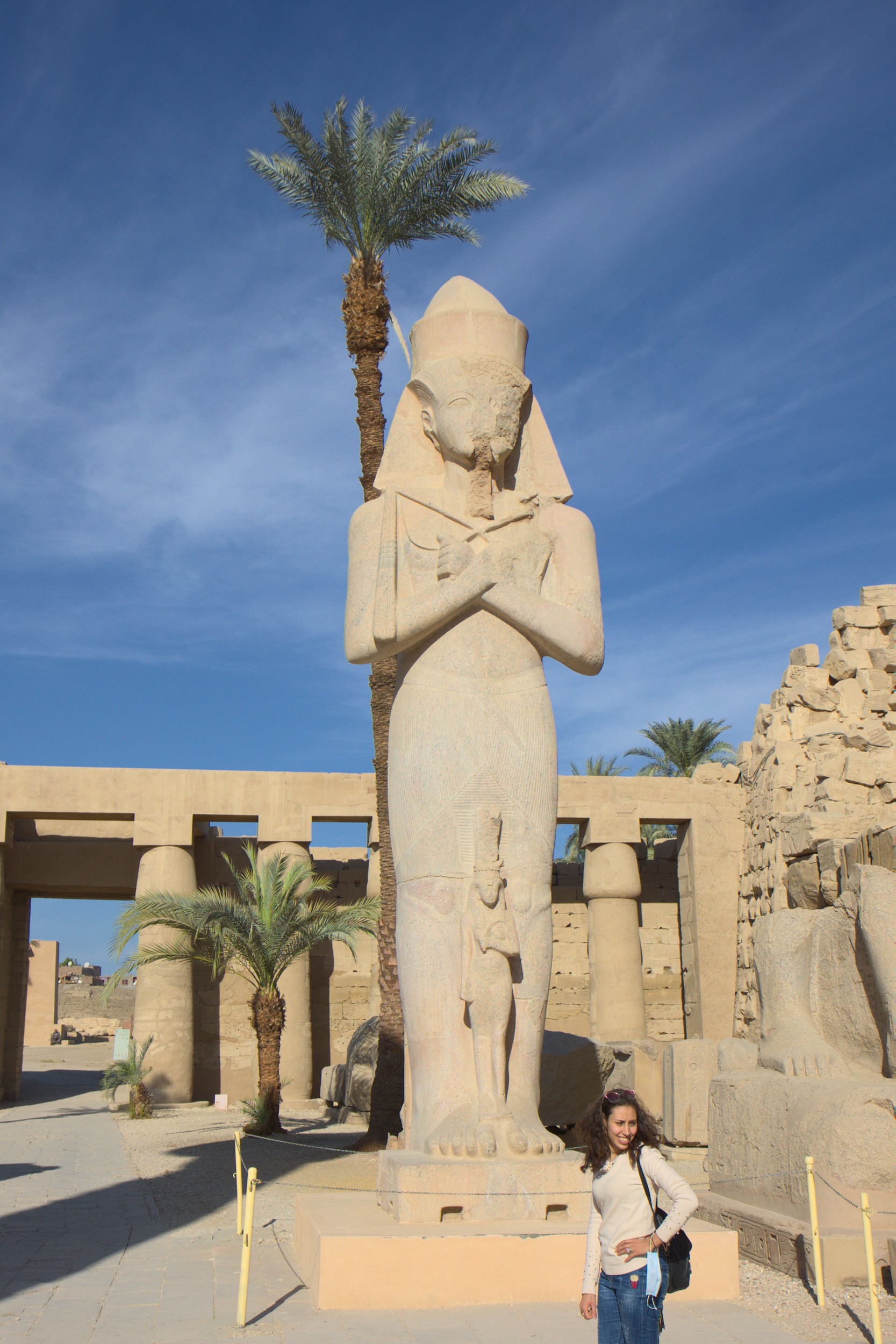
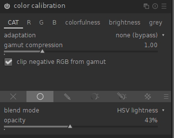
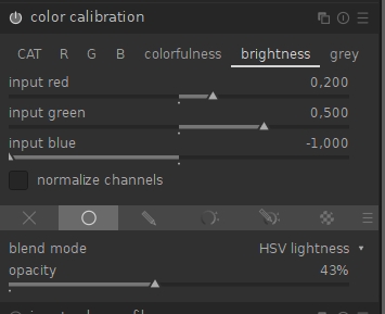
Take this version and bump slightly the blue brightness slider in the color calibration brightness tab…these two tabs are the perfect spot to tinker with your sky…
If I am reading this correctly, it means that the module won’t have colour context of DNGs. This means you would have to set your own defaults from which to start.
Open an image, work on it until you get something you like
Save the settings as a module preset that applies automatically
Iterative steps:
Open a new image with automated settings applied
Modify it until it suits your taste
Compare the modules settings with the default one, and choose which changes you want to keep
Update the preset with new settings
Repeat
After some steps like that, I got sane defaults that can apply to most of my images or give me a good starting point.
Potentially, you can use conditions on ISO or lens for example to select one preset over another.
And I also have some predefined presets, that I apply manually, for specific uses: interior, exterior, night photo, portrait …
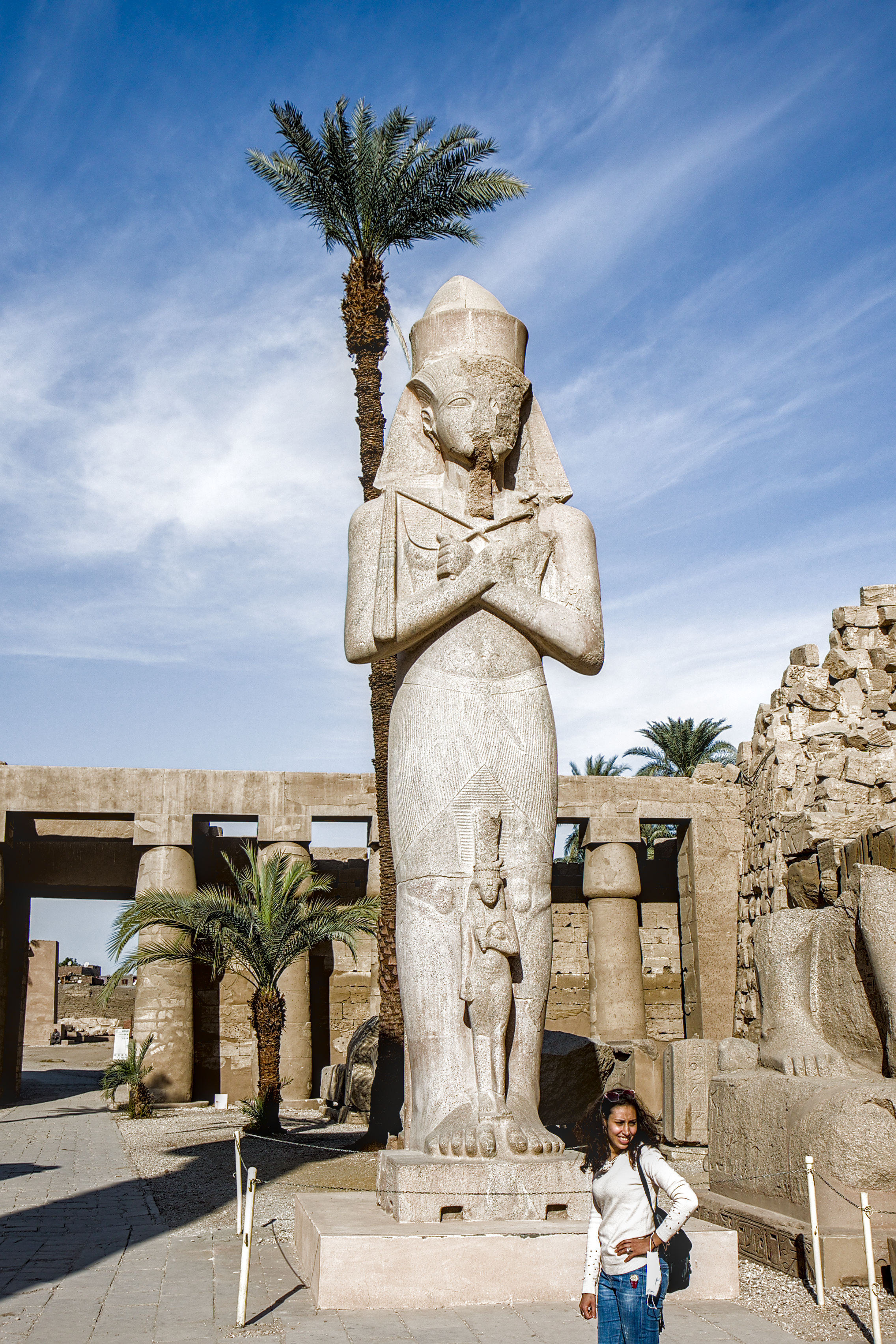
Your photo was taken on 2021/01/16 3:31:55 PM in Luxor and sunset was about 5:25 PM on that day so with less than 2 hours until sunset the sun was fairly low in the sky (note long shadows) and therefore likely the light was quite warm. I gave it a rather warm color like you would have had at that time of day. I only spent about 4-5 minutes on this and I am not as skillful as some people here, but for what it is worth here it is. By the way, it is cool to see this place again. I was there in December 2009.
I am using Linux exclusively and I couldn’t get DPP to run under WINE so I opted for Adobe DNG. In theory there should be no difference as its a lossless conversion, and so far I can get decent results.
Does anyone know for sure if there is a downside to .CR3 - DNG ?
I uploaded the .CR3 above in case anyone can read it.
Yes, I can read it (using Canon’s dpp on Win X).
At first glance, it looks like if Canon’s software can
squeeze a bit more out of the .cr3. Want me to try
to produce a more or less “neutral” tiff for you from it?
I see there is a plan for .CR3 support by May which would be good. In the meantime I am working through my 1,000 Egypt photos and getting some better understanding of the new modules, shortcuts etc.
Aurelien is great and his videos are very welcome, but I wish he would summarise a little (or at least drop the comments which would be footnotes in article) so his videos were 30 min max.
As far as I can see with ART, there is no perceptible difference between the CR3 and the DNG except that the camera WB from the CR3 is different from the one from the DNG and is surely wrong.
I think this is the proper way to edit such images - at least if you want to reproduce your perception of the scene and not a purely scientific rendering of an object.
Don’t rely on numbers, trust your eyes