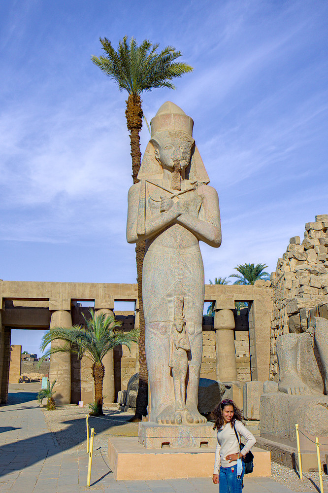
Having trouble with my sky blueness . . . .

yes, … because it enables me to darken the blue tones in a similar way to how it is possible with a polarizing filter and in a way that is not possible with the “color zones” module

I know that a polarizing filter works fundamentally different, but with this filter setting I can, for example, turn the sky blue wonderfully.

for example (i know, it is overdone)

RawTherapee 5.8 (dev) + Krita 4.4.2

EDIT: Image/site doesn’t behave (auto info/expand functionality here on pixls), trying to re-upload.

Suki and Jade,
I think people have shown a good variety of ways to tone down the blue sky, but the trouble is, there is blue in the statue, and if you tone it down too much, you lose the detail and colour in the stonework. The stone is nicely honey coloured in reality.

I think the only way to do a perfect job is to to parametric +mask. Parametric selecting Blue and the mask on the key bits of stone and statue so they avoid being toned down.

That is the reason why I pulled it into Krita and used a mask to work on the sky :slight_smile:

The rest I warmed up and sharpened a bit, but I tried to keep it, what I thought to be, as real as possible. One of the downsides of not being there is not knowing how it looked in real life. Adding some warm/golden glow on the statue/overall image wouldn’t be that much of a problem.

I have to be honest though: I’ve been diving into working with Krita and found this one a nice opportunity to test masking (or more accurate: my skills of applying them). I did reasonable well, but did overlook a spot now that I have another look (palm tree, just under the left-most leaf).

Yes, that is possible.
however, you were primarily concerned with the sky.
what you would work out differently on the picture is up to your creativity alone. we can only be of help or inspiration here. :slight_smile: :wink:

No problem, and many thanks for the ideas!

Some module has a polarizing preset…colorize maybe?? I haven’t tried it…I see that you use many of the “older” modules but you might want to expt with the brightness and colorfulness sliders in the color calibration module as you can also get some nice effects like this and quite quickly. Just a suggestion to augment your toolbox…The algorithm for these in 3.4 is harder to predict but it has been updated and works really nicely…

are “rgb curve” and “color calibration” old modules?
“contrast shadow highlights” is an old module.

i actually use pretty much all modules that are available to me and that correspond to the result i am looking for.
or are you referring to my post on “global tone mapping”?

I guess I was a bit. Going from memory you had low pass filter and a couple of others in one of your edits…As you used a channel mixer approach here I was just suggesting you also try those sliders in the color cal to compare. I wasn’t intending to suggest you are not up to date or using any of the modern modules… sorry if it sounded that way

no problem

I use various modules (for certain reasons) as standard.
the low pass filter is a kind of color denoising that works quite well on my A6000 and fuji XE2.
(yes, with the new “denoise profile” no longer necessary :slight_smile: )

I am with you I use a good array with some presets arrived at by experimentation rather than theory. Even the contrast eq can work on color denoise in some cases with a nice degree of control. Lots of ways to attack things. THanks for sharing your polarizing settings I will give them a try for effect. Its funny to have a collection of these things…I have a preset that starts with 10% opacity. Its a linear curve so just the default straight curve blended in subtract. I usually use it for a contrast / color boost in the range or 10-20%…can even look a bit like dehaze. I tried it in the rgb tone curve and it doesn’t have the quite the same impact so I use the “older” module…maybe it is just where it is in the pipeline I would have to look or maybe the color model?? No idea…just discovered if from playing around…

They’re new.

i know :wink:

In scene referred, perhaps it is better to use blending mode RGB (scene) and lightness, instead of HSV lightness

for me, “HSV lightness” is the better alternative. For me, all other blend modes have too strong effects on other colors, which shouldn’t mean that it can’t be appropriate.

Interesting, they may not be talking about the same thing but on the Krita site where they were discussing painting and the scene referred workflow they say HSV is okay…I wonder if they are referring to the same thing just using the same acronym??

KRITA DOCS
""Okay, but why isn’t this all the rage then?
Simply put, because while it’s easier in the long run, you will also have to drop tools and change habits…

In particular, there are many tools in a digital painter’s toolbox that have hard-coded assumptions about black and white.

A very simple but massive problem is one with inversion. Inverting colors is done code-wise by taking the color for white and subtracting the color you want to invert from it. It’s used in many blending modes. But often the color white is hardcoded in these filters. There’s currently no application out there that allows you to define the value range that inversion is done with, so inverting is useless. And that also means the filters and blending modes that use it, such as (but not limited to)…

Screen (invert+multiply+invert)

Overlay (screens values below midtone-value, in sRGB this would be middle gray)

Color-dodge (divides the lower color with an inversion of the top one)

Color-burn (inverts the lower color and then divides it by the top color)

Hardlight (a different way of doing overlay, including the inversion)

Softlight (uses several inversions along the way)

Conversely Multiply, Linear Dodge/Addition (they’re the same thing), Subtract, Divide, Darker (only compares colors’ channel values), Lighter (ditto), and Difference are fine to use, as long as the program you use doesn’t do weird clipping there.

Another one is HSL, HSI and HSY algorithms. They too need to assume something about the top value to allow scaling to white. HSV doesn’t have this problem. So it’s best to use an HSV color selector.

For the blending modes that use HSY, there’s always the issue that they tend to be hardcoded to sRGB/Rec. 709 values, but are otherwise fine (and they give actually far more correct results in a linear space). So these are not a good idea to use with wide-gamut colorspaces, and due to the assumption about black and white, not with scene linear painting. The following blending modes use them:

Color

Luminosity

Saturation

Darker Color (uses luminosity to determine the color)

Lighter Color (Ditto)

So that is the blending modes. Many filters suffer from similar issues, and in many applications, filters aren’t adjusted to work with arbitrary whites."""
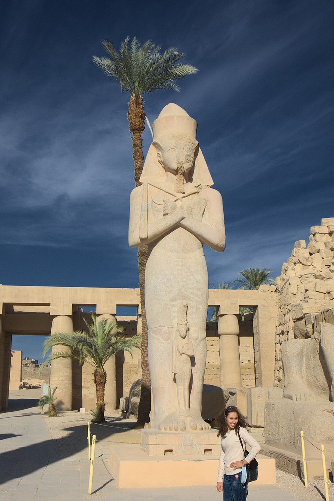
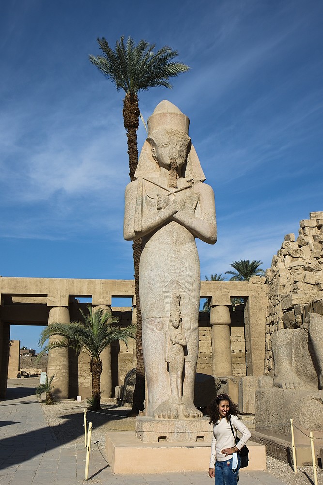
A simple solution is to go to the Color Zones module in Darktable. Use the eyedropper to select the blue color of the sky and then raise this portion of the curve in the lightness tab.

Yes but there is a lot of blue in the statue, so you lose some details - and masking around the statue is a bit fiddly to define

I retested my idea of using Color Zones. Before doing any adjustment I took a snap shot and then I adjusted the brightness of blue using the lightness tab. There was no detectable change in the statue. The woman’s blue jeans did alter, but none of the earthy tones of the statute so I see no need for masking. Out of interest I created a parametric mask based upon the blue colour of the sky and this quickly masked out the statute, but the only small change this made was around the leaves of the palm tree in the sky and was not significant. I look forward to CR3 files working in DT very soon because I am not sure what would be loss during the DNG conversion.

Nice photo. Thought I would try my hand at it.

darktable-3.5.0+1170~gb428b0d7f-win64.exe
ER6_4832_10.dng.xmp (24.0 KB)

The blue of the sky around the palm trees on the right was very problematic.