With the latest build it is now possible to easily customize the look of the flexi panel with a few CSS rules.
It seems a good a moment to ask those with more good taste than yours truly to play a bit with the CSS and come up with a proposal for a good and functional look for the default theme.
Hi Daniele. I am not able to help with the look but I have a question. I presume the the second mask (which might be a brush) could be set to exclude rather than union and then would act as an eraser effectively. Is that correct?
Is the flexi mask panel in the nightly builds yet?
I’ve been wondering about the mask combination modes myself today. @Terry ‘difference’ mode acts like an ‘erase’ or ‘subtract’ mode with the existing tools. ‘Exclusion’ I’m not too sure about (not familiar with XOR), but it seems like ‘add to masked area, but also subtract from other masks at the same time.’
I think I should bring up the naming for Difference and ask about icons in the other thread (when the servers stop being broken, I can barely load a single page on firefox atm).
Thanks for the response. I used the term exclude but there may be an already accepted convention such as difference.
BTW, I went to look at the mask manager before posting. Hell…you would need to have the user guide opened to work out that beast unless you were experienced. I was right clicking, left clicking and everything else I could consider but couldn’t work out how to change the way masks worked together.
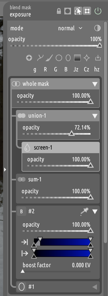
I found it tricky at first but they work like the pipeline in a way… Interactions are determined from the bottom towards the top and you can reorder things…it will take some experimentation…
Yes, Terry. If you have a group set to difference with N children, the children above will be subtracted from the one below.
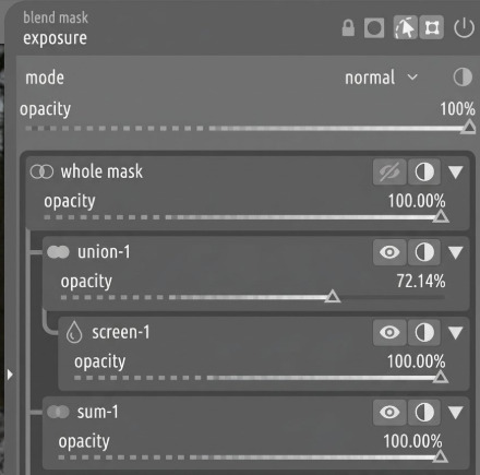
Note that you can already subtract in the classic mask, but the UX is much less convenient. In classic, everytime that you draw a brush stroke you have to go in the mask manager and change its operator to difference. This does not play well with the typical workflow of overlaying many layers of low opacity brush strokes. In flexi, you would just select a subtractive group and start drawing. All shapes that you add end up in that group automatically, so you can easily add many brush strokes much more conveniently.
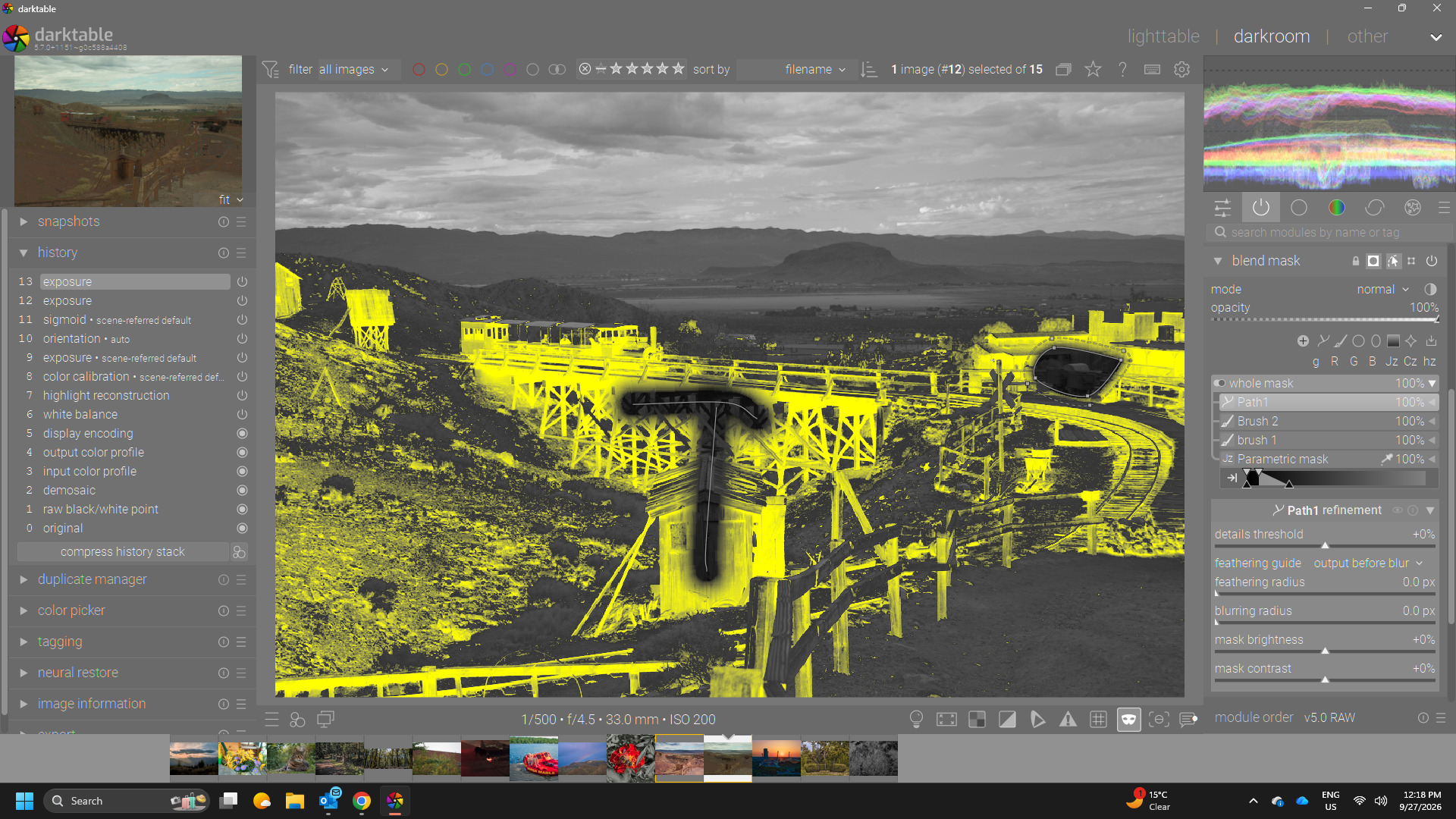
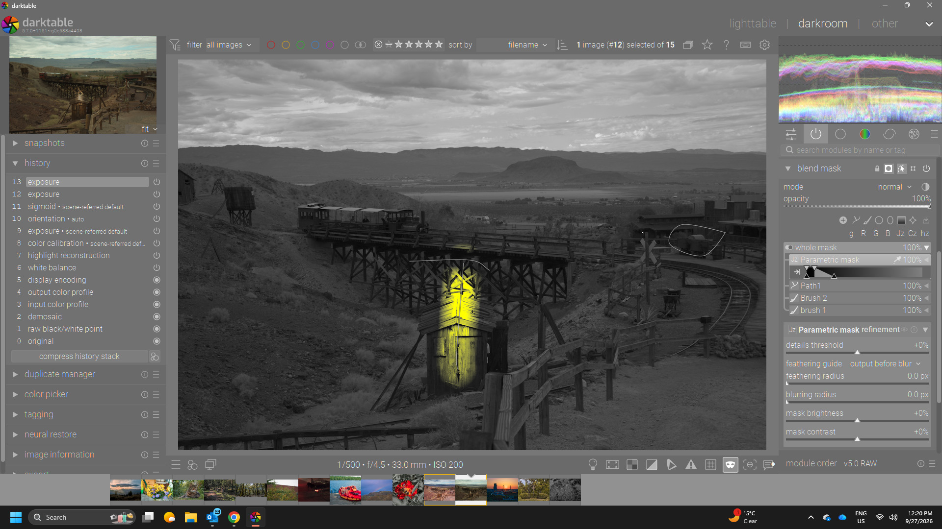
For example Terry…here is a quick group…set to interact in difference. I added the parametric mask first then two brush strokes with a litttle overlap and path off to the side… you will get this…
This is really great work. I think its truly really flexible and after people get the hang of it I think this will really take off.
I have two suggestions that came up for me during testing…Maybe real world it would be used less but could we consider, and further pardon me if this came up already as it likely did but I find two features a little bit of a pain to have to right click to get and that is the invert and the enable/disable. I think maybe the disable is hidden there to make sure people have to take a positive action to do it maybe??
I know already you have packed in so much to a small space but I think even if it was an option to enable that clicking on the element icon, ie the path or brush or drawn object etc identifier icon in the element header could be used to toggle the module off and on maybe with a visual bolding and unbolding or whatever. Second maybe allowing alt clicking on the element header or hover and a key like “i” for inverting… Basically it would be nice to have a direct way to explore the mask by being able to quickly invert and enable/disable… I may have missed something around this so if its already flogged to death just ignore me…
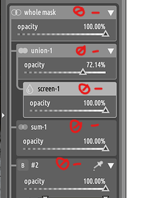
Hi Daniele. I agree with Todd that invert and disable should be more visible.
In the screen shot here I have drawn the icons for disable and invert in a place that might be suitable and not chew up real estate. Not really sure what icon gets used for disable. Of course with experience I am sure the idea of right clicking would become second nature.
I have retreated to the tower to study your module and have gathered some thoughts I would like to share if I might:
Styling
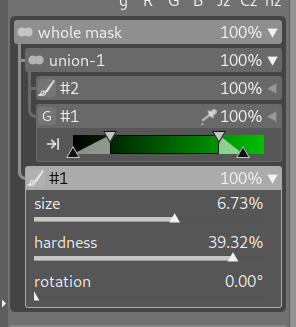
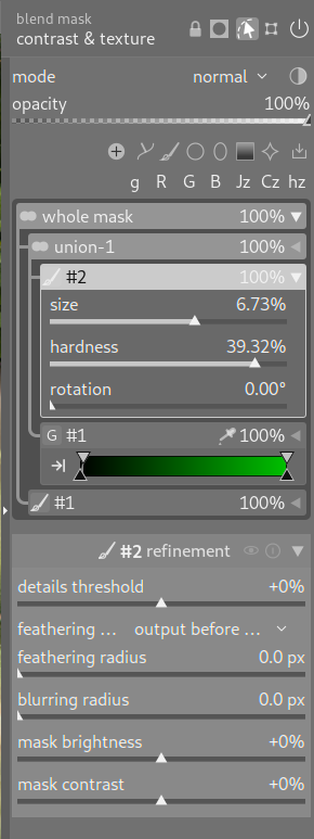
There is a visual disconnect between the three “levels” of flexi: The top part including the buttons for the tools feels disconnected from the grouping area, the refinement section below looks very different from the grouping area.
Maybe style the refinement section in accordance with the grouping section?
Gradients: I’m not a big fan of the gradient for the headers; I find them distracting and they don’t fit the bauhaus-theming of dt IMHO.
Hover and Selected:
I find differentiating between hover and selected by their background color disorienting. It feels visually more busy when hovering about.
After changing the CSS to unify hover and selected I find it more pleasing to use flexi.
The slight downside that the currently selected element is not highlighted while hovering is IMHO not a big deal as one will probably be able to see that the mouse is over the element.
What is lost by this is the ability to hover an already selected shape and see it highlightd
grouping lines:
For my brain the grouping-lines are much more digestible when they arent pinned to the exact corner. Though this may also be a matter of training ones visual cortex.
I suspect the current style is a deliberate choice but somehow to me it hurts clearness. This would work better IMHO (but looks less elegant admittedly):
/* ---- flexi mask panel ---- */

/* header / rail / card-frame shades per state */
@define-color mask_rest          rgba(255, 255, 255, 0.2); /*slightly brighter for better separation*/
@define-color mask_implied       rgba(255, 255, 255, 0.4);
@define-color mask_selected_top  rgba(255, 255, 255, 0.7); /* hover and seleted unified*/
@define-color mask_selected      rgba(255, 255, 255, 0.7); /* and brightened for contrast*/
@define-color mask_hover_top     rgba(255, 255, 255, 0.7);
@define-color mask_hover         rgba(255, 255, 255, 0.7);
/* background of the controls under an open header */
@define-color mask_card          rgba(255, 255, 255, 0.15); /* could be brightened to increase contrast of bg vs. sliders? */
/* background of the whole list container, rails included */
@define-color mask_list_bg       rgba(0, 0, 0, 0.3); /* slightly brightened to make it blend better with the rest of the UI, was too dark imho */

/* header names per state */
@define-color mask_text_rest     @fg_color;
@define-color mask_text_implied  @mask_text_rest;
@define-color mask_text_selected rgba(0, 0, 0, 0.9);
@define-color mask_text_hover    rgba(0, 0, 0, 0.9);

/* compact opacity value in headers ("use sliders for opacity" off) */
@define-color mask_text_value       alpha(@text_color, 0.85);
@define-color mask_text_value_hover @text_color;

/* slider labels and values in cards */
@define-color mask_text_control       @fg_color;
@define-color mask_text_control_hover shade(@fg_color, 1.2);

/* the list container's shape */
#masks-list-box
{
  padding: 4px;
  border-radius: 5px;
}
Other comments:
If a picker for a color-range-selector is armed it should be deactivated if one clicks another element of the flexi-panel. Currently one has to put it back manually
What do you think about grouping elements by dragging them onto each other? I intuitively tried this and was suprised it doesn’t work - creates room for accidental grouping though.
I still think the flexi-header could do with a mask-icon to make it clearer that it is connected to the “mask” button in the toolbar area (please tell me whether I should commenting on this )
Adding an AI object crashes dt the moment I press right click to apply the mask: corrupted size vs. prev_size
And most importantly : Thank you for all the work you put into darktable
Ok. For the record, the styled opacity slider exists because at some point I was putting the slider in the header of mask elements. Since there was not enough space for the label, the slider itself had to carry information about what it was controlling, hence the styling.
Wait, now I am confused again An example of what? Are there other styled sliders?


 , but at least that was my understanding when I wrote that I thought the same!)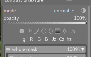
 (please tell me whether I should commenting on this
  : Thank you for all the work you put into darktable
  An example of what? Are there other styled sliders?