Help with oversaturared colors and clipping

Hi :slightly_smiling_face:

I’m not sure I have the right settings for clipping warnings, especially for colour.

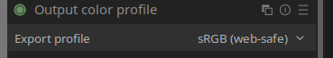
To begin with, my monitor isn’t calibrated, nor is it the most expensive, but it performs quite well for sRGB; at least, I don’t notice anything unusual compared to others. On my camera (Sony A7II), I have AdobeRGB set.

The purpose of my photographs is almost always for viewing on devices (mobile phones, computers, etc.), so I’m not very demanding when it comes to slight deviations in tones. I have sometimes used printing services such as Saal Digital, but I am aware of my limitations and possible problems.

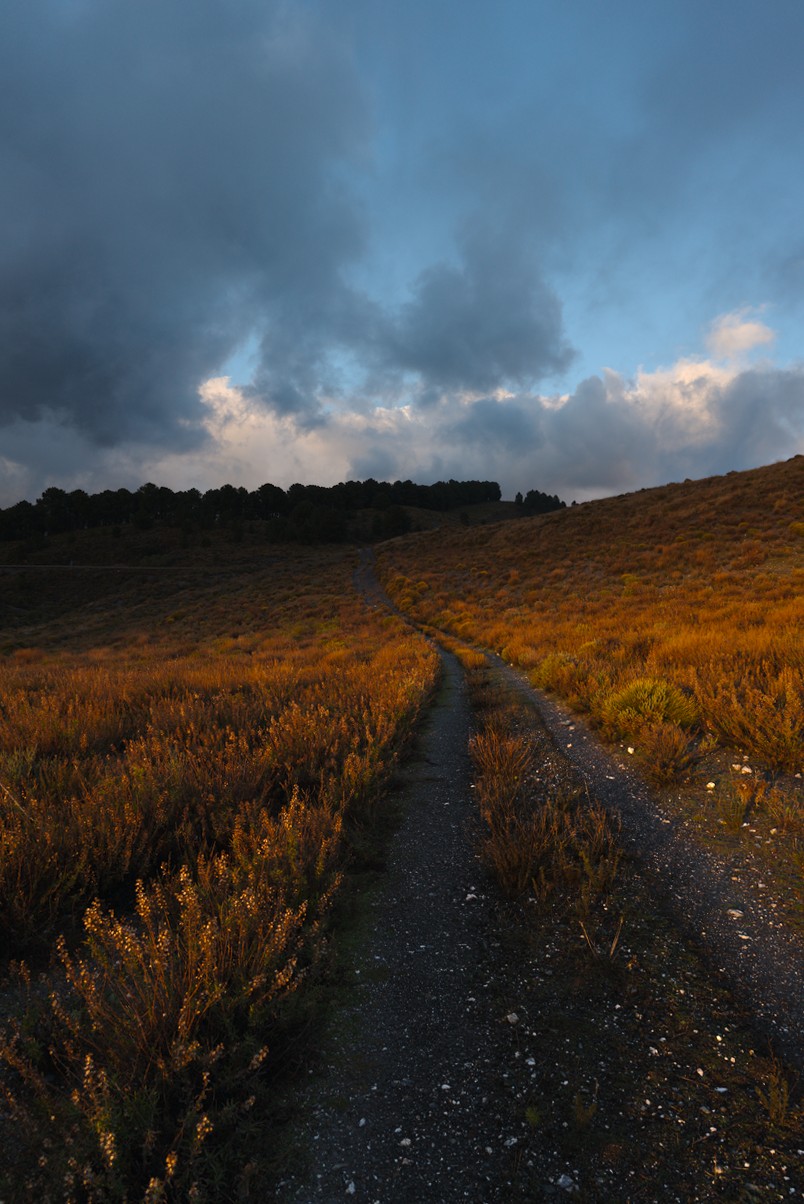
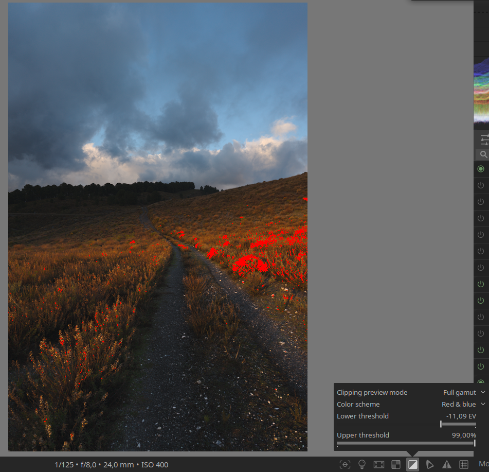
The main issue is that, in my context, I’m not sure what the most recommended settings would be to ensure that the colours and exposure come out correctly. In the attached case, I would like to leave it as it is, but the clipping warnings indicate that I have areas of colour saturation. I have tried various modules to correct this in order to maintain the ‘look’ but fix the oversaturation, without success. Finally, I decided to export it as it is and see how the photo looked on other devices, where it apparently does not look bad.

Should I pay less attention to the clipping warning? What values should I set in toggle gamut checking? If it is possible to adjust the image so that the warnings do not appear without losing the look, what modules should I use to do this?

I have read the clipping sections of the darktable manual without fully understanding it, and I thought it would be a good topic to ask about here. I would like to be able to export the photo as it is, with the peace of mind that it will be viewed without any major problems.

Thank you, and of course, you are free to edit the photo however you like.

_DSC6754.ARW (23,9 MB)
_DSC6754.ARW.xmp (17,6 KB)

This file is licensed Creative Commons, By-Attribution, Share-Alike.

I will defer to answers from more knowledgeable people and people who use the clipping indicators to their advantage. But the color space you choose in the camera only affects the JPG as far as I know. I personally don’t use the clipping warnings anymore as I don’t find them very helpful. In my view if the picture looks good it is good.

I do like to use the raw clipping indicator however since it can show me if the image is clipped in all three of the rgb channels. Often just the green channel is clipped and DT tends to resolve that problem in highlight reconstruction module.

1 Like

I think clipping indicators for colors are only important if the colors outside the gamut lead to color distortion. If not, you can ignore the indication.

However, there are a few things you can do to bring the colors into the gamut. For example, you can use primaries in AgX. In this case, reduce the purity boost for red. You can also select the sRGB color space as the color space for primaries:

11 Likes

Thank you @Terry and @s7habo Sometimes I felt a bit limited creatively and it’s a relief to know that it’s not absolutely necessary.

1 Like

I never use the clipping indicators. While the maths behind darktable are very complicated and technically, editing pictures is a process of aesthetics and creativity. Both things which are hard to calculate with mathematics.

You have no calibrated high end monitor? Who cares. If it is not really cheap rubbish and you set it up carefully (see SF - Color management - Display calibration) that’s enough.

A proper calibration is in my opinion only necessary if there is a high quality printing process involved.

Just my 2 ct.

3 Likes

I do use them sometimes. A brightly reflecting piece of fabric, for instance, colour or white, might be clipping flat and I might not realise how much detail I’m missing there. Haha… when there are often silk saris in one’s pics! :slight_smile:

I seem to remember that the clipping indicator used to complain about a lot of stuff that looked absolutely fine. I do not remember where, but I read some recommendations for its settings that made it only shout when it is a real problem.

Bottom line: I do agree that if it looks right, it is right. Just… the clipping indicator can suggest to look a bit deeper at something.

2 Likes

I tend to ignore in particular the clipping in the colour channels, if it looks good, it is good in my opinion, i use the clipping warnings for the white clipping, just to see if ive blown anything i maybe should of, but if its just specular highlights etc i just let them be, for example, those bright LED type street lights often blow on a night shoot, but they look pure white to my eyes anyway, so i wouldnt massively underexpose to protect them, or bother doing bracketing on them, because they are white anyway, i want them to look super bright!

2 Likes

No, that is not what it does. It checks if a raw (before demosaicing) channel is fully saturated (clipped). It is very different from the gamut-related checks we are discussing here. It’s fine to discuss that feature, but if we do, let’s do it in a separate topic.

1 Like