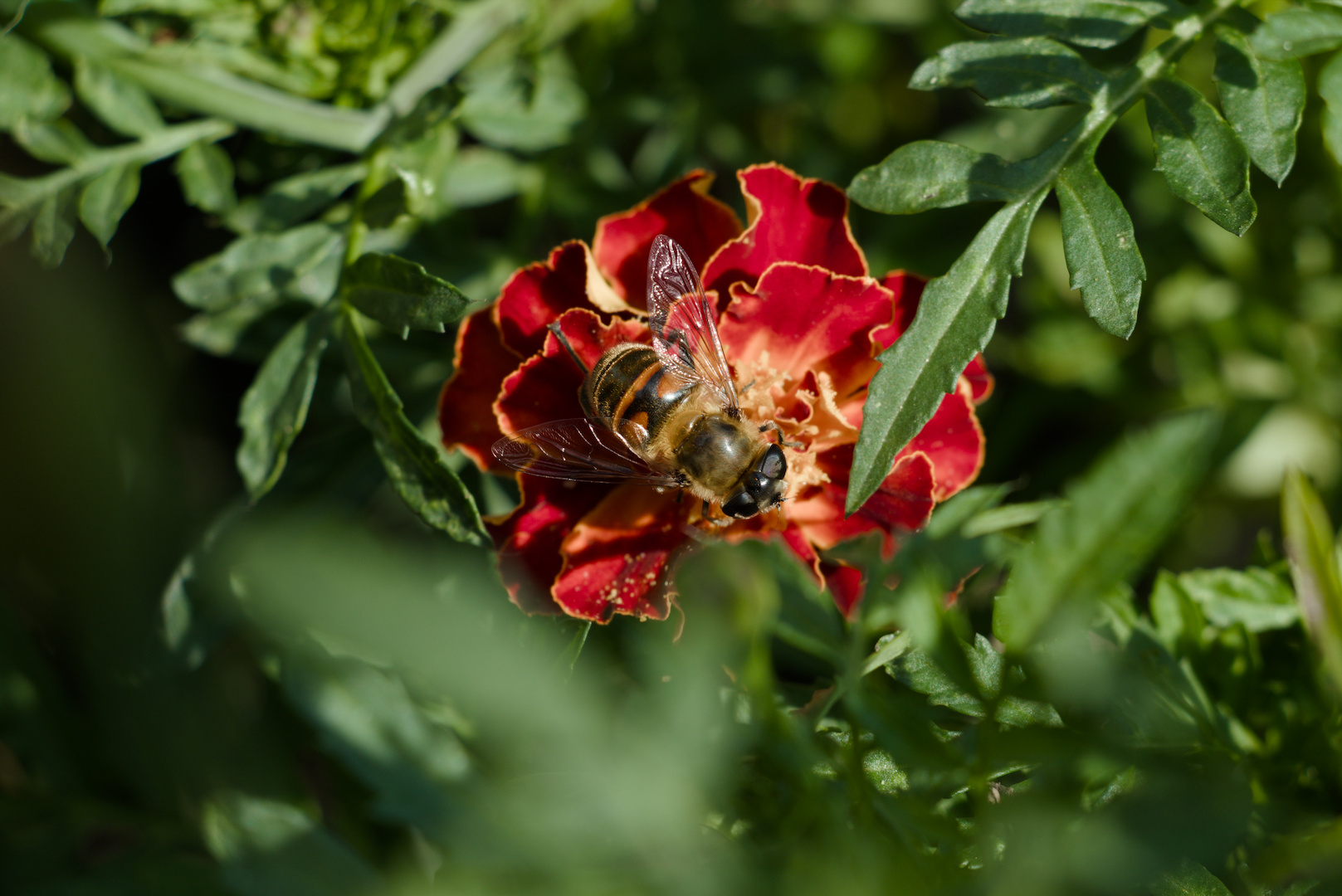
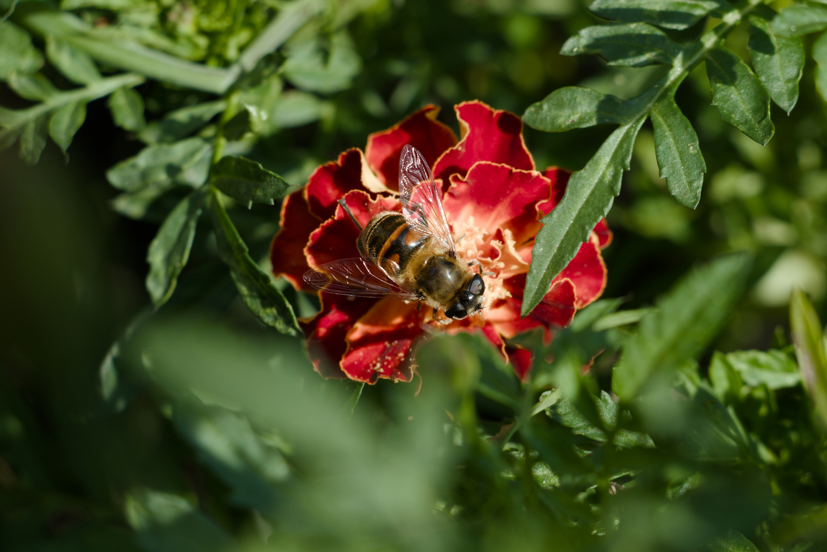
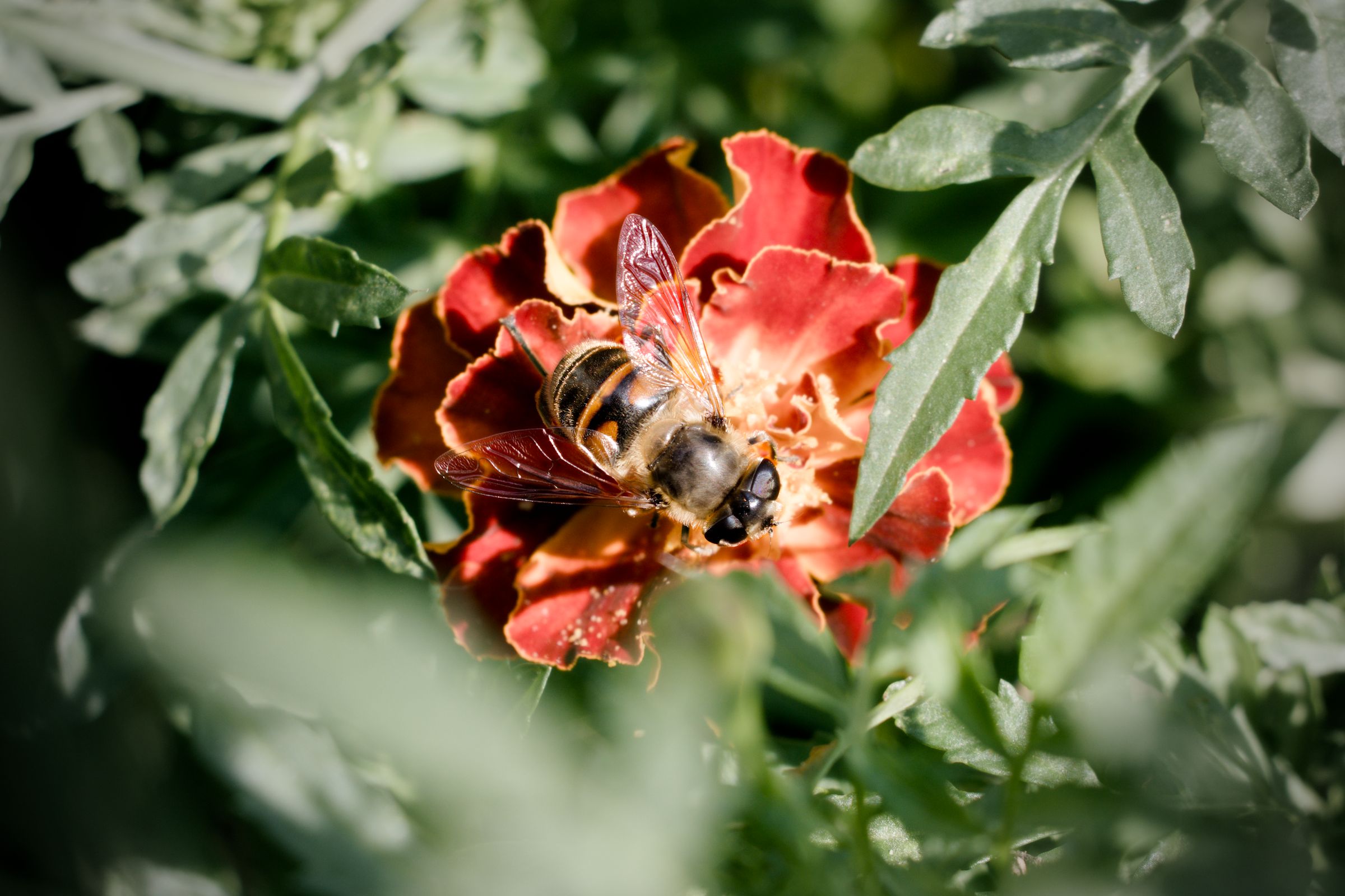
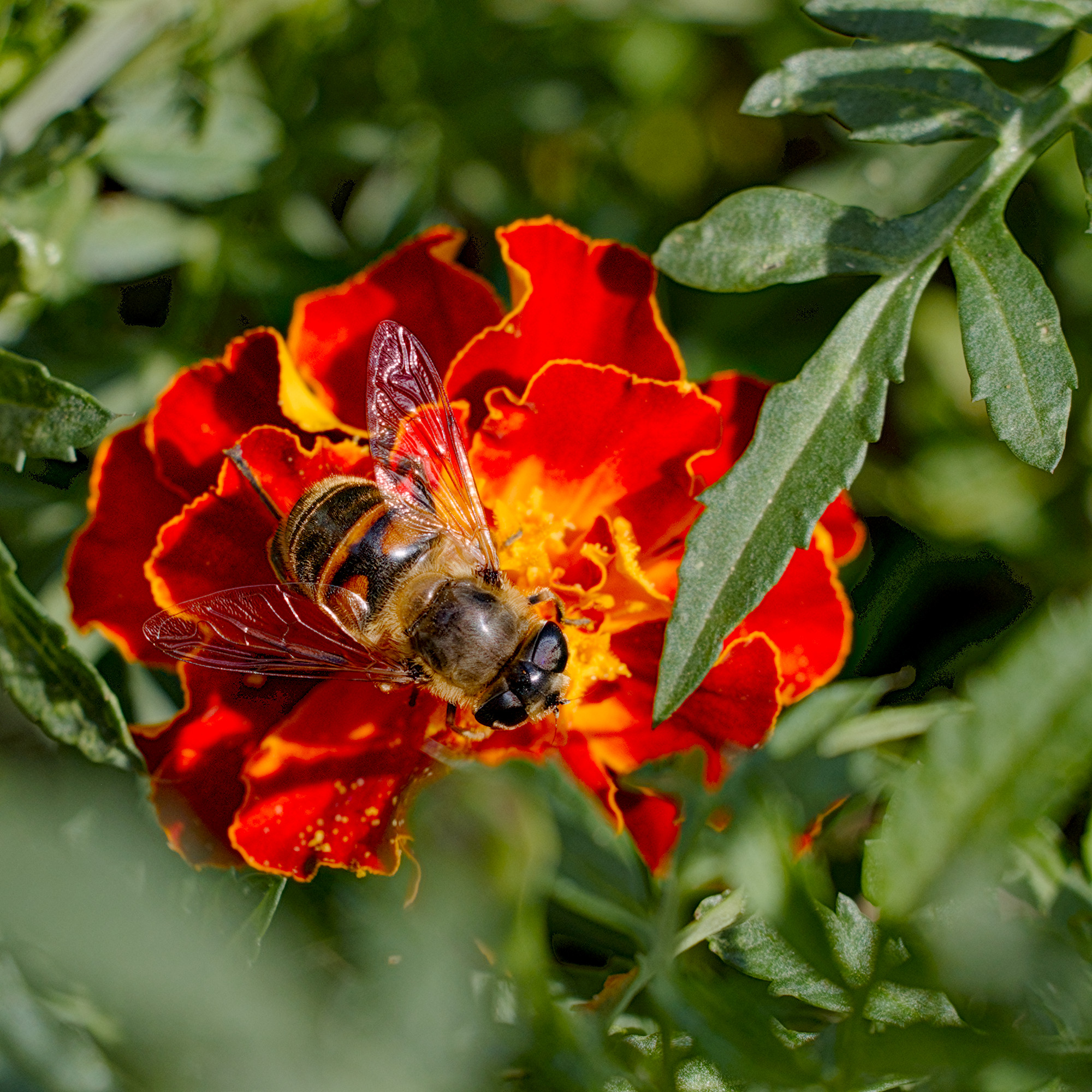
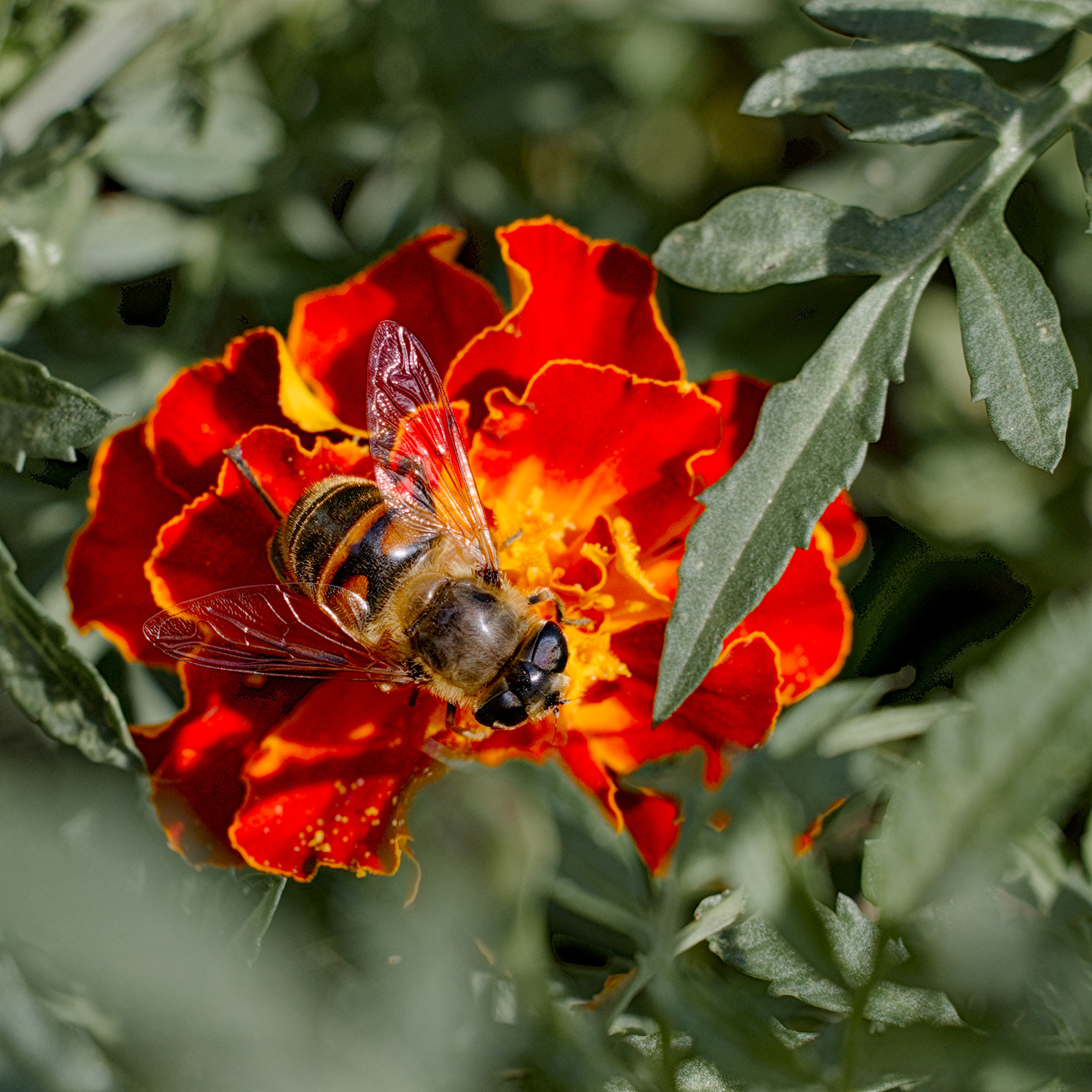
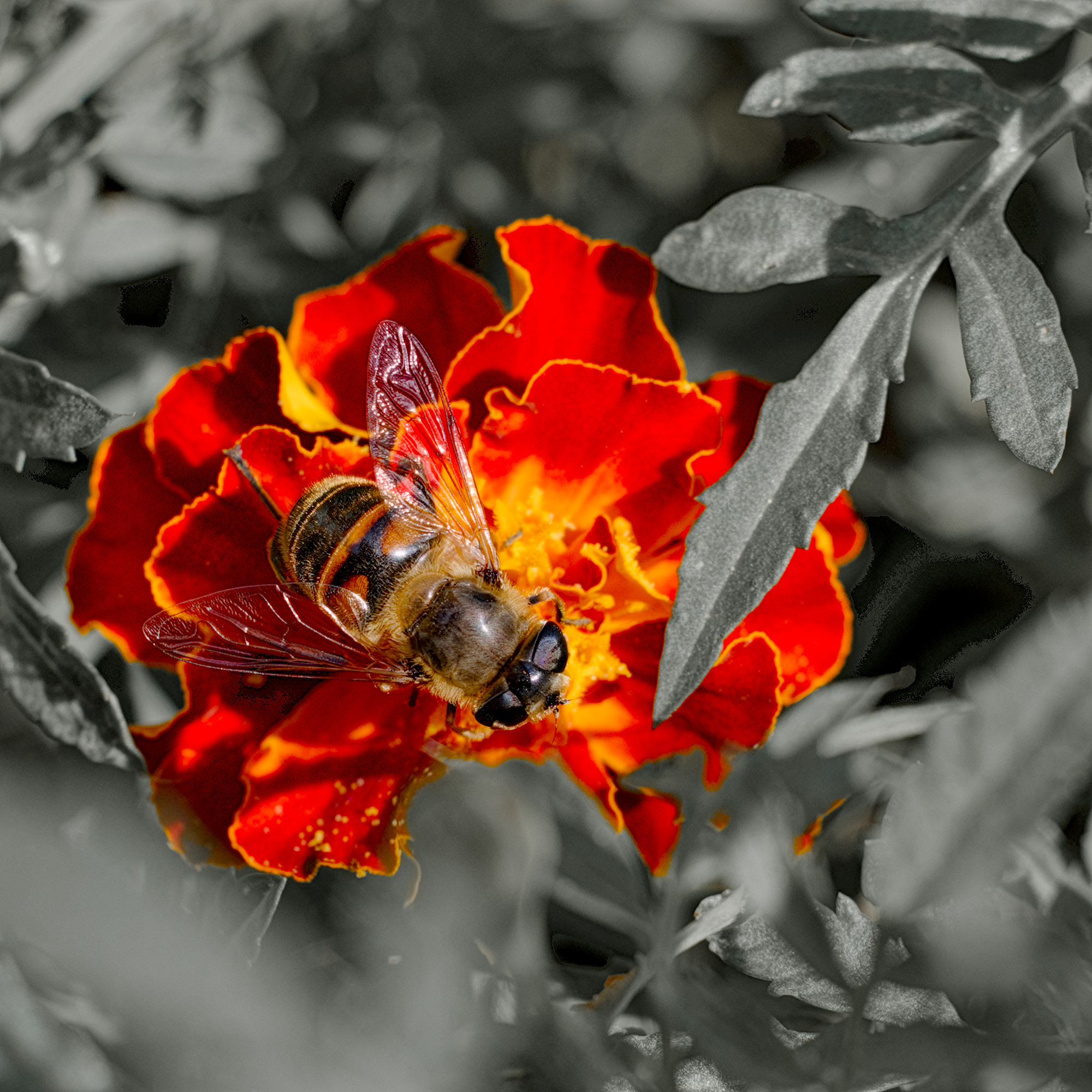
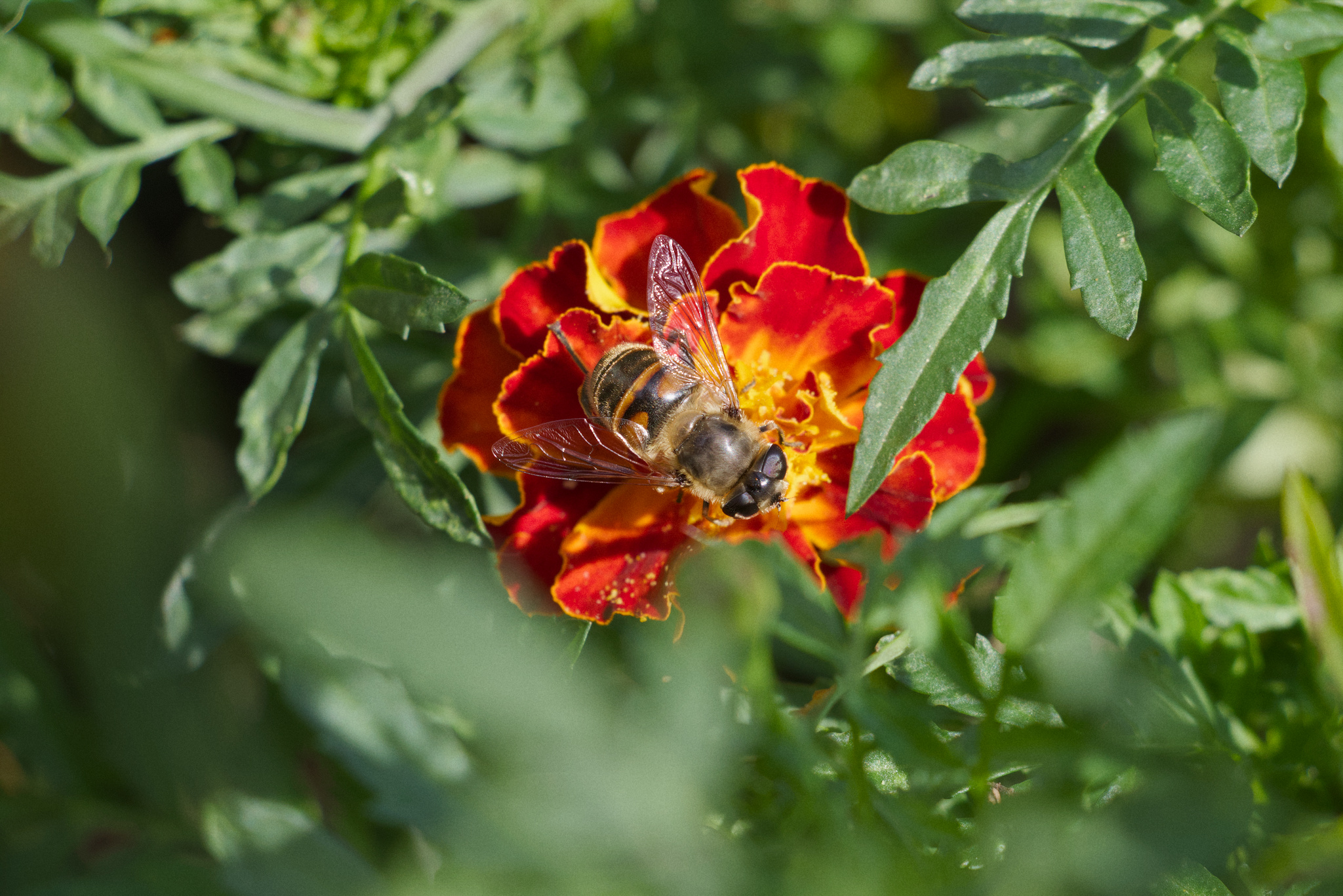
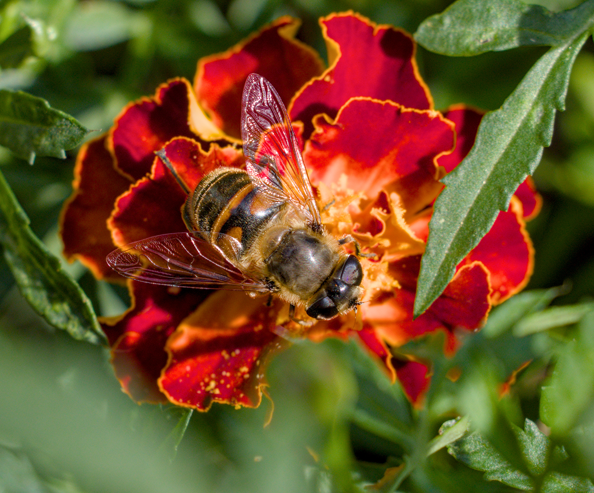
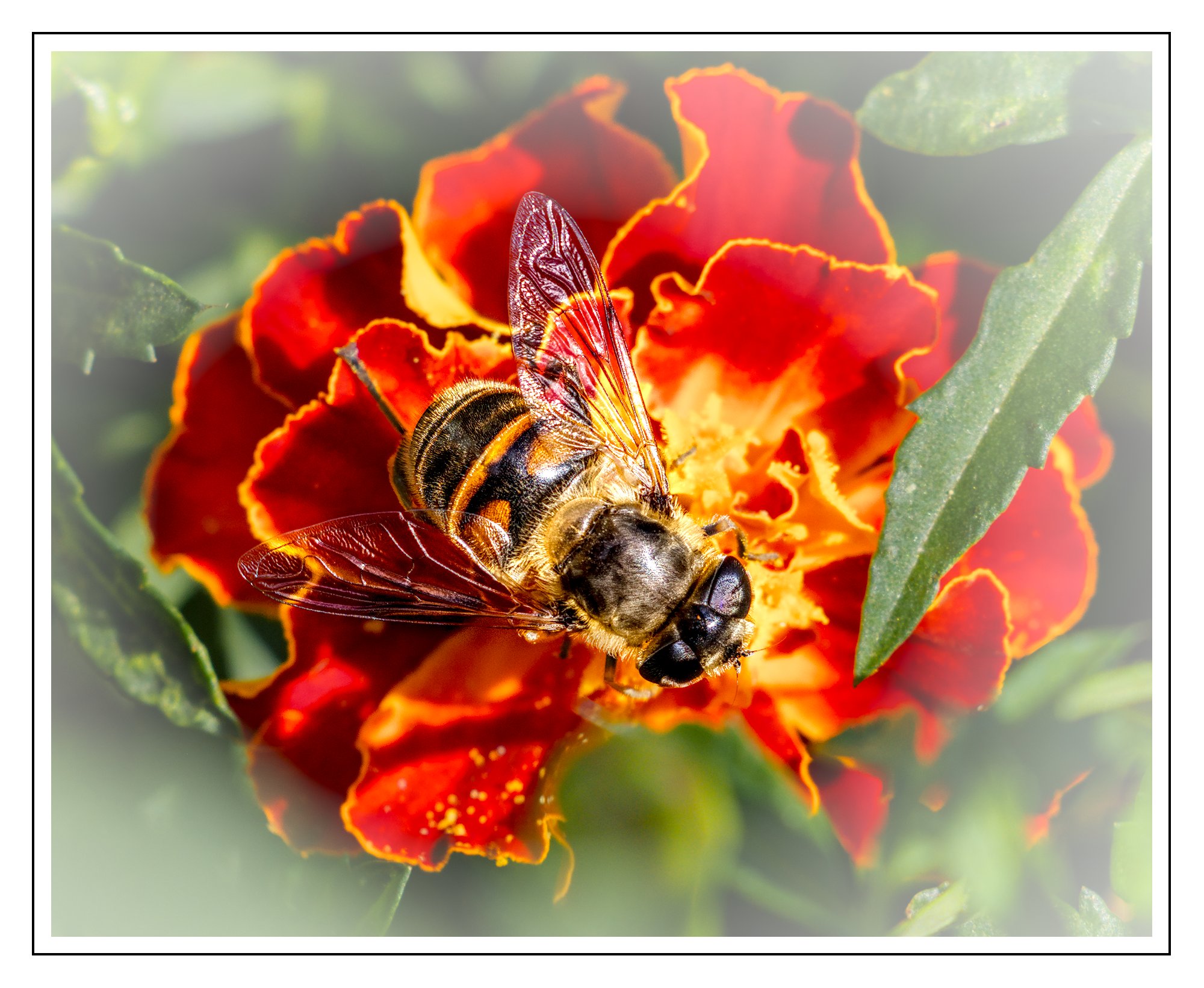
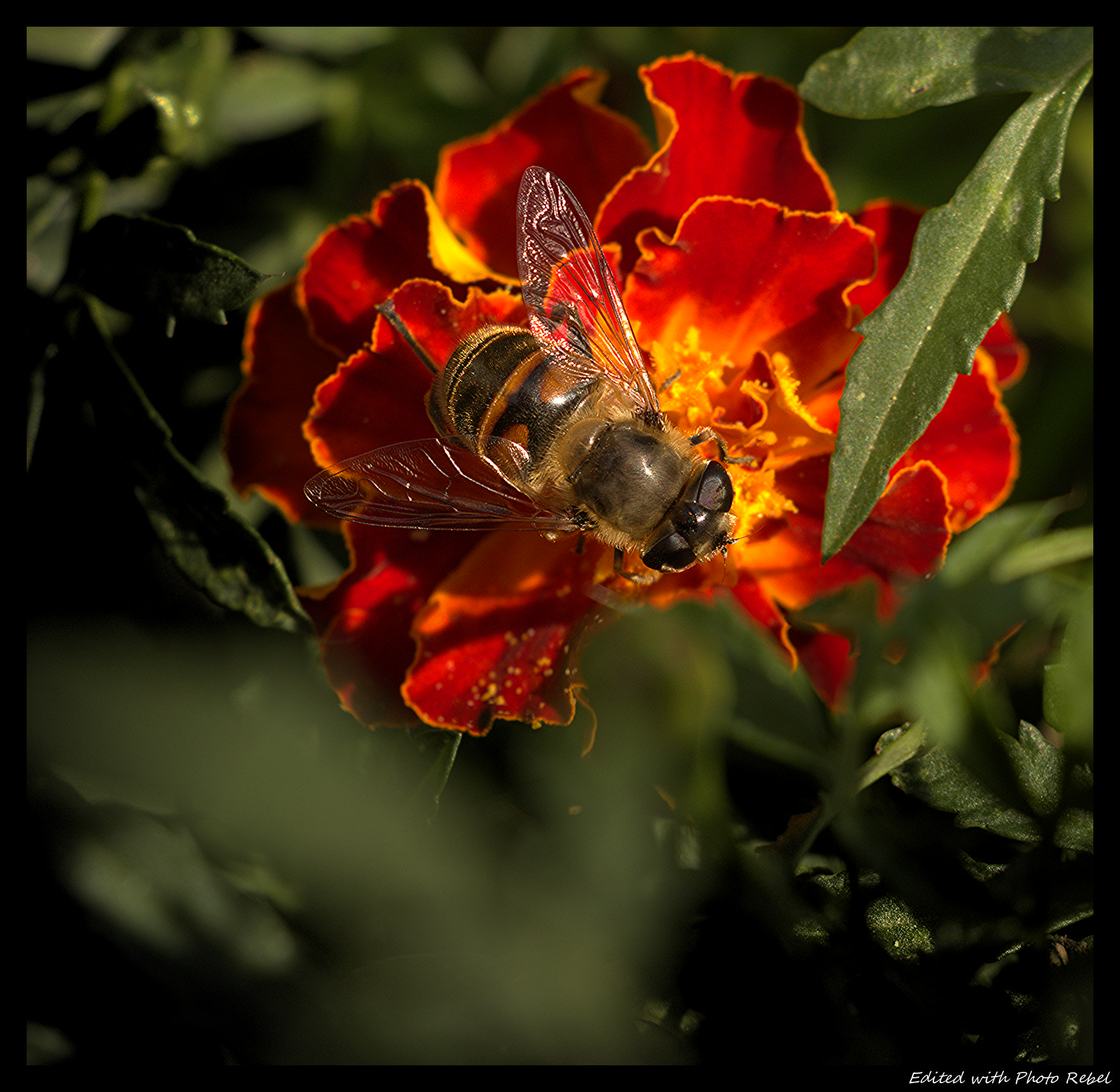
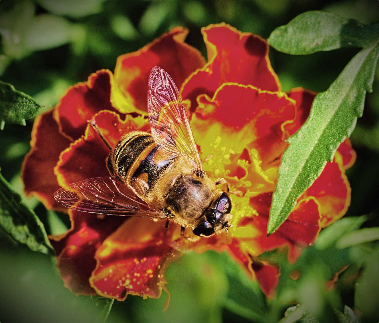
Hello, I tried to highlight the insect by desaturating the background a little and making some local edits using local AI masking. It can be surely done much better. Used nightly build 720 because of contrast/texture module.
There’s two types of contrast: colour contrast and tonal contrast.
You can achieve a lot with the colour contrast here. I wouldn’t really pivot to the conventional colour theory (complementary colours, etc), but rather only adjust the white balance between the subject and the background. For example, in your interpretation, both the background and the subject are similarly warm, so you can make the background colder to really set them apart. Alternatively you can make the background warmer so the colder subject stands out more.
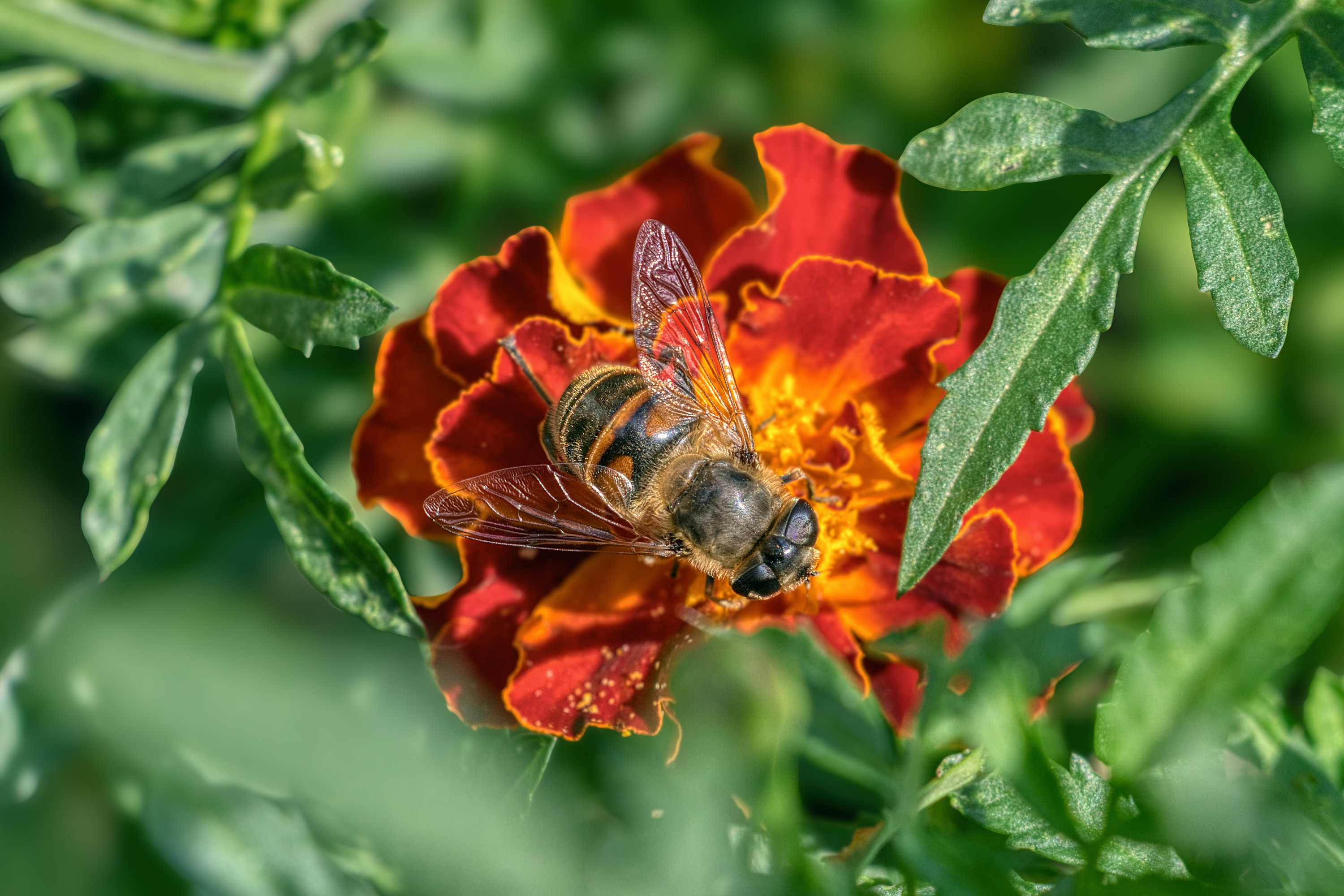
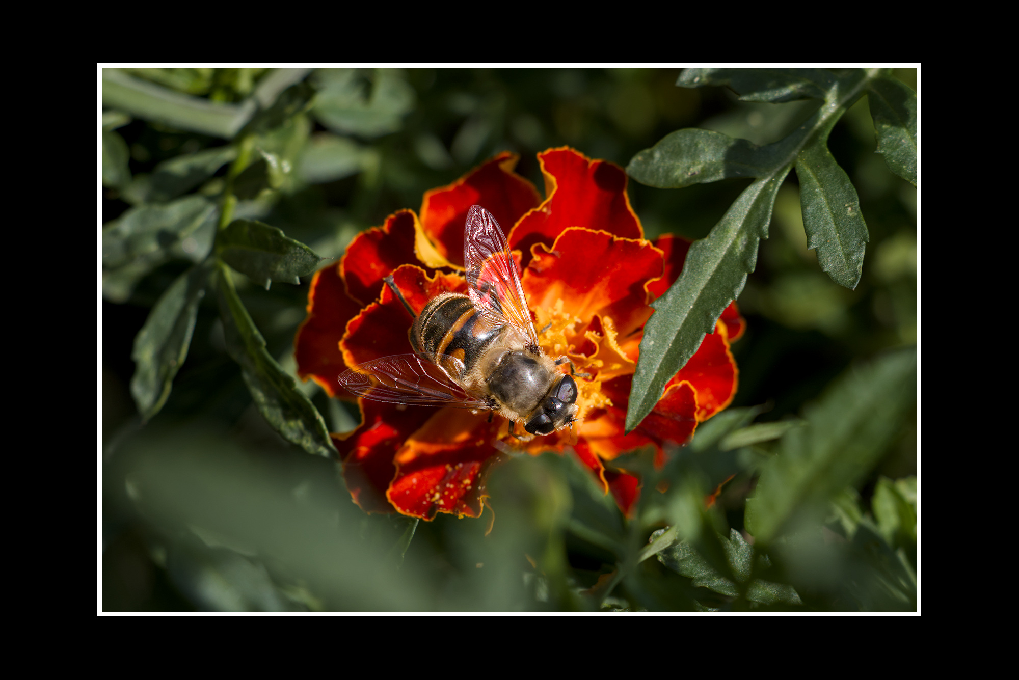
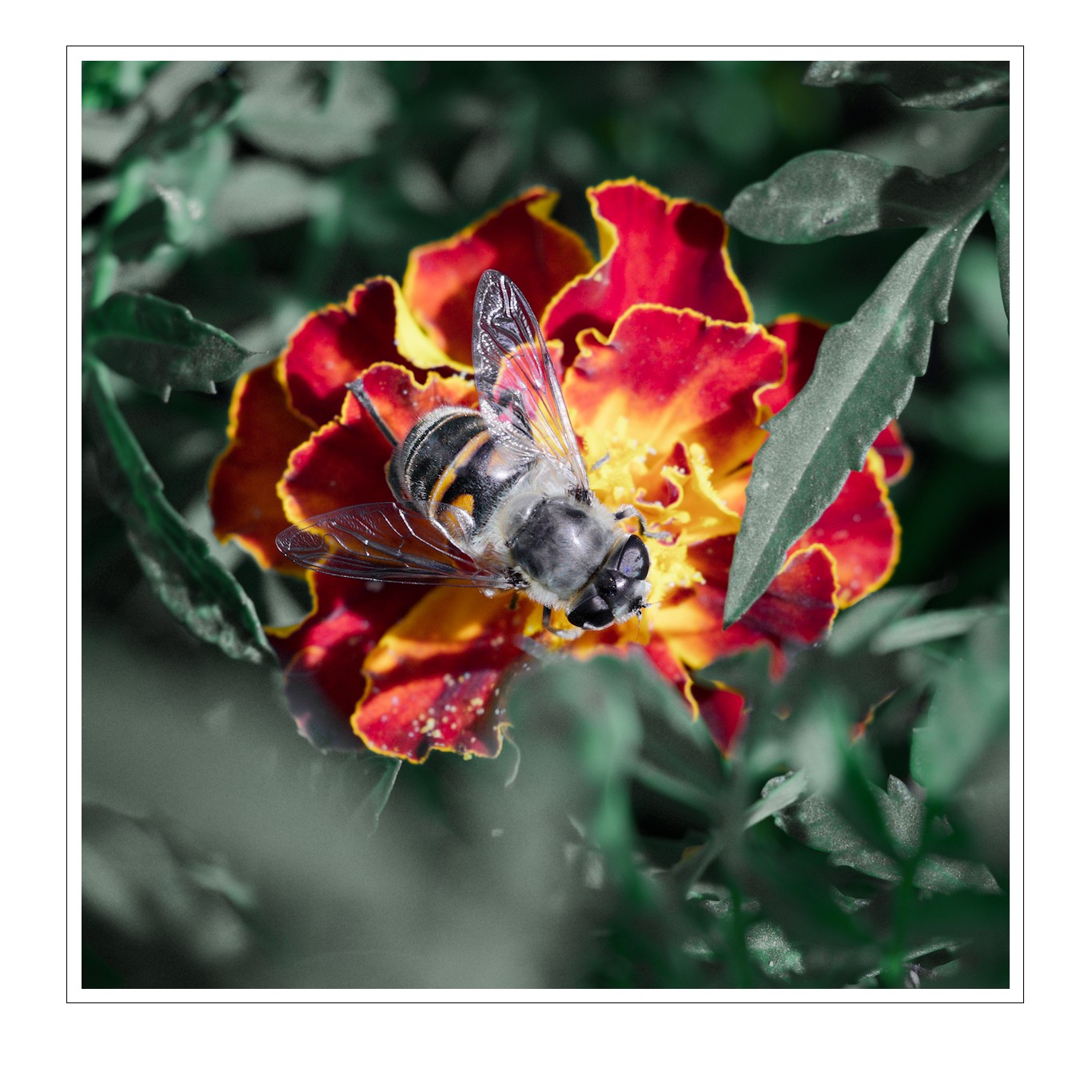
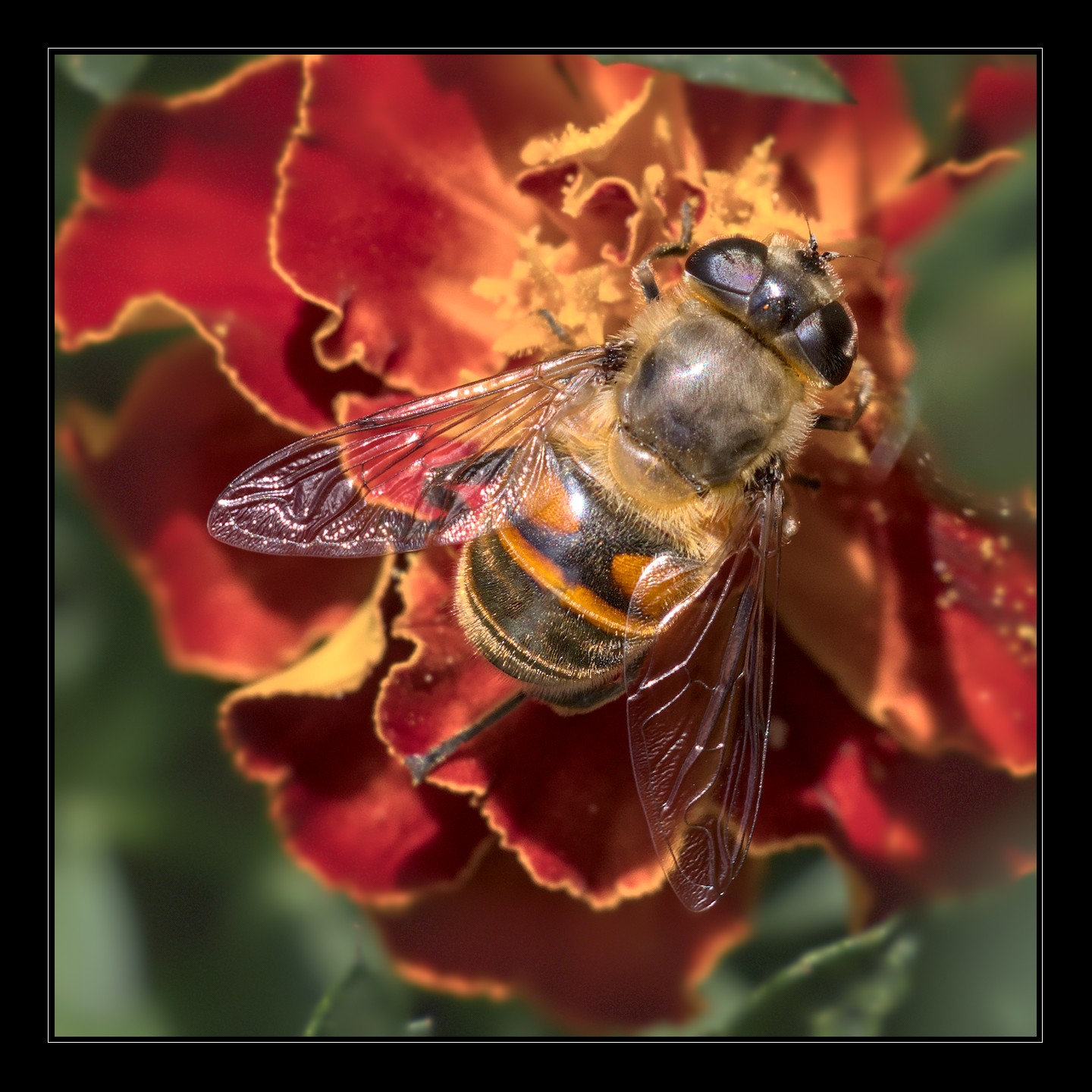
Here’s one version. I’ve made the scene and the flower colder, so the bee stands out with its warm orange coating.
When it comes to the tonal contrast, there’s 2 options.
First option would be bright subject on a dark background, and it really depends on how far you’re comfortable in pushing down the flower. When pushed too much the central part of the flower loses contrast and starts looking bad.
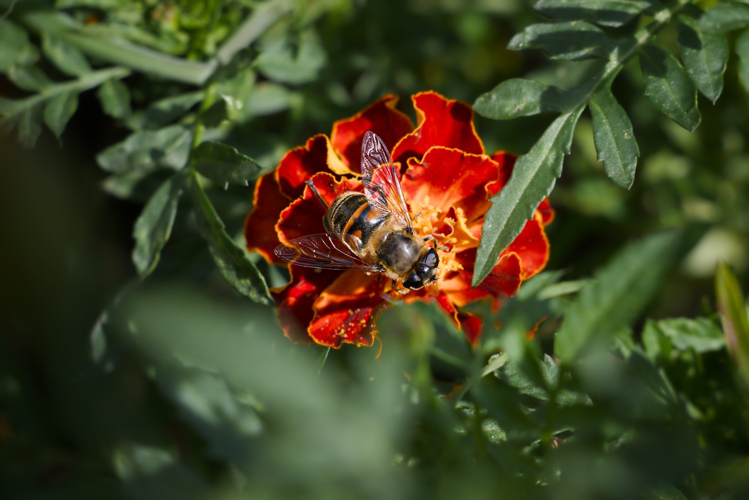
Second option is dark subject on a bright background. I think this route is more approachable because insects appearing dark looks natural and flowers appearing bright also looks natural.
The changes are all quite minimal (within ±half a stop) but I think they alter the scene quite nicely. Obviously you can push them harder if you want to.
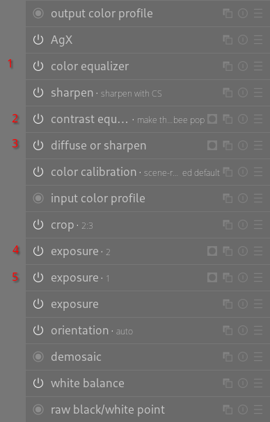
Note that I’m also on a nightly build but I’ve only used the following modules: exposure, AgX, color calibration, color equalizer, color balance rgb, so they should be compatible with 5.6.
Thanks for sharing this beautiful shot @Petr_Valenta !
If I may some constructive criticism: I think your version is a bit too bright, which causes contrast to be lost between the right part of the bee and the center of the flower. Also decreasing saturation in effect seems to have brightened the background, reducing tonal contrast. And I think more “negative” space helps - you chose quite a tight crop, leading to a bit of a busy feeling for me.
To add to the wonderful writeup by @ho4 (should we make that a short blog post for darktable.org?): Contrast between areas of higher and lesser local contrast. By increasing pop on the bee and smoothing the bokehyou can also help with separation/steering the viewers attention.
Pushed the greens to make 'em more pleasing for me, reduced red saturation and brightness and increased yellow saturation for more colour.-contrast between the bee and the bloom
CE with mask to make the bee pop
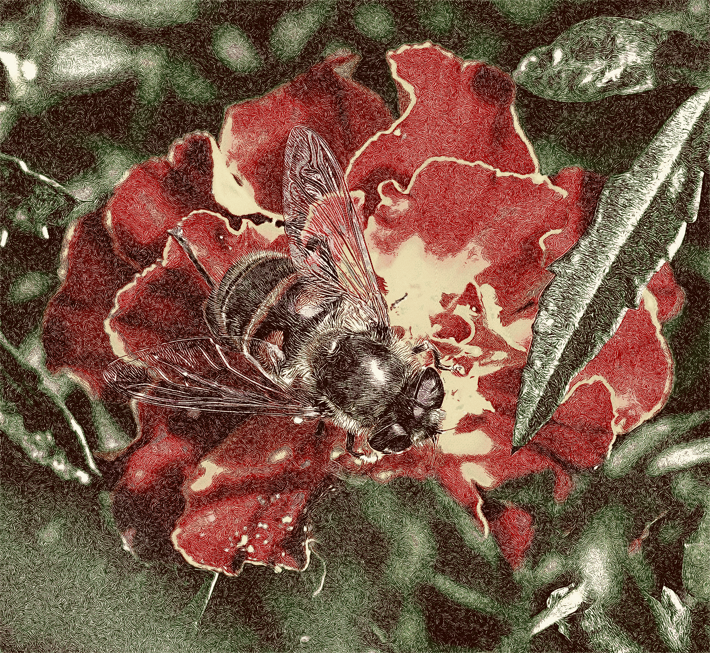
diffuse or sharpen to make the surroundings more lush
surface blur preset
Blend mode “geometric mean” to make the effect more subtle
masked to not affect the subject
tuned the strength of the effect with iterations
turned down 3rd order speed to avoid the weird artifacts the preset sometimes creates
masked exposure instance to darken the north and east border
masked exposure instance for vignetting
Edit: Only just saw that you used contrast&texture as well - since the inception of that module I prefer it over contrast equalizer.