Hi,
I have an OK monitor for image processing. Nothing garbage, nor fancy (Dell 2209WA, calibrated). Practically no reflecting light on my monitor…
I have recently noticed (after some unsuccessful attempts at processing some essentially not difficult images) that I was not seeing the blue color of the histogram properly. This was because I was missing the clipped highlights and/or clipped dark pixels on the histogram. When the clipped pixels were displayed “on the image” I was unable to see the reason why they were happening at all.
In short, the red and green colors of the histogram display are bright and strong. However, dark blue on a dark background was very difficult to see for me. My age is probably have something to do with this. Still, I believe the chosen blue hue for display in the histogram is not ergonomically correct. I bet its luminance is very close to the background in comparison with the two others (R and G).
I guess I will not be able to modify the said hue as a user. I just wonder if developers would be inclined to note this issue and consider modifying that color in the future (if that is not part of a standard, of course).
Here is an excerpt from a medical article on the subject:
“… Colour vision changes cause some
reduction of ability to discriminate blues and bluegreens.
The yellowing of the lens (that becomes
increasingly dense) is believed to be responsible for
this effect, and causes a selective absorption of short
wavelength light, blues and greens. Blue colour may
appear dark and hard to distinguish from green,
because the yellowish elderly lens absorbs blue light
selectively…” (https://pdfs.semanticscholar.org/0ec8/0e4ba8db6538f956b3a2a895068815ed0a22.pdf)
On this forum, @afre’s profile picture does the same thing for me, in the dark theme.
In my hack software, I have a lighter dock background color, RGB:119,119,119, against which the blue line stands out better. You might try such in darktable, I understand more of such settings were exposed in 3.0…
@ggbutcher Yes, it is one weakness of the profile picture but I have never gotten around to fixing it. Also looks terrible on GitHub because of its low resolution.
Would it be possible to hook it so that CSS could modify it for such a purpose? If it isn’t already possible, maybe someone could post an issue…
The difficulty seeing “blue” is progressive. An average 75 year old will see a certain darkish blue significantly harder than an average 60 year old. Also, depending on many variables, a 50 year old may not see the same hue properly as well. It is not simply calendar age.
I believe, an ability to adjust luminosity of the histogram colors “for all users” will be the best option. (Of course, I have no idea about the feasibility of this). Most people will never touch the red, few would play with the green and a great many -on one day or another- will adjust the blue.
Ruminating a bit more, I looked at my histogram code in rawproc. Thing is, the hard-coded R, G and B colors are already maxed out at 255, so I can’t make them any more intense. So, a different shade, maybe? I’d hesitate to take that too far, however, because the red, green and blue histogram colors mean something semantically to the presentation.
I still think changing the contrasting background color might be more productive…
You may well be right. The background can be modified somehow…
As a side note, I believe removal of the lens (the one within our eyeballs) may help seeing blues (among others) better. Yet I probably have 5-10 years for cataract removal. This difficulty differentiating dark blue on dark background is a rather early sign.
Another path from user CSS modifications is one that I have been using. I have trouble with colours myself. What I do is use an OS level colour dropper tool to zoom in the location and give me the colour values. BTW, I changed the topic tag to color-blindness. Might not be exact but I think the keyword covers it. An alternative could be the bigger umbrella of accessibility, which I will add now.
More then ten years ago, I had a talk in a bar in Dublin with 2 opticians (having a lot of irish whiskey). They told we will get each of you at a certain time. Well, it’s true…
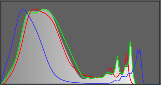
Below is Filmulator’s histogram, which I can see easily, clearly. Glenn seems right about modifying the background (alone or in combination with other changes).