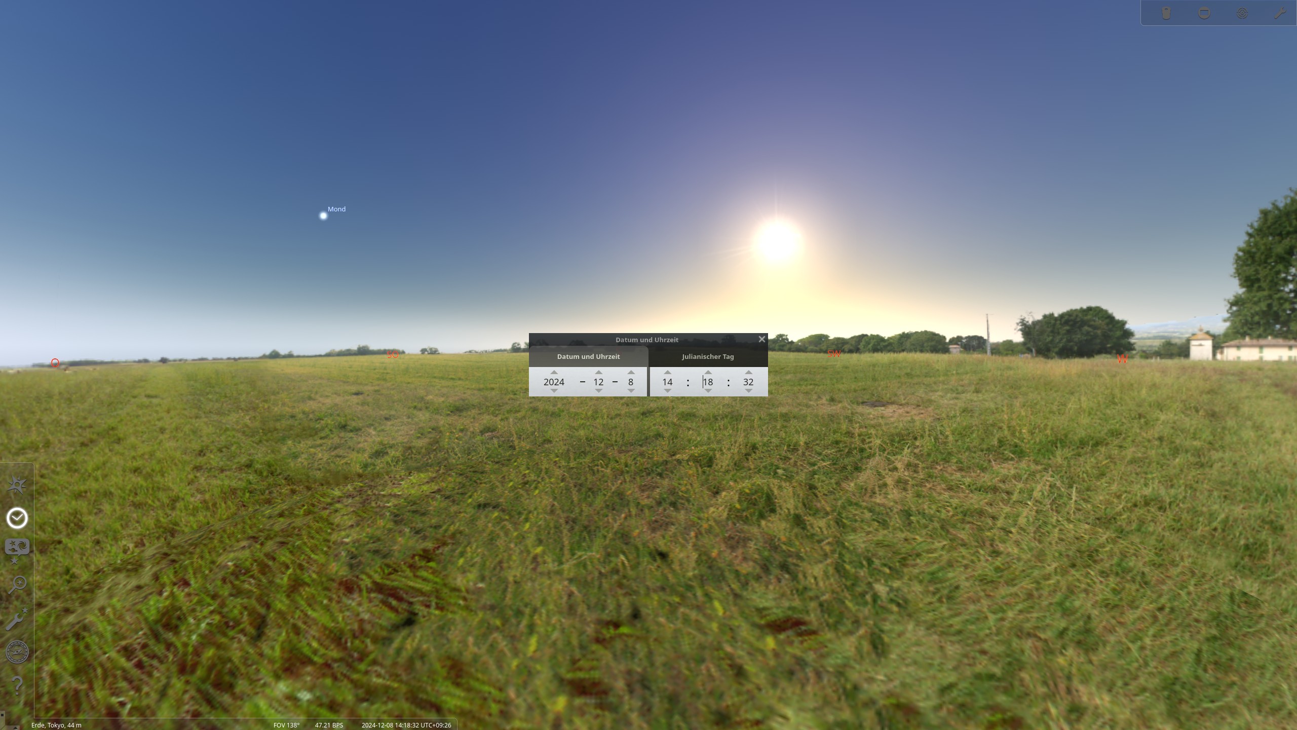
I just had a look at Stellariium and the sun was definitely already very deep at this time:
2 Likes
That’s an interesting point. I should make notes when I take these photos.
For reference the photo was taken here…
It is very clear during the day, but as the sun goes down you often get a very red sky. It can look amazing.
Focussing on the word “realistic” I can’t help looking at this image and wondering how “Googlified” is it… Including my own attempts it just strikes me as not looking realistic. I am not sure how to put my finger on it. At times I feel I am looking at lego  , but I guess maybe the best point of reference I can think of to me (and I realize I am an n=1 and this could just be me), is that it looks a lot like those images you see on media for “coming soon” condo’s or hotels or business buildings. I am not sure what software is used for those artist recreation/rendering images but to me this image has that sort of quality… It would be interesting to see the same image shot on a decent camera without computational input and see how they compared…
Maybe its just the way this one strikes and the impression it makes on me…
1 Like
The original looks very HDR tone mapped to me. The shadow side of the building we see is way way way to light for what the shadow in the foreground is.
3 Likes
Here’s my proposal with filmic and satured colours (and I use a mask)
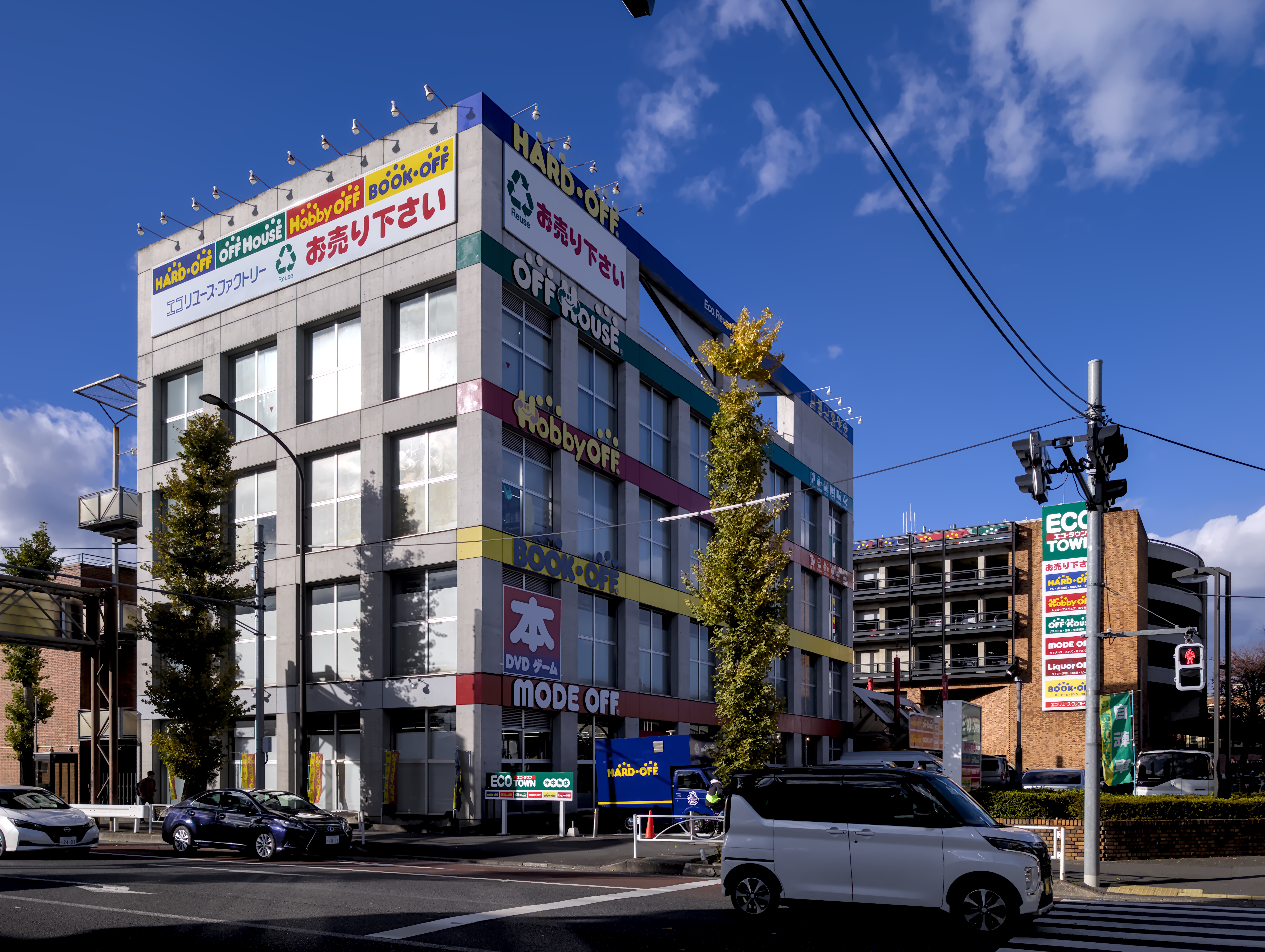
PXL_20241208_051828478.RAW-02.ORIGINAL.dng.xmp (73.6 KB)
1 Like

PXL_20241208_051828478.RAW-02.ORIGINAL.dng.xmp (14.9 KB)
This resolution is insane for a phone, it looks really good. I wonder if this DNG is a single frame or already a result of some stacking and computational photography.
3 Likes
It’s a 50MP Sony sensor, and my understanding is that the sensor captures two exposures at once and the software combines them. So it’s at least two exposures stacked.
1 Like
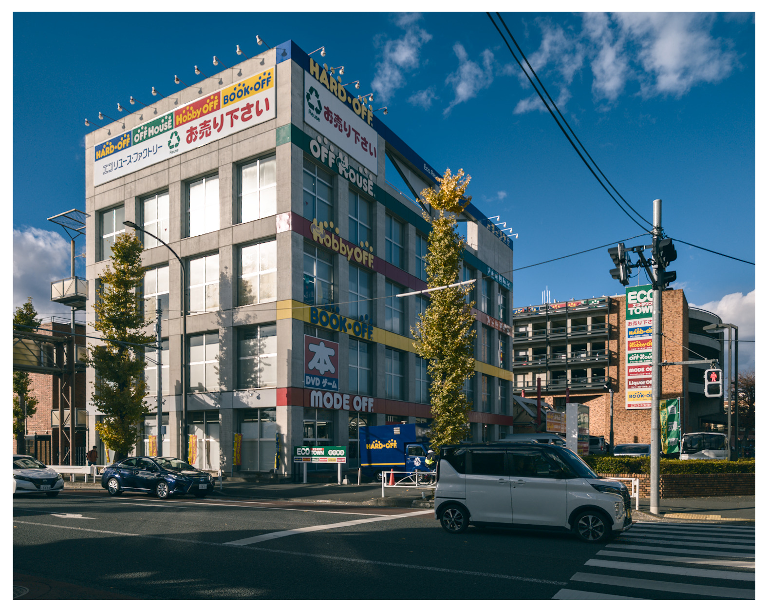
I went for a more analogue look, somewhat akin to Classic Chrome on a Fuji camera.
I also have a Pixel camera and I really can’t stand the JPEGs it produces. I was very impressed with them at first because they bring out lots of detail and tone map everything to look like it’s the correct exposure. But I’ve grown to really dislike that HDR look with too much detail. I prefer to always develop the DNGs now.
4 Likes
I’ve got one too…its a Pixel 8 not the pro so I can’t get the hi res DNG. I also find that pixel seems to play a game with the blue channel for contrast maybe?? I find the jpg hit or miss…sometimes just very true to life…other times not…and pixel peeping reveals that they don’t always get there merge that great…sometimes with say text on a boat or something like that you will get an outline of text or on the faces you can get some really weird artifacts for lines in the face or around the mouth with smiles so the DNG are good to keep have esp in that case or if you shoot something interesting and want to see where it will go…
Yes. Didn’t bother me much. Post deleted.
Sorry, that’s not what I wanted.
1 Like
I know it always can be problematic in a forum like this to criticize others.
Anyway, I think this should be allowed as long as it is constructive ( and I think it was constructive). In my opinion, without critiques, it’s harder to recognize flaws in the own workflow. I for example have often the problem, that I forget to correct chromatic aberrations and sometimes my edits are simply a touch too much.
If people give me a hint what’s wrong they are always welcome, because it helps me to improve. Whereas critiques like: “What boring rubbish” isn’t helpful nor friendly.
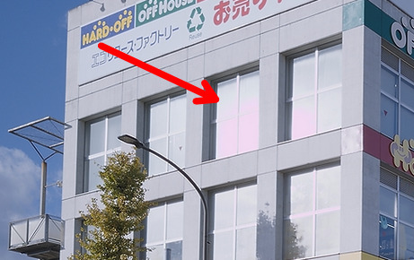
Giving a hint on a technical problem, shouldn’t be taken as an offence but as a helpful hand. A pinkish highlight may have been overlooked even in an otherwise wonderful edit. So I think it would be better to not delete a post, just because someone gives me a hint.
In the end we are a community and I think we are more interested in helping each other than bashing each other. I for myself at least have the feeling, that it is like that.
6 Likes
Here is Japanese information about ART.
Post undeleted to please all who didn’t like the deletion.
I was well aware of the RT pink windows when I posted it and I really did not need the example edit with the huge arrow to know that the pink was there. With no comments on the rest of my work, I deleted the post in a fit of pique. I get fits of pique quite often at my age (85).
2 Likes
You are correct. I’m sorry. Won’t happen again.
3 Likes
Holy crap, I hope I will be able to make such edits when I’m 85 (If I manage to reach this age). My father is already struggling with his PC at the age of 82. And he was once quite fit.
Thanx for undeleting!
2 Likes
I’m starting to lean towards straightening the building now too. At first I thought it make it look kind of fake, like a model or something, but now I’m seeing it as making it look more… I’m not sure what the word is. Maybe more like the subject of the photo, rather than just a part of it.
@cedric Thanks for undeleteing your post…
It’s just as relevant and integral as any other in the thread.
As Uli… @Popanz noted it can sometimes “not” come across in a short comment that the real intent or notion of the poster is not to criticize but just to make an observation or comment as part of an exchange.
I can assure you that @kofa is one of the most dedicated and respectful individuals on this forum and I dont’ think there was any intent to be critical but rather it was a purely technical observation…
In your post you used the term “lots of slider-waggling” so it may very well have been that @kofa was simply inspired to say hey did you notice the magenta bit in the window…as this is normally corrected by default for the most part and might have come unintended from one of the “slider waggles” … that is in the end not important
In any case there is as of late I feel quite a good level of discussion around things with generally a very good level of civility and people will certainly not look to criticize but might comment on approaches and (often as I am) they might be on their phone and so the comments might be short without some of the usual context.
Moderation is well done (I feel) on the forum so you won’t ever be picked on or trolled or singled out and others will be quick to call out any sort of behaviour of that nature… It’s just not helpful
Its a good reminder though as always that sometimes a few extra words are necessary to carefully and respectfully convey our comments and suggestions…
I for one hope that I am always able to convey that tone but if not please call me out… I will clarify and apologize…
5 Likes
You don’t need to worry, Todd, you’re one of the most polite, diplomatic and respectful on this forum. There are some on here who I respect a lot who can still sometimes come across a little terse, abrupt, confrontational, etc. But we are dealing with non-native-language speakers, cultural differences, generational differences, expertise differences, etc. So I always keep this in mind when interacting with others. Us Canadians are sometimes teased for our politeness, but I wouldn’t have it any other way!
5 Likes