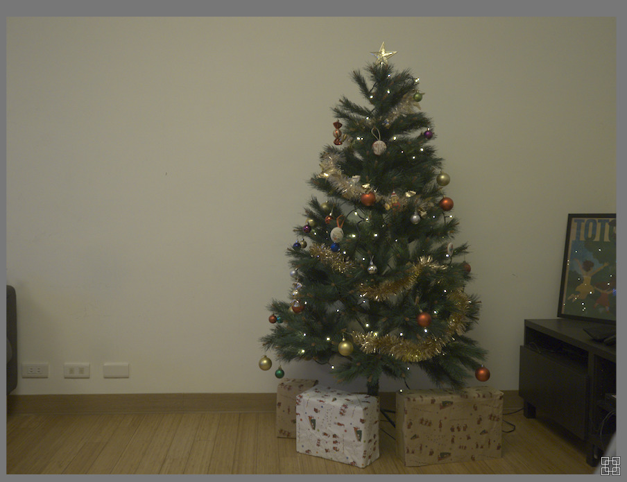
The wall is somewhat cream color, but as you can see here it looks like the whole picture has an orange layer applied to it.
I am a bit overwhelmed by the different processing modules in darktable. I started by using the “Color Calibration” one, but could not get something I wanted. I tried simply playing with the “White balance” module, but got a warning message because the Color Calibration module was also being used and the two modules were interfering with each others.
What is the proper way of dealing with this kind of basic issue?
Since I also have family photos, my concern is that I don’t want to go overboard with blueish tints, because then the skin color will be affected as well!
If Play Raw is a better place for this kind of question, then yes, please! I thought it was more of a dedicated section to actually provide an artistic point of view of a given photo.
Color calibration is the ‘proper’ way, in the current darktable - it does give all the control and more that traditional white balance does. But it can be a little disconcerting… Try using the eyedropper to select something white - maybe the wrapping paper perhaps? Then if the correction is too strong, (too blue) reduce the chroma slider to let some warmth back in.
Or, you can use the 4 ways tab in colour balance rgb to add a little warmth.
If you want to use the white balance module for adjustments, switch off color calibration, or set to bypass.
5 minutes later…
I used color calibration to white balance off the right-hand bit of wall, as that gave a very neutral-looking overall scene, then used colour balance rgb to add some warmth into both the midtones (power) and the highlights, and cool the shadows just slightly.
Faily standard sigmoid workflow otherwise - you can load my xmp if you like to see what’s there.
P.S. I’m sure that tree will look lovely at night with the room lights off, just lit by the fairy lights. Long exposure, small aperture maybe get some stars…
There are two ways to set white balance.
The ‘legacy way’ is without color calibration, simply with white balance. It’s perfectly valid.
The other is the ‘modern way’ with color calibration, but in this case white balancemust be set to camera reference. Now, the trouble is, for some cameras the reference values in the profile are wrong, and therefore this method gives wrong results. There are also other drawbacks (the white balance is not set correctly until you get past color calibration, which means that demosaicing, chromatic aberration correction and other modules don’t work with the real colours).
Anyway, my first attempt (either in color calibration or turning that off, and then in white balance) is to pick a neutral spot. The electrical sockets/mountings looked like a reasonable target.
That gave me this (no filmic, sigmoid or any other curve):
Not knowing the original colour of the wall, I don’t know if any of those are close to reality colour-wise? Then brightness and contrast could be set with any of the curves.
You can combine picking and manual adjustments, of course.
With the ‘legacy’ WB, using the bottom-right corner, and sigmoid curve: PC170001_01.ORF.xmp (10.7 KB)
Following up on @Thomas_Gulmark 's comments… often the picker on the whole image with CC is actually not bad but a bit strong. After you set the wb that way and if you don’t have any good neutral candidates then you can go to the hue chroma settings… they are displayed most of the time but if not select custom from the drop down. If you now just slowly begin to drop the chroma you will easy back some of the corrected color. You can do this until you find the image pleasing. The correct way is probably to do this late with one of the other modules but this can work… Sometimes to my eye even when you grab a “neutral” spot the correction seems harsh to the eye. I rarely mess with the hue that gets selected by the picker but some tweaking of the chroma can dial in a nice look while still correcting much of the color cast you are targeting…
Olympus cameras have an option in the auto white balance that says ‘keep warm color’ on/off or something similar.
If you turn it off , shots like this will be neutral . But sometimes you want the warmth (to capture a sunny day as a warm sunny day for example :)).
The Olympus editing tool (om workspace its called these days I believe ?) doesn’t work nice in my opinion , but it allows you to pick the other AWB option for raw files I believe .
What others said , using color calibration is the most correct way , but any way you get results is ok, don’t worry :).
The warning about white balance and color calibration is because they both attempt to do the same. If it gives a result you like : nothing wrong with that . If you like the white balance control more , turn of color calibration and use white balance to pick a part of white.
But color calibration can do the same.
Use the picker in there to select a large part of the wall, And it should make the wall white.
As you said , it isn’t really white. So use the chroma slider in color calibration after picking it to undo the effect slightly , to your liking.
Color calibration also allows you to target something else than white / gray.
You could take a photo of the same wall in normal daylight lighting. Open that in darktable, and use color calibrate to select the wall but use it as a target. (It’s in one of the collapsed sections in the color calibration module ). Now open this image (the yellow tinted one ), and select the wall. It will now turn it your previously selected colour , instead of white / neutral .
For the record : I THINK you want to do the correction on the whole image . It’s not just the wall that’s off , this is lighting conditions so everything is tinted.
So in case there are people in the shot, those will probably also be way too yellow / warm .
So you have some good replies here already. The color correction of this image is a standard technique you want to master to successfully edit your images in the future. It is a simple white balance issue. You can either use just the white balance module alone and turn off the color calibration module or set the white balance module to camera reference (the default) and use the color calibration module to calculate the white balance from a selected region of the image.
I also sometimes “fine tune” the color using the rgb curves module. To add a little red just raise the centre of the red curve or to reduce red just lower it a little from the centre. The same adjustments apply for the green and blue channels by adjusting their curves. With your image the white balance calculated from a selected region of the image was a little cold looking so I add a touch of red and yellow using the rgb curve module.
Ya that was the sort of thing I was trying to mention in my comment and since you posted the dialog box you can see if you drop chroma to maybe even just around 112% (or to taste) you start to bring things back a little… so if you trust the hue selected by CC module you can modulate that with the chroma just ever so slightly to make the image look less sterile…
This image has some bounce light off the floor as well and maybe even the tree in the corner … Not sure if any suggested it but you could even try some masking an two instances of CC depending on the end result you are looking for…
Argh! I got this camera a few months ago. Back then, I did notice this setting… and then I completely forgot about it! I checked and of course it was set to “On”. No wonder my pictures look all reddish!
I’m a Linux user, so even if it worked fine, it would be out of reach for me