Here is another go attempting to bring out more clarity, contrast and detail in the foreground shadowed region. This was mainly achieved by using two instances of default values for shadow and highlights. This module adds contrast and colour in the shadows by default. Never exceed the value of 50% on the sliders, but rather use multiple instances if a stronger effect is desired.
BTW, this is a great shot for demonstrating the different approaches and looks that each person obtains here. The edit I have done here is too vibrant for my taste, but I felt constrained by trying to achieve something similar to the LR edit. If you had put this image in the Plawraw category and gave no hint of your expectations it would be interesting to what we would have done with it.
I think this kind of thread, and the whole attempt to develop an image to match or be similar to something else is very educational. In the normal way, one may be quite happy with a certain approach in a certain piece of software, and that’s all good, but trying to match a different result pushes one away from the “path of least resistance” if I may call it that.
To be honest, my attempt in this case wasn’t so different to my normal workflow anyway, as I like those sort of punchy colorful results (in the right circumstances), but I’ve learnt a lot from Play Raws, as well as watching videos and so on.
From an educational perspective it can be very interesting and challenging. I have to overcome my tendency to see these requests as “I want DT to match LR” and wondering why should DT match LR. certainly this image has taught me to play more with the color balance module to pump up the saturation to a desired level. It has also reinforced/justified my love of the shadows and highlights module.
Should we really try to mimic other mainstream software?
Aren’t we exaggerating with our elaborations, sometimes pushed to excess?
And above all, what makes a photo the ideal subject for a Play Raw?
Defective photos at the start hardly leave room for interpretation. Perfect photos even less. Perhaps the photos that best lend themselves to Play Raw are the ones that are well done, but still can be perfected.
A flower? A dragonfly? Maybe not, maybe yes. Perhaps a street photo with lots of detail and lots of colors lends itself more. Or an ancient bridge of Roman origin. A boat in the middle of nowhere? A hazy landscape? A close up flowering blossom in a cold whether?
What do you think is the best photo that could you catch involved in a Play Raw game?
Is it the subject?
Is it the light?
Is it the colors?
Is it the quality of the master image?
Or something else?
For what am I concerned, before I enter a Play Raw thread the original photo must be:
I realized just now that this was not a Play Raw post
Please @freepenguin84 can you add a Play Raw tag to your post so that my last comment would make sense? Thank you.
As it turns out, I had downloaded a trial version of Lightroom to see what it was about. I suppose I’m a little different in that my serious editing began with darktable and I haven’t used much else, so my challenge is adapting to the LR way of doing things.
Both versions took me about the same amount of time. I think DT was more work because I had to call up multiple instances of color balance rgb to address the green, red and blue, while LR has a color mixer where I can choose a hue and make HSL adjustments (I think this is one of the things I miss in DT).
I think the colors in my DT version are more realistic and to my taste. I had a hard time getting what I wanted out of LR. But I’ve used DT for years and LR for two day, so I have a lot of learning curve under my belt with DT. The thing I miss in LR are the blending modes. In my mind this is where DT really shines.
I’m sure I can get the results with LR given time to learn, but I’m finding that whatever I can do in LR, I can do in DT as well - even if it’s a bit more effort at times.
My answer to this is very personal. If the image processing challenges intrigues me then that is a perfect photo regardless of subject. Some photos are just too straight forward to get my interest. Others are flawed or challenging images which as a photographer I would prefer to go back and capture correctly rather than fix a poor image. As one of my students said to me once when talking about processing images " you don’t carve rotten wood" meaning why edit a bad photo. But in saying that I have edited many bad photos of my own because I can not recapture the moment or opportunity. DT has proven so great at this, especially with noise issues.
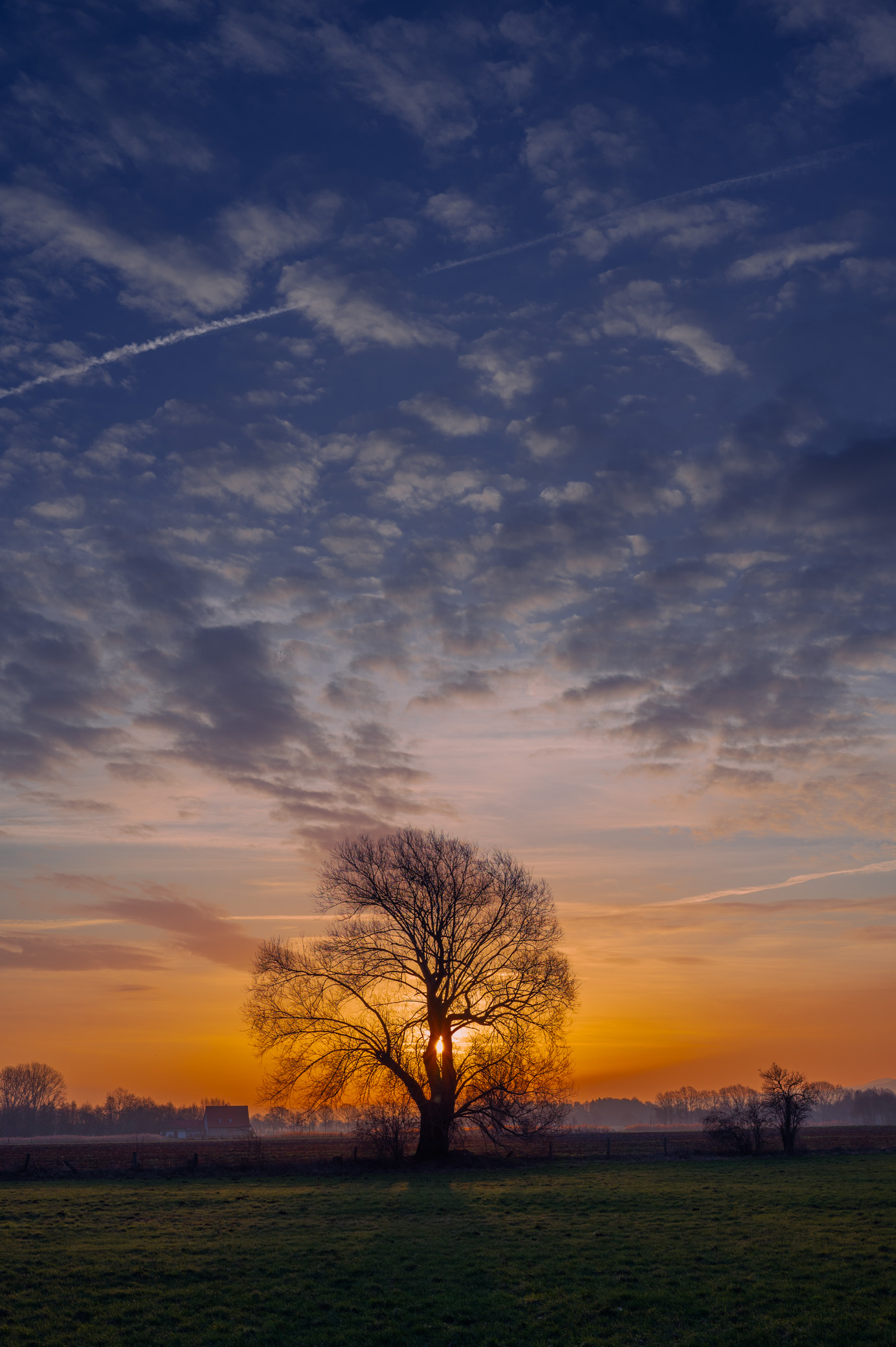
Yes, I could have spent time finessing the mist-tree-yellow sky border but I didn’t want to. Also there is mist rising above the trees at extreme left and right in the OP image, so I thought it didn’t look completely unnatural.
My aim was to quickly respond to the OP comment of getting a ‘pleasing result’ in darktable, and therefore I imitated the OP posted Lightroom image as much as possible. If it was my shot I would approach it differently.
@freepenguin84 Glad you liked my attempt. There are many great tutorials out there, and the one’s I find most helpfull in terms of understanding the details of how/why/when to use various darkroom modules are those of @s7habo . For example, the use of Tone Equalizer in HDR situations, which I used in my edit of your shot, was from one of his videos. Good luck on you darktable journey!
A more faster version, the darktable’s shadow/highlights could be used with highlights set to 0 before sigmoid , in this way it doesn’t clamp highlights.
Here is my try in darktable, all global edits. The important thing was to set LocalContrast to HDR tonemapping preset, and use preset compress shadows/highlights in ToneEqualizer. Then, crank up saturation and chroma in ColorBalanceRGB. Overall, a challenging picture. Looking at the original raw file, however, I think this is overedited. I wouldn’t go to such high saturation/chroma levels in my own edits.
This is as close as I was able to get. It certainly wasn’t just dragging a few sliders. Though, I guess, replicating a darktable edit in Lightroom wouldn’t be that simple, either.