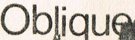
The typeface above is Nimbus Sans. How do I best achieve that distressed-photocopied-worn look that the above typeface has?
Welcome to the forum. I hope someone has the answer you are seeking. My attempt is probably not what you are really looking for but hopefully the idea heads you in the right direction.
The text layer in GIMP is a separate layer so filters could be applied to that layer alone. It is a matter of finding which filter or combination of filters will give that distressed look. In the top example I applied two noise filters. First spread and then CIE lch Noise. In the bottom example I also applied slur filter.


Thank you. I like the first one a bit better as it seems ‘more natural’. What I am looking for is something in-between, but nudging closer to the top one. I will try this when I get home and report back. Thanks again.
You could try this maybe in combination with Terry’s post
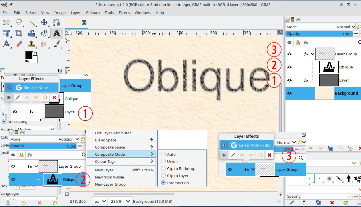
A bit complicated but leaves the text editable. In a layer group
(1) Is a noise layer, Filters → Render → Noise → Simplex Noise
(2) The text layer mode is Addition and also for Addition mode the Composite Mode → Intersection.
(3) The layer group has a small Linear Motion Blur applied.
1 Like