There have been posts (not too frequently, though), when some wanted to check the colours of the image, ignoring lightness. Some LUTs have been posted, but those are limited to brightness = 100%, so are not really compatible with the scene referred workflow.
However, darktable’s development version has a new module, composite, which makes this possible:
open any photo, and enable the composite module with the preset created above. Since composite is normally before exposure, it’ll probably be very bright:
(Again, the preview showed some weird artefacts when I made the darktable window smaller for this screenshot, so I don’t bombard the forum with 4K screenshots. Bug?)
Drag to the desired place in the pipeline (some place above exposure, usually). Here, I just dragged it to the end:
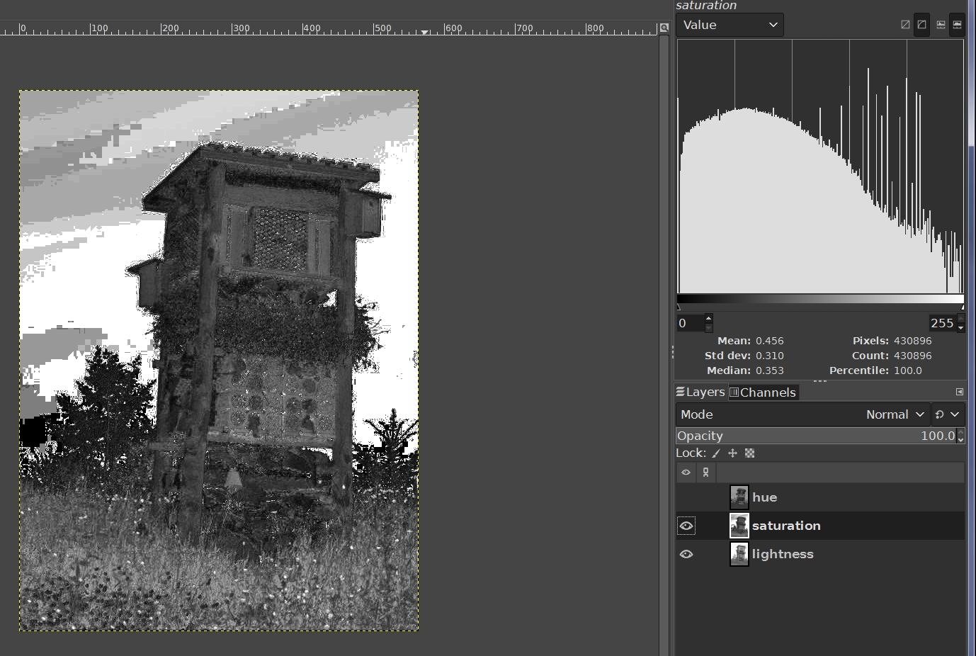
Interesting - seems similar to the GIMP’s ‘Decompose’ which can actually show a distribution histogram where the 0-255 level is equivalent to HSL Hue degree value:
Yep (I’m aware of those tools in Gimp, have used them), but:
in HSL/HSV hue 0° = 360°, which can be problematic when shown on a histogram (related colours may appear at distant ends of the histogram);
this shows hue and saturation (= colour) in a single view, simply ignoring brightness (so you don’t have to rely on numbers);
the aim was to do it inside darktable;
this is not intended an editing tool, just an assessment / visualisation.
I don’t use colour harmonies and such, but maybe people who analyse their images more will find it useful. If not, it wasn’t much effort to do this, so no big loss. The idea just occurred to me and I tested if it works.
That is not what I meant. I’m sorry for the harsh tone.
Yes, they are useful for statistical purposes. But just like a brightness / lightness histogram is different from the lightness channel in a Gimp decomposition (or from a B&W conversion), the hue / saturation histograms are different from the colour-only view. For example, spatial arrangement is not reported.
I’m not saying it’s a ‘great invention’ (I did not come up with the idea of such a view, in the first place), and all other methods are bad/wrong/obsolete. Use it if you find value in it, ignore it if you don’t.
Not sure I follow. You basically get this view if you hold the C key on the hue channel when creating a mask so I’m not sure of the advantage of this for masking…
I don’t think you’ll find it in the manual. It was a while ago now, but if I remember rightly, I figured it out after watching a YT video by Joanna Kustra about colour harmonies. She does something similar in Photoshop using a 50% grey layer, so I converted the process to the Colorize module. I think there was a thread about it on here a couple of years ago, and we also managed to come up with something similar using the Tone Curve module:
There are probably differences with all of the various techniques, but they can all be used to visualize hues.
Wasn’t happy with my last effort. This time, left the GIMP ‘precision’ at 32-bit floating point, Linear and this time decomposed to HSV, instead of HSL, with V filled with medium-light gray and then recomposed.