How'd They Do This? Achieving a Specific Look in Darktable

I’m a huge fan of this look but I don’t yet have the eye for knowing what exactly is in play here, and I’m very new to DT (4.4.2), so I’m not sure how these elements translate into post processing.

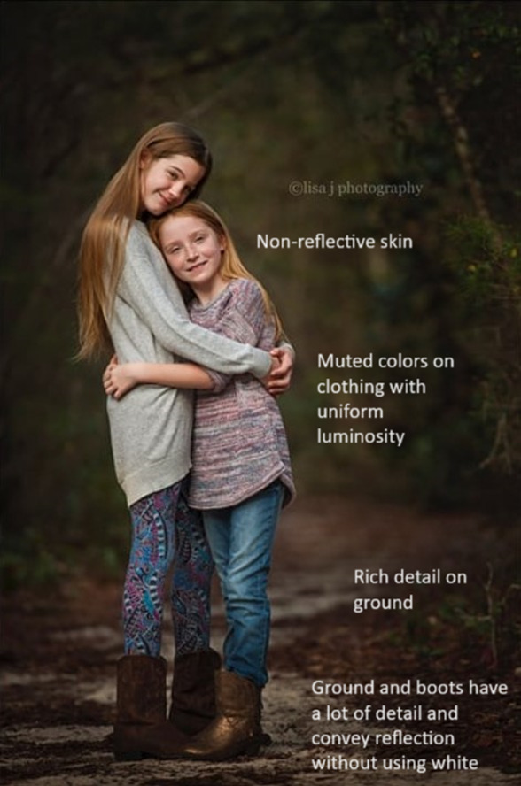
I’ve put notes on the 2nd version of each photo to show what I admire and desire to achieve. I’ve also included a random snap of my daughter to see if anyone could recreate this look in DT and share the XMP.

DSC_0291.NEF (26.8 MB)

If there’s something else all of these images have in common, I could use some help identifying it – I just like the way they all feel.

Aside from the DT part, is there any insight you all can offer into how much the original shot affects the outcome here (lighting, exposure, etc). I’m not sure if this look can be applied to any photo or if the vision for final product must be present when taking the photo. If it all depends on how the photo is taken, what have these amazing photographers done to achieve this look?

I’m familiar with the DT basics: exposure, filmic, color calibration, color balance RGB, local contrast, color zones, tone equalizer, and a few others.

I’m very grateful for all the support this community has shown me so far, thank you all so much for helping newcomers like me.

PS a few of these came from how-to posts on the matte effect, but the pictures I’ve used are the before versions.

Image credit: Julia Trotti


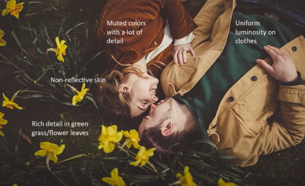
Image Credit: Brendan Williams


Image Credit Julia Trotti


Image Credit: lisa j photography

image
image

1 Like

Nice challenge. :slight_smile: (not saying I can succeed!)
My first thought is that @s7habo would be the person to tackle this - I’m sure he’d make it look easy! :wink: (hint hint)

I’ll have a go though!
Looking at your examples, they’re all lit primarily by relatively diffused lighting, although with some directionality too I think.
All except the the woman with the furry hood have slightly raised black levels, as described in the last , “Coles Classroom” tutorial, as I’m sure you saw already.
(not sure if that’s the right term - not to be confused with the white and black levels module in dt which is normally a ‘hands off’ technical thing).

At the same time, contrast is fairly high, with quite deep shadows.

Most also have quite warm colors overall - I think as a combination of color grading, as well as desaturating or shifting some cooler colours.

Here’s 2 slightly different attempts - not sure if you want me to post the results so for now I’ll just post the .xmps.
On both I use sigmoid as the tonemapper, set the contrast quite high, the use tone eq starting with the 'compress shadows highlights GF (soft) preset but then resetting the curve and pulling highlights back.

I applied a little color grading in color balance rgb.

In diffuse and sharpen I started with the ‘sharpen demosaicing AA filter’ preset, then increased the iterations to give a stronger effect, but moved the “1st order speed” slider well over to the right to apply softening instead of sharpening to the coarsest details (within the scope set by the other controls).

DSC_0291.NEF.xmp (10.8 KB)
DSC_0291_01.NEF.xmp (12.8 KB)

Then on the first one I used color zones to selectively adjust various colours… and the tone curve module (the deprecated one) to give that little bump to the black level. I think that with any tone curve one needs to set color preservation to ‘none’ to get this effect.

On the second I used color calibration and the more current rgb tone curve to attempt the same thing, but it came out a little differently.

Note that I’m still using the old white balance arrangement of just the WB module and no color calibration for this purpose - shouldn’t make much difference but wanted to mention it case it confuses…

Not sure how much this all helps :laughing:

1 Like

Not sure if I accomplished anything, but here are my thoughts:

(1) No reflective skin => kill skin highlights using masked tone eq

grafik

(2) muted colors => use an inverted vibrance curve using the color zones (chroma vs chroma, the
higher chroma the less chroma output), this kinda kills the vibrant colors

grafik

(3) uniform luminosity in colored areas => use an tone eq to compress while masking it to higher chroma areas (with a parametric mask)

grafik

I think this are the main ideas for the challenge. Didn’t include the picture because family member.

DSC_0291.NEF.xmp (24.2 KB)

3 Likes

Non of these image look like snapshots.

So, first guess on the non-reflective skin: make-up artist.

And then some large directional light as pointed out by @123sg .
The trick with large light sources is, you don’t need a lot of extra power because in these scenarios you want them to “invisible”. One of those (rare) situations where power settings in 1/10 EV steps are actually really really helpful. Often the same effect can be achieved by using a large diffusing reflector - white foamboard - and adjust the distance accordingly.

The rest is probably some skin retouching, selective sharpening & contrast and only a little color correction - when you have done all of the above, there is not a lot left to do.

PS: I just skipped through one of those BTS videos by Julia Trotti - actually it is just soft light and a lot of lightroom preset action plus some really heavy skin editing from what I can see. Don’t try this in darktable, it will be an exercise in pain. Her unedited photos have a lot of shine on the skin, she just completely airbrushed them away. Well done, but absolutely not my style, hence the underlying snark in my text.

3 Likes

I actually thought it was natural light… but then, I’m hopeless at working out lighting! :smile: I defer to your experience. :innocent:

Interesting about the skin retouching/makeup - again, no experience but makes a lot of sense.
The choice of clothing and it’s colours subconsciously ends up part of the style too I think.

1 Like

And I think you are right, at least for the Totti images. :partying_face:

Sometimes it is really hard to see the difference without seeing the complete environment. And also as often a lot can be nudged into a certain direction through editing. The skin retouching on some of the images fooled me into thinking that there was some extra light at play, but after I have seen a little larger versions it dawned on me.

1 Like

A hint for the matte effect … if you are using sigmoid, just dial it down a bit and adjust the exposure accordingly.

2 Likes

MMmm… interesting. I’ll try that later. Somehow can’t imagine it giving quite the right effect… shift the skew at all?

Soft light - good call I didn’t recognise it but see it now you mention it. Bloom (either DorS or the old bloom module) with the blend mode set to multiply gives a rather nice effect along those lines.

1 Like

There are countless ways you can do this with darktable.

What you want is a matte look with strong local contrast and color grading.

The idea behind the matte look is to lighten the black point (move it from black to dark gray) so that the contrasts in darker areas of the photo are not as pronounced.

The first photo you could achieve with channel mixer and color balance modules.

Instead of photos of your daughter I will take a subject that fits better to the subject from the first photo.

This is the starting point with the white balance, saturation and contrasts done.

In the channel mixer, the main task - roughly speaking - is to swap the proportions of green and blue to get cyan-green and at the same time to make orange out of the red:

These are the changes I made in the channel mixer:

I have only increased a little value of red to have white point a little warmer:

grafik

In the green channel I increased green with input red (to get orange) and input blue (to get cyan) and decreased value in input green as compensation:

grafik

In the blue channel I decreased the value of blue with input red (to have more yellow in red) and “compensated” this decrease with input green:

grafik

In colorfulness tab I have increased saturation of blue to increase saturation of cyan portion in green:

grafik

And in the brightness tab I darkened green and lightened red, so that the skin colors become lighter.

grafik

In the second instance of the color balance module in the “4 ways” tab I increased the luminance of the global offset to get a matte look. With hue and chroma I gave this matte look a little yellowish tone. With highlights gain and power I increased the contrasts in mids and highlights:

And in the end, with the help of diffuse and sharpen module, I increased the local contrasts a bit:

The matte look can also be achieved very easily with rgb curves. But I recommend to move the curves over filmic to have the effect in the display-reffered area. This way the effect will be similar to other programs like Photoshop.

Other examples above from the main post are very similar in color composition. These are simply variations on this theme.

19 Likes

This is tremendously helpful! The way you narrated what you saw in these photos is invaluable as I’m not yet to the point where I understand what I’m looking at from a technical perspective. I’ll study the images with your commentary and try to recognize these elements.

Beautiful work on the images, thank you so much for sharing; I’ll be spending a great deal of time studying the moves you made.

Thank you for your consideration about posting results :slight_smile: And thank you so very much for taking the time to break this down and help me out!

2 Likes

This is great stuff! Really opened my way of thinking when it comes to achieving a desired result… I would have never thought of using the tone eq in that way to achieve uniform luminosity. And the inverted vibrance curve you did in color zones… I didn’t realize that was an option - thanks!

Mission accomplished! Your work looks great; I’ve got a lot more studying to do to fully understand what you did now that I know why you did it. The learning curve with processing is so steep, I feel like my brain is about to explode.

Thank you for your consideration about posting the result :slight_smile: And thank you so much for your time in supporting me, very generous of you!

3 Likes

Thank you for the insight on the setup here… I imagined the setup is at least half the battle, but maybe I’m underestimating it still. The RAW I posted was in a dimly lit living room with windows all around and light coming from every imaginable direction; I didn’t think much about it until I read what you wrote… keeping that in my toolkit from now on.

The Julia picture I posted was actually a screen grab from the intro of one of her videos, not even sure if it’s her work as I bounced over to her blog and immediately noticed some of the heavy skin editing you’re referring to. Nothing against it, it just wasn’t aligned with the screen grab that pretty much inspired this post.

Thank you so much for taking the time to drop by and share your knowledge with a newcomer!

1 Like

Aside from being a bit starstruck, I’m not sure I have the words to say just how perfectly you nailed this - well done. Not that I’m surprised - I just watched your video on The way to the goal last night, very impressive.

I’ve been watching hours of your videos, so it was a bit surreal to see you taking the time to post such a thorough tutorial on this thread. A million thanks to you, and for your contribution to this fascinating art.

Thank you for being so aware of your audience and going the extra distance to explain the intent behind each minor adjustment (especially with the colors). I hope others benefit from your explanation on how to achieve this look as much as I did - this is great information!

I’m truly grateful. As always, you make it look so easy; hopping over to DT after this to experiment.

6 Likes

You are welcome! And as a mentor to me once said “in photography you will (or should) never know what is right - in time you just worked out a lot of things that (very likely) will not work in a given context.” - I learned a few things myself here. Again. :sunglasses:

@s7habo am I right in the presumption that the new primaries tool will make some of this a lot easier? Personally I never got too much into the RGB input slider tabs in color calibration due to their fiddly nature and tabby layout.

1 Like

Yes, because you can directly move the primary colors towards their adjacent secondary colors without having to use additional inputs. This makes it much easier to make color corrections. Also, there is an additional hue slider with which you can set the overall “hue” of the scene.

Here is the color grading from the above example that you can get right away:

6 Likes

Well, I’m glad if I’ve been of any help.:blush:
Do bear in mind that I’m not a pro or expert by any means so don’t read too much into the way I did things…
Have fun!

1 Like