Changes look great @rudantu!
I noticed the colour labels have quite different levels of perceived lightness. Recently I made a palette based on ‘darktable ucs’ color space that presents each hue at the same level of perceived saturation and lightness. Using the mid level ‘lightness 50’ from those palettes, here is how it would look on the grey and dark backgrounds for the primaries and secondaries:
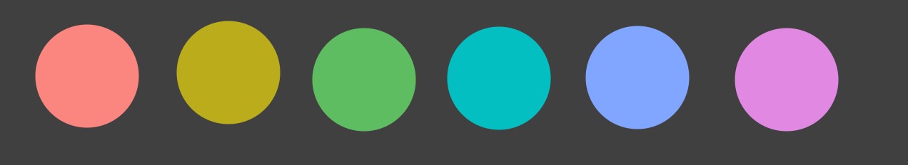
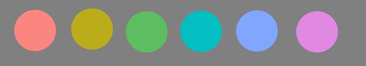
I put it here for consideration in your re-design. If interested, the hex values for those colours can be found in the dt ucs max chroma.txt found at the given link.
EDIT: Another possibility is to use the same colours as used in the darktable logo.