Howdy all! Its inspiring to see the interest in product design and usability continue! I think areas like masking are good to explore since that is a high use feature in DT.
I plan on doing larger batches of work and making more milestone posts, aiming to deliver a ‘spec’ for each idea. A cohesive vision of systematic design changes to improve general usability for new users and pros alike.
So forgive if the below ideas seem a bit unsubstantiated and all-over-the-show.
Modules as the thing to get right
So just to revisit, I think this is a good place to do our design workout.
Modules are probably the highest traffic element in DT - a folded group of controls that get 99% of our attention during work.
A module has a name (its function), a state (on, off, unfolded, folded), some controls (presets, reset), indicators (masks applied, errors, multiple instances) and also user labels.
That’s a lot to communicate in a small space, and we dislike hiding stuff, right? We need the above but don’t want to feel overwhelmed.
So above is WIP concept art. Some notable tweaks:
- Chunkier fonts & icons. Sliiightly more tonal contrast. Helps with legibility.
- The module’s function is communicated by both its name AND its icon, this becomes interesting in a second.
- Module state is communicated by its opacity. Disabled modules lack their shape container, and fade slightly. They’re ‘not involved’ with the party.
- I think ‘hover to see controls’ is a good default and isn’t harming ‘discoverability’ - you click on modules all the time anyway.
Now, some details.
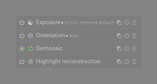
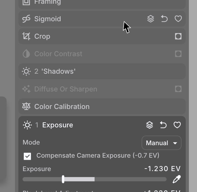
You may notice above, the modules Exposure and ‘Shadows’ are actually numbered. That’s new. Check out the below!

Huh? Three exposure modules? Oh right! Darktable has module instances.
Its quite important we can always tell an instance apart - for example in the quick controls panel above. Now, we are super clear on what this quick control is connected to. The link icon reinforces this - it links back to the main module.
And that second module is completely renamed! Yup, since we have icons to show function, users are entrusted to fully rename their modules. One can always hover to see what a module’s true name is  . This idea also helps save precious space.
Speaking of hovering modules.
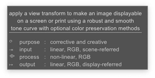
The above is the current tooltip for most modules. Its great! A diagram of the pixel pipeline is a nice reference and educational prompt.
And now you may laugh.
But this got me at first. Its silly.
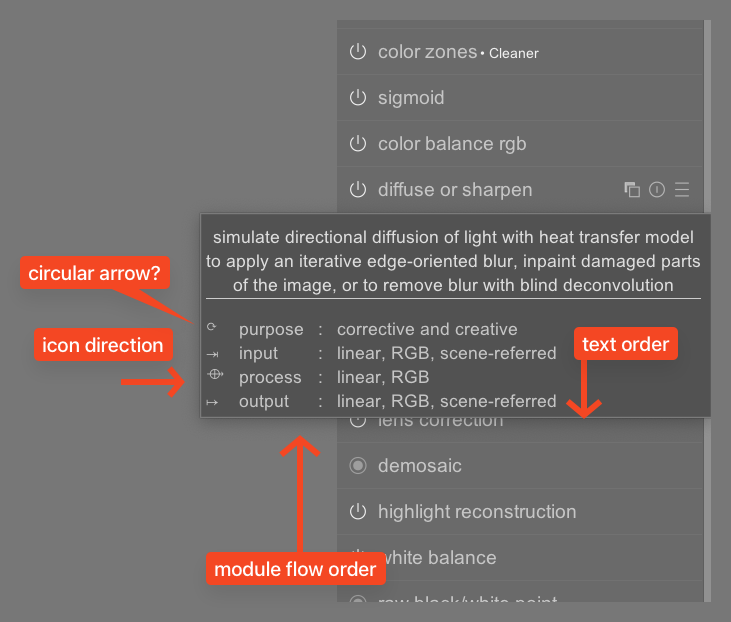
Each arrow here is in a different direction.
My mental model of how this flow worked was all wonky and I struggled to understand it. The below is what I imagined may help:
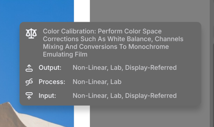
The order is bottom to top, always. The actual pixel pipeline flow now is communciated by the icons and the text order  . This seems to be clicking, at least for my friends.
Regarding masking.
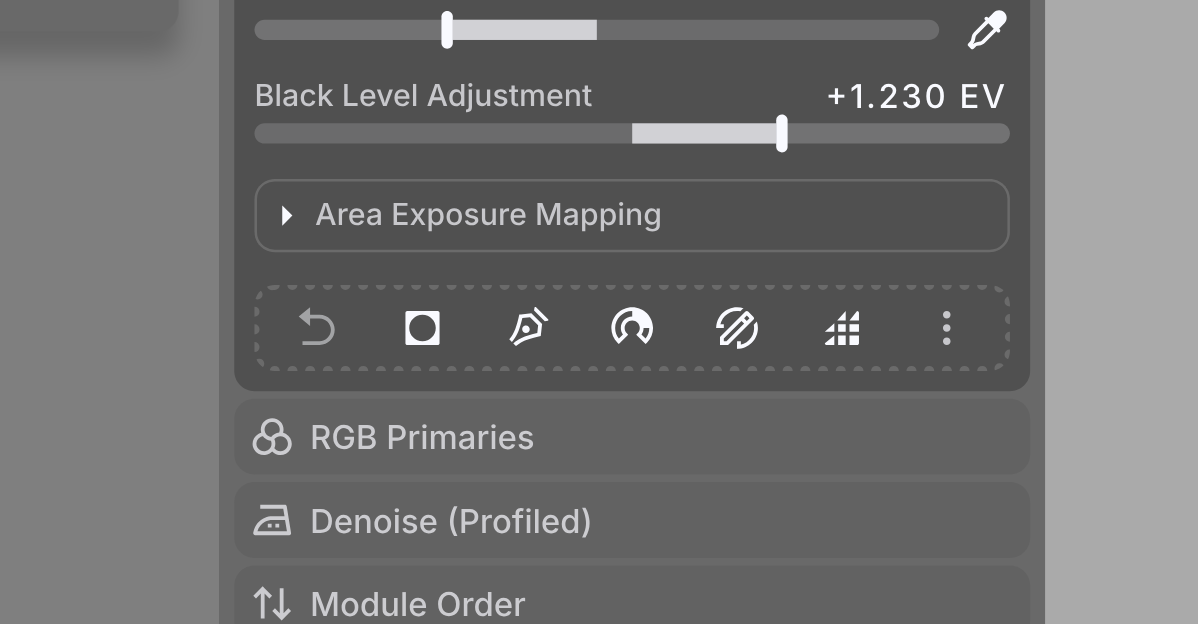
I think possibly yes, this is a lot of icons. Diving into masks feels overwhelming here — I will rethink this. I do like the idea of this dotted line container to symbolize ‘selection’, but thats it. 