Blender’s new design is good I think. One app I love to use is Bitwig. Ableton has a similar design. I don’t know what makes it so appealing but I think a lot could be learned from them
While I embrace the new icons and webdesign - thanks to @rudantu, I am not sure if I like the new rounded logo. I think I prefer consistency on a logo. Anyway I can live with it easily.
But I’m not sure, if it is necessary to invent the wheel anew and overhaul the whole GUI. darktable has a quite unique and very efficient UI. If we want to modernize it I think it should be done very carefully. And I think changes should be done step by step, so people are still able to recognize darktable.
Just my two cents
6 Likes
That question threw me for a loop. Intuitively, I thought, sure, there are plenty of apps I love! And then I started thinking about it some more, and came up blank. Zero.
I like my Kobo ereader. I like my Steam Deck. I could list some delightful video games. I like my camera. My printer and scanner work well. But Apps? Darktable comes to mind, for its flexibility. Though I have plenty of quibbles with it, too. Maybe MoneyMoney, a Mac app that just mostly just does one thing with a minimum of fuss? Perhaps the Zen browser, which has subtly pushed me to a saner web usage. Gink is a Windows application for drawing on your screen that works well. Obsidian is a fairly unobtrusive journaling app. But I don’t love any of them. Which is depressing, because I used to.
I could easily rattle off a huge list of apps that are absolute trash fires, but I’m forced to use them daily anyway. Microsoft Teams finally learned to spell-check more than one language. In 2025!!! For crying out loud. Google Maps has sent us down the wrong path. So. Many. Infuriating. Times. I’ll stop right here, I’m getting worked up.
It’s a bit easier on the phone: Mapy is a beautiful maps app. Windy is a delightful weather app. Futo is a great, FOSS, keyboard. Signal is a decent messaging app. OurGroceries is a gem of a shared grocery list app. AntennaPod is a great FOSS podcast client. Redreader for Reddit. FocusReader for RSS feeds. FeedBin is a great website for RSS aggregation. Raindrop is a delightful link aggregator.
I guess I did come up with a list of good apps after all. I feel somewhat relieved.
2 Likes
I’d think we would need a good definition of “new user” that doesn’t equate to someone with no knowledge. None of the three of these apps will do well with some average person you just plop down in front of them; they all require some knowledge of the domain. Perhaps that is also true of darktable, but the domain isn’t photography but image processing. At any rate I’ve heard some 3d and video people say they find darktable very intuitive and simple.
4 Likes
I agree. I expressed myself incorrectly. I meant that Ableton and Bitwig look good merely on a UI visual standpoint. They manage to have quit flat looks, like dt needs to have, but still be hyper eligible in a way that darktable could be improved. I believe a lot of it is simply due to the font and icons. The font has a lot more weight compared to darktable’s, but that’s about it.
It is true that when using compositing applications like Nuke (in the open source world we have Natron) or 3D applications like Blender and other VFX programs, their interfaces are quite complete, full of icons and options. So in those cases for this type of users darktable looks like a friendly interface.
Even as in my case I was looking if darktable had a node mode like DaVinci or the compositor of Nuke or Blender, but it doesn’t have that workflow (vkdt has this possibility, but it is still too new to adopt it more than to experience the new options).
*Clarification: I’m not asking that darktable must have this kind of workflow by nodes. The darktable interface is fine as a RAW developer. There are details that can be improved, of course, but that depends on a group of people who in their little free time are committed to carry out these tasks, not easy.
This is the Blender interface with a custom theme I made for my work.
This is a Nuke interface showing the work by nodes.
Greetings from Mérida, Yucatán.
4 Likes
I signed up to the forums specifically to share my enthusiasm for everything that is going on in this thread. Top work @rudantu! I personally would love to see this all come to life.
A couple of things on me before I add any other feedback. I used to do quite a big of photography, but for various reasons stopped and recently have just started getting back into it. I gave up on Adobe a couple of years ago, and after a little while looking at my options decided to settle on Darktable for processing my photos, so for me it is very much a new application. While I’m not a full time professional, only occasional freelance work, I have been doing digital art for about 20 years and so have used a whole host of 2d and 3d applications for a long time (my website should anyone be interested: https://alastairtemple.co.uk/). I might not be far off what @paperdigits is thinking of as a ‘new user’.
I’m starting to get a little bit more used to the UI but there are definitely aspects that could use work. Primarily the text heavy nature of the UI in combination with a general lack of obvious hierarchy and separation between components and tools, which makes lots of parts feel very overwhelming and it can be hard to quickly identify what goes with what. That isn’t to say its “bad” as such, but it could definitely be more approachable.
For the long time users, I totally understand that we get used to stuff and when it changes we have to re-learn and its frustrating and annoying. However I would urge you to not necessarily mistake familiarity for good/simplicity, in some cases they will overlap, but they won’t always.
Blender feels like a very good reference point here, given it is also open source and it was notorious for having an unapproachable UI until it went through its own major re-design for version 2.80. Since then it has exploded in popularity and very very few users would want to go back to what it was before. A full UI design could very well do the same thing for Darktable.
Blender also a good touch point in terms of UI colour use I think. As has been pointed out in this thread before there is a good reason for the main grey nature of the primary theme and that should definitely be kept (probably alongside a slightly lighter and slightly darker version for users to choose as they prefer). However, much like blender is also primarily grey (if a slightly darker), it has all sorts of small elements of colour around the UI to help make things clearer, to help categories tools, etc. Hell even darktable has the odd bit of colour around the UI, e.g. the scopes or the colour icon in the modules filter bar. The point being, small elements of colour in the UI, e.g. to highlight something selected, or in an icon to help categories modules/in a menu for setting up module groups, can be beneficial without becoming so distracting from the image you are working on.
Anyway, just my 2 cents.
9 Likes
I haven’t been following this thread but I do like the suggestion for presets and undo. They are so intuitive and should be implemented.
I am not a big fan of color for color’s sake in the UI so I would keep that to a minimum. I personally don’t see an advantage in having icons for each module. I read the name of the module and that is sufficient for me. I like the current triangle because it shows that the module is expended or compressed and this is intuitive to me. Replacing this with an icon would not be progress in my view.
My bug bear with the current UI is the difficulty in telling if a module is activated or deactivated. I would like some distinct change in the symbol without the use of color. The current UI is too subtle for this.
Good luck to everyone who is contributing to the ongoing development of DT.
10 Likes
I second this. I looked at the icons and found them rather distracting as I was trying to figure out the icon meaning rather than read the name. For some, it’s ok, but often it doesn’t work for me
7 Likes
This might not be the right place for this comment, but I was wondering if there would be any merit in streamlining the masking options.
Right now we have 5 options: Uniformly, Drawn mask, Parametric mask, Drawn and Parametric mask, Raster mask.
Maybe we could get rid of the individual Drawn mask and Parametric mask options, and just retain the “Drawn and Parametric mask” option, reducing the total number of options to 3?
The individual Drawn tools and Parametric tools could be collapsible to save screen vertical space?
Maybe there are good reasons for separating them that I’m unaware of, but I realized that I often just use the “Drawn and Parametric mask” option because it always gives the option to use one or the other or both.
5 Likes
I’d put that in github.
I don’t have a problem with the masking options as they exist now. What I like is that if I start with just a parametric mask but then decide to add a drawn mask as an after thought it can be done. Selecting from 3 or 5 option doesn’t make a lot of difference in my view.
2 Likes
There is a tiny, tiny snag here: The pop-up text to the Display Mask icon that becomes visible in the module header, informs what kind of mask the module has, in correspondence with what kind of mask we have selected to create (– even if no such masks have yet been drawn/specified, that is). This text remains if we thereafter click another mask icon, leading to the pop-up text not reflecting anymore what kind of mask that currently really is used.
Thanks for the link to the Tantacrul Musescore video. I watched the entire thing…really well done. I’ve never written a line of code, or music for that matter, but the video did a great job of describing the ripple effect any one change can make.
It also really demonstrated the need for a coordinated team to overhaul a large community effort. My hats off to that team and the one coalescing around your recent efforts.
I’m new to DT and this my first post. That video inspired me to jump in.
2 Likes
I never read the text but I do visualize the mask using the icon. More of a problem to me is if I draw a mask but then delete it. The header shows a mask icon even if a mask is no longer present. A minor issue at best.
I personally find myself at the other end of the spectrum regarding icons, I rely on them heavily in most programs.
When using a program, it’s easy to associate a filter or action icon with its effect. Once familiar with the icon language, I use it as a guide to quickly identify what I might want to add at a glance, rather than solely relying on text. This helps me speed up my workflow.
Since icons are implemented and optional (it might be worth prompting new users to enable them or not during first-time setup, though that’s probably a separate matter), I think it would make sense to provide an updated version that aligns with other suggested (yet to be considered and submitted) redesigns when the time comes. This would help create a clean, visually cohesive UI, especially useful for new users who might find some module names to be daunting at first. I’ve definitely been there while learning the program.
I think the icon set crafted by @rudantu is a well-balanced and coherent approach. Its modular design makes it easy to adapt based on user feedback.
The reason the original ones don’t work well for me, currently, is that they’re tied to font size. On Windows 11 I use an FHD screen with font size set to 9,0 pts (which is the system default). If I increase it to get icons to a useful size (big enough to be somewhat readable without going all the way to 13) the text is huge. In my case, 10 is already too much. At my preferred text size, the icons end up very thin, and with the added “downsampling” artifacts as they shrink, it becomes hard to read them properly. I find them valuable, if only they were of a reasonable size.
2 Likes
That’s a feature, at the time you select “drawn mask”, “parametric mask”, or “raster mask” you get the icon. That is, there is a mask even if it is selecting the whole image. Actually this icon shows the state of the blending option for the module.
2 Likes
Hi Terry-
I also had a problem with seeing if a module was on or off, and used this addition to the .css area of the general preferences area, uncommented of course:
/* @define-color button_fg alpha(@fg_color, .35); */
It seemed to help me on the elegant gray preset.
I’ve since moved on to a more customized css, which seems to have it’s own fix for this problem.
I think that switching to a different icon (let’s say a checkmark) would be a better solution. I find in general dt has too little contrast in it’s interface. While I understand the rational, these old eyes struggle with it sometimes.
Anyways, I hope this might help you.
3 Likes
I have often gone from one to the other…with no issue I think the main thing that happens is that it hides the interface for the elements so in drawn that is all you access in parametric the same, when you select the mode with both you have both the sets of controls… I think really that is basically the only difference and of course the mask will be either drawn parametric or both combined…there may be a use case to be able to toggle between what the image looks like with just a drawn mask or parmetric or both depending on the mask design I suppose…
1 Like
Howdy all! Its inspiring to see the interest in product design and usability continue! I think areas like masking are good to explore since that is a high use feature in DT.
I plan on doing larger batches of work and making more milestone posts, aiming to deliver a ‘spec’ for each idea. A cohesive vision of systematic design changes to improve general usability for new users and pros alike.
So forgive if the below ideas seem a bit unsubstantiated and all-over-the-show.
Modules as the thing to get right
So just to revisit, I think this is a good place to do our design workout.
Modules are probably the highest traffic element in DT - a folded group of controls that get 99% of our attention during work.
A module has a name (its function), a state (on, off, unfolded, folded), some controls (presets, reset), indicators (masks applied, errors, multiple instances) and also user labels.
That’s a lot to communicate in a small space, and we dislike hiding stuff, right? We need the above but don’t want to feel overwhelmed.
So above is WIP concept art. Some notable tweaks:
- Chunkier fonts & icons. Sliiightly more tonal contrast. Helps with legibility.
- The module’s function is communicated by both its name AND its icon, this becomes interesting in a second.
- Module state is communicated by its opacity. Disabled modules lack their shape container, and fade slightly. They’re ‘not involved’ with the party.
- I think ‘hover to see controls’ is a good default and isn’t harming ‘discoverability’ - you click on modules all the time anyway.
Now, some details.
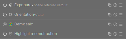
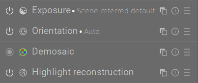
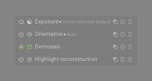
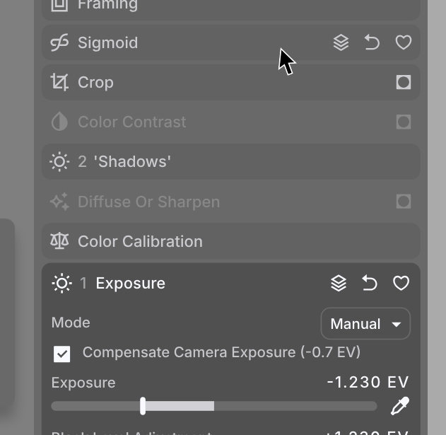
You may notice above, the modules Exposure and ‘Shadows’ are actually numbered. That’s new. Check out the below!

Huh? Three exposure modules? Oh right! Darktable has module instances.
Its quite important we can always tell an instance apart - for example in the quick controls panel above. Now, we are super clear on what this quick control is connected to. The link icon reinforces this - it links back to the main module.
And that second module is completely renamed! Yup, since we have icons to show function, users are entrusted to fully rename their modules. One can always hover to see what a module’s true name is  . This idea also helps save precious space.
Speaking of hovering modules.
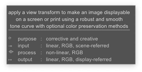
The above is the current tooltip for most modules. Its great! A diagram of the pixel pipeline is a nice reference and educational prompt.
And now you may laugh.
But this got me at first. Its silly.
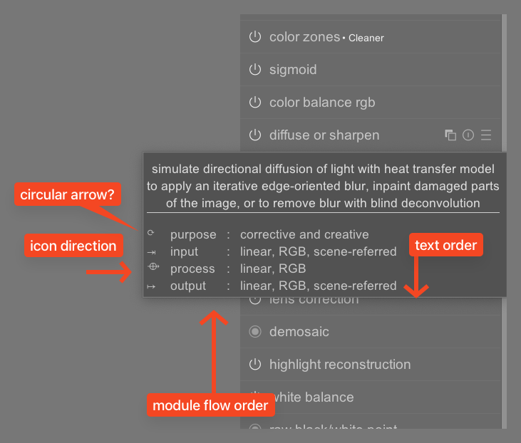
Each arrow here is in a different direction.
My mental model of how this flow worked was all wonky and I struggled to understand it. The below is what I imagined may help:
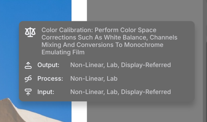
The order is bottom to top, always. The actual pixel pipeline flow now is communciated by the icons and the text order  . This seems to be clicking, at least for my friends.
Regarding masking.
I think possibly yes, this is a lot of icons. Diving into masks feels overwhelming here — I will rethink this. I do like the idea of this dotted line container to symbolize ‘selection’, but thats it. 
22 Likes